Data analysis is a broad term that covers a wide range of techniques for revealing insights and relationships in raw data. Data analysis with Python has become a default workflow in industry, thanks to a mature ecosystem of libraries like pandas, NumPy, Matplotlib, and scikit-learn. Once you’ve analyzed your data, you can use your findings to make sound business decisions, improve procedures, and even make informed predictions.
In this tutorial, you’ll:
- Understand the need for a sound data analysis workflow
- Understand the different stages of a data analysis workflow
- Learn how you can use Python for data analysis
Before you start, you should familiarize yourself with Jupyter Notebook, a popular tool for data analysis. Alternatively, JupyterLab will give you an enhanced notebook experience. You might also like to learn how a pandas DataFrame stores its data. Knowing the difference between a DataFrame and a pandas Series will also prove useful.
Get Your Code: Click here to download the free data files and sample code for your mission into data analysis with Python.
In this tutorial, you’ll use a file named james_bond_data.csv. This is a doctored version of the free James Bond Movie Dataset. The james_bond_data.csv file contains a subset of the original data with some of the records altered to make them suitable for this tutorial. You’ll find it in the downloadable materials. Once you have your data file, you’re ready to begin your first mission into data analysis.
Take the Quiz: Test your knowledge with our interactive “Using Python for Data Analysis” quiz. You’ll receive a score upon completion to help you track your learning progress:

Interactive Quiz
Using Python for Data AnalysisTest your understanding of a data analysis workflow in Python, from cleansing raw data with pandas to spotting insights with regression.
Understanding the Need for a Data Analysis Workflow
Data analysis is a very popular field and can involve performing many different tasks of varying complexity. Which specific analysis steps you perform will depend on which dataset you’re analyzing and what information you hope to glean. To overcome these scope and complexity issues, you need to take a strategic approach when performing your analysis. This is where a data analysis workflow can help you.
A data analysis workflow is a process that provides a set of steps for your analysis team to follow when analyzing data. The implementation of each of these steps will vary depending on the nature of your analysis, but following an agreed-upon workflow allows everyone involved to know what needs to happen and to see how the project is progressing.
Using a workflow also helps futureproof your analysis methodology. By following the defined set of steps, your efforts become systematic, which minimizes the possibility that you’ll make mistakes or miss something. Furthermore, when you carefully document your work, you can reapply your procedures against future data as it becomes available. Data analysis workflows therefore also provide repeatability and scalability.
There’s no single data workflow process that suits every analysis, nor is there universal terminology for the procedures used within it. To provide a structure for the rest of this tutorial, the diagram below illustrates the stages that you’ll commonly find in most workflows:
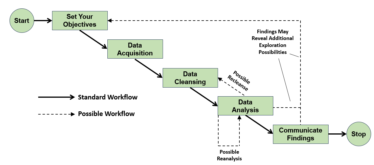
The solid arrows show the standard data analysis workflow that you’ll work through to learn what happens at each stage. The dashed arrows indicate where you may need to carry out some of the individual steps several times depending upon the success of your analysis. Indeed, you may even have to repeat the entire process should your first analysis reveal something interesting that demands further attention.
Now that you have an understanding of the need for a data analysis workflow, you’ll work through its steps and perform an analysis of movie data. The movies that you’ll analyze all relate to the British secret agent Bond … James Bond.
Setting Your Objectives
The very first workflow step in data analysis is to carefully but clearly define your objectives. It’s important for you and your analysis team to be clear on what exactly you’re all trying to achieve. This step doesn’t involve any programming but is every bit as important because, without an understanding of where you want to go, you’re unlikely to ever get there.
The objectives of your data analysis will vary depending on what you’re analyzing. Your team leader may want to know why a new product hasn’t sold, or perhaps your government wants information about a clinical test of a new medical drug. You may even be asked to make investment recommendations based on the past results of a particular financial instrument. Regardless, you must still be clear on your objectives. These define your scope.
In this tutorial, you’ll gain experience in data analysis by having some fun with the James Bond movie dataset mentioned earlier. What are your objectives? Now pay attention, 007:
- Is there any relationship between the Rotten Tomatoes ratings and those from IMDb?
- Are there any insights to be gleaned from analyzing the lengths of the movies?
- Is there a relationship between the number of enemies James Bond has killed and the user ratings of the movie in which they were killed?
Now that you’ve been briefed on your mission, it’s time to get out into the field and see what intelligence you can uncover.
Acquiring Your Data
Once you’ve established your objectives, your next step is to think about what data you’ll need to achieve them. Hopefully, this data will be readily available, but you may have to work hard to get it. You may need to extract it from the data storage systems within an organization or collect survey data. Regardless, you’ll somehow need to get the data.
In this case, you’re in luck. When your bosses briefed you on your objectives, they also gave you the data in the james_bond_data.csv file. You must now spend some time becoming familiar with what you have in front of you. During the briefing, you made some notes on the content of this file:
| Heading | Meaning |
|---|---|
Release |
The release date of the movie |
Movie |
The title of the movie |
Bond |
The actor playing the title role |
Bond_Car_MFG |
The manufacturer of James Bond’s car |
US_Gross |
The movie’s gross US earnings |
World_Gross |
The movie’s gross worldwide earnings |
Budget ($ 000s) |
The movie’s budget, in thousands of US dollars |
Film_Length |
The running time of the movie |
Avg_User_IMDB |
The average user rating from IMDb |
Avg_User_Rtn_Tom |
The average user rating from Rotten Tomatoes |
Martinis |
The number of martinis that Bond drank in the movie |
Kills_Bond |
The number of enemies that Bond killed in the movie |
As you can see, you have quite a variety of data. You won’t need all of it to meet your objectives, but you can think more about this later. For now, you’ll concentrate on getting the data out of the file and into Python for cleansing and analysis.
Remember, also, it’s considered best practice to retain the original file in case you need it in the future. So you decide to create a second data file with a cleansed version of the data. This will also simplify any future analysis that may arise as a consequence of your mission.
Reading Data From CSV Files
You can obtain your data in a variety of file formats. One of the most common is the comma-separated values (CSV) file. This is a text file that separates each piece of data with commas. The first row is usually a header row that defines the file’s content, with the subsequent rows containing the actual data. CSV files have been in use for several years and remain popular because several data storage programs use them.
Because james_bond_data.csv is a text file, you can open it in any text editor. The screenshot below shows it opened in Notepad:
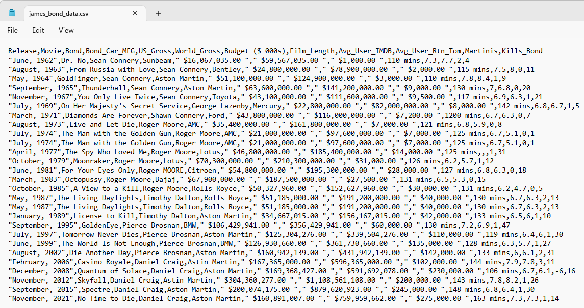
As you can see, a CSV file isn’t a pleasant read. Fortunately, you rarely need to read them in their raw form.
When you need to analyze data, Python’s pandas library is a popular option. To install pandas in a Jupyter Notebook, add a new code cell and type !python -m pip install pandas. When you run the cell, you’ll install the library. If you’re working in the command line, then you use the same command, only without the exclamation point (!).
With pandas installed, you can now use it to read your data file into a pandas DataFrame. The code below will do this for you:
In [1]: import pandas as pd
   ...:
   ...: james_bond_data = pd.read_csv("james_bond_data.csv").convert_dtypes()
Firstly, you import the pandas library into your program. It’s standard practice to alias pandas as pd for code to use as a reference. Next, you use the read_csv() function to read your data file into a DataFrame named james_bond_data. This will not only read your file but also take care of sorting out the headings from the data and indexing each record.
While using pd.read_csv() alone will work, you can also use .convert_dtypes(). This good practice allows pandas to optimize the data types that it uses in the DataFrame.
Suppose your CSV file contained a column of integers with missing values. By default, these will be assigned the numpy.NaN floating-point constant. This forces pandas to assign the column a float64 data type. Any integers in the column are then cast as floats for consistency.
These floating-point values could cause other undesirable floats to appear in the results of subsequent calculations. Similarly, if the original numbers were, for example, ages, then having them cast into floats probably wouldn’t be what you want.
Your use of .convert_dtypes() means that columns will be assigned one of the extension data types. Any integer columns, which were of type int, will now become the new Int64 type. This occurs because pandas.NA represents the original missing values and can be read as an Int64. Similarly, text columns become string types, rather than the more generic object. Incidentally, floats become the new Float64 extension type, with a capital F.
After creating the DataFrame, you then decide to take a quick look at it to make sure the read has worked as you expected it to. A quick way to do this is to use .head(). This function will display the first five records for you by default, but you can customize .head() to display any number you like by passing an integer to it. Here, you decide to view the default five records:
In [2]: james_bond_data.head()
Out[2]:
           Release                  Movie          Bond  Bond_Car_MFG  \
0       June, 1962                 Dr. No  Sean Connery       Sunbeam
1     August, 1963  From Russia with Love  Sean Connery       Bentley
2        May, 1964             Goldfinger  Sean Connery  Aston Martin
3  September, 1965            Thunderball  Sean Connery  Aston Martin
4   November, 1967    You Only Live Twice  Sean Connery        Toyota

          US_Gross        World_Gross  Budget ($ 000s)  Film_Length  \
0   $16,067,035.00     $59,567,035.00        $1,000.00     110 mins
1   $24,800,000.00     $78,900,000.00        $2,000.00     115 mins
2   $51,100,000.00    $124,900,000.00        $3,000.00     110 mins
3   $63,600,000.00    $141,200,000.00        $9,000.00     130 mins
4   $43,100,000.00    $111,600,000.00        $9,500.00     117 mins

   Avg_User_IMDB  Avg_User_Rtn_Tom  Martinis  Kills_Bond
0            7.3               7.7         2           4
1            7.5               8.0         0          11
2            7.8               8.4         1           9
3            7.0               6.8         0          20
4            6.9               6.3         1          21

[5 rows x 12 columns]
You now have a pandas DataFrame containing the records along with their headings and a numerical index on the left-hand side. The wide-format output above assumes a Jupyter Notebook or wide IPython console. If you’re running this in a plain Python REPL, pandas may truncate the output with … instead. To force the full layout, run pd.set_option("display.width", None) and pd.set_option("display.max_columns", None) once at the start of your session.
Even with those options set, a plain REPL or script displays DataFrames as a single very wide line per row, without the backslash continuations or [N rows x M columns] footers that the Jupyter screenshots in this tutorial show. The data is identical. Only the layout differs, so don’t worry if your output doesn’t visually match cell-for-cell.
If you’re using a Jupyter Notebook, then the output will look like this:
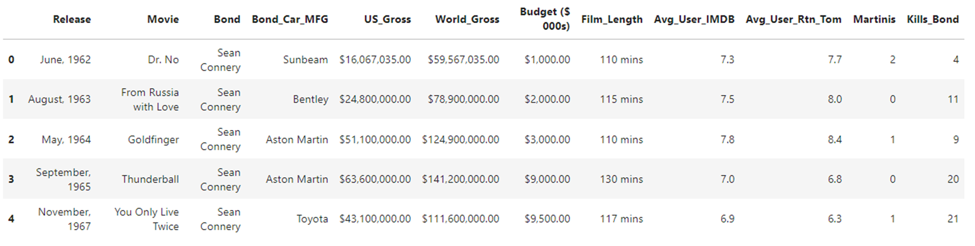
As you can see, the Jupyter Notebook output is even more readable. However, both are much better than the CSV file that you started with.
Reading Data From Other Sources
Although CSV is a popular data file format, it isn’t particularly good. Lack of format standardization means that some CSV files contain multiple header and footer rows, while others contain neither. Also, the lack of a defined date format and the use of different separator and delimiter characters within and between data can cause issues when you read it.
Fortunately, pandas allows you to read many other formats, like JSON and Excel. It also provides web-scraping capabilities to allow you to read tables from websites. One particularly interesting and relatively new format is the column-oriented Apache Parquet file format used for handling bulk data. Parquet files are also cost-effective when working with cloud storage systems because of their compression ability.
Although having the ability to read basic CSV files is sufficient for this analysis, the downloads section provides some alternative file formats containing the same data as james_bond_data.csv. Each file is named james_bond_data, with a file-specific extension. Why not see if you can figure out how to read each of them into a DataFrame in the same way as you did with your CSV file?
If you want an additional challenge, then try scraping the Books, by publication sequence, table from Wikipedia. If you succeed, then you’ll have gained some valuable knowledge, and M will be very pleased with you.
For solutions to these challenges, expand the following collapsible sections:
To read in a JSON file, you use pd.read_json():
In [1]: import pandas as pd
   ...:
   ...: james_bond_data = pd.read_json("james_bond_data.json").convert_dtypes()
As you can see, you only need to specify the JSON file that you want to read. You can also specify some interesting formatting and data conversion options if you need to. The docs page will tell you more.
Before this will work, you must install the openpyxl library. You use the command !python -m pip install openpyxl from within your Jupyter Notebook or python -m pip install openpyxl at the terminal. To read your Excel file, you then use .read_excel():
In [1]: import pandas as pd
   ...:
   ...: james_bond_data = pd.read_excel("james_bond_data.xlsx").convert_dtypes()
As before, you only need to specify the filename. In cases where you’re reading from one of several worksheets, you must also specify the worksheet name by using the sheet_name argument. The docs page will tell you more.
Before this will work, you must install a serialization engine such as pyarrow. To do this, you use the command !python -m pip install pyarrow from within your Jupyter Notebook or python -m pip install pyarrow at the terminal. To read your parquet file, you then use .read_parquet():
In [1]: import pandas as pd
   ...:
   ...: james_bond_data = pd.read_parquet(
   ...:     "james_bond_data.parquet"
   ...: ).convert_dtypes()
As before, you only need to specify the filename. The docs page will tell you more, including how to use alternative serialization engines.
Before this will work, you must install the lxml library to allow you to read HTML files. To do this, you use the command !python -m pip install lxml from within your Jupyter Notebook or python -m pip install lxml at the terminal. To read, or scrape, an HTML table, you use read_html():
In [1]: import pandas as pd
   ...:
   ...: james_bond_tables = pd.read_html(
   ...:     "https://en.wikipedia.org/wiki/List_of_James_Bond_novels_and_short_stories",
   ...:     storage_options={"User-Agent": "Mozilla/5.0"},
   ...: )
   ...: james_bond_data = james_bond_tables[1].convert_dtypes()
This time, you pass the URL of the website that you wish to scrape. The read_html() function will return a list of the tables on the web page. The one that interests you in this example is at list index 1, but finding the one you want may require a certain amount of trial and error.
The storage_options argument sets a browser-style User-Agent header, which Wikipedia and many other sites now require—without it, you’ll get an HTTP Error 403: Forbidden. The docs page will tell you more.
Now that you have your data, you might think it’s time to start your analysis. While this is tempting, you can’t do it just yet. This is because your data might not yet be analyzable. In the next step, you’ll fix this.
Cleansing Your Data With Python
The data cleansing stage of the data analysis workflow is often the stage that takes the longest, particularly when there’s a large volume of data to be analyzed. It’s at this stage that you must check over your data to make sure that it’s free from poorly formatted, incorrect, duplicated, or incomplete data. Unless you have quality data to analyze, your Python data analysis code is highly unlikely to return quality results.
While you must check and re-check your data to resolve as many problems as possible before the analysis, you must also accept that additional problems could appear during your analysis. That is why there’s a possible iteration between the data cleansing and analysis stages in the diagram that you saw earlier.
The traditional way to cleanse data is by applying pandas methods separately until the data has been cleansed. While this works, it means that you create a set of intermediate DataFrame versions, each with a separate fix applied. However, this creates reproducibility problems with future cleansings because you must reapply each fix in strict order.
A better approach is for you to cleanse data by repeatedly updating the same DataFrame in memory using a single piece of code. When writing data cleansing code, you should build it up in increments and test it after writing each increment. Then, once you’ve written enough to cleanse your data fully, you’ll have a highly reusable script for cleansing any future data that you may need to analyze. This is the approach that you’ll adopt here.
Creating Meaningful Column Names
When you extract data from some systems, the column names may not be as meaningful as you’d like. It’s good practice to make sure the columns in your DataFrame are sensibly named. To keep them readable within code, you should adopt the Python variable-naming convention of using all lowercase characters, with multiple words being separated by underscores. This forces your analysis code to use these names and makes it more readable as a result.
To rename the columns in a DataFrame, you use .rename(). You pass it a Python dictionary whose keys are the original column names and whose values are the replacement names:
In [3]: new_column_names = {
   ...:     "Release": "release_date",
   ...:     "Movie": "movie_title",
   ...:     "Bond": "bond_actor",
   ...:     "Bond_Car_MFG": "car_manufacturer",
   ...:     "US_Gross": "income_usa",
   ...:     "World_Gross": "income_world",
   ...:     "Budget ($ 000s)": "movie_budget",
   ...:     "Film_Length": "film_length",
   ...:     "Avg_User_IMDB": "imdb",
   ...:     "Avg_User_Rtn_Tom": "rotten_tomatoes",
   ...:     "Martinis": "martinis_consumed",
   ...:     "Kills_Bond": "bond_kills",
   ...: }
   ...:
   ...: data = james_bond_data.rename(columns=new_column_names)
In the code above, you’ve replaced each of the column names with something more Pythonic. This returns a fresh DataFrame that’s referenced using the data variable, not the original DataFrame referenced by james_bond_data. The data DataFrame is the one that you’ll work with from this point forward.
Note: When analyzing data, it’s good practice to retain the raw data in its original form. This is necessary to ensure that others can reproduce your analysis to confirm its validity. Remember, it’s the raw data, not your cleansed version, that provides the real proof of your conclusions.
As with all stages in data cleansing, it’s important to test that your code has worked as you expect:
In [4]: data.columns
Out[4]:
Index(['release_date', 'movie_title', 'bond_actor', 'car_manufacturer',
       'income_usa', 'income_world', 'movie_budget', 'film_length',
       'imdb', 'rotten_tomatoes', 'martinis_consumed', 'bond_kills'],
      dtype='str')
To quickly view the column labels in your DataFrame, you use the DataFrame’s .columns property. As you can see, you’ve successfully renamed the columns. You’re now ready to move on and cleanse the actual data itself.
Dealing With Missing Data
As a starting point, you can quickly check to see if anything is missing within your data. The DataFrame’s .info() method allows you to quickly do this:
In [5]: data.info()
Out[5]:
<class 'pandas.DataFrame'>
RangeIndex: 27 entries, 0 to 26
Data columns (total 12 columns):
 #   Column                  Non-Null Count  Dtype
---  ------                  --------------  -----
 0   release_date            27 non-null     string
 1   movie_title             27 non-null     string
 2   bond_actor              27 non-null     string
 3   car_manufacturer        27 non-null     string
 4   income_usa              27 non-null     string
 5   income_world            27 non-null     string
 6   movie_budget            27 non-null     string
 7   film_length             27 non-null     string
 8   imdb                    26 non-null     Float64
 9   rotten_tomatoes         26 non-null     Float64
 10  martinis_consumed       27 non-null     Int64
 11  bond_kills              27 non-null     Int64
dtypes: Float64(2), Int64(2), string(8)
memory usage: 2.8 KB
When this method runs, you see a very concise summary of the DataFrame. The .info() method has revealed that there’s missing data. The RangeIndex line near the top of the output tells you that there have been twenty-seven rows of data read into the DataFrame. However, the imdb and rotten_tomatoes columns contain only twenty-six non-null values each. Each of these columns has one piece of missing data.
You may also have noticed that some data columns have incorrect data types. To begin with, you’ll concentrate on fixing missing data. You’ll deal with the data type issues afterward.
Before you can fix these columns, you need to see them. The code below will reveal them to you:
In [6]: data.loc[data.isna().any(axis="columns")]
Out[6]:
   release_date           movie_title   bond_actor car_manufacturer  \
10  April, 1977  The Spy Who Loved Me  Roger Moore            Lotus

         income_usa       income_world  movie_budget  film_length  \
10   $46,800,000.00    $185,400,000.00    $14,000.00     125 mins

    imdb  rotten_tomatoes  martinis_consumed  bond_kills
10  <NA>             <NA>                  1          31

[1 rows x 12 columns]
To find rows with missing data, you can make use of the DataFrame’s .isna() method. This will analyze the data DataFrame and return a second, identically sized Boolean DataFrame that contains either True or False values, depending on whether or not the corresponding values in the data DataFrame contain <NA> or not.
Once you have this second Boolean DataFrame, you then use its .any(axis="columns") method to return a pandas Series that will contain True where rows in the second DataFrame have a True value, and False if they don’t. The True values in this Series indicate rows containing missing data, while the False values indicate where there’s no missing data.
At this point, you have a Boolean Series of values. To see the rows themselves, you can make use of the DataFrame’s .loc property. Although you usually use .loc to access subsets of rows and columns by their labels, you can also pass it your Boolean Series and get back a DataFrame containing only those rows corresponding to the True entries in the Series. These are the rows with missing data.
If you put all of this together, then you get data.loc[data.isna().any(axis="columns")]. As you can see, the output displays only one row that contains both <NA> values.
When you first saw only one row appear, you might have felt a bit shaken, but now you’re not stirred because you understand why.
One of your aims is to produce code that you can reuse in the future. The previous piece of code is really only for locating duplicates and won’t be part of your final production code. If you’re working in a Jupyter Notebook, then you may be tempted to include code such as this. While this is necessary if you want to document everything that you’ve done, you’ll end up with a messy notebook that will be distracting for others to read.
If you’re working within a notebook in JupyterLab, then a good workflow tactic is to open a new console within JupyterLab against your notebook and run your test and exploratory code inside that console. You can copy any code that gives you the desired results to your Jupyter notebook, and you can discard any code that doesn’t do what you expected or that you don’t need.
To add a new console to your notebook, right-click anywhere on the running notebook and choose New Console for Notebook from the pop-up menu that appears. A new console will appear below your notebook. Type any code that you wish to experiment with into the console and tap Shift+Enter to run it. You’ll see the results appear above the code, allowing you to decide whether or not you wish to keep it.
Once your analysis is finished, you should reset and retest your entire Jupyter notebook from scratch. To do this, select Kernel → Restart Kernel → Clear Outputs of All Cells from the menu. This will reset your notebook’s kernel, removing all traces of the previous results. You can then rerun the code cells sequentially to verify that everything works correctly.
Two Jupyter notebooks are provided as part of the downloadable content, which you can get by clicking the link below:
Get Your Code: Click here to download the free data files and sample code for your mission into data analysis with Python.
The data_analysis_results.ipynb notebook contains a reusable version of the code for cleansing and analyzing the data, while the data_analysis_findings.ipynb notebook contains a log of the procedures used to arrive at these final results.
You can complete this tutorial using other Python environments, but Jupyter Notebook within JupyterLab is highly recommended.
To fix these errors, you need to update the data DataFrame. As you learned earlier, you’ll build up all changes temporarily in a DataFrame referenced by the data variable then write them to disk when they are all complete. You’ll now add some code to fix those <NA> values that you’ve discovered.
After doing some research, you find out the missing values are 7.1 and 6.8, respectively. The code below will update each missing value correctly:
 1In [7]: data = james_bond_data.rename(columns=new_column_names).combine_first(
 2   ...:     pd.DataFrame({"imdb": {10: 7.1}, "rotten_tomatoes": {10: 6.8}})
 3   ...:)
Here, you’ve chosen to define a DataFrame using a Python dictionary. The keys of the dictionary define its column headings, while its values define the data. Each value consists of a nested dictionary. The keys of this nested dictionary provide the row index, while the values provide the updates. The DataFrame looks like this:
In [8]: pd.DataFrame({"imdb": {10: 7.1}, "rotten_tomatoes": {10: 6.8}})
Out[8]:
    imdb  rotten_tomatoes
10   7.1              6.8
Then when you call .combine_first() and pass it this DataFrame, the two missing values in the imdb and rotten_tomatoes columns in row 10 are replaced by 7.1 and 6.8, respectively. Remember, you haven’t updated the original james_bond_data DataFrame. You’ve only changed the DataFrame referenced by the data variable.
You must now test your efforts. Go ahead and run data.loc[data.isna().any(axis="columns")] to make sure no rows are returned. You should see an empty DataFrame.
Now you’ll fix the invalid data types. Without this, numerical analysis of your data is meaningless, if not impossible. To begin with, you’ll fix the currency columns.
Handling Financial Columns
The data.info() code that you ran earlier also revealed to you a subtler issue. The income_usa, income_world, movie_budget, and film_length columns all have data types of string. However, these should all be numeric types because strings are of little use for calculations. Similarly, the release_date column, which contains the release date, is also a string. This should be a date type.
First of all, you need to take a look at some of the data in each of the columns to learn what the problem is:
In [9]: data[
   ...:     ["income_usa", "income_world", "movie_budget", "film_length"]
   ...: ].head()
Out[9]:
        income_usa     income_world  movie_budget  film_length
0   $16,067,035.00   $59,567,035.00     $1,000.00     110 mins
1   $24,800,000.00   $78,900,000.00     $2,000.00     115 mins
2   $51,100,000.00  $124,900,000.00     $3,000.00     110 mins
3   $63,600,000.00  $141,200,000.00     $9,000.00     130 mins
4   $43,100,000.00  $111,600,000.00     $9,500.00     117 mins
To access multiple columns, you pass a list of column names into the DataFrame’s [] operator. Although you could also use data.loc[], using data[] alone is cleaner. Either option will return a DataFrame containing all the data from those columns. To keep things manageable, you use the .head() method to restrict the output to the first five records.
As you can see, the three financial columns each have dollar signs and comma separators, while the film_length column contains "mins". You’ll need to remove all of this to use the remaining numbers in the analysis. These additional characters are why the data types are being misinterpreted as strings.
Although you could replace the $ sign in the entire DataFrame, this may remove it in places where you don’t want to. It’s safer if you remove it one column at a time. To do this, you can make excellent use of the .assign() method of a DataFrame. This can either add a new column to a DataFrame, or replace existing columns with updated values.
As a starting point, suppose you wanted to replace the $ symbols in the income_usa column of the data DataFrame that you’re creating. The additional code in lines 6 through 12 achieves this:
 1In [10]: data = (
 2   ...:     james_bond_data.rename(columns=new_column_names)
 3   ...:     .combine_first(
 4   ...:         pd.DataFrame({"imdb": {10: 7.1}, "rotten_tomatoes": {10: 6.8}})
 5   ...:     )
 6   ...:     .assign(
 7   ...:         income_usa=lambda data: (
 8   ...:             data["income_usa"]
 9   ...:             .replace(r"[$,\s]", "", regex=True)
10   ...:             .astype("Float64")
11   ...:         ),
12   ...:     )
13   ...: )
To correct the income_usa column, you define its new data as a pandas Series and pass it into the data DataFrame’s .assign() method. This method will then either overwrite an existing column with a new Series or create a new column containing it. You define the name of the column to be updated or created as a named parameter that references the new data Series. In this case, you’ll pass a parameter named income_usa.
It’s best to create the new Series using a lambda function. The lambda function used in this example accepts the data DataFrame as its argument and then uses the .replace() method to remove the $ and comma separators from each value in the income_usa column. Finally, it converts the remaining digits, which are currently of type string, to Float64.
To actually remove the $ symbol, commas, and any surrounding whitespace, you pass the regular expression [$,\s] into .replace(). By enclosing the characters in [], you’re specifying that you want to remove all instances of any of them, and \s matches any whitespace character. The leading r makes this a raw string so that \s is passed through unchanged.
Then you define their replacements as "", and set the regex parameter to True so that r"[$,\s]" is interpreted as a regular expression.
The result of the lambda function is a Series with no $ or comma separators. You then assign this Series to the variable income_usa. This causes the .assign() method to overwrite the existing income_usa column’s data with the cleansed updates.
Take another look at the above code, and you’ll see how this all fits together. You pass .assign() a parameter named income_usa, which references a lambda function that calculates a Series containing the updated content. You assign the Series that the lambda produces to a parameter named income_usa, which tells .assign() to update the existing income_usa column with the new values.
Now go ahead and run this code to remove the offending characters from the income_usa column. Don’t forget to test your work and verify that you’ve made the replacements. Also, remember to verify that the data type of income_usa is indeed Float64.
Note: When using assign(), it’s also possible to pass in a column directly by using .assign(income_usa=data["income_usa"]...). However, this causes problems if the income_usa column has been changed earlier in the pipeline. These changes won’t be available for the calculation of the updated data. By using a lambda function, you force the calculation of a new set of column data based on the most recent version of that data.
Of course, it isn’t only the income_usa column that you need to work on. You also need to do the same with the income_world and movie_budget columns. You can also achieve this using the same .assign() method. You can use it to create and assign as many columns as you like. You simply pass them in as separate named arguments.
Why not go ahead and see if you can write the code that removes the same two characters from the income_world and movie_budget columns? As before, don’t forget to verify that your code has worked as you expect, but remember to check the correct columns!
Note: Remember that the parameter names you use within .assign() to update columns must be valid Python identifiers. This was another reason why changing the column names the way you did at the beginning of your data cleansing was a good idea.
Once you’ve tried your hand at resolving the remaining issues with these columns, you can reveal the solution below:
In the code below, you’ve used the earlier code but added a lambda to remove the remaining "$" and separator strings:
 1In [11]: data = (
 2   ...:     james_bond_data.rename(columns=new_column_names)
 3   ...:     .combine_first(
 4   ...:         pd.DataFrame({"imdb": {10: 7.1}, "rotten_tomatoes": {10: 6.8}})
 5   ...:     )
 6   ...:     .assign(
 7   ...:         income_usa=lambda data: (
 8   ...:             data["income_usa"]
 9   ...:             .replace(r"[$,\s]", "", regex=True)
10   ...:             .astype("Float64")
11   ...:         ),
12   ...:         income_world=lambda data: (
13   ...:             data["income_world"]
14   ...:             .replace(r"[$,\s]", "", regex=True)
15   ...:             .astype("Float64")
16   ...:         ),
17   ...:         movie_budget=lambda data: (
18   ...:             data["movie_budget"]
19   ...:             .replace(r"[$,\s]", "", regex=True)
20   ...:             .astype("Float64")
21   ...:         ),
22   ...:     )
23   ...: )
Line 12 deals with the income_world data, while line 17 deals with the movie_budget data. As you can see, all three lambdas work in the same way.
Once you’ve made these corrections, remember to test your code by using data.info(). You’ll see the financial figures are no longer string types, but Float64 numbers. To view the actual changes, you can use data.head().
With the currency column data types now corrected, you can fix the remaining invalid types.
Correcting Invalid Data Types
Next, you must remove the " mins" string from the film length values, then convert the column to the integer type. This will allow you to analyze the values.
To remove the offending " mins" text, including the space that separates it from the digits, you decide to use pandas’ .str.removesuffix() Series method. This allows you to remove the string passed to it from the right-hand side of the film_length column. You can then use .astype("Int64") to take care of the data type.
Using the above information, go ahead and see if you can update the film_length column using a lambda, and add it in as another parameter to the .assign() method.
You can reveal the solution below:
In the code below, you’re using the earlier code but adding a lambda to remove the "mins" string starting at line 22:
 1In [12]: data = (
 2   ...:     james_bond_data.rename(columns=new_column_names)
 3   ...:     .combine_first(
 4   ...:         pd.DataFrame({"imdb": {10: 7.1}, "rotten_tomatoes": {10: 6.8}})
 5   ...:     )
 6   ...:     .assign(
 7   ...:         income_usa=lambda data: (
 8   ...:             data["income_usa"]
 9   ...:             .replace(r"[$,\s]", "", regex=True)
10   ...:             .astype("Float64")
11   ...:         ),
12   ...:         income_world=lambda data: (
13   ...:             data["income_world"]
14   ...:             .replace(r"[$,\s]", "", regex=True)
15   ...:             .astype("Float64")
16   ...:         ),
17   ...:         movie_budget=lambda data: (
18   ...:             data["movie_budget"]
19   ...:             .replace(r"[$,\s]", "", regex=True)
20   ...:             .astype("Float64")
21   ...:         ),
22   ...:         film_length=lambda data: (
23   ...:             data["film_length"]
24   ...:             .str.removesuffix(" mins")
25   ...:             .astype("Int64")
26   ...:         ),
27   ...:     )
28   ...: )
As you can see, the lambda uses .removesuffix() at line 24 to update the film_length column by generating a new Series based on the data from the original film_length column but minus the " mins" string from the end of each value. To make sure you can use the column’s data as numbers, you use .astype("Int64").
As before, test your code with the .info() and .head() methods that you used earlier. You should see the film_length column now has a more useful Int64 data type, and you’ve removed "mins".
In addition to the problems with the financial data, you also noticed that the release_date column was being treated as a string. To convert its data into datetime format, you can use pd.to_datetime().
To use to_datetime(), you pass the Series data["release_date"] into it, not forgetting to specify a format string to allow the date values to be interpreted correctly. Each date here is of the form June, 1962, so in your code, you use %B followed by a comma and space to denote the position of the month names, then %Y to denote the four-digit years.
You also take the opportunity to create a new column in your DataFrame named release_year for storing the year portion of your updated data["release_date"] column data. The code to access this value is data["release_date"].dt.year. You figure that having each year separate may be useful for future analysis and even perhaps a future DataFrame index.
Using the above information, go ahead and see if you can update the release_date column to the correct type, and also create a new release_year column containing the year that each movie came out. As before, you can achieve both with .assign() and lambdas, and again as before, remember to test your efforts.
You can reveal the solution below:
In the code below, you use the earlier code with the addition of lambdas to update the release_date column’s data type and create a new column containing the release year:
 1In [13]: data = (
 2   ...:     james_bond_data.rename(columns=new_column_names)
 3   ...:     .combine_first(
 4   ...:         pd.DataFrame({"imdb": {10: 7.1}, "rotten_tomatoes": {10: 6.8}})
 5   ...:     )
 6   ...:     .assign(
 7   ...:         income_usa=lambda data: (
 8   ...:             data["income_usa"]
 9   ...:             .replace(r"[$,\s]", "", regex=True)
10   ...:             .astype("Float64")
11   ...:         ),
12   ...:         income_world=lambda data: (
13   ...:             data["income_world"]
14   ...:             .replace(r"[$,\s]", "", regex=True)
15   ...:             .astype("Float64")
16   ...:         ),
17   ...:         movie_budget=lambda data: (
18   ...:             data["movie_budget"]
19   ...:             .replace(r"[$,\s]", "", regex=True)
20   ...:             .astype("Float64")
21   ...:         ),
22   ...:         film_length=lambda data: (
23   ...:             data["film_length"]
24   ...:             .str.removesuffix(" mins")
25   ...:             .astype("Int64")
26   ...:         ),
27   ...:         release_date=lambda data: pd.to_datetime(
28   ...:             data["release_date"], format="%B, %Y"
29   ...:         ),
30   ...:         release_year=lambda data: (
31   ...:             data["release_date"]
32   ...:             .dt.year
33   ...:             .astype("Int64")
34   ...:         ),
35   ...:     )
36   ...: )
As you can see, the lambda assigned to release_date on line 27 updates the release_date column, while the lambda on line 30 creates a new release_year column containing the year part of the dates from the release_date column.
As always, don’t forget to test your efforts.
Now that you’ve resolved these initial issues, you rerun data.info() to verify that you’ve fixed all of your initial concerns:
 1In [14]: data.info()
 2Out[14]:
 3<class 'pandas.DataFrame'>
 4RangeIndex: 27 entries, 0 to 26
 5Data columns (total 13 columns):
 6 #   Column             Non-Null Count  Dtype
 7---  ------             --------------  -----
 8 0   release_date       27 non-null     datetime64[us]
 9 1   movie_title        27 non-null     string
10 2   bond_actor         27 non-null     string
11 3   car_manufacturer   27 non-null     string
12 4   income_usa         27 non-null     Float64
13 5   income_world       27 non-null     Float64
14 6   movie_budget       27 non-null     Float64
15 7   film_length        27 non-null     Int64
16 8   imdb               27 non-null     Float64
17 9   rotten_tomatoes    27 non-null     Float64
18 10  martinis_consumed  27 non-null     Int64
19 11  bond_kills         27 non-null     Int64
20 12  release_year       27 non-null     Int64
21dtypes: Float64(5), Int64(4), datetime64[us](1), string(3)
22memory usage: 3.1 KB
As you can see, the original twenty-seven entries now all have data in them. The release_date column has a datetime64 format, and the three earnings and film_length columns all have numeric types. There’s even a new release_year column at the end of your DataFrame as well. Of course, this check wasn’t really necessary because, like all good secret agents, you already checked your code as you wrote it.
At this point, you’ve made sure nothing is missing from your data and that it’s all of the correct type. Next you turn your attention to the actual data itself.
Fixing Inconsistencies in Data
While updating the movie_budget column label earlier, you may have noticed that its numbers appear small compared to the other financial columns. The reason is that its data is in thousands, whereas the other columns are actual figures. You decide to do something about this because it could cause problems if you compared this data with the other financial columns that you worked on.
You might be tempted to write another lambda and pass it into .assign() using the movie_budget parameter. Unfortunately, this won’t work because you can’t use the same parameter twice in the same function. You could revisit the movie_budget parameter and add functionality to multiply its result by 1000, or you could create yet another column based on the movie_budget column values. Alternatively, you could create a separate .assign() call.
Each of these options would work, but multiplying the existing values is probably the simplest. Go ahead and see if you can multiply the results of your earlier movie_budget lambda by 1000.
You can reveal the solution below:
The code below is similar to the earlier version. To multiply the lambda results, you use multiplication:
 1In [15]: data = (
 2   ...:     james_bond_data.rename(columns=new_column_names)
 3   ...:     .combine_first(
 4   ...:         pd.DataFrame({"imdb": {10: 7.1}, "rotten_tomatoes": {10: 6.8}})
 5   ...:     )
 6   ...:     .assign(
 7   ...:         income_usa=lambda data: (
 8   ...:             data["income_usa"]
 9   ...:             .replace(r"[$,\s]", "", regex=True)
10   ...:             .astype("Float64")
11   ...:         ),
12   ...:         income_world=lambda data: (
13   ...:             data["income_world"]
14   ...:             .replace(r"[$,\s]", "", regex=True)
15   ...:             .astype("Float64")
16   ...:         ),
17   ...:         movie_budget=lambda data: (
18   ...:             data["movie_budget"]
19   ...:             .replace(r"[$,\s]", "", regex=True)
20   ...:             .astype("Float64")
21   ...:             * 1000
22   ...:         ),
23   ...:         film_length=lambda data: (
24   ...:             data["film_length"]
25   ...:             .str.removesuffix(" mins")
26   ...:             .astype("Int64")
27   ...:         ),
28   ...:         release_date=lambda data: pd.to_datetime(
29   ...:             data["release_date"], format="%B, %Y"
30   ...:         ),
31   ...:         release_year=lambda data: (
32   ...:             data["release_date"]
33   ...:             .dt.year
34   ...:             .astype("Int64")
35   ...:         ),
36   ...:     )
37   ...: )
The lambda starting at line 17 fixes the currency values, and you’ve adjusted it at line 21 to multiply those values by 1000. All financial columns are now in the same units, making comparisons possible.
You can use the techniques that you used earlier to view the values in movie_budget and confirm that you’ve correctly adjusted them.
Now that you’ve sorted out some formatting issues, it’s time for you to move on and do some other checks.
Correcting Spelling Errors
One of the most difficult data cleansing tasks is checking for typos because they can appear anywhere. As a consequence, you’ll often not encounter them until late in your analysis and, indeed, may never notice them at all.
In this exercise, you’ll look for typos in the names of the actors who played Bond and in the car manufacturers’ names. This is relatively straightforward to do because both of these columns contain data items from a finite set of allowable values:
 1In [16]: data["bond_actor"].value_counts()
 2Out[16]:
 3bond_actor
 4Roger Moore       7
 5Sean Connery      5
 6Daniel Craig      5
 7Pierce Brosnan    4
 8Timothy Dalton    3
 9George Lazenby    1
10Shawn Connery     1
11Roger MOORE       1
12Name: count, dtype: Int64
The .value_counts() method allows you to quickly obtain a count of each element within a pandas Series. Here you use it to help you find possible typos in the bond_actor column. As you can see, one instance of Sean Connery and one of Roger Moore contain typos.
To fix these with string replacement, you use the .str.replace() method of a pandas data Series. In its simplest form, you only need to pass it the original string and the string that you want to replace it with. In this case, you can replace both typos at the same time by chaining two calls to .str.replace().
Using the above information, go ahead and see if you can correct the typos in the bond_actor column. As before, you can achieve this with a lambda.
You can reveal the solution below:
In the updated code, you’ve fixed the actors’ names:
 1In [17]: data = (
 2   ...:     james_bond_data.rename(columns=new_column_names)
 3   ...:     .combine_first(
 4   ...:         pd.DataFrame({"imdb": {10: 7.1}, "rotten_tomatoes": {10: 6.8}})
 5   ...:     )
 6   ...:     .assign(
 7   ...:         income_usa=lambda data: (
 8   ...:             data["income_usa"]
 9   ...:             .replace(r"[$,\s]", "", regex=True)
10   ...:             .astype("Float64")
11   ...:         ),
12   ...:         income_world=lambda data: (
13   ...:             data["income_world"]
14   ...:             .replace(r"[$,\s]", "", regex=True)
15   ...:             .astype("Float64")
16   ...:         ),
17   ...:         movie_budget=lambda data: (
18   ...:             data["movie_budget"]
19   ...:             .replace(r"[$,\s]", "", regex=True)
20   ...:             .astype("Float64")
21   ...:             * 1000
22   ...:         ),
23   ...:         film_length=lambda data: (
24   ...:             data["film_length"]
25   ...:             .str.removesuffix(" mins")
26   ...:             .astype("Int64")
27   ...:         ),
28   ...:         release_date=lambda data: pd.to_datetime(
29   ...:             data["release_date"], format="%B, %Y"
30   ...:         ),
31   ...:         release_year=lambda data: (
32   ...:             data["release_date"]
33   ...:             .dt.year
34   ...:             .astype("Int64")
35   ...:         ),
36   ...:         bond_actor=lambda data: (
37   ...:             data["bond_actor"]
38   ...:             .str.replace("Shawn", "Sean")
39   ...:             .str.replace("MOORE", "Moore")
40   ...:         ),
41   ...:     )
42   ...: )
As you can see, a new lambda on line 36 updates both typos in the bond_actor column. The first .str.replace() changes all instances of Shawn to Sean, while the second one fixes the MOORE instances.
You can test that these changes have been made by rerunning the .value_counts() method once more.
As an exercise, why don’t you analyze the car manufacturer’s names and see if you can spot any typos? If there are any, use the techniques shown above to fix them.
You can reveal the solution below:
Once again, you use value_counts() to analyze the car_manufacturer column:
 1In [18]: data["car_manufacturer"].value_counts()
 2Out[18]:
 3car_manufacturer
 4Aston Martin    8
 5AMC             3
 6Rolls Royce     3
 7Lotus           2
 8BMW             2
 9Astin Martin    2
10Sunbeam         1
11Bentley         1
12Toyota          1
13Mercury         1
14Ford            1
15Citroen         1
16Bajaj           1
17Name: count, dtype: Int64
This time, there are two rogue entries for a car named Astin Martin. These are incorrect and need fixing:
 1In [19]: data = (
 2   ...:     james_bond_data.rename(columns=new_column_names)
 3   ...:     .combine_first(
 4   ...:         pd.DataFrame({"imdb": {10: 7.1}, "rotten_tomatoes": {10: 6.8}})
 5   ...:     )
 6   ...:     .assign(
 7   ...:         income_usa=lambda data: (
 8   ...:             data["income_usa"]
 9   ...:             .replace(r"[$,\s]", "", regex=True)
10   ...:             .astype("Float64")
11   ...:         ),
12   ...:         income_world=lambda data: (
13   ...:             data["income_world"]
14   ...:             .replace(r"[$,\s]", "", regex=True)
15   ...:             .astype("Float64")
16   ...:         ),
17   ...:         movie_budget=lambda data: (
18   ...:             data["movie_budget"]
19   ...:             .replace(r"[$,\s]", "", regex=True)
20   ...:             .astype("Float64")
21   ...:             * 1000
22   ...:         ),
23   ...:         film_length=lambda data: (
24   ...:             data["film_length"]
25   ...:             .str.removesuffix(" mins")
26   ...:             .astype("Int64")
27   ...:         ),
28   ...:         release_date=lambda data: pd.to_datetime(
29   ...:             data["release_date"], format="%B, %Y"
30   ...:         ),
31   ...:         release_year=lambda data: (
32   ...:             data["release_date"]
33   ...:             .dt.year
34   ...:             .astype("Int64")
35   ...:         ),
36   ...:         bond_actor=lambda data: (
37   ...:             data["bond_actor"]
38   ...:             .str.replace("Shawn", "Sean")
39   ...:             .str.replace("MOORE", "Moore")
40   ...:         ),
41   ...:         car_manufacturer=lambda data: (
42   ...:             data["car_manufacturer"].str.replace("Astin", "Aston")
43   ...:         ),
44   ...:     )
45   ...: )
To fix the typo, you use the same techniques as earlier, only this time you replace "Astin" with "Aston" in the car_manufacturer column. The lambda at line 41 achieves this.
Before you go any further, you should, of course, rerun the .value_counts() method against your data to validate your updates.
With the typos fixed, next you’ll see if you can find any suspicious-looking data.
Checking for Invalid Outliers
The next check that you’ll perform is verifying that the numerical data is in the correct range. This again requires careful thought, because any large or small data point could be a genuine outlier, so you may need to recheck your source. But some may indeed be incorrect.
In this example, you’ll investigate the martinis that Bond consumed in each movie, as well as the length of each movie, to make sure their values are within a sensible range. There are several ways that you could analyze numerical data to check for outliers. A quick way is to use the .describe() method:
In [20]: data[["film_length", "martinis_consumed"]].describe()
Out[20]:
       film_length  martinis_consumed
count    27.000000               27.0
mean    168.222222            0.62963
std     206.572083           1.547905
min     106.000000               -6.0
25%     123.000000                0.0
50%     130.000000                1.0
75%     133.000000                1.0
max    1200.000000                3.0
When you use .describe() on either a pandas Series or a DataFrame, it gives you a set of statistical measures relating to the Series or DataFrame’s numerical values. As you can see, .describe() has given you a range of statistical data relating to each of the two columns of the DataFrame that you called it on. These also reveal some probable errors.
Looking at the film_length column, the quartile figures reveal that most movies are around 130 minutes long, yet the mean is almost 170 minutes. The mean has been skewed by the maximum, which is a whopping 1200 minutes.
Depending on the nature of the analysis, you’d probably want to recheck your source to find out if this maximum value is indeed incorrect. In this scenario, having a movie lasting twenty hours clearly indicates a typo. After verifying your original dataset, you find 120 to be the correct value.
Turning next to the number of martinis that Bond drank during each movie, the minimum figure of -6 simply doesn’t make sense. As before, you recheck the source and find that this should be 6.
You can fix both of these errors using the .replace() method introduced earlier. For example data["martinis_consumed"].replace(-6, 6) will update the martini figures, and you can use a similar technique for the film duration. As before, you can do both using lambdas within .assign(), so why not give it a try?
You can reveal the updated cleansing code, including these latest additions, below:
Now you’ve added in the two additional lambdas:
 1In [21]: data = (
 2   ...:     james_bond_data.rename(columns=new_column_names)
 3   ...:     .combine_first(
 4   ...:         pd.DataFrame({"imdb": {10: 7.1}, "rotten_tomatoes": {10: 6.8}})
 5   ...:     )
 6   ...:     .assign(
 7   ...:         income_usa=lambda data: (
 8   ...:             data["income_usa"]
 9   ...:             .replace(r"[$,\s]", "", regex=True)
10   ...:             .astype("Float64")
11   ...:         ),
12   ...:         income_world=lambda data: (
13   ...:             data["income_world"]
14   ...:             .replace(r"[$,\s]", "", regex=True)
15   ...:             .astype("Float64")
16   ...:         ),
17   ...:         movie_budget=lambda data: (
18   ...:             data["movie_budget"]
19   ...:             .replace(r"[$,\s]", "", regex=True)
20   ...:             .astype("Float64")
21   ...:             * 1000
22   ...:         ),
23   ...:         film_length=lambda data: (
24   ...:             data["film_length"]
25   ...:             .str.removesuffix(" mins")
26   ...:             .astype("Int64")
27   ...:             .replace(1200, 120)
28   ...:         ),
29   ...:         release_date=lambda data: pd.to_datetime(
30   ...:             data["release_date"], format="%B, %Y"
31   ...:         ),
32   ...:         release_year=lambda data: (
33   ...:             data["release_date"]
34   ...:             .dt.year
35   ...:             .astype("Int64")
36   ...:         ),
37   ...:         bond_actor=lambda data: (
38   ...:             data["bond_actor"]
39   ...:             .str.replace("Shawn", "Sean")
40   ...:             .str.replace("MOORE", "Moore")
41   ...:         ),
42   ...:         car_manufacturer=lambda data: (
43   ...:             data["car_manufacturer"].str.replace("Astin", "Aston")
44   ...:         ),
45   ...:         martinis_consumed=lambda data: (
46   ...:             data["martinis_consumed"].replace(-6, 6)
47   ...:         ),
48   ...:     )
49   ...: )
Earlier, you used a lambda to remove a "mins" string from the film_length column entries. You can’t, therefore, create a separate lambda within the same .assign() to replace the incorrect film length because doing so would mean passing in a second parameter into .assign() with the same name as this. This, of course, is illegal.
However, there’s an alternative solution that requires some lateral thinking. You could’ve created a separate .assign() method, but it’s probably more readable to keep all changes to the same column in the same .assign().
To perform the replacement, you adjusted this existing lambda starting at line 23 to replace the invalid 1200 with 120. You fixed the martinis column with a new lambda on line 45 that replaced -6 with 6.
As ever, you should test these updates once more using the describe() method. You should now see sensible values for the maximum film_length and the minimum martinis_consumed columns.
Your data is almost cleansed. There is just one more thing to check and fix, and that’s the possibility that drinking too many vodka martinis has left you seeing double.
Removing Duplicate Data
The final issue that you’ll check for is whether any of the rows of data have been duplicated. It’s usually good practice to leave this step until last because it’s possible that your earlier changes could cause duplicate data to occur. This most commonly happens when you fix strings within data because often it’s different variants of the same string that cause unwanted duplicates to occur in the first place.
The easiest way to detect duplicates is to use the DataFrame’s .duplicated() method:
In [22]: data.loc[data.duplicated(keep=False)]
Out[22]:
   release_date                  movie_title      bond_actor car_manufacturer  \
8    1974-07-01  The Man with the Golden Gun     Roger Moore              AMC
9    1974-07-01  The Man with the Golden Gun     Roger Moore              AMC
15   1987-05-01         The Living Daylights  Timothy Dalton      Rolls Royce
16   1987-05-01         The Living Daylights  Timothy Dalton      Rolls Royce

    income_usa  income_world  movie_budget  film_length  imdb  \
8   21000000.0    97600000.0     7000000.0          125   6.7
9   21000000.0    97600000.0     7000000.0          125   6.7
15  51185000.0   191200000.0    40000000.0          130   6.7
16  51185000.0   191200000.0    40000000.0          130   6.7

    rotten_tomatoes  martinis_consumed  bond_kills  release_year
8               5.1                  0           1          1974
9               5.1                  0           1          1974
15              6.3                  2          13          1987
16              6.3                  2          13          1987
By setting keep=False, the .duplicated() method will return a Boolean Series with duplicate rows marked as True. As you saw earlier, when you pass this Boolean Series into data.loc[], the duplicate DataFrame rows are revealed to you. In your data, two rows have been duplicated. So your next step is to get rid of one instance of each row.
To get rid of duplicate rows, you call the .drop_duplicates() method on the data DataFrame that you’re building up. As its name suggests, this method will look through the DataFrame and remove any duplicate rows that it finds, leaving only one. To reindex the DataFrame sequentially, you set ignore_index=True.
See if you can figure out where to insert .drop_duplicates() in your code. You don’t use a lambda, but duplicates are removed after the call to .assign() has finished. Test your effort to make sure that you’ve indeed removed the duplicates.
You can reveal the solution below:
In the updated code, you’ve dropped the duplicate row:
 1In [23]: data = (
 2   ...:     james_bond_data.rename(columns=new_column_names)
 3   ...:     .combine_first(
 4   ...:         pd.DataFrame({"imdb": {10: 7.1}, "rotten_tomatoes": {10: 6.8}})
 5   ...:     )
 6   ...:     .assign(
 7   ...:         income_usa=lambda data: (
 8   ...:             data["income_usa"]
 9   ...:             .replace(r"[$,\s]", "", regex=True)
10   ...:             .astype("Float64")
11   ...:         ),
12   ...:         income_world=lambda data: (
13   ...:             data["income_world"]
14   ...:             .replace(r"[$,\s]", "", regex=True)
15   ...:             .astype("Float64")
16   ...:         ),
17   ...:         movie_budget=lambda data: (
18   ...:             data["movie_budget"]
19   ...:             .replace(r"[$,\s]", "", regex=True)
20   ...:             .astype("Float64")
21   ...:             * 1000
22   ...:         ),
23   ...:         film_length=lambda data: (
24   ...:             data["film_length"]
25   ...:             .str.removesuffix(" mins")
26   ...:             .astype("Int64")
27   ...:             .replace(1200, 120)
28   ...:         ),
29   ...:         release_date=lambda data: pd.to_datetime(
30   ...:             data["release_date"], format="%B, %Y"
31   ...:         ),
32   ...:         release_year=lambda data: (
33   ...:             data["release_date"]
34   ...:             .dt.year
35   ...:             .astype("Int64")
36   ...:         ),
37   ...:         bond_actor=lambda data: (
38   ...:             data["bond_actor"]
39   ...:             .str.replace("Shawn", "Sean")
40   ...:             .str.replace("MOORE", "Moore")
41   ...:         ),
42   ...:         car_manufacturer=lambda data: (
43   ...:             data["car_manufacturer"].str.replace("Astin", "Aston")
44   ...:         ),
45   ...:         martinis_consumed=lambda data: (
46   ...:             data["martinis_consumed"].replace(-6, 6)
47   ...:         ),
48   ...:     )
49   ...:     .drop_duplicates(ignore_index=True)
50   ...: )
As you can see, you’ve placed .drop_duplicates() on line 49, after the .assign() method has finished adjusting and creating columns.
If you rerun data.loc[data.duplicated(keep=False)], it won’t return any rows. Each row is now unique.
You’ve now successfully identified several flaws with your data and used various techniques to cleanse them. Keep in mind that if your analysis highlights new flaws, then you may need to revisit the cleansing phase once more. On this occasion, this isn’t necessary.
With your data suitably cleansed, you might be tempted to jump in and start your analysis. But just before you start, don’t forget that other very important task that you still have left to do!
Storing Your Cleansed Data
As part of your training, you’ve learned that you should save your cleansed DataFrame to a fresh file. Other analysts can then use this to save the trouble of having to recleanse the same issues once more, but you’re also allowing access to the original file in case they need it for reference. The .to_csv() method allows you to perform this good practice:
In [24]: data.to_csv("james_bond_data_cleansed.csv", index=False)
You write your cleansed DataFrame out to a CSV file named james_bond_data_cleansed.csv. By setting index=False, you’re not writing the index, only the pure data. This file will be useful to future analysts.
Note: Earlier you saw how you can source data from a variety of different file types, including Excel spreadsheets and JSON. You won’t be surprised to learn that pandas also allows you to write DataFrame content back out to these files. To do this, you use an appropriate method like .to_excel() or .to_parquet(). The input/output section of the pandas documentation contains the details.
Parquet is a great format for storing your intermediate files, because they’re compressed and support the different data types you’re working with. Its biggest disadvantage is that Parquet is not supported by all tools.
Before moving on, take a moment to reflect on what you’ve achieved up to this point. You’ve cleansed your data such that it’s now structurally sound with nothing missing, no duplicates, and no invalid data types or outliers. You’ve also removed spelling errors and inconsistencies between similar data values.
Your effort so far allows you to analyze your data with confidence, but by highlighting these issues, you may be able to revisit the data source and fix those issues there as well. You can perhaps prevent similar issues from reappearing in the future if you’ve highlighted a flaw in the processes for acquiring the original data.
Data cleansing really is worth putting time and effort into, and you’ve reached an important milestone. Now that you’ve tidied up and stored your data, it’s time to move on to the main part of your mission. It’s time to start meeting your objectives.
Performing Data Analysis With Python
Data analysis is a huge topic and requires extensive study to master. However, there are four major types of analysis:
-
Descriptive analysis uses previous data to explain what’s happened in the past. Common examples include identifying sales trends or your customers’ behaviors.
-
Diagnostic analysis takes things a stage further and tries to find out why those events have happened. For example, why did the sales trend occur? And why exactly did your customers do what they did?
-
Predictive analysis builds on the previous analysis and uses techniques to try and predict what might happen in the future. For example, what do you expect future sales trends to do? Or what do you expect your customers to do next?
-
Prescriptive analysis takes everything discovered by the earlier analysis types and uses that information to formulate a future strategy. For example, you might want to implement measures to prevent sales trend predictions from falling or to prevent your customers from purchasing elsewhere.
In this tutorial, you’ll use Python to perform some descriptive analysis techniques on your james_bond_data_cleansed.csv data file to answer the questions that your boss asked earlier. Time to see what you can find.
The purpose of the analysis stage in the workflow diagram that you saw at the start of this tutorial is for you to process your cleansed data and extract insights and relationships from it that are of use to other interested parties. Although it’s probably your conclusions that others will be interested in, if you’re ever challenged on how you arrived at them, you have the source data to support your claims.
To complete the remainder of this tutorial, you’ll need to install both the matplotlib and scikit-learn libraries. You can do this by using python -m pip install matplotlib scikit-learn, but don’t forget to prefix it with ! if you’re using it from within a Jupyter Notebook.
During your analysis, you’ll be drawing some plots of your data. To do this, you’ll use the plotting capabilities of the Matplotlib library.
In addition, you’ll be performing a regression analysis, so you’ll need to use some tools from the scikit-learn library.
Performing a Regression Analysis
Your data contains reviews from both Rotten Tomatoes and IMDb. Your first objective is to find out if there’s a relationship between the Rotten Tomatoes ratings and those from IMDb. To do this, you’ll use a regression analysis to see if the two rating sets are related.
When performing a regression analysis, a good first step is to draw a scatterplot of the two sets of data that you’re analyzing. The shape of this plot gives you a quick visual clue as to the presence of any relationship between them, and if so, whether it’s linear, quadratic, or exponential.
The code below sets you up to eventually produce a scatterplot of both ratings sets:
In [1]: import pandas as pd
   ...: import matplotlib.pyplot as plt
   ...:
   ...: data = pd.read_csv("james_bond_data_cleansed.csv").convert_dtypes()
To begin with, you import the pandas library to allow you to read your shiny new james_bond_data_cleansed.csv into a DataFrame. You also import the matplotlib.pyplot library, which you’ll use to create the actual scatterplot.
Note that CSV doesn’t preserve type information, so even with .convert_dtypes(), the release_date column comes back as a string rather than the datetime64 type you saved it as. The analysis below only uses the numeric columns, so this round-trip doesn’t matter here. But keep it in mind if you extend the analysis to work with dates. To restore the datetime type, pass parse_dates=["release_date"] to pd.read_csv().
You then use the following code to actually create the scatterplot:
In [2]: fig, ax = plt.subplots()
   ...: ax.scatter(data["imdb"], data["rotten_tomatoes"])
   ...: ax.set_title("Scatter Plot of Ratings")
   ...: ax.set_xlabel("Average IMDb Rating")
   ...: ax.set_ylabel("Average Rotten Tomatoes Rating")
   ...: fig.show()
Calling the subplots() function sets up an infrastructure that allows you to add one or more plots into the same figure. This won’t concern you here because you’ll only have one, but its capabilities are worth investigating.
To create the initial scatterplot, you specify the horizontal Series as the imdb column of your data and the vertical Series as the rotten_tomatoes column. For a scatterplot, the order is arbitrary, because you’re only looking for a relationship between the two columns.
That changes once you fit a regression line. Ordinary least squares predicts the vertical axis from the horizontal one, so swapping the axes yields a different best-fit equation. The R-squared value, which measures the strength of the relationship, stays the same either way, as you’ll see in the interactive explorer below.
To help readers understand your plot, you next give your plot a title, and then provide sensible labels for both axes. The fig.show() code, which is optional in a Jupyter Notebook, may be needed to display your plot.
In Jupyter Notebooks, your plot should look like this:
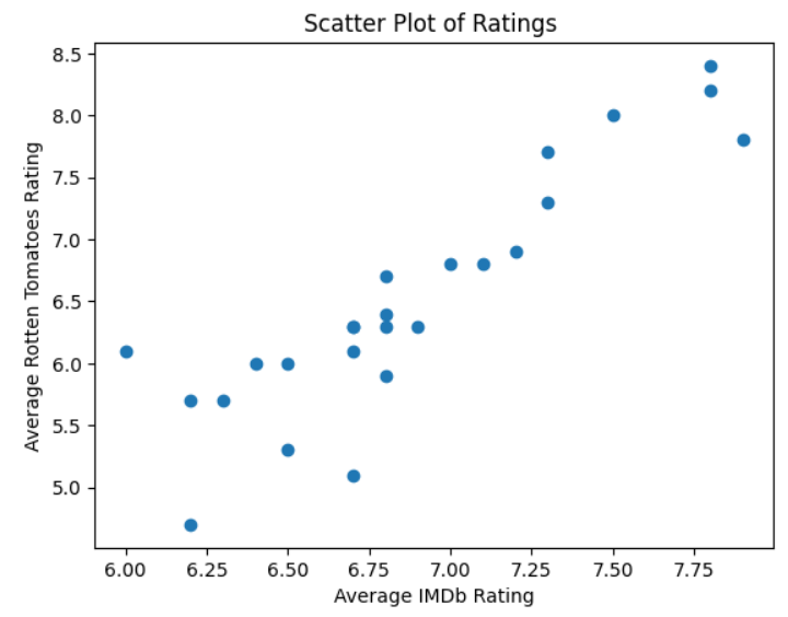
The scatterplot shows a distinct slope upwards from left to right. This means that as one set of ratings increases, the other set does as well. To dig deeper and find a mathematical relationship that will allow you to estimate one set based on the other, you need to perform a regression analysis. This means that you need to expand your previous code as follows:
In [3]: from sklearn.linear_model import LinearRegression
   ...:
   ...: x = data.loc[:, ["imdb"]]
   ...: y = data.loc[:, "rotten_tomatoes"]
First of all, you import LinearRegression. As you’ll see shortly, you’ll need this to perform the linear regression calculation. You then create a pandas DataFrame and a pandas Series. Your x is a DataFrame that contains the imdb column’s data, while y is a Series that contains the rotten_tomatoes column’s data. You could potentially regress on several features, which is why x is defined as a DataFrame with a list of columns.
You now have everything you need to perform the linear regression calculations:
In [4]: model = LinearRegression()
   ...: model.fit(x, y)
   ...:
   ...: r_squared = f"R-Squared: {model.score(x, y):.2f}"
   ...: best_fit = f"y = {model.coef_[0]:.4f}x{model.intercept_:+.4f}"
   ...: y_pred = model.predict(x)
First of all, you create a LinearRegression instance and pass in both data sets to it using .fit(). This will perform the actual calculations for you. By default, it uses ordinary least squares (OLS) to do so.
Once you’ve created and populated the LinearRegression instance, its .score() method calculates the R-squared, or coefficient of determination, value. This measures how close the best-fit line is to the actual values. In your analysis, the R-squared value of 0.79 indicates a 79 percent accuracy between the best-fit line and the actual values. You convert it to a string named r_squared for plotting later. You round the value for neatness.
To construct a string of the equation of the best-fit straight line, you use your LinearRegression object’s .coef_ attribute to get its gradient, and its .intercept_ attribute to find the y-intercept. The equation is stored in a variable named best_fit so that you can plot it later.
Note: You may be wondering why both the model.coef_ and model.intercept_ variables have underscore suffixes. This is a scikit-learn convention to indicate variables that contain estimated values.
To get the various y coordinates that the model predicts for each given value of x, you use your model’s .predict() method and pass it the x values. You store these values in a variable named y_pred, again to allow you to plot the line later.
Finally, you produce your scatterplot:
In [5]: fig, ax = plt.subplots()
   ...: ax.scatter(x, y)
   ...: ax.plot(x, y_pred, color="red")
   ...: ax.text(7.25, 5.5, r_squared, fontsize=10)
   ...: ax.text(7.25, 7, best_fit, fontsize=10)
   ...: ax.set_title("Scatter Plot of Ratings")
   ...: ax.set_xlabel("Average IMDb Rating")
   ...: ax.set_ylabel("Average Rotten Tomatoes Rating")
   ...: fig.show()
The first three lines add the best-fit line onto the scatterplot. The text() function places the r_squared and best_fit at the coordinates passed to it, while the .plot() method adds the best-fit line, in red, to the scatterplot. As before, fig.show() isn’t needed in a Jupyter Notebook.
The Jupyter Notebook result of all of this is shown below:
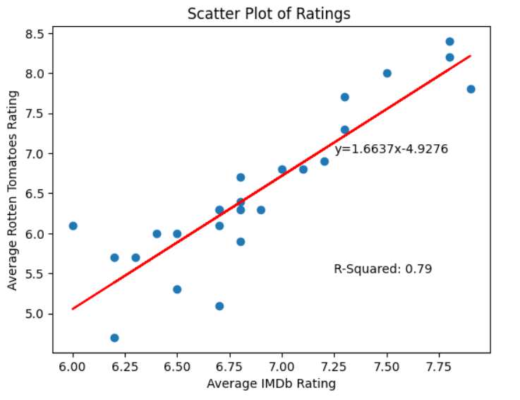
Now that you’ve completed your regression analysis, you can use its equation to predict one rating from the other with approximately 79 percent accuracy.
Practicing Your Intuition for a Regression Analysis
A regression analysis is more straightforward to understand when you can experiment with it yourself. In the interactive explorer below, each point is one of the Bond movies. Drag the slope and height sliders to fit your own line through the cloud of points, and watch the vertical residuals between each movie and your line.
The sum of squared errors (SSE) totals up how far off your line is overall. Once you’ve made your best attempt, click Show best fit (OLS) to reveal the least-squares line. It’s the same one that LinearRegression calculated for you, shown with its equation and R-squared value.
You can also change either axis to pit any two columns from the dataset against each other, and compare what a strong relationship looks like next to a weak one. Try swapping the two ratings, too. Because the line is fitted to the vertical gaps you see as residuals, flipping X and Y gives a different best-fit equation. The R-squared value, which measures only the strength of the link, stays the same:
However carefully you position your own line by eye, you won’t manage to beat the best-fit line’s SSE. That’s exactly what ordinary least squares does for you: out of all the straight lines you could draw, it finds the single one that makes the total squared error as small as it can be.
Investigating a Statistical Distribution
Your data includes information on the running times of each of the different Bond movies. Your second objective asks you to find out if there are any insights to glean from analyzing the lengths of the movies. To do this, you’ll create a bar plot of movie timings and see if it reveals anything interesting:
In [6]: fig, ax = plt.subplots()
   ...: length = data["film_length"].value_counts(bins=7).sort_index()
   ...: length.plot.bar(
   ...:     ax=ax,
   ...:     title="Film Length Distribution",
   ...:     xlabel="Time Range (mins)",
   ...:     ylabel="Count",
   ...: )
   ...: fig.show()
This time, you create a bar plot using the plotting capabilities of pandas. While these aren’t as extensive as Matplotlib’s, they do use some of Matplotlib’s underlying functionality. You create a Series consisting of the data from the film_length column of your data. You then use .value_counts() to create a Series containing the count of each movie’s length. Finally, you group them into seven ranges by passing in bins=7.
Once you’ve created the Series, you can quickly plot it using .plot.bar(). This allows you to define a title and axis labels for your plot as shown. The resulting plot reveals a very common statistical distribution:
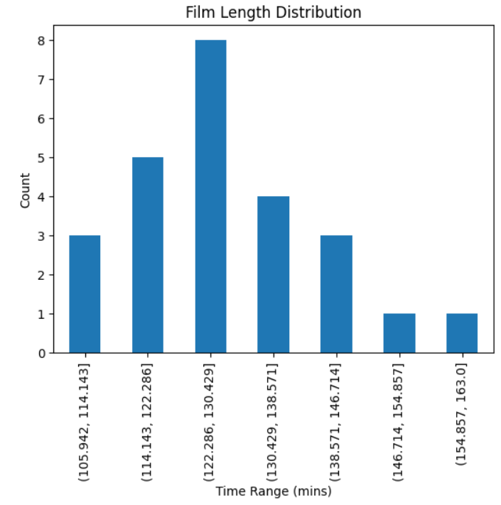
As you can see from the plot, the movie lengths resemble a normal distribution. The mean movie time sits between 122 minutes and 130 minutes, a little over two hours.
Note that neither the fig, ax = plt.subplots() nor fig.show() code is necessary in a Jupyter Notebook. Some environments may need it to allow them to display the plot.
You can find more specific statistical values if you wish:
In [7]: data["film_length"].agg(["min", "max", "mean", "std"])
Out[7]:
min     106.000000
max     163.000000
mean    128.280000
std      12.940634
Name: film_length, dtype: float64
Each pandas data Series has a useful .agg() method that allows you to pass in a list of functions. Each of these is then applied to the data in the Series. As you can see, the mean is indeed in the 122 to 130 minutes range. The standard deviation is small, meaning there isn’t much spread in the range of movie times. The minimum and maximum are 106 minutes and 163 minutes, respectively.
Finding No Relationship
In this final analysis, you’ve been asked to investigate whether or not there’s any relationship between a movie’s user rating and the number of kills that Bond achieves in it.
You decide to proceed along similar lines as you did when you analyzed the relationship between the two different ratings sets. You start with a scatterplot:
In [8]: fig, ax = plt.subplots()
   ...: ax.scatter(data["imdb"], data["bond_kills"])
   ...: ax.set_title("Scatter Plot of Kills vs Ratings")
   ...: ax.set_xlabel("Average IMDb Rating")
   ...: ax.set_ylabel("Kills by Bond")
   ...: fig.show()
The code is virtually identical to what you used in your earlier scatterplot. You decided to use the IMDb data in the analysis, but you could’ve used the Rotten Tomatoes data instead. You’ve already established that there’s a close relationship between the two, so it doesn’t matter which you choose.
This time, when you draw the scatterplot, it looks like this:
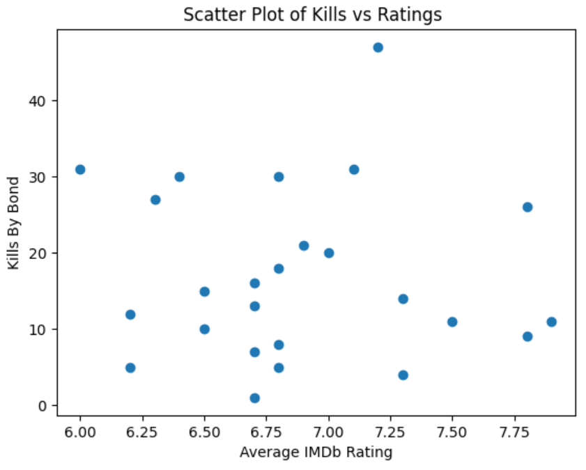
As you can see, the scatterplot shows you that the data is randomly distributed. This indicates that there’s no relationship between movie rating and the number of Bond kills. Whether the victim wound up on the wrong side of a Walther PPK, got sucked out of a plane, or was left to drift off into space, Bond movie fans don’t seem to care much about the number of bad guys that Bond eliminates.
To see this contrast for yourself, scroll back up to the regression explorer in the regression analysis section and set its axes to the IMDb rating and the number of kills. When you reveal the best fit this time, the line barely tilts and its R-squared value collapses toward zero—the visual signature of two measures that simply aren’t related.
When analyzing data, it’s important to realize that you may not always find something useful. Indeed, one of the pitfalls that you must avoid when performing data analysis is introducing your own bias into your data before analyzing it, and then using it to justify your preconceived conclusions. Sometimes there’s simply nothing to conclude.
At this point, you’re happy with your findings. It’s time for you to communicate them back to your bosses.
Communicating Your Findings
Once your data modeling is complete and you’ve obtained useful information from it, the next stage is to communicate your findings to other interested parties. After all, they’re not For Your Eyes Only. You could do this using a report or presentation. You’ll likely discuss your data sources and analysis methodology before stating your conclusions. Having the data and methodology behind your conclusions gives them authority.
You may find that once you’ve presented your findings, questions will come up that require future analysis. Once more, you may need to set additional objectives and work through the entire workflow process to resolve these new points. Look back at the diagram, and you’ll see that there’s a possible cyclic, as well as iterative, nature to a data analysis workflow.
In some cases, you may reuse your analysis methods. If so, you may consider writing some scripts that read future versions of the data, cleanse it, and analyze it in the same way that you just have. This will allow future results to be compared to yours and will add scalability to your efforts. By repeating your analysis in the future, you can monitor your original findings to see how well they stand up in the face of future data.
Alternatively, you may discover a flaw in your methodology and need to reanalyze your data differently. Again, the workflow diagram notes this possibility as well.
Resolving an Anomaly
As you analyzed the dataset, you may have noticed that one of the James Bond Movies is missing. Take a look back and see if you can figure out which one it is. You can reveal the answer below, but no peeking! Also, if you run data["bond_actor"].value_counts() you may be surprised to find that Sean Connery played Bond only six times to Roger Moore’s seven. Or did he?
The dataset that you’re using in this tutorial doesn’t include Never Say Never Again. This movie wasn’t considered an official part of the James Bond franchise. However, it did star Sean Connery in the title role. So technically, both Connery and Moore have played Bond 007 times each.
That’s it, your mission is complete. M is very pleased. As a reward, he instructs Q to give you a pen that turns into a helicopter. Always a handy tool to have for tracking down future data for analysis.
Conclusion
You’ve now gained experience in using a data analysis workflow to analyze some data and draw conclusions from your findings. You understand the main stages in a data analysis workflow and the reasons for following them. As you learn more advanced analysis techniques in the future, you can still use the key skills that you learned here to make sure your future data analysis projects progress thoroughly and efficiently.
In this tutorial, you’ve learned:
- The importance of a data analysis workflow
- The purpose of the main stages in a data analysis workflow
- Common techniques for cleansing data
- How to use some common data analysis methods to meet objectives
- How to display the results of a data analysis graphically
You should consider learning more data analysis techniques and practicing your skills using them. If you’ve done any further analysis on the James Bond data used here, then feel free to share your interesting findings in the comments section below. In fact, try finding something to share with us that’s shocking. Positively shocking.
Get Your Code: Click here to download the free data files and sample code for your mission into data analysis with Python.
Take the Quiz: Test your knowledge with our interactive “Using Python for Data Analysis” quiz. You’ll receive a score upon completion to help you track your learning progress:
Interactive Quiz
Using Python for Data AnalysisTest your understanding of a data analysis workflow in Python, from cleansing raw data with pandas to spotting insights with regression.