A picture is worth a thousand words, and with Python’s matplotlib library, it fortunately takes far less than a thousand words of code to create a production-quality graphic.
However, matplotlib is also a massive library, and getting a plot to look just right is often achieved through trial and error. Using one-liners to generate basic plots in matplotlib is fairly simple, but skillfully commanding the remaining 98% of the library can be daunting.
This article is a beginner-to-intermediate-level walkthrough on matplotlib that mixes theory with examples. While learning by example can be tremendously insightful, it helps to have even just a surface-level understanding of the library’s inner workings and layout as well.
Here’s what we’ll cover:
- Pylab and pyplot: which is which?
- Key concepts of matplotlib’s design
- Understanding
plt.subplots() - Visualizing arrays with matplotlib
- Plotting with the pandas + matplotlib combination
Free Bonus: Click here to download 5 Python + Matplotlib examples with full source code that you can use as a basis for making your own plots and graphics.
This article assumes the user knows a tiny bit of NumPy. We’ll mainly use the numpy.random module to generate “toy” data, drawing samples from different statistical distributions.
If you don’t already have matplotlib installed, see here for a walkthrough before proceeding.
Why Can Matplotlib Be Confusing?
Learning matplotlib can be a frustrating process at times. The problem is not that matplotlib’s documentation is lacking: the documentation is actually extensive. But the following issues can cause some challenges:
- The library itself is huge, at something like 70,000 total lines of code.
- Matplotlib is home to several different interfaces (ways of constructing a figure) and capable of interacting with a handful of different backends. (Backends deal with the process of how charts are actually rendered, not just structured internally.)
- While it is comprehensive, some of matplotlib’s own public documentation is seriously out-of-date. The library is still evolving, and many older examples floating around online may take 70% fewer lines of code in their modern version.
So, before we get to any glitzy examples, it’s useful to grasp the core concepts of matplotlib’s design.
Pylab: What Is It, and Should I Use It?
Let’s start with a bit of history: John D. Hunter, a neurobiologist, began developing matplotlib around 2003, originally inspired to emulate commands from Mathworks’ MATLAB software. John passed away tragically young at age 44, in 2012, and matplotlib is now a full-fledged community effort, developed and maintained by a host of others. (John gave a talk about the evolution of matplotlib at the 2012 SciPy conference, which is worth a watch.)
One relevant feature of MATLAB is its global style. The Python concept of importing is not heavily used in MATLAB, and most of MATLAB’s functions are readily available to the user at the top level.
Knowing that matplotlib has its roots in MATLAB helps to explain why pylab exists. pylab is a module within the matplotlib library that was built to mimic MATLAB’s global style. It exists only to bring a number of functions and classes from both NumPy and matplotlib into the namespace, making for an easy transition for former MATLAB users who were not used to needing import statements.
Ex-MATLAB converts (who are all fine people, I promise!) liked this functionality, because with from pylab import *, they could simply call plot() or array() directly, as they would in MATLAB.
The issue here may be apparent to some Python users: using from pylab import * in a session or script is generally bad practice. Matplotlib now directly advises against this in its own tutorials:
“[pylab] still exists for historical reasons, but it is highly advised not to use. It pollutes namespaces with functions that will shadow Python built-ins and can lead to hard-to-track bugs. To get IPython integration without imports the use of the
%matplotlibmagic is preferred.” [Source]
Internally, there are a ton of potentially conflicting imports being masked within the short pylab source. In fact, using ipython --pylab (from the terminal/command line) or %pylab (from IPython/Jupyter tools) simply calls from pylab import * under the hood.
The bottom line is that matplotlib has abandoned this convenience module and now explicitly recommends against using pylab, bringing things more in line with one of Python’s key notions: explicit is better than implicit.
Without the need for pylab, we can usually get away with just one canonical import:
>>> import matplotlib.pyplot as plt
While we’re at it, let’s also import NumPy, which we’ll use for generating data later on, and call np.random.seed() to make examples with (pseudo)random data reproducible:
>>> import numpy as np
>>> np.random.seed(444)
The Matplotlib Object Hierarchy
One important big-picture matplotlib concept is its object hierarchy.
If you’ve worked through any introductory matplotlib tutorial, you’ve probably called something like plt.plot([1, 2, 3]). This one-liner hides the fact that a plot is really a hierarchy of nested Python objects. A “hierarchy” here means that there is a tree-like structure of matplotlib objects underlying each plot.
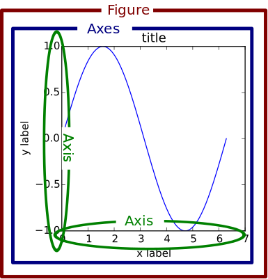
A Figure object is the outermost container for a matplotlib graphic, which can contain multiple Axes objects. One source of confusion is the name: an Axes actually translates into what we think of as an individual plot or graph (rather than the plural of “axis,” as we might expect).
You can think of the Figure object as a box-like container holding one or more Axes (actual plots). Below the Axes in the hierarchy are smaller objects such as tick marks, individual lines, legends, and text boxes. Almost every “element” of a chart is its own manipulable Python object, all the way down to the ticks and labels:
Here’s an illustration of this hierarchy in action. Don’t worry if you’re not completely familiar with this notation, which we’ll cover later on:
>>> fig, _ = plt.subplots()
>>> type(fig)
<class 'matplotlib.figure.Figure'>
Above, we created two variables with plt.subplots(). The first is a top-level Figure object. The second is a “throwaway” variable that we don’t need just yet, denoted with an underscore. Using attribute notation, it is easy to traverse down the figure hierarchy and see the first tick of the y axis of the first Axes object:
>>> one_tick = fig.axes[0].yaxis.get_major_ticks()[0]
>>> type(one_tick)
<class 'matplotlib.axis.YTick'>
Above, fig (a Figure class instance) has multiple Axes (a list, for which we take the first element). Each Axes has a yaxis and xaxis, each of which have a collection of “major ticks,” and we grab the first one.
Matplotlib presents this as a figure anatomy, rather than an explicit hierarchy:
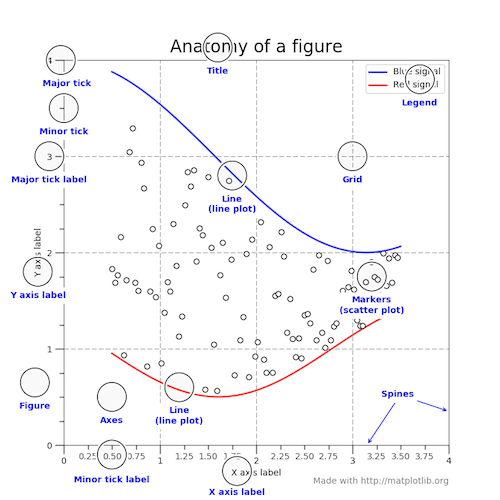
(In true matplotlib style, the figure above is created in the matplotlib docs here.)
Stateful Versus Stateless Approaches
Alright, we need one more chunk of theory before we can get around to the shiny visualizations: the difference between the stateful (state-based, state-machine) and stateless (object-oriented, OO) interfaces.
Above, we used import matplotlib.pyplot as plt to import the pyplot module from matplotlib and name it plt.
Almost all functions from pyplot, such as plt.plot(), are implicitly either referring to an existing current Figure and current Axes, or creating them anew if none exist. Hidden in the matplotlib docs is this helpful snippet:
“[With pyplot], simple functions are used to add plot elements (lines, images, text, etc.) to the current axes in the current figure.” [emphasis added]
Hardcore ex-MATLAB users may choose to word this by saying something like, “plt.plot() is a state-machine interface that implicitly tracks the current figure!” In English, this means that:
- The stateful interface makes its calls with
plt.plot()and other top-level pyplot functions. There is only ever one Figure or Axes that you’re manipulating at a given time, and you don’t need to explicitly refer to it. - Modifying the underlying objects directly is the object-oriented approach. We usually do this by calling methods of an
Axesobject, which is the object that represents a plot itself.
The flow of this process, at a high level, looks like this:
Tying these together, most of the functions from pyplot also exist as methods of the matplotlib.axes.Axes class.
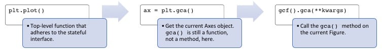
This is easier to see by peeking under the hood. plt.plot() can be boiled down to five or so lines of code:
# matplotlib/pyplot.py
>>> def plot(*args, **kwargs):
...     """An abridged version of plt.plot()."""
...     ax = plt.gca()
...     return ax.plot(*args, **kwargs)

>>> def gca(**kwargs):
...     """Get the current Axes of the current Figure."""
...     return plt.gcf().gca(**kwargs)
Calling plt.plot() is just a convenient way to get the current Axes of the current Figure and then call its plot() method. This is what is meant by the assertion that the stateful interface always “implicitly tracks” the plot that it wants to reference.
pyplot is home to a batch of functions that are really just wrappers around matplotlib’s object-oriented interface. For example, with plt.title(), there are corresponding setter and getter methods within the OO approach, ax.set_title() and ax.get_title(). (Use of getters and setters tends to be more popular in languages such as Java but is a key feature of matplotlib’s OO approach.)
Calling plt.title() gets translated into this one line: gca().set_title(s, *args, **kwargs). Here’s what that is doing:
gca()grabs the current axis and returns it.set_title()is a setter method that sets the title for that Axes object. The “convenience” here is that we didn’t need to specify any Axes object explicitly withplt.title().
Similarly, if you take a few moments to look at the source for top-level functions like plt.grid(), plt.legend(), and plt.ylabels(), you’ll notice that all of them follow the same structure of delegating to the current Axes with gca() and then calling some method of the current Axes. (This is the underlying object-oriented approach!)
Understanding plt.subplots() Notation
Alright, enough theory. Now, we’re ready to tie everything together and do some plotting. From here on out, we’ll mostly rely on the stateless (object-oriented) approach, which is more customizable and comes in handy as graphs become more complex.
The prescribed way to create a Figure with a single Axes under the OO approach is (not too intuitively) with plt.subplots(). This is really the only time that the OO approach uses pyplot, to create a Figure and Axes:
>>> fig, ax = plt.subplots()
Above, we took advantage of iterable unpacking to assign a separate variable to each of the two results of plt.subplots(). Notice that we didn’t pass arguments to subplots() here. The default call is subplots(nrows=1, ncols=1). Consequently, ax is a single AxesSubplot object:
>>> type(ax)
<class 'matplotlib.axes._subplots.AxesSubplot'>
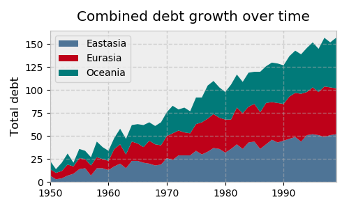
We can call its instance methods to manipulate the plot similarly to how we call pyplots functions. Let’s illustrate with a stacked area graph of three time series:
>>> rng = np.arange(50)
>>> rnd = np.random.randint(0, 10, size=(3, rng.size))
>>> yrs = 1950 + rng

>>> fig, ax = plt.subplots(figsize=(5, 3))
>>> ax.stackplot(yrs, rng + rnd, labels=['Eastasia', 'Eurasia', 'Oceania'])
>>> ax.set_title('Combined debt growth over time')
>>> ax.legend(loc='upper left')
>>> ax.set_ylabel('Total debt')
>>> ax.set_xlim(xmin=yrs[0], xmax=yrs[-1])
>>> fig.tight_layout()
Here’s what’s going on above:
-
After creating three random time series, we defined one Figure (
fig) containing one Axes (a plot,ax). -
We call methods of
axdirectly to create a stacked area chart and to add a legend, title, and y-axis label. Under the object-oriented approach, it’s clear that all of these are attributes ofax. -
tight_layout()applies to the Figure object as a whole to clean up whitespace padding.
Let’s look at an example with multiple subplots (Axes) within one Figure, plotting two correlated arrays that are drawn from the discrete uniform distribution:
>>> x = np.random.randint(low=1, high=11, size=50)
>>> y = x + np.random.randint(1, 5, size=x.size)
>>> data = np.column_stack((x, y))

>>> fig, (ax1, ax2) = plt.subplots(nrows=1, ncols=2,
...                                figsize=(8, 4))

>>> ax1.scatter(x=x, y=y, marker='o', c='r', edgecolor='b')
>>> ax1.set_title('Scatter: $x$ versus $y$')
>>> ax1.set_xlabel('$x$')
>>> ax1.set_ylabel('$y$')

>>> ax2.hist(data, bins=np.arange(data.min(), data.max()),
...          label=('x', 'y'))
>>> ax2.legend(loc=(0.65, 0.8))
>>> ax2.set_title('Frequencies of $x$ and $y$')
>>> ax2.yaxis.tick_right()
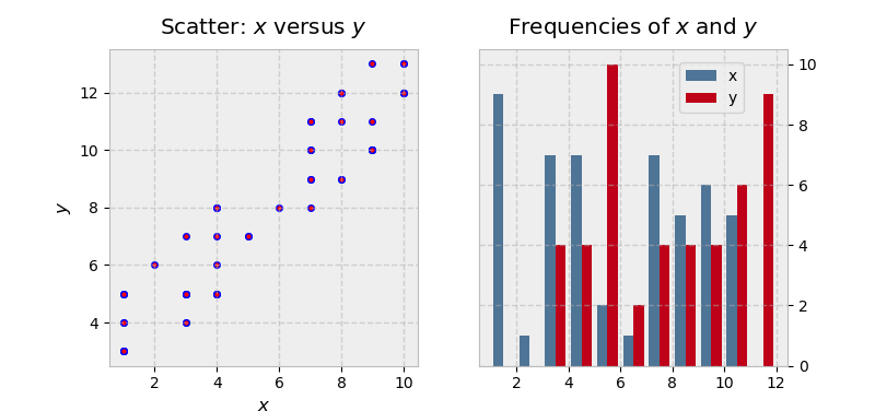
There’s a little bit more going on in this example:
-
Because we’re creating a “1x2” Figure, the returned result of
plt.subplots(1, 2)is now a Figure object and a NumPy array of Axes objects. (You can inspect this withfig, axs = plt.subplots(1, 2)and taking a look ataxs.) -
We deal with
ax1andax2individually, which would be difficult to do with the stateful approach. The final line is a good illustration of the object hierarchy, where we are modifying theyaxisbelonging to the second Axes, placing its ticks and ticklabels to the right. -
Text inside dollar signs utilizes TeX markup to put variables in italics.
Remember that multiple Axes can be enclosed in or “belong to” a given figure. In the case above, fig.axes gets us a list of all the Axes objects:
>>> (fig.axes[0] is ax1, fig.axes[1] is ax2)
(True, True)
(fig.axes is lowercase, not uppercase. There’s no denying the terminology is a bit confusing.)
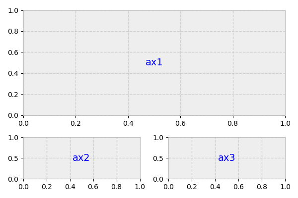
Taking this one step further, we could alternatively create a figure that holds a 2x2 grid of Axes objects:
>>> fig, ax = plt.subplots(nrows=2, ncols=2, figsize=(7, 7))
Now, what is ax? It’s no longer a single Axes, but a two-dimensional NumPy array of them:
>>> type(ax)
numpy.ndarray

>>> ax
array([[<matplotlib.axes._subplots.AxesSubplot object at 0x1106daf98>,
        <matplotlib.axes._subplots.AxesSubplot object at 0x113045c88>],
       [<matplotlib.axes._subplots.AxesSubplot object at 0x11d573cf8>,
        <matplotlib.axes._subplots.AxesSubplot object at 0x1130117f0>]],
      dtype=object)

>>> ax.shape
(2, 2)
This is reaffirmed by the docstring:
“
axcan be either a singlematplotlib.axes.Axesobject or an array ofAxesobjects if more than one subplot was created.”
We now need to call plotting methods on each of these Axes (but not the NumPy array, which is just a container in this case). A common way to address this is to use iterable unpacking after flattening the array to be one-dimensional:
>>> fig, ax = plt.subplots(nrows=2, ncols=2, figsize=(7, 7))
>>> ax1, ax2, ax3, ax4 = ax.flatten()  # flatten a 2d NumPy array to 1d
We could’ve also done this with ((ax1, ax2), (ax3, ax4)) = ax, but the first approach tends to be more flexible.
To illustrate some more advanced subplot features, let’s pull some macroeconomic California housing data extracted from a compressed tar archive, using io, tarfile, and urllib from Python’s Standard Library.
>>> from io import BytesIO
>>> import tarfile
>>> from urllib.request import urlopen

>>> url = 'http://www.dcc.fc.up.pt/~ltorgo/Regression/cal_housing.tgz'
>>> b = BytesIO(urlopen(url).read())
>>> fpath = 'CaliforniaHousing/cal_housing.data'

>>> with tarfile.open(mode='r', fileobj=b) as archive:
...     housing = np.loadtxt(archive.extractfile(fpath), delimiter=',')
The “response” variable y below, to use the statistical term, is an area’s average home value. pop and age are the area’s population and average house age, respectively:
>>> y = housing[:, -1]
>>> pop, age = housing[:, [4, 7]].T
Next let’s define a “helper function” that places a text box inside of a plot and acts as an “in-plot title”:
>>> def add_titlebox(ax, text):
...     ax.text(.55, .8, text,
...         horizontalalignment='center',
...         transform=ax.transAxes,
...         bbox=dict(facecolor='white', alpha=0.6),
...         fontsize=12.5)
...     return ax
We’re ready to do some plotting. Matplotlib’s gridspec module allows for more subplot customization. pyplot’s subplot2grid() interacts with this module nicely. Let’s say we want to create a layout like this:
Above, what we actually have is a 3x2 grid. ax1 is twice the height and width of ax2/ax3, meaning that it takes up two columns and two rows.
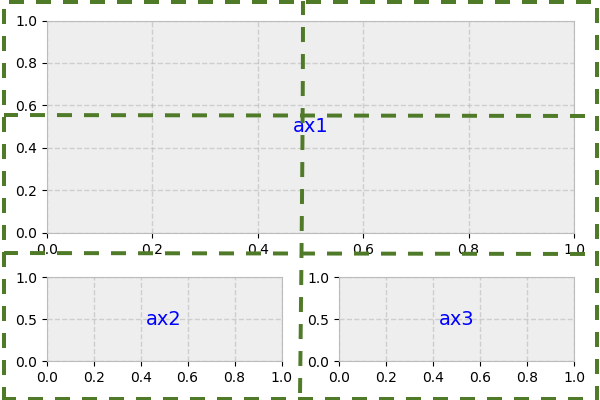
The second argument to subplot2grid() is the (row, column) location of the Axes within the grid:
>>> gridsize = (3, 2)
>>> fig = plt.figure(figsize=(12, 8))
>>> ax1 = plt.subplot2grid(gridsize, (0, 0), colspan=2, rowspan=2)
>>> ax2 = plt.subplot2grid(gridsize, (2, 0))
>>> ax3 = plt.subplot2grid(gridsize, (2, 1))
Now, we can proceed as normal, modifying each Axes individually:
>>> ax1.set_title('Home value as a function of home age & area population',
...               fontsize=14)
>>> sctr = ax1.scatter(x=age, y=pop, c=y, cmap='RdYlGn')
>>> plt.colorbar(sctr, ax=ax1, format='$%d')
>>> ax1.set_yscale('log')
>>> ax2.hist(age, bins='auto')
>>> ax3.hist(pop, bins='auto', log=True)

>>> add_titlebox(ax2, 'Histogram: home age')
>>> add_titlebox(ax3, 'Histogram: area population (log scl.)')

Above, colorbar() (different from ColorMap earlier) gets called on the Figure directly, rather than the Axes. Its first argument uses Matplotlib’s .scatter() and is the result of ax1.scatter(), which functions as a mapping of y-values to a ColorMap.
Visually, there isn’t much differentiation in color (the y-variable) as we move up and down the y-axis, indicating that home age seems to be a stronger determinant of house value.
The “Figures” Behind The Scenes
Each time you call plt.subplots() or the less frequently used plt.figure() (which creates a Figure, with no Axes), you are creating a new Figure object that matplotlib sneakily keeps around in memory. Earlier, we alluded to the concept of a current Figure and current Axes. By default, these are the most recently created Figure and Axes, which we can show with the built-in function id() to display the address of the object in memory:
>>> fig1, ax1 = plt.subplots()

>>> id(fig1)
4525567840

>>> id(plt.gcf())  # `fig1` is the current figure.
4525567840

>>> fig2, ax2 = plt.subplots()
>>> id(fig2) == id(plt.gcf())  # The current figure has changed to `fig2`.
True
(We could also use the built-in is operator here.)
After the above routine, the current figure is fig2, the most recently created figure. However, both figures are still hanging around in memory, each with a corresponding ID number (1-indexed, in MATLAB style):
>>> plt.get_fignums()
[1, 2]
A useful way to get all of the Figures themselves is with a mapping of plt.figure() to each of these integers:
>>> def get_all_figures():
...    return [plt.figure(i) for i in plt.get_fignums()]

>>> get_all_figures()
[<matplotlib.figure.Figure at 0x10dbeaf60>,
 <matplotlib.figure.Figure at 0x1234cb6d8>]
Be cognizant of this if running a script where you’re creating a group of figures. You’ll want to explicitly close each of them after use to avoid a MemoryError. By itself, plt.close() closes the current figure, plt.close(num) closes the figure number num, and plt.close('all') closes all the figure windows:
>>> plt.close('all')
>>> get_all_figures()
[]
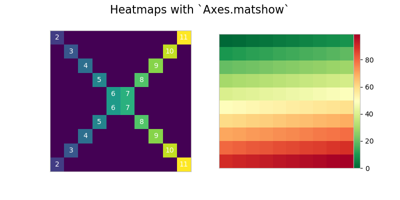
A Burst of Color: imshow() and matshow()
While ax.plot() is one of the most common plotting methods on an Axes, there are a whole host of others, as well. (We used ax.stackplot() above. You can find the complete list here.)
Methods that get heavy use are imshow() and matshow(), with the latter being a wrapper around the former. These are useful anytime that a raw numerical array can be visualized as a colored grid.
First, let’s create two distinct grids with some fancy NumPy indexing:
>>> x = np.diag(np.arange(2, 12))[::-1]
>>> x[np.diag_indices_from(x[::-1])] = np.arange(2, 12)
>>> x2 = np.arange(x.size).reshape(x.shape)
Next, we can map these to their image representations. In this specific case, we toggle “off” all axis labels and ticks by using a dictionary comprehension and passing the result to ax.tick_params():
>>> sides = ('left', 'right', 'top', 'bottom')
>>> nolabels = {s: False for s in sides}
>>> nolabels.update({'label%s' % s: False for s in sides})
>>> print(nolabels)
{'left': False, 'right': False, 'top': False, 'bottom': False, 'labelleft': False,
 'labelright': False, 'labeltop': False, 'labelbottom': False}
Then, we can use a context manager to disable the grid, and call matshow() on each Axes. Lastly, we need to put the colorbar in what is technically a new Axes within fig. For this, we can use a bit of an esoteric function from deep within matplotlib:
>>> from mpl_toolkits.axes_grid1.axes_divider import make_axes_locatable

>>> with plt.rc_context(rc={'axes.grid': False}):
...     fig, (ax1, ax2) = plt.subplots(1, 2, figsize=(8, 4))
...     ax1.matshow(x)
...     img2 = ax2.matshow(x2, cmap='RdYlGn_r')
...     for ax in (ax1, ax2):
...         ax.tick_params(axis='both', which='both', **nolabels)
...     for i, j in zip(*x.nonzero()):
...         ax1.text(j, i, x[i, j], color='white', ha='center', va='center')
...
...     divider = make_axes_locatable(ax2)
...     cax = divider.append_axes("right", size='5%', pad=0)
...     plt.colorbar(img2, cax=cax, ax=[ax1, ax2])
...     fig.suptitle('Heatmaps with `Axes.matshow`', fontsize=16)
Plotting in Pandas
The pandas library has become popular for not just for enabling powerful data analysis, but also for its handy pre-canned plotting methods. Interestingly though, pandas plotting methods are really just convenient wrappers around existing matplotlib calls.
That is, the plot() method on pandas’ Series and DataFrame is a wrapper around plt.plot(). One convenience provided, for example, is that if the DataFrame’s Index consists of dates, gcf().autofmt_xdate() is called internally by pandas to get the current Figure and nicely auto-format the x-axis.
In turn, remember that plt.plot() (the state-based approach) is implicitly aware of the current Figure and current Axes, so pandas is following the state-based approach by extension.
We can prove this “chain” of function calls with a bit of introspection. First, let’s construct a plain-vanilla pandas Series, assuming we’re starting out in a fresh interpreter session:
>>> import pandas as pd

>>> s = pd.Series(np.arange(5), index=list('abcde'))
>>> ax = s.plot()

>>> type(ax)
<matplotlib.axes._subplots.AxesSubplot at 0x121083eb8>

>>> id(plt.gca()) == id(ax)
True
This internal architecture is helpful to know when you are mixing pandas plotting methods with traditional matplotlib calls, which is done below in plotting the moving average of a widely watched financial time series. ma is a pandas Series for which we can call ma.plot() (the pandas method), and then customize by retrieving the Axes that is created by this call (plt.gca()), for matplotlib to reference:
>>> import pandas as pd
>>> import matplotlib.transforms as mtransforms

>>> url = 'https://fred.stlouisfed.org/graph/fredgraph.csv?id=VIXCLS'
>>> vix = pd.read_csv(url, index_col=0, parse_dates=True, na_values='.',
...                   infer_datetime_format=True,
...                   squeeze=True).dropna()
>>> ma = vix.rolling('90d').mean()
>>> state = pd.cut(ma, bins=[-np.inf, 14, 18, 24, np.inf],
...                labels=range(4))

>>> cmap = plt.get_cmap('RdYlGn_r')
>>> ma.plot(color='black', linewidth=1.5, marker='', figsize=(8, 4),
...         label='VIX 90d MA')
>>> ax = plt.gca()  # Get the current Axes that ma.plot() references
>>> ax.set_xlabel('')
>>> ax.set_ylabel('90d moving average: CBOE VIX')
>>> ax.set_title('Volatility Regime State')
>>> ax.grid(False)
>>> ax.legend(loc='upper center')
>>> ax.set_xlim(xmin=ma.index[0], xmax=ma.index[-1])

>>> trans = mtransforms.blended_transform_factory(ax.transData, ax.transAxes)
>>> for i, color in enumerate(cmap([0.2, 0.4, 0.6, 0.8])):
...     ax.fill_between(ma.index, 0, 1, where=state==i,
...                     facecolor=color, transform=trans)
>>> ax.axhline(vix.mean(), linestyle='dashed', color='xkcd:dark grey',
...            alpha=0.6, label='Full-period mean', marker='')
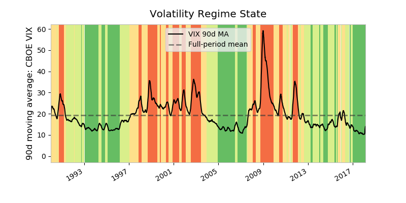
There’s a lot happening above:
-
mais a 90-day moving average of the VIX Index, a measure of market expectations of near-term stock volatility.stateis a binning of the moving average into different regime states. A high VIX is seen as signaling a heightened level of fear in the marketplace. -
cmapis a ColorMap—a matplotlib object that is essentially a mapping of floats to RGBA colors. Any colormap can be reversed by appending'_r', so'RdYlGn_r'is the reversed Red-Yellow-Green colormap. Matplotlib maintains a handy visual reference guide to ColorMaps in its docs. -
The only real pandas call we’re making here is
ma.plot(). This callsplt.plot()internally, so to integrate the object-oriented approach, we need to get an explicit reference to the current Axes withax = plt.gca(). -
The second chunk of code creates color-filled blocks that correspond to each bin of
state.cmap([0.2, 0.4, 0.6, 0.8])says, “Get us an RGBA sequence for the colors at the 20th, 40th, 60th, and 80th ‘percentile’ along the ColorMaps’ spectrum.”enumerate()is used because we want to map each RGBA color back to a state.
Pandas also comes built-out with a smattering of more advanced plots (which could take up an entire tutorial all on their own). However, all of these, like their simpler counterparts, rely on matplotlib machinery internally.
Wrapping Up
As shown by some of the examples above, there’s no getting around the fact that matplotlib can be a technical, syntax-heavy library. Creating a production-ready chart sometimes requires a half hour of Googling and combining a hodgepodge of lines in order to fine-tune a plot.
However, understanding how matplotlib’s interfaces interact is an investment that can pay off down the road. As Real Python’s own Dan Bader has advised, taking the time to dissect code rather than resorting to the Stack Overflow “copy pasta” solution tends to be a smarter long-term solution. Sticking to the object-oriented approach can save hours of frustration when you want to take a plot from plain to a work of art.
More Resources
From the matplotlib documentation:
- An index of matplotlib examples
- The usage FAQ
- The tutorials page, which is broken up into beginner, intermediate, and advanced sections
- Lifecylcle of a plot, which touches on the object-oriented versus stateful approaches
Free Bonus: Click here to download 5 Python + Matplotlib examples with full source code that you can use as a basis for making your own plots and graphics.
Third-party resources:
- DataCamp’s matplotlib cheat sheet
- PLOS Computational Biology: Ten Simple Rules for Better Figures
- Chapter 9 (Plotting & Visualization) of Wes McKinney’s Python for Data Analysis, 2nd ed.
- Chaper 11 (Visualization with Matplotlib, Pandas, and Seaborn) of Ted Petrou’s Pandas Cookbook
- Section 1.4 (Matplotlib: Plotting) of the SciPy Lecture Notes
- The xkcd color palette
- The matplotlib external resources page
- Matplotlib, Pylab, Pyplot, etc: What’s the difference between these and when to use each? from queirozf.com
- The visualization page in the pandas documentation
Other plotting libraries:
- The seaborn library, built on top of matplotlib and designed for advanced statistical graphics, which could take up an entire tutorial all on its own
- Datashader, a graphics library geared specifically towards large datasets
- A list of other third-party packages from the matplotlib documentation
Appendix A: Configuration and Styling
If you’ve been following along with this tutorial, it’s likely that the plots popping up on your screen look different stylistically than the ones shown here.
Matplotlib offers two ways to configure style in a uniform way across different plots:
- By customizing a matplotlibrc file
- By changing your configuration parameters interactively, or from a .py script.
A matplotlibrc file (Option #1 above) is basically a text file specifying user-customized settings that are remembered between Python sessions. On Mac OS X, this normally resides at ~/.matplotlib/matplotlibrc.
Quick Tip: GitHub is a great place to keep configuration files. I keep mine here. Just make sure that they don’t contain personally identifiable or private information, such as passwords or SSH private keys!
Alternatively, you can change your configuration parameters interactively (Option #2 above). When you import matplotlib.pyplot as plt, you get access to an rcParams object that resembles a Python dictionary of settings. All of the module objects starting with “rc” are a means to interact with your plot styles and settings:
>>> [attr for attr in dir(plt) if attr.startswith('rc')]
['rc', 'rcParams', 'rcParamsDefault', 'rc_context', 'rcdefaults']
Of these:
plt.rcdefaults()restores the rc parameters from matplotlib’s internal defaults, which are listed atplt.rcParamsDefault. This will revert (overwrite) whatever you’ve already customized in a matplotlibrc file.plt.rc()is used for setting parameters interactively.plt.rcParamsis a (mutable) dictionary-like object that lets you manipulate settings directly. If you have customized settings in a matplotlibrc file, these will be reflected in this dictionary.
With plt.rc() and plt.rcParams, these two syntaxes are equivalent for adjusting settings:
>>> plt.rc('lines', linewidth=2, color='r')  # Syntax 1

>>> plt.rcParams['lines.linewidth'] = 2  # Syntax 2
>>> plt.rcParams['lines.color'] = 'r'
Notably, the Figure class then uses some of these as its default arguments.
Relatedly, a style is just a predefined cluster of custom settings. To view available styles, use:
>>> plt.style.available
['seaborn-dark', 'seaborn-darkgrid', 'seaborn-ticks', 'fivethirtyeight',
 'seaborn-whitegrid', 'classic', '_classic_test', 'fast', 'seaborn-talk',
 'seaborn-dark-palette', 'seaborn-bright', 'seaborn-pastel', 'grayscale',
 'seaborn-notebook', 'ggplot', 'seaborn-colorblind', 'seaborn-muted',
 'seaborn', 'Solarize_Light2', 'seaborn-paper', 'bmh', 'seaborn-white',
 'dark_background', 'seaborn-poster', 'seaborn-deep']
To set a style, make this call:
>>> plt.style.use('fivethirtyeight')
Your plots will now take on a new look:
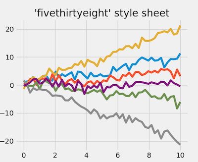
This full example is available here.
For inspiration, matplotlib keeps some style sheet displays for reference as well.
Appendix B: Interactive Mode
Behind the scenes, matplotlib also interacts with different backends. A backend is the workhorse behind actually rendering a chart. (On the popular Anaconda distribution, for instance, the default backend is Qt5Agg.) Some backends are interactive, meaning they are dynamically updated and “pop up” to the user when changed.
While interactive mode is off by default, you can check its status with plt.rcParams['interactive'] or plt.isinteractive(), and toggle it on and off with plt.ion() and plt.ioff(), respectively:
>>> plt.rcParams['interactive']  # or: plt.isinteractive()
True
>>> plt.ioff()
>>> plt.rcParams['interactive']
False
In some code examples, you may notice the presence of plt.show() at the end of a chunk of code. The main purpose of plt.show(), as the name implies, is to actually “show” (open) the figure when you’re running with interactive mode turned off. In other words:
- If interactive mode is on, you don’t need
plt.show(), and images will automatically pop-up and be updated as you reference them. - If interactive mode is off, you’ll need
plt.show()to display a figure andplt.draw()to update a plot.
Below, we make sure that interactive mode is off, which requires that we call plt.show() after building the plot itself:
>>> plt.ioff()
>>> x = np.arange(-4, 5)
>>> y1 = x ** 2
>>> y2 = 10 / (x ** 2 + 1)
>>> fig, ax = plt.subplots()
>>> ax.plot(x, y1, 'rx', x, y2, 'b+', linestyle='solid')
>>> ax.fill_between(x, y1, y2, where=y2>y1, interpolate=True,
...                 color='green', alpha=0.3)
>>> lgnd = ax.legend(['y1', 'y2'], loc='upper center', shadow=True)
>>> lgnd.get_frame().set_facecolor('#ffb19a')
>>> plt.show()
Notably, interactive mode has nothing to do with what IDE you’re using, or whether you’ve enable inline plotting with something like jupyter notebook --matplotlib inline or %matplotlib.