In the era of big data and artificial intelligence, data science and machine learning have become essential in many fields of science and technology. A necessary aspect of working with data is the ability to describe, summarize, and represent data visually. Python statistics libraries are comprehensive, popular, and widely used tools that will assist you in working with data.
In this tutorial, you’ll learn:
- What numerical quantities you can use to describe and summarize your datasets
- How to calculate descriptive statistics in pure Python
- How to get descriptive statistics with available Python libraries
- How to visualize your datasets
Free Bonus: Click here to download 5 Python + Matplotlib examples with full source code that you can use as a basis for making your own plots and graphics.
Understanding Descriptive Statistics
Descriptive statistics is about describing and summarizing data. It uses two main approaches:
- The quantitative approach describes and summarizes data numerically.
- The visual approach illustrates data with charts, plots, histograms, and other graphs.
You can apply descriptive statistics to one or many datasets or variables. When you describe and summarize a single variable, you’re performing univariate analysis. When you search for statistical relationships among a pair of variables, you’re doing a bivariate analysis. Similarly, a multivariate analysis is concerned with multiple variables at once.
Types of Measures
In this tutorial, you’ll learn about the following types of measures in descriptive statistics:
- Central tendency tells you about the centers of the data. Useful measures include the mean, median, and mode.
- Variability tells you about the spread of the data. Useful measures include variance and standard deviation.
- Correlation or joint variability tells you about the relation between a pair of variables in a dataset. Useful measures include covariance and the correlation coefficient.
You’ll learn how to understand and calculate these measures with Python.
Population and Samples
In statistics, the population is a set of all elements or items that you’re interested in. Populations are often vast, which makes them inappropriate for collecting and analyzing data. That’s why statisticians usually try to make some conclusions about a population by choosing and examining a representative subset of that population.
This subset of a population is called a sample. Ideally, the sample should preserve the essential statistical features of the population to a satisfactory extent. That way, you’ll be able to use the sample to glean conclusions about the population.
Outliers
An outlier is a data point that differs significantly from the majority of the data taken from a sample or population. There are many possible causes of outliers, but here are a few to start you off:
- Natural variation in data
- Change in the behavior of the observed system
- Errors in data collection
Data collection errors are a particularly prominent cause of outliers. For example, the limitations of measurement instruments or procedures can mean that the correct data is simply not obtainable. Other errors can be caused by miscalculations, data contamination, human error, and more.
There isn’t a precise mathematical definition of outliers. You have to rely on experience, knowledge about the subject of interest, and common sense to determine if a data point is an outlier and how to handle it.
Choosing Python Statistics Libraries
There are many Python statistics libraries out there for you to work with, but in this tutorial, you’ll be learning about some of the most popular and widely used ones:
-
Python’s
statisticsis a built-in Python library for descriptive statistics. You can use it if your datasets are not too large or if you can’t rely on importing other libraries. -
NumPy is a third-party library for numerical computing, optimized for working with single- and multi-dimensional arrays. Its primary type is the array type called
ndarray. This library contains many routines for statistical analysis. -
SciPy is a third-party library for scientific computing based on NumPy. It offers additional functionality compared to NumPy, including
scipy.statsfor statistical analysis. -
pandas is a third-party library for numerical computing based on NumPy. It excels in handling labeled one-dimensional (1D) data with
Seriesobjects and two-dimensional (2D) data withDataFrameobjects. -
Matplotlib is a third-party library for data visualization. It works well in combination with NumPy, SciPy, and pandas.
Note that, in many cases, Series and DataFrame objects can be used in place of NumPy arrays. Often, you might just pass them to a NumPy or SciPy statistical function. In addition, you can get the unlabeled data from a Series or DataFrame as a np.ndarray object by calling .values or .to_numpy().
Getting Started With Python Statistics Libraries
The built-in Python statistics library has a relatively small number of the most important statistics functions. The official documentation is a valuable resource to find the details. If you’re limited to pure Python, then the Python statistics library might be the right choice.
A good place to start learning about NumPy is the official User Guide, especially the quickstart and basics sections. The official reference can help you refresh your memory on specific NumPy concepts. While you read this tutorial, you might want to check out the statistics section and the official scipy.stats reference as well.
Note:
To learn more about NumPy, check out these resources:
If you want to learn pandas, then the official Getting Started page is an excellent place to begin. The introduction to data structures can help you learn about the fundamental data types, Series and DataFrame. Likewise, the excellent official introductory tutorial aims to give you enough information to start effectively using pandas in practice.
Note:
To learn more about pandas, check out these resources:
matplotlib has a comprehensive official User’s Guide that you can use to dive into the details of using the library. Anatomy of Matplotlib is an excellent resource for beginners who want to start working with matplotlib and its related libraries.
Note:
To learn more about data visualization, check out these resources:
Let’s start using these Python statistics libraries!
Calculating Descriptive Statistics
Start by importing all the packages you’ll need:
>>> import math
>>> import statistics
>>> import numpy as np
>>> import scipy.stats
>>> import pandas as pd
These are all the packages you’ll need for Python statistics calculations. Usually, you won’t use Python’s built-in math package, but it’ll be useful in this tutorial. Later, you’ll import matplotlib.pyplot for data visualization.
Let’s create some data to work with. You’ll start with Python lists that contain some arbitrary numeric data:
>>> x = [8.0, 1, 2.5, 4, 28.0]
>>> x_with_nan = [8.0, 1, 2.5, math.nan, 4, 28.0]
>>> x
[8.0, 1, 2.5, 4, 28.0]
>>> x_with_nan
[8.0, 1, 2.5, nan, 4, 28.0]
Now you have the lists x and x_with_nan. They’re almost the same, with the difference that x_with_nan contains a nan value. It’s important to understand the behavior of the Python statistics routines when they come across a not-a-number value (nan). In data science, missing values are common, and you’ll often replace them with nan.
Note: How do you get a nan value?
In Python, you can use any of the following:
You can use all of these functions interchangeably:
>>> math.isnan(np.nan), np.isnan(math.nan)
(True, True)
>>> math.isnan(y_with_nan[3]), np.isnan(y_with_nan[3])
(True, True)
You can see that the functions are all equivalent. However, please keep in mind that comparing two nan values for equality returns False. In other words, math.nan == math.nan is False!
Now, create np.ndarray and pd.Series objects that correspond to x and x_with_nan:
>>> y, y_with_nan = np.array(x), np.array(x_with_nan)
>>> z, z_with_nan = pd.Series(x), pd.Series(x_with_nan)
>>> y
array([ 8. ,  1. ,  2.5, 4. , 28. ])
>>> y_with_nan
array([ 8. ,  1. ,  2.5,  nan,  4. , 28. ])
>>> z
0     8.0
1     1.0
2     2.5
3     4.0
4    28.0
dtype: float64
>>> z_with_nan
0     8.0
1     1.0
2     2.5
3     NaN
4     4.0
5    28.0
dtype: float64
You now have two NumPy arrays (y and y_with_nan) and two pandas Series (z and z_with_nan). All of these are 1D sequences of values.
Note: Although you’ll use lists throughout this tutorial, please keep in mind that, in most cases, you can use tuples in the same way.
You can optionally specify a label for each value in z and z_with_nan.
Measures of Central Tendency
The measures of central tendency show the central or middle values of datasets. There are several definitions of what’s considered to be the center of a dataset. In this tutorial, you’ll learn how to identify and calculate these measures of central tendency:
- Mean
- Weighted mean
- Geometric mean
- Harmonic mean
- Median
- Mode
Mean
The sample mean, also called the sample arithmetic mean or simply the average, is the arithmetic average of all the items in a dataset. The mean of a dataset 𝑥 is mathematically expressed as Σᵢ𝑥ᵢ/𝑛, where 𝑖 = 1, 2, …, 𝑛. In other words, it’s the sum of all the elements 𝑥ᵢ divided by the number of items in the dataset 𝑥.
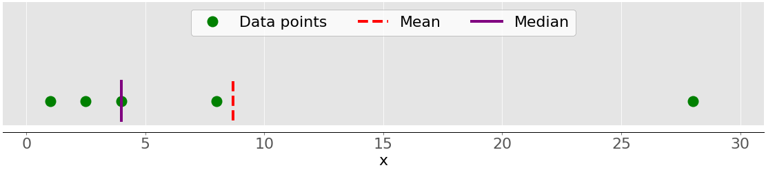
This figure illustrates the mean of a sample with five data points:
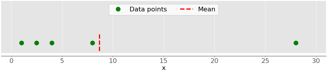
The green dots represent the data points 1, 2.5, 4, 8, and 28. The red dashed line is their mean, or (1 + 2.5 + 4 + 8 + 28) / 5 = 8.7.
You can calculate the mean with pure Python using sum() and len(), without importing libraries:
>>> mean_ = sum(x) / len(x)
>>> mean_
8.7
Although this is clean and elegant, you can also apply built-in Python statistics functions:
>>> mean_ = statistics.mean(x)
>>> mean_
8.7
>>> mean_ = statistics.fmean(x)
>>> mean_
8.7
You’ve called the functions mean() and fmean() from the built-in Python statistics library and got the same result as you did with pure Python. fmean() is introduced in Python 3.8 as a faster alternative to mean(). It always returns a floating-point number.
However, if there are nan values among your data, then statistics.mean() and statistics.fmean() will return nan as the output:
>>> mean_ = statistics.mean(x_with_nan)
>>> mean_
nan
>>> mean_ = statistics.fmean(x_with_nan)
>>> mean_
nan
This result is consistent with the behavior of sum(), because sum(x_with_nan) also returns nan.
If you use NumPy, then you can get the mean with np.mean():
>>> mean_ = np.mean(y)
>>> mean_
8.7
In the example above, mean() is a function, but you can use the corresponding method .mean() as well:
>>> mean_ = y.mean()
>>> mean_
8.7
The function mean() and method .mean() from NumPy return the same result as statistics.mean(). This is also the case when there are nan values among your data:
>>> np.mean(y_with_nan)
nan
>>> y_with_nan.mean()
nan
You often don’t need to get a nan value as a result. If you prefer to ignore nan values, then you can use np.nanmean():
>>> np.nanmean(y_with_nan)
8.7
nanmean() simply ignores all nan values. It returns the same value as mean() if you were to apply it to the dataset without the nan values.
pd.Series objects also have the method .mean():
>>> mean_ = z.mean()
>>> mean_
8.7
As you can see, it’s used similarly as in the case of NumPy. However, .mean() from pandas ignores nan values by default:
>>> z_with_nan.mean()
8.7
This behavior is the result of the default value of the optional parameter skipna. You can change this parameter to modify the behavior.
Weighted Mean
The weighted mean, also called the weighted arithmetic mean or weighted average, is a generalization of the arithmetic mean that enables you to define the relative contribution of each data point to the result.
You define one weight 𝑤ᵢ for each data point 𝑥ᵢ of the dataset 𝑥, where 𝑖 = 1, 2, …, 𝑛 and 𝑛 is the number of items in 𝑥. Then, you multiply each data point with the corresponding weight, sum all the products, and divide the obtained sum with the sum of weights: Σᵢ(𝑤ᵢ𝑥ᵢ) / Σᵢ𝑤ᵢ.
Note: It’s convenient (and usually the case) that all weights are nonnegative, 𝑤ᵢ ≥ 0, and that their sum is equal to one, or Σᵢ𝑤ᵢ = 1.
The weighted mean is very handy when you need the mean of a dataset containing items that occur with given relative frequencies. For example, say that you have a set in which 20% of all items are equal to 2, 50% of the items are equal to 4, and the remaining 30% of the items are equal to 8. You can calculate the mean of such a set like this:
>>> 0.2 * 2 + 0.5 * 4 + 0.3 * 8
4.8
Here, you take the frequencies into account with the weights. With this method, you don’t need to know the total number of items.
You can implement the weighted mean in pure Python by combining sum() with either range() or zip():
>>> x = [8.0, 1, 2.5, 4, 28.0]
>>> w = [0.1, 0.2, 0.3, 0.25, 0.15]
>>> wmean = sum(w[i] * x[i] for i in range(len(x))) / sum(w)
>>> wmean
6.95
>>> wmean = sum(x_ * w_ for (x_, w_) in zip(x, w)) / sum(w)
>>> wmean
6.95
Again, this is a clean and elegant implementation where you don’t need to import any libraries.
However, if you have large datasets, then NumPy is likely to provide a better solution. You can use np.average() to get the weighted mean of NumPy arrays or pandas Series:
>>> y, z, w = np.array(x), pd.Series(x), np.array(w)
>>> wmean = np.average(y, weights=w)
>>> wmean
6.95
>>> wmean = np.average(z, weights=w)
>>> wmean
6.95
The result is the same as in the case of the pure Python implementation. You can also use this method on ordinary lists and tuples.
Another solution is to use the element-wise product w * y with np.sum() or .sum():
>>> (w * y).sum() / w.sum()
6.95
That’s it! You’ve calculated the weighted mean.
However, be careful if your dataset contains nan values:
>>> w = np.array([0.1, 0.2, 0.3, 0.0, 0.2, 0.1])
>>> (w * y_with_nan).sum() / w.sum()
nan
>>> np.average(y_with_nan, weights=w)
nan
>>> np.average(z_with_nan, weights=w)
nan
In this case, average() returns nan, which is consistent with np.mean().
Harmonic Mean
The harmonic mean is the reciprocal of the mean of the reciprocals of all items in the dataset: 𝑛 / Σᵢ(1/𝑥ᵢ), where 𝑖 = 1, 2, …, 𝑛 and 𝑛 is the number of items in the dataset 𝑥. One variant of the pure Python implementation of the harmonic mean is this:
>>> hmean = len(x) / sum(1 / item for item in x)
>>> hmean
2.7613412228796843
It’s quite different from the value of the arithmetic mean for the same data x, which you calculated to be 8.7.
You can also calculate this measure with statistics.harmonic_mean():
>>> hmean = statistics.harmonic_mean(x)
>>> hmean
2.7613412228796843
The example above shows one implementation of statistics.harmonic_mean(). If you have a nan value in a dataset, then it’ll return nan. If there’s at least one 0, then it’ll return 0. If you provide at least one negative number, then you’ll get statistics.StatisticsError:
>>> statistics.harmonic_mean(x_with_nan)
nan
>>> statistics.harmonic_mean([1, 0, 2])
0
>>> statistics.harmonic_mean([1, 2, -2])  # Raises StatisticsError
Keep these three scenarios in mind when you’re using this method!
A third way to calculate the harmonic mean is to use scipy.stats.hmean():
>>> scipy.stats.hmean(y)
2.7613412228796843
>>> scipy.stats.hmean(z)
2.7613412228796843
Again, this is a pretty straightforward implementation. However, if your dataset contains nan, 0, a negative number, or anything but positive numbers, then you’ll get a ValueError!
Geometric Mean
The geometric mean is the 𝑛-th root of the product of all 𝑛 elements 𝑥ᵢ in a dataset 𝑥: ⁿ√(Πᵢ𝑥ᵢ), where 𝑖 = 1, 2, …, 𝑛. The following figure illustrates the arithmetic, harmonic, and geometric means of a dataset:
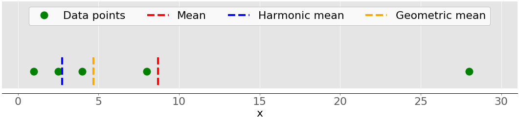
Again, the green dots represent the data points 1, 2.5, 4, 8, and 28. The red dashed line is the mean. The blue dashed line is the harmonic mean, and the yellow dashed line is the geometric mean.
You can implement the geometric mean in pure Python like this:
>>> gmean = 1
>>> for item in x:
...     gmean *= item
...
>>> gmean **= 1 / len(x)
>>> gmean
4.677885674856041
As you can see, the value of the geometric mean, in this case, differs significantly from the values of the arithmetic (8.7) and harmonic (2.76) means for the same dataset x.
Python 3.8 introduced statistics.geometric_mean(), which converts all values to floating-point numbers and returns their geometric mean:
>>> gmean = statistics.geometric_mean(x)
>>> gmean
4.67788567485604
You’ve got the same result as in the previous example, but with a minimal rounding error.
If you pass data with nan values, then statistics.geometric_mean() will behave like most similar functions and return nan:
>>> gmean = statistics.geometric_mean(x_with_nan)
>>> gmean
nan
Indeed, this is consistent with the behavior of statistics.mean(), statistics.fmean(), and statistics.harmonic_mean(). If there’s a zero or negative number among your data, then statistics.geometric_mean() will raise the statistics.StatisticsError.
You can also get the geometric mean with scipy.stats.gmean():
>>> scipy.stats.gmean(y)
4.67788567485604
>>> scipy.stats.gmean(z)
4.67788567485604
You obtained the same result as with the pure Python implementation.
If you have nan values in a dataset, then gmean() will return nan. If there’s at least one 0, then it’ll return 0.0 and give a warning. If you provide at least one negative number, then you’ll get nan and the warning.
Median
The sample median is the middle element of a sorted dataset. The dataset can be sorted in increasing or decreasing order. If the number of elements 𝑛 of the dataset is odd, then the median is the value at the middle position: 0.5(𝑛 + 1). If 𝑛 is even, then the median is the arithmetic mean of the two values in the middle, that is, the items at the positions 0.5𝑛 and 0.5𝑛 + 1.
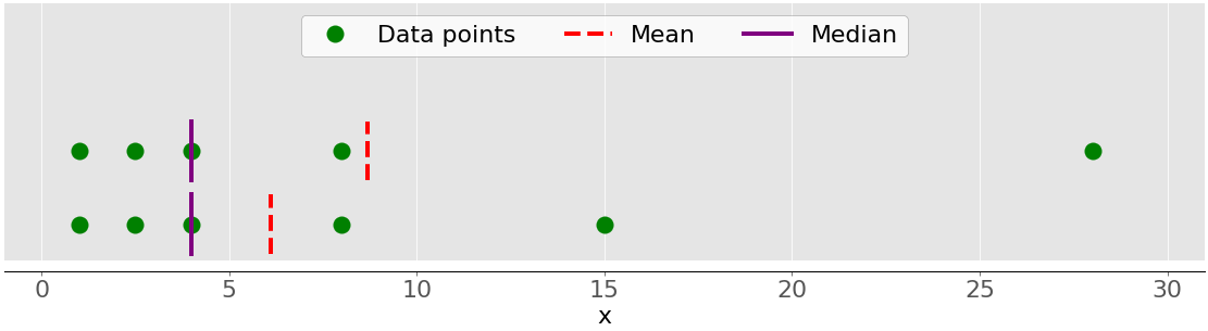
For example, if you have the data points 2, 4, 1, 8, and 9, then the median value is 4, which is in the middle of the sorted dataset (1, 2, 4, 8, 9). If the data points are 2, 4, 1, and 8, then the median is 3, which is the average of the two middle elements of the sorted sequence (2 and 4). The following figure illustrates this:
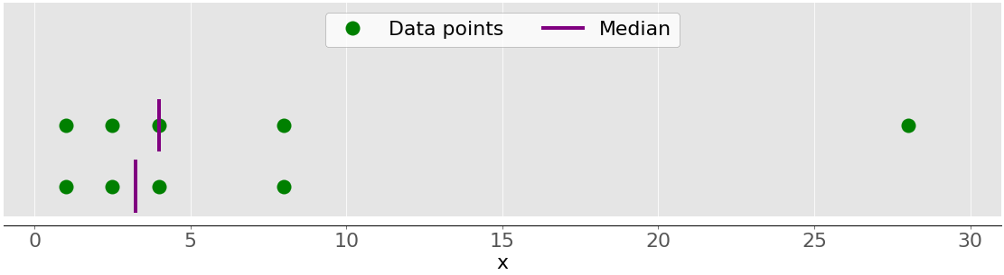
The data points are the green dots, and the purple lines show the median for each dataset. The median value for the upper dataset (1, 2.5, 4, 8, and 28) is 4. If you remove the outlier 28 from the lower dataset, then the median becomes the arithmetic average between 2.5 and 4, which is 3.25.
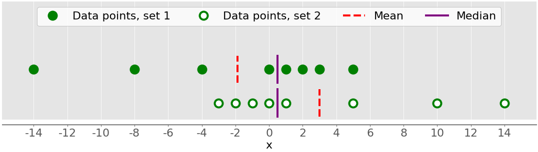
The figure below shows both the mean and median of the data points 1, 2.5, 4, 8, and 28:
Again, the mean is the red dashed line, while the median is the purple line.
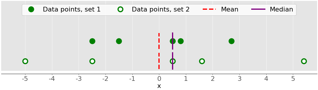
The main difference between the behavior of the mean and median is related to dataset outliers or extremes. The mean is heavily affected by outliers, but the median only depends on outliers either slightly or not at all. Consider the following figure:
The upper dataset again has the items 1, 2.5, 4, 8, and 28. Its mean is 8.7, and the median is 5, as you saw earlier. The lower dataset shows what’s going on when you move the rightmost point with the value 28:
- If you increase its value (move it to the right), then the mean will rise, but the median value won’t ever change.
- If you decrease its value (move it to the left), then the mean will drop, but the median will remain the same until the value of the moving point is greater than or equal to 4.
You can compare the mean and median as one way to detect outliers and asymmetry in your data. Whether the mean value or the median value is more useful to you depends on the context of your particular problem.
Here is one of many possible pure Python implementations of the median:
>>> n = len(x)
>>> if n % 2:
...     median_ = sorted(x)[round(0.5*(n-1))]
... else:
...     x_ord, index = sorted(x), round(0.5 * n)
...     median_ = 0.5 * (x_ord[index-1] + x_ord[index])
...
>>> median_
4
Two most important steps of this implementation are as follows:
- Sorting the elements of the dataset
- Finding the middle element(s) in the sorted dataset
You can get the median with statistics.median():
>>> median_ = statistics.median(x)
>>> median_
4
>>> median_ = statistics.median(x[:-1])
>>> median_
3.25
The sorted version of x is [1, 2.5, 4, 8.0, 28.0], so the element in the middle is 4. The sorted version of x[:-1], which is x without the last item 28.0, is [1, 2.5, 4, 8.0]. Now, there are two middle elements, 2.5 and 4. Their average is 3.25.
median_low() and median_high() are two more functions related to the median in the Python statistics library. They always return an element from the dataset:
- If the number of elements is odd, then there’s a single middle value, so these functions behave just like
median(). - If the number of elements is even, then there are two middle values. In this case,
median_low()returns the lower andmedian_high()the higher middle value.
You can use these functions just as you’d use median():
>>> statistics.median_low(x[:-1])
2.5
>>> statistics.median_high(x[:-1])
4
Again, the sorted version of x[:-1] is [1, 2.5, 4, 8.0]. The two elements in the middle are 2.5 (low) and 4 (high).
Unlike most other functions from the Python statistics library, median(), median_low(), and median_high() don’t return nan when there are nan values among the data points:
>>> statistics.median(x_with_nan)
6.0
>>> statistics.median_low(x_with_nan)
4
>>> statistics.median_high(x_with_nan)
8.0
Beware of this behavior because it might not be what you want!
You can also get the median with np.median():
>>> median_ = np.median(y)
>>> median_
4.0
>>> median_ = np.median(y[:-1])
>>> median_
3.25
You’ve obtained the same values with statistics.median() and np.median().
However, if there’s a nan value in your dataset, then np.median() issues the RuntimeWarning and returns nan. If this behavior is not what you want, then you can use nanmedian() to ignore all nan values:
>>> np.nanmedian(y_with_nan)
4.0
>>> np.nanmedian(y_with_nan[:-1])
3.25
The obtained results are the same as with statistics.median() and np.median() applied to the datasets x and y.
pandas Series objects have the method .median() that ignores nan values by default:
>>> z.median()
4.0
>>> z_with_nan.median()
4.0
The behavior of .median() is consistent with .mean() in pandas. You can change this behavior with the optional parameter skipna.
Mode
The sample mode is the value in the dataset that occurs most frequently. If there isn’t a single such value, then the set is multimodal since it has multiple modal values. For example, in the set that contains the points 2, 3, 2, 8, and 12, the number 2 is the mode because it occurs twice, unlike the other items that occur only once.
This is how you can get the mode with pure Python:
>>> u = [2, 3, 2, 8, 12]
>>> mode_ = max((u.count(item), item) for item in set(u))[1]
>>> mode_
2
You use u.count() to get the number of occurrences of each item in u. The item with the maximal number of occurrences is the mode. Note that you don’t have to use set(u). Instead, you might replace it with just u and iterate over the entire list.
Note: set(u) returns a Python set with all unique items in u. You can use this trick to optimize working with larger data, especially when you expect to see a lot of duplicates.
You can obtain the mode with statistics.mode() and statistics.multimode():
>>> mode_ = statistics.mode(u)
>>> mode_
>>> mode_ = statistics.multimode(u)
>>> mode_
[2]
As you can see, mode() returned a single value, while multimode() returned the list that contains the result. This isn’t the only difference between the two functions, though. If there’s more than one modal value, then mode() raises StatisticsError, while multimode() returns the list with all modes:
>>> v = [12, 15, 12, 15, 21, 15, 12]
>>> statistics.mode(v)  # Raises StatisticsError
>>> statistics.multimode(v)
[12, 15]
You should pay special attention to this scenario and be careful when you’re choosing between these two functions.
statistics.mode() and statistics.multimode() handle nan values as regular values and can return nan as the modal value:
>>> statistics.mode([2, math.nan, 2])
2
>>> statistics.multimode([2, math.nan, 2])
[2]
>>> statistics.mode([2, math.nan, 0, math.nan, 5])
nan
>>> statistics.multimode([2, math.nan, 0, math.nan, 5])
[nan]
In the first example above, the number 2 occurs twice and is the modal value. In the second example, nan is the modal value since it occurs twice, while the other values occur only once.
Note: statistics.multimode() is introduced in Python 3.8.
You can also get the mode with scipy.stats.mode():
>>> u, v = np.array(u), np.array(v)
>>> mode_ = scipy.stats.mode(u)
>>> mode_
ModeResult(mode=array([2]), count=array([2]))
>>> mode_ = scipy.stats.mode(v)
>>> mode_
ModeResult(mode=array([12]), count=array([3]))
This function returns the object with the modal value and the number of times it occurs. If there are multiple modal values in the dataset, then only the smallest value is returned.
You can get the mode and its number of occurrences as NumPy arrays with dot notation:
>>> mode_.mode
array([12])
>>> mode_.count
array([3])
This code uses .mode to return the smallest mode (12) in the array v and .count to return the number of times it occurs (3). scipy.stats.mode() is also flexible with nan values. It allows you to define desired behavior with the optional parameter nan_policy. This parameter can take on the values 'propagate', 'raise' (an error), or 'omit'.
pandas Series objects have the method .mode() that handles multimodal values well and ignores nan values by default:
>>> u, v, w = pd.Series(u), pd.Series(v), pd.Series([2, 2, math.nan])
>>> u.mode()
0    2
dtype: int64
>>> v.mode()
0    12
1    15
dtype: int64
>>> w.mode()
0    2.0
dtype: float64
As you can see, .mode() returns a new pd.Series that holds all modal values. If you want .mode() to take nan values into account, then just pass the optional argument dropna=False.
Measures of Variability
The measures of central tendency aren’t sufficient to describe data. You’ll also need the measures of variability that quantify the spread of data points. In this section, you’ll learn how to identify and calculate the following variability measures:
- Variance
- Standard deviation
- Skewness
- Percentiles
- Ranges
Variance
The sample variance quantifies the spread of the data. It shows numerically how far the data points are from the mean. You can express the sample variance of the dataset 𝑥 with 𝑛 elements mathematically as 𝑠² = Σᵢ(𝑥ᵢ − mean(𝑥))² / (𝑛 − 1), where 𝑖 = 1, 2, …, 𝑛 and mean(𝑥) is the sample mean of 𝑥. If you want to understand deeper why you divide the sum with 𝑛 − 1 instead of 𝑛, then you can dive deeper into Bessel’s correction.
The following figure shows you why it’s important to consider the variance when describing datasets:
There are two datasets in this figure:
- Green dots: This dataset has a smaller variance or a smaller average difference from the mean. It also has a smaller range or a smaller difference between the largest and smallest item.
- White dots: This dataset has a larger variance or a larger average difference from the mean. It also has a bigger range or a bigger difference between the largest and smallest item.
Note that these two datasets have the same mean and median, even though they appear to differ significantly. Neither the mean nor the median can describe this difference. That’s why you need the measures of variability.
Here’s how you can calculate the sample variance with pure Python:
>>> n = len(x)
>>> mean_ = sum(x) / n
>>> var_ = sum((item - mean_)**2 for item in x) / (n - 1)
>>> var_
123.19999999999999
This approach is sufficient and calculates the sample variance well. However, the shorter and more elegant solution is to call the existing function statistics.variance():
>>> var_ = statistics.variance(x)
>>> var_
123.2
You’ve obtained the same result for the variance as above. variance() can avoid calculating the mean if you provide the mean explicitly as the second argument: statistics.variance(x, mean_).
If you have nan values among your data, then statistics.variance() will return nan:
>>> statistics.variance(x_with_nan)
nan
This behavior is consistent with mean() and most other functions from the Python statistics library.
You can also calculate the sample variance with NumPy. You should use the function np.var() or the corresponding method .var():
>>> var_ = np.var(y, ddof=1)
>>> var_
123.19999999999999
>>> var_ = y.var(ddof=1)
>>> var_
123.19999999999999
It’s very important to specify the parameter ddof=1. That’s how you set the delta degrees of freedom to 1. This parameter allows the proper calculation of 𝑠², with (𝑛 − 1) in the denominator instead of 𝑛.
If you have nan values in the dataset, then np.var() and .var() will return nan:
>>> np.var(y_with_nan, ddof=1)
nan
>>> y_with_nan.var(ddof=1)
nan
This is consistent with np.mean() and np.average(). If you want to skip nan values, then you should use np.nanvar():
>>> np.nanvar(y_with_nan, ddof=1)
123.19999999999999
np.nanvar() ignores nan values. It also needs you to specify ddof=1.
pd.Series objects have the method .var() that skips nan values by default:
>>> z.var(ddof=1)
123.19999999999999
>>> z_with_nan.var(ddof=1)
123.19999999999999
It also has the parameter ddof, but its default value is 1, so you can omit it. If you want a different behavior related to nan values, then use the optional parameter skipna.
You calculate the population variance similarly to the sample variance. However, you have to use 𝑛 in the denominator instead of 𝑛 − 1: Σᵢ(𝑥ᵢ − mean(𝑥))² / 𝑛. In this case, 𝑛 is the number of items in the entire population. You can get the population variance similar to the sample variance, with the following differences:
- Replace
(n - 1)withnin the pure Python implementation. - Use
statistics.pvariance()instead ofstatistics.variance(). - Specify the parameter
ddof=0if you use NumPy or pandas. In NumPy, you can omitddofbecause its default value is0.
Note that you should always be aware of whether you’re working with a sample or the entire population whenever you’re calculating the variance!
Standard Deviation
The sample standard deviation is another measure of data spread. It’s connected to the sample variance, as standard deviation, 𝑠, is the positive square root of the sample variance. The standard deviation is often more convenient than the variance because it has the same unit as the data points. Once you get the variance, you can calculate the standard deviation with pure Python:
>>> std_ = var_ ** 0.5
>>> std_
11.099549540409285
Although this solution works, you can also use statistics.stdev():
>>> std_ = statistics.stdev(x)
>>> std_
11.099549540409287
Of course, the result is the same as before. Like variance(), stdev() doesn’t calculate the mean if you provide it explicitly as the second argument: statistics.stdev(x, mean_).
You can get the standard deviation with NumPy in almost the same way. You can use the function std() and the corresponding method .std() to calculate the standard deviation. If there are nan values in the dataset, then they’ll return nan. To ignore nan values, you should use np.nanstd(). You use std(), .std(), and nanstd() from NumPy as you would use var(), .var(), and nanvar():
>>> np.std(y, ddof=1)
11.099549540409285
>>> y.std(ddof=1)
11.099549540409285
>>> np.std(y_with_nan, ddof=1)
nan
>>> y_with_nan.std(ddof=1)
nan
>>> np.nanstd(y_with_nan, ddof=1)
11.099549540409285
Don’t forget to set the delta degrees of freedom to 1!
pd.Series objects also have the method .std() that skips nan by default:
>>> z.std(ddof=1)
11.099549540409285
>>> z_with_nan.std(ddof=1)
11.099549540409285
The parameter ddof defaults to 1, so you can omit it. Again, if you want to treat nan values differently, then apply the parameter skipna.
The population standard deviation refers to the entire population. It’s the positive square root of the population variance. You can calculate it just like the sample standard deviation, with the following differences:
- Find the square root of the population variance in the pure Python implementation.
- Use
statistics.pstdev()instead ofstatistics.stdev(). - Specify the parameter
ddof=0if you use NumPy or pandas. In NumPy, you can omitddofbecause its default value is0.
As you can see, you can determine the standard deviation in Python, NumPy, and pandas in almost the same way as you determine the variance. You use different but analogous functions and methods with the same arguments.
Skewness
The sample skewness measures the asymmetry of a data sample.
There are several mathematical definitions of skewness. One common expression to calculate the skewness of the dataset 𝑥 with 𝑛 elements is (𝑛² / ((𝑛 − 1)(𝑛 − 2))) (Σᵢ(𝑥ᵢ − mean(𝑥))³ / (𝑛𝑠³)). A simpler expression is Σᵢ(𝑥ᵢ − mean(𝑥))³ 𝑛 / ((𝑛 − 1)(𝑛 − 2)𝑠³), where 𝑖 = 1, 2, …, 𝑛 and mean(𝑥) is the sample mean of 𝑥. The skewness defined like this is called the adjusted Fisher-Pearson standardized moment coefficient.
The previous figure showed two datasets that were quite symmetrical. In other words, their points had similar distances from the mean. In contrast, the following image illustrates two asymmetrical sets:
The first set is represented by the green dots and the second with the white ones. Usually, negative skewness values indicate that there’s a dominant tail on the left side, which you can see with the first set. Positive skewness values correspond to a longer or fatter tail on the right side, which you can see in the second set. If the skewness is close to 0 (for example, between −0.5 and 0.5), then the dataset is considered quite symmetrical.
Once you’ve calculated the size of your dataset n, the sample mean mean_, and the standard deviation std_, you can get the sample skewness with pure Python:
>>> x = [8.0, 1, 2.5, 4, 28.0]
>>> n = len(x)
>>> mean_ = sum(x) / n
>>> var_ = sum((item - mean_)**2 for item in x) / (n - 1)
>>> std_ = var_ ** 0.5
>>> skew_ = (sum((item - mean_)**3 for item in x)
...          * n / ((n - 1) * (n - 2) * std_**3))
>>> skew_
1.9470432273905929
The skewness is positive, so x has a right-side tail.
You can also calculate the sample skewness with scipy.stats.skew():
>>> y, y_with_nan = np.array(x), np.array(x_with_nan)
>>> scipy.stats.skew(y, bias=False)
1.9470432273905927
>>> scipy.stats.skew(y_with_nan, bias=False)
nan
The obtained result is the same as the pure Python implementation. The parameter bias is set to False to enable the corrections for statistical bias. The optional parameter nan_policy can take the values 'propagate', 'raise', or 'omit'. It allows you to control how you’ll handle nan values.
pandas Series objects have the method .skew() that also returns the skewness of a dataset:
>>> z, z_with_nan = pd.Series(x), pd.Series(x_with_nan)
>>> z.skew()
1.9470432273905924
>>> z_with_nan.skew()
1.9470432273905924
Like other methods, .skew() ignores nan values by default, because of the default value of the optional parameter skipna.
Percentiles
The sample 𝑝 percentile is the element in the dataset such that 𝑝% of the elements in the dataset are less than or equal to that value. Also, (100 − 𝑝)% of the elements are greater than or equal to that value. If there are two such elements in the dataset, then the sample 𝑝 percentile is their arithmetic mean. Each dataset has three quartiles, which are the percentiles that divide the dataset into four parts:
- The first quartile is the sample 25th percentile. It divides roughly 25% of the smallest items from the rest of the dataset.
- The second quartile is the sample 50th percentile or the median. Approximately 25% of the items lie between the first and second quartiles and another 25% between the second and third quartiles.
- The third quartile is the sample 75th percentile. It divides roughly 25% of the largest items from the rest of the dataset.
Each part has approximately the same number of items. If you want to divide your data into several intervals, then you can use statistics.quantiles():
>>> x = [-5.0, -1.1, 0.1, 2.0, 8.0, 12.8, 21.0, 25.8, 41.0]
>>> statistics.quantiles(x, n=2)
[8.0]
>>> statistics.quantiles(x, n=4, method='inclusive')
[0.1, 8.0, 21.0]
In this example, 8.0 is the median of x, while 0.1 and 21.0 are the sample 25th and 75th percentiles, respectively. The parameter n defines the number of resulting equal-probability percentiles, and method determines how to calculate them.
Note: statistics.quantiles() is introduced in Python 3.8.
You can also use np.percentile() to determine any sample percentile in your dataset. For example, this is how you can find the 5th and 95th percentiles:
>>> y = np.array(x)
>>> np.percentile(y, 5)
-3.44
>>> np.percentile(y, 95)
34.919999999999995
percentile() takes several arguments. You have to provide the dataset as the first argument and the percentile value as the second. The dataset can be in the form of a NumPy array, list, tuple, or similar data structure. The percentile can be a number between 0 and 100 like in the example above, but it can also be a sequence of numbers:
>>> np.percentile(y, [25, 50, 75])
array([ 0.1,  8. , 21. ])
>>> np.median(y)
8.0
This code calculates the 25th, 50th, and 75th percentiles all at once. If the percentile value is a sequence, then percentile() returns a NumPy array with the results. The first statement returns the array of quartiles. The second statement returns the median, so you can confirm it’s equal to the 50th percentile, which is 8.0.
If you want to ignore nan values, then use np.nanpercentile() instead:
>>> y_with_nan = np.insert(y, 2, np.nan)
>>> y_with_nan
array([-5. , -1.1,  nan,  0.1,  2. ,  8. , 12.8, 21. , 25.8, 41. ])
>>> np.nanpercentile(y_with_nan, [25, 50, 75])
array([ 0.1,  8. , 21. ])
That’s how you can avoid nan values.
NumPy also offers you very similar functionality in quantile() and nanquantile(). If you use them, then you’ll need to provide the quantile values as the numbers between 0 and 1 instead of percentiles:
>>> np.quantile(y, 0.05)
-3.44
>>> np.quantile(y, 0.95)
34.919999999999995
>>> np.quantile(y, [0.25, 0.5, 0.75])
array([ 0.1,  8. , 21. ])
>>> np.nanquantile(y_with_nan, [0.25, 0.5, 0.75])
array([ 0.1,  8. , 21. ])
The results are the same as in the previous examples, but here your arguments are between 0 and 1. In other words, you passed 0.05 instead of 5 and 0.95 instead of 95.
pd.Series objects have the method .quantile():
>>> z, z_with_nan = pd.Series(y), pd.Series(y_with_nan)
>>> z.quantile(0.05)
-3.44
>>> z.quantile(0.95)
34.919999999999995
>>> z.quantile([0.25, 0.5, 0.75])
0.25     0.1
0.50     8.0
0.75    21.0
dtype: float64
>>> z_with_nan.quantile([0.25, 0.5, 0.75])
0.25     0.1
0.50     8.0
0.75    21.0
dtype: float64
.quantile() also needs you to provide the quantile value as the argument. This value can be a number between 0 and 1 or a sequence of numbers. In the first case, .quantile() returns a scalar. In the second case, it returns a new Series holding the results.
Ranges
The range of data is the difference between the maximum and minimum element in the dataset. You can get it with the function np.ptp():
>>> np.ptp(y)
46.0
>>> np.ptp(z)
46.0
>>> np.ptp(y_with_nan)
nan
>>> np.ptp(z_with_nan)
46.0
This function returns nan if there are nan values in your NumPy array. If you use a pandas Series object, then it will return a number.
Alternatively, you can use built-in Python, NumPy, or pandas functions and methods to calculate the maxima and minima of sequences:
max()andmin()from the Python standard libraryamax()andamin()from NumPynanmax()andnanmin()from NumPy to ignorenanvalues.max()and.min()from NumPy.max()and.min()from pandas to ignorenanvalues by default
Here are some examples of how you would use these routines:
>>> np.amax(y) - np.amin(y)
46.0
>>> np.nanmax(y_with_nan) - np.nanmin(y_with_nan)
46.0
>>> y.max() - y.min()
46.0
>>> z.max() - z.min()
46.0
>>> z_with_nan.max() - z_with_nan.min()
46.0
That’s how you get the range of data.
The interquartile range is the difference between the first and third quartile. Once you calculate the quartiles, you can take their difference:
>>> quartiles = np.quantile(y, [0.25, 0.75])
>>> quartiles[1] - quartiles[0]
20.9
>>> quartiles = z.quantile([0.25, 0.75])
>>> quartiles[0.75] - quartiles[0.25]
20.9
Note that you access the values in a pandas Series object with the labels 0.75 and 0.25.
Summary of Descriptive Statistics
SciPy and pandas offer useful routines to quickly get descriptive statistics with a single function or method call. You can use scipy.stats.describe() like this:
>>> result = scipy.stats.describe(y, ddof=1, bias=False)
>>> result
DescribeResult(nobs=9, minmax=(-5.0, 41.0), mean=11.622222222222222, variance=228.75194444444446, skewness=0.9249043136685094, kurtosis=0.14770623629658886)
You have to provide the dataset as the first argument. The argument can be a NumPy array, list, tuple, or similar data structure. You can omit ddof=1 since it’s the default and only matters when you’re calculating the variance. You can pass bias=False to force correcting the skewness and kurtosis for statistical bias.
Note: The optional parameter nan_policy can take the values 'propagate' (default), 'raise' (an error), or 'omit'. This parameter allows you to control what’s happening when there are nan values.
describe() returns an object that holds the following descriptive statistics:
nobs: the number of observations or elements in your datasetminmax: the tuple with the minimum and maximum values of your datasetmean: the mean of your datasetvariance: the variance of your datasetskewness: the skewness of your datasetkurtosis: the kurtosis of your dataset
You can access particular values with dot notation:
>>> result.nobs
9
>>> result.minmax[0]  # Min
-5.0
>>> result.minmax[1]  # Max
41.0
>>> result.mean
11.622222222222222
>>> result.variance
228.75194444444446
>>> result.skewness
0.9249043136685094
>>> result.kurtosis
0.14770623629658886
With SciPy, you’re just one function call away from a descriptive statistics summary for your dataset.
pandas has similar, if not better, functionality. Series objects have the method .describe():
>>> result = z.describe()
>>> result
count     9.000000
mean     11.622222
std      15.124548
min      -5.000000
25%       0.100000
50%       8.000000
75%      21.000000
max      41.000000
dtype: float64
It returns a new Series that holds the following:
count: the number of elements in your datasetmean: the mean of your datasetstd: the standard deviation of your datasetminandmax: the minimum and maximum values of your dataset25%,50%, and75%: the quartiles of your dataset
If you want the resulting Series object to contain other percentiles, then you should specify the value of the optional parameter percentiles. You can access each item of result with its label:
>>> result['mean']
11.622222222222222
>>> result['std']
15.12454774346805
>>> result['min']
-5.0
>>> result['max']
41.0
>>> result['25%']
0.1
>>> result['50%']
8.0
>>> result['75%']
21.0
That’s how you can get descriptive statistics of a Series object with a single method call using pandas.
Measures of Correlation Between Pairs of Data
You’ll often need to examine the relationship between the corresponding elements of two variables in a dataset. Say there are two variables, 𝑥 and 𝑦, with an equal number of elements, 𝑛. Let 𝑥₁ from 𝑥 correspond to 𝑦₁ from 𝑦, 𝑥₂ from 𝑥 to 𝑦₂ from 𝑦, and so on. You can then say that there are 𝑛 pairs of corresponding elements: (𝑥₁, 𝑦₁), (𝑥₂, 𝑦₂), and so on.
You’ll see the following measures of correlation between pairs of data:
- Positive correlation exists when larger values of 𝑥 correspond to larger values of 𝑦 and vice versa.
- Negative correlation exists when larger values of 𝑥 correspond to smaller values of 𝑦 and vice versa.
- Weak or no correlation exists if there is no such apparent relationship.
The following figure shows examples of negative, weak, and positive correlation:
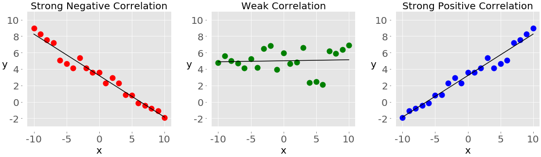
The plot on the left with the red dots shows negative correlation. The plot in the middle with the green dots shows weak correlation. Finally, the plot on the right with the blue dots shows positive correlation.
Note: There’s one important thing you should always have in mind when working with correlation among a pair of variables, and that’s that correlation is not a measure or indicator of causation, but only of association!
The two statistics that measure the correlation between datasets are covariance and the correlation coefficient. Let’s define some data to work with these measures. You’ll create two Python lists and use them to get corresponding NumPy arrays and pandas Series:
>>> x = list(range(-10, 11))
>>> y = [0, 2, 2, 2, 2, 3, 3, 6, 7, 4, 7, 6, 6, 9, 4, 5, 5, 10, 11, 12, 14]
>>> x_, y_ = np.array(x), np.array(y)
>>> x__, y__ = pd.Series(x_), pd.Series(y_)
Now that you have the two variables, you can start exploring the relationship between them.
Covariance
The sample covariance is a measure that quantifies the strength and direction of a relationship between a pair of variables:
- If the correlation is positive, then the covariance is positive, as well. A stronger relationship corresponds to a higher value of the covariance.
- If the correlation is negative, then the covariance is negative, as well. A stronger relationship corresponds to a lower (or higher absolute) value of the covariance.
- If the correlation is weak, then the covariance is close to zero.
The covariance of the variables 𝑥 and 𝑦 is mathematically defined as 𝑠ˣʸ = Σᵢ (𝑥ᵢ − mean(𝑥)) (𝑦ᵢ − mean(𝑦)) / (𝑛 − 1), where 𝑖 = 1, 2, …, 𝑛, mean(𝑥) is the sample mean of 𝑥, and mean(𝑦) is the sample mean of 𝑦. It follows that the covariance of two identical variables is actually the variance: 𝑠ˣˣ = Σᵢ(𝑥ᵢ − mean(𝑥))² / (𝑛 − 1) = (𝑠ˣ)² and 𝑠ʸʸ = Σᵢ(𝑦ᵢ − mean(𝑦))² / (𝑛 − 1) = (𝑠ʸ)².
This is how you can calculate the covariance in pure Python:
>>> n = len(x)
>>> mean_x, mean_y = sum(x) / n, sum(y) / n
>>> cov_xy = (sum((x[k] - mean_x) * (y[k] - mean_y) for k in range(n))
...           / (n - 1))
>>> cov_xy
19.95
First, you have to find the mean of x and y. Then, you apply the mathematical formula for the covariance.
NumPy has the function cov() that returns the covariance matrix:
>>> cov_matrix = np.cov(x_, y_)
>>> cov_matrix
array([[38.5       , 19.95      ],
       [19.95      , 13.91428571]])
Note that cov() has the optional parameters bias, which defaults to False, and ddof, which defaults to None. Their default values are suitable for getting the sample covariance matrix. The upper-left element of the covariance matrix is the covariance of x and x, or the variance of x. Similarly, the lower-right element is the covariance of y and y, or the variance of y. You can check to see that this is true:
>>> x_.var(ddof=1)
38.5
>>> y_.var(ddof=1)
13.914285714285711
As you can see, the variances of x and y are equal to cov_matrix[0, 0] and cov_matrix[1, 1], respectively.
The other two elements of the covariance matrix are equal and represent the actual covariance between x and y:
>>> cov_xy = cov_matrix[0, 1]
>>> cov_xy
19.95
>>> cov_xy = cov_matrix[1, 0]
>>> cov_xy
19.95
You’ve obtained the same value of the covariance with np.cov() as with pure Python.
pandas Series have the method .cov() that you can use to calculate the covariance:
>>> cov_xy = x__.cov(y__)
>>> cov_xy
19.95
>>> cov_xy = y__.cov(x__)
>>> cov_xy
19.95
Here, you call .cov() on one Series object and pass the other object as the first argument.
Correlation Coefficient
The correlation coefficient, or Pearson product-moment correlation coefficient, is denoted by the symbol 𝑟. The coefficient is another measure of the correlation between data. You can think of it as a standardized covariance. Here are some important facts about it:
- The value 𝑟 > 0 indicates positive correlation.
- The value 𝑟 < 0 indicates negative correlation.
- The value r = 1 is the maximum possible value of 𝑟. It corresponds to a perfect positive linear relationship between variables.
- The value r = −1 is the minimum possible value of 𝑟. It corresponds to a perfect negative linear relationship between variables.
- The value r ≈ 0, or when 𝑟 is around zero, means that the correlation between variables is weak.
The mathematical formula for the correlation coefficient is 𝑟 = 𝑠ˣʸ / (𝑠ˣ𝑠ʸ) where 𝑠ˣ and 𝑠ʸ are the standard deviations of 𝑥 and 𝑦 respectively. If you have the means (mean_x and mean_y) and standard deviations (std_x, std_y) for the datasets x and y, as well as their covariance cov_xy, then you can calculate the correlation coefficient with pure Python:
>>> var_x = sum((item - mean_x)**2 for item in x) / (n - 1)
>>> var_y = sum((item - mean_y)**2 for item in y) / (n - 1)
>>> std_x, std_y = var_x ** 0.5, var_y ** 0.5
>>> r = cov_xy / (std_x * std_y)
>>> r
0.861950005631606
You’ve got the variable r that represents the correlation coefficient.
scipy.stats has the routine pearsonr() that calculates the correlation coefficient and the 𝑝-value:
>>> r, p = scipy.stats.pearsonr(x_, y_)
>>> r
0.861950005631606
>>> p
5.122760847201171e-07
pearsonr() returns a tuple with two numbers. The first one is 𝑟 and the second is the 𝑝-value.
Similar to the case of the covariance matrix, you can apply np.corrcoef() with x_ and y_ as the arguments and get the correlation coefficient matrix:
>>> corr_matrix = np.corrcoef(x_, y_)
>>> corr_matrix
array([[1.        , 0.86195001],
       [0.86195001, 1.        ]])
The upper-left element is the correlation coefficient between x_ and x_. The lower-right element is the correlation coefficient between y_ and y_. Their values are equal to 1.0. The other two elements are equal and represent the actual correlation coefficient between x_ and y_:
>>> r = corr_matrix[0, 1]
>>> r
0.8619500056316061
>>> r = corr_matrix[1, 0]
>>> r
0.861950005631606
Of course, the result is the same as with pure Python and pearsonr().
You can get the correlation coefficient with scipy.stats.linregress():
>>> scipy.stats.linregress(x_, y_)
LinregressResult(slope=0.5181818181818181, intercept=5.714285714285714, rvalue=0.861950005631606, pvalue=5.122760847201164e-07, stderr=0.06992387660074979)
linregress() takes x_ and y_, performs linear regression, and returns the results. slope and intercept define the equation of the regression line, while rvalue is the correlation coefficient. To access particular values from the result of linregress(), including the correlation coefficient, use dot notation:
>>> result = scipy.stats.linregress(x_, y_)
>>> r = result.rvalue
>>> r
0.861950005631606
That’s how you can perform linear regression and obtain the correlation coefficient.
pandas Series have the method .corr() for calculating the correlation coefficient:
>>> r = x__.corr(y__)
>>> r
0.8619500056316061
>>> r = y__.corr(x__)
>>> r
0.861950005631606
You should call .corr() on one Series object and pass the other object as the first argument.
Working With 2D Data
Statisticians often work with 2D data. Here are some examples of 2D data formats:
- Database tables
- CSV files
- Excel, Calc, and Google spreadsheets
NumPy and SciPy provide a comprehensive means to work with 2D data. pandas has the class DataFrame specifically to handle 2D labeled data.
Axes
Start by creating a 2D NumPy array:
>>> a = np.array([[1, 1, 1],
...               [2, 3, 1],
...               [4, 9, 2],
...               [8, 27, 4],
...               [16, 1, 1]])
>>> a
array([[ 1,  1,  1],
       [ 2,  3,  1],
       [ 4,  9,  2],
       [ 8, 27,  4],
       [16,  1,  1]])
Now you have a 2D dataset, which you’ll use in this section. You can apply Python statistics functions and methods to it just as you would to 1D data:
>>> np.mean(a)
5.4
>>> a.mean()
5.4
>>> np.median(a)
2.0
>>> a.var(ddof=1)
53.40000000000001
As you can see, you get statistics (like the mean, median, or variance) across all data in the array a. Sometimes, this behavior is what you want, but in some cases, you’ll want these quantities calculated for each row or column of your 2D array.
The functions and methods you’ve used so far have one optional parameter called axis, which is essential for handling 2D data. axis can take on any of the following values:
axis=Nonesays to calculate the statistics across all data in the array. The examples above work like this. This behavior is often the default in NumPy.axis=0says to calculate the statistics across all rows, that is, for each column of the array. This behavior is often the default for SciPy statistical functions.axis=1says to calculate the statistics across all columns, that is, for each row of the array.
Let’s see axis=0 in action with np.mean():
>>> np.mean(a, axis=0)
array([6.2, 8.2, 1.8])
>>> a.mean(axis=0)
array([6.2, 8.2, 1.8])
The two statements above return new NumPy arrays with the mean for each column of a. In this example, the mean of the first column is 6.2. The second column has the mean 8.2, while the third has 1.8.
If you provide axis=1 to mean(), then you’ll get the results for each row:
>>> np.mean(a, axis=1)
array([ 1.,  2.,  5., 13.,  6.])
>>> a.mean(axis=1)
array([ 1.,  2.,  5., 13.,  6.])
As you can see, the first row of a has the mean 1.0, the second 2.0, and so on.
Note: You can extend these rules to multi-dimensional arrays, but that’s beyond the scope of this tutorial. Feel free to dive into this topic on your own!
The parameter axis works the same way with other NumPy functions and methods:
>>> np.median(a, axis=0)
array([4., 3., 1.])
>>> np.median(a, axis=1)
array([1., 2., 4., 8., 1.])
>>> a.var(axis=0, ddof=1)
array([ 37.2, 121.2,   1.7])
>>> a.var(axis=1, ddof=1)
array([  0.,   1.,  13., 151.,  75.])
You’ve got the medians and sample variations for all columns (axis=0) and rows (axis=1) of the array a.
This is very similar when you work with SciPy statistics functions. But remember that in this case, the default value for axis is 0:
>>> scipy.stats.gmean(a)  # Default: axis=0
array([4.        , 3.73719282, 1.51571657])
>>> scipy.stats.gmean(a, axis=0)
array([4.        , 3.73719282, 1.51571657])
If you omit axis or provide axis=0, then you’ll get the result across all rows, that is, for each column. For example, the first column of a has a geometric mean of 4.0, and so on.
If you specify axis=1, then you’ll get the calculations across all columns, that is for each row:
>>> scipy.stats.gmean(a, axis=1)
array([1.        , 1.81712059, 4.16016765, 9.52440631, 2.5198421 ])
In this example, the geometric mean of the first row of a is 1.0. For the second row, it’s approximately 1.82, and so on.
If you want statistics for the entire dataset, then you have to provide axis=None:
>>> scipy.stats.gmean(a, axis=None)
2.829705017016332
The geometric mean of all the items in the array a is approximately 2.83.
You can get a Python statistics summary with a single function call for 2D data with scipy.stats.describe(). It works similar to 1D arrays, but you have to be careful with the parameter axis:
>>> scipy.stats.describe(a, axis=None, ddof=1, bias=False)
DescribeResult(nobs=15, minmax=(1, 27), mean=5.4, variance=53.40000000000001, skewness=2.264965290423389, kurtosis=5.212690982795767)
>>> scipy.stats.describe(a, ddof=1, bias=False)  # Default: axis=0
DescribeResult(nobs=5, minmax=(array([1, 1, 1]), array([16, 27,  4])), mean=array([6.2, 8.2, 1.8]), variance=array([ 37.2, 121.2,   1.7]), skewness=array([1.32531471, 1.79809454, 1.71439233]), kurtosis=array([1.30376344, 3.14969121, 2.66435986]))
>>> scipy.stats.describe(a, axis=1, ddof=1, bias=False)
DescribeResult(nobs=3, minmax=(array([1, 1, 2, 4, 1]), array([ 1,  3,  9, 27, 16])), mean=array([ 1.,  2.,  5., 13.,  6.]), variance=array([  0.,   1.,  13., 151.,  75.]), skewness=array([0.        , 0.        , 1.15206964, 1.52787436, 1.73205081]), kurtosis=array([-3. , -1.5, -1.5, -1.5, -1.5]))
When you provide axis=None, you get the summary across all data. Most results are scalars. If you set axis=0 or omit it, then the return value is the summary for each column. So, most results are the arrays with the same number of items as the number of columns. If you set axis=1, then describe() returns the summary for all rows.
You can get a particular value from the summary with dot notation:
>>> result = scipy.stats.describe(a, axis=1, ddof=1, bias=False)
>>> result.mean
array([ 1.,  2.,  5., 13.,  6.])
That’s how you can see a statistics summary for a 2D array with a single function call.
DataFrames
The class DataFrame is one of the fundamental pandas data types. It’s very comfortable to work with because it has labels for rows and columns. Use the array a and create a DataFrame:
>>> row_names = ['first', 'second', 'third', 'fourth', 'fifth']
>>> col_names = ['A', 'B', 'C']
>>> df = pd.DataFrame(a, index=row_names, columns=col_names)
>>> df
         A   B  C
first    1   1  1
second   2   3  1
third    4   9  2
fourth   8  27  4
fifth   16   1  1
In practice, the names of the columns matter and should be descriptive. The names of the rows are sometimes specified automatically as 0, 1, and so on. You can specify them explicitly with the parameter index, though you’re free to omit index if you like.
DataFrame methods are very similar to Series methods, though the behavior is different. If you call Python statistics methods without arguments, then the DataFrame will return the results for each column:
>>> df.mean()
A    6.2
B    8.2
C    1.8
dtype: float64
>>> df.var()
A     37.2
B    121.2
C      1.7
dtype: float64
What you get is a new Series that holds the results. In this case, the Series holds the mean and variance for each column. If you want the results for each row, then just specify the parameter axis=1:
>>> df.mean(axis=1)
first      1.0
second     2.0
third      5.0
fourth    13.0
fifth      6.0
dtype: float64
>>> df.var(axis=1)
first       0.0
second      1.0
third      13.0
fourth    151.0
fifth      75.0
dtype: float64
The result is a Series with the desired quantity for each row. The labels 'first', 'second', and so on refer to the different rows.
You can isolate each column of a DataFrame like this:
>>> df['A']
first      1
second     2
third      4
fourth     8
fifth     16
Name: A, dtype: int64
Now, you have the column 'A' in the form of a Series object and you can apply the appropriate methods:
>>> df['A'].mean()
6.2
>>> df['A'].var()
37.20000000000001
That’s how you can obtain the statistics for a single column.
Sometimes, you might want to use a DataFrame as a NumPy array and apply some function to it. It’s possible to get all data from a DataFrame with .values or .to_numpy():
>>> df.values
array([[ 1,  1,  1],
       [ 2,  3,  1],
       [ 4,  9,  2],
       [ 8, 27,  4],
       [16,  1,  1]])
>>> df.to_numpy()
array([[ 1,  1,  1],
       [ 2,  3,  1],
       [ 4,  9,  2],
       [ 8, 27,  4],
       [16,  1,  1]])
df.values and df.to_numpy() give you a NumPy array with all items from the DataFrame without row and column labels. Note that df.to_numpy() is more flexible because you can specify the data type of items and whether you want to use the existing data or copy it.
Like Series, DataFrame objects have the method .describe() that returns another DataFrame with the statistics summary for all columns:
>>> df.describe()
              A          B        C
count   5.00000   5.000000  5.00000
mean    6.20000   8.200000  1.80000
std     6.09918  11.009087  1.30384
min     1.00000   1.000000  1.00000
25%     2.00000   1.000000  1.00000
50%     4.00000   3.000000  1.00000
75%     8.00000   9.000000  2.00000
max    16.00000  27.000000  4.00000
The summary contains the following results:
count: the number of items in each columnmean: the mean of each columnstd: the standard deviationminandmax: the minimum and maximum values25%,50%, and75%: the percentiles
If you want the resulting DataFrame object to contain other percentiles, then you should specify the value of the optional parameter percentiles.
You can access each item of the summary like this:
>>> df.describe().at['mean', 'A']
6.2
>>> df.describe().at['50%', 'B']
3.0
That’s how you can get descriptive Python statistics in one Series object with a single pandas method call.
Visualizing Data
In addition to calculating the numerical quantities like mean, median, or variance, you can use visual methods to present, describe, and summarize data. In this section, you’ll learn how to present your data visually using the following graphs:
- Box plots
- Histograms
- Pie charts
- Bar charts
- X-Y plots
- Heatmaps
matplotlib.pyplot is a very convenient and widely-used library, though it’s not the only Python library available for this purpose. You can import it like this:
>>> import matplotlib.pyplot as plt
>>> plt.style.use('ggplot')
Now, you have matplotlib.pyplot imported and ready for use. The second statement sets the style for your plots by choosing colors, line widths, and other stylistic elements. You’re free to omit these if you’re satisfied with the default style settings.
Note: This section focuses on representing data and keeps stylistic settings to a minimum. You’ll see links to the official documentation for used routines from matplotlib.pyplot, so you can explore the options that you won’t see here.
You’ll use pseudo-random numbers to get data to work with. You don’t need knowledge on random numbers to be able to understand this section. You just need some arbitrary numbers, and pseudo-random generators are a convenient tool to get them. The module np.random generates arrays of pseudo-random numbers:
- Normally distributed numbers are generated with
np.random.randn(). - Uniformly distributed integers are generated with
np.random.randint().
NumPy 1.17 introduced another module for pseudo-random number generation. To learn more about it, check the official documentation.
Box Plots
The box plot is an excellent tool to visually represent descriptive statistics of a given dataset. It can show the range, interquartile range, median, mode, outliers, and all quartiles. First, create some data to represent with a box plot:
>>> np.random.seed(seed=0)
>>> x = np.random.randn(1000)
>>> y = np.random.randn(100)
>>> z = np.random.randn(10)
The first statement sets the seed of the NumPy random number generator with seed(), so you can get the same results each time you run the code. You don’t have to set the seed, but if you don’t specify this value, then you’ll get different results each time.
The other statements generate three NumPy arrays with normally distributed pseudo-random numbers. x refers to the array with 1000 items, y has 100, and z contains 10 items. Now that you have the data to work with, you can apply .boxplot() to get the box plot:
fig, ax = plt.subplots()
ax.boxplot((x, y, z), vert=False, showmeans=True, meanline=True,
           labels=('x', 'y', 'z'), patch_artist=True,
           medianprops={'linewidth': 2, 'color': 'purple'},
           meanprops={'linewidth': 2, 'color': 'red'})
plt.show()
The parameters of .boxplot() define the following:
xis your data.vertsets the plot orientation to horizontal whenFalse. The default orientation is vertical.showmeansshows the mean of your data whenTrue.meanlinerepresents the mean as a line whenTrue. The default representation is a point.labels: the labels of your data.patch_artistdetermines how to draw the graph.medianpropsdenotes the properties of the line representing the median.meanpropsindicates the properties of the line or dot representing the mean.
There are other parameters, but their analysis is beyond the scope of this tutorial.
The code above produces an image like this:
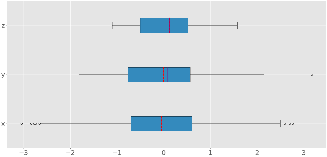
You can see three box plots. Each of them corresponds to a single dataset (x, y, or z) and show the following:
- The mean is the red dashed line.
- The median is the purple line.
- The first quartile is the left edge of the blue rectangle.
- The third quartile is the right edge of the blue rectangle.
- The interquartile range is the length of the blue rectangle.
- The range contains everything from left to right.
- The outliers are the dots to the left and right.
A box plot can show so much information in a single figure!
Histograms
Histograms are particularly useful when there are a large number of unique values in a dataset. The histogram divides the values from a sorted dataset into intervals, also called bins. Often, all bins are of equal width, though this doesn’t have to be the case. The values of the lower and upper bounds of a bin are called the bin edges.
The frequency is a single value that corresponds to each bin. It’s the number of elements of the dataset with the values between the edges of the bin. By convention, all bins but the rightmost one are half-open. They include the values equal to the lower bounds, but exclude the values equal to the upper bounds. The rightmost bin is closed because it includes both bounds. If you divide a dataset with the bin edges 0, 5, 10, and 15, then there are three bins:
- The first and leftmost bin contains the values greater than or equal to 0 and less than 5.
- The second bin contains the values greater than or equal to 5 and less than 10.
- The third and rightmost bin contains the values greater than or equal to 10 and less than or equal to 15.
The function np.histogram() is a convenient way to get data for histograms:
>>> hist, bin_edges = np.histogram(x, bins=10)
>>> hist
array([  9,  20,  70, 146, 217, 239, 160,  86,  38,  15])
>>> bin_edges
array([-3.04614305, -2.46559324, -1.88504342, -1.3044936 , -0.72394379,
       -0.14339397,  0.43715585,  1.01770566,  1.59825548,  2.1788053 ,
        2.75935511])
It takes the array with your data and the number (or edges) of bins and returns two NumPy arrays:
histcontains the frequency or the number of items corresponding to each bin.bin_edgescontains the edges or bounds of the bin.
What histogram() calculates, .hist() can show graphically:
fig, ax = plt.subplots()
ax.hist(x, bin_edges, cumulative=False)
ax.set_xlabel('x')
ax.set_ylabel('Frequency')
plt.show()
The first argument of .hist() is the sequence with your data. The second argument defines the edges of the bins. The third disables the option to create a histogram with cumulative values. The code above produces a figure like this:
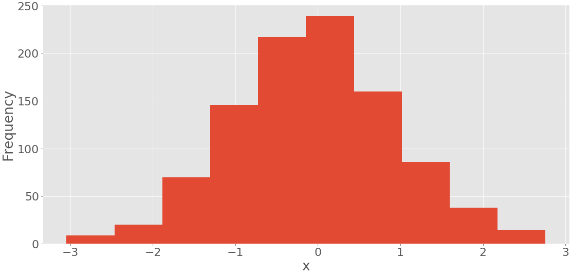
You can see the bin edges on the horizontal axis and the frequencies on the vertical axis.
It’s possible to get the histogram with the cumulative numbers of items if you provide the argument cumulative=True to .hist():
fig, ax = plt.subplots()
ax.hist(x, bin_edges, cumulative=True)
ax.set_xlabel('x')
ax.set_ylabel('Frequency')
plt.show()
This code yields the following figure:
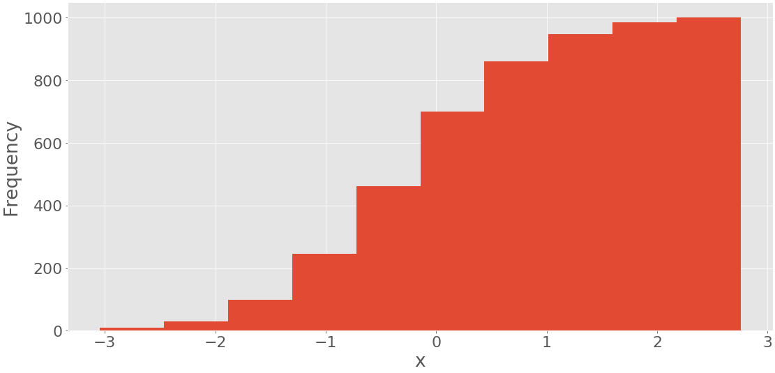
It shows the histogram with the cumulative values. The frequency of the first and leftmost bin is the number of items in this bin. The frequency of the second bin is the sum of the numbers of items in the first and second bins. The other bins follow this same pattern. Finally, the frequency of the last and rightmost bin is the total number of items in the dataset (in this case, 1000). You can also directly draw a histogram with pd.Series.hist() using matplotlib in the background.
Pie Charts
Pie charts represent data with a small number of labels and given relative frequencies. They work well even with the labels that can’t be ordered (like nominal data). A pie chart is a circle divided into multiple slices. Each slice corresponds to a single distinct label from the dataset and has an area proportional to the relative frequency associated with that label.
Let’s define data associated to three labels:
>>> x, y, z = 128, 256, 1024
Now, create a pie chart with .pie():
fig, ax = plt.subplots()
ax.pie((x, y, z), labels=('x', 'y', 'z'), autopct='%1.1f%%')
plt.show()
The first argument of .pie() is your data, and the second is the sequence of the corresponding labels. autopct defines the format of the relative frequencies shown on the figure. You’ll get a figure that looks like this:
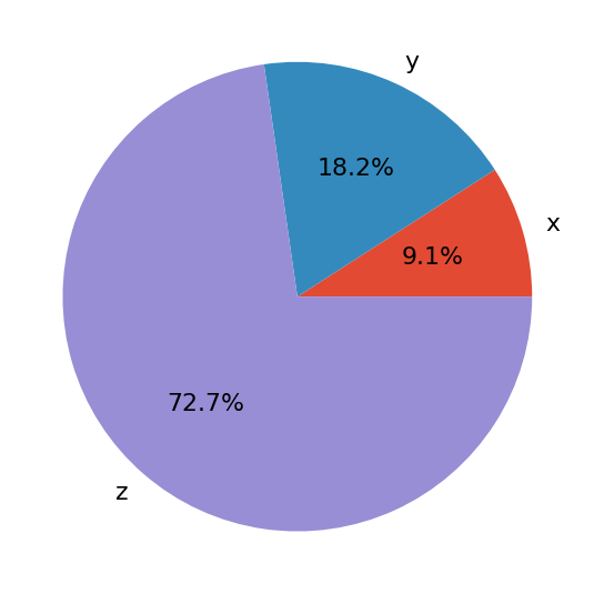
The pie chart shows x as the smallest part of the circle, y as the next largest, and then z as the largest part. The percentages denote the relative size of each value compared to their sum.
Bar Charts
Bar charts also illustrate data that correspond to given labels or discrete numeric values. They can show the pairs of data from two datasets. Items of one set are the labels, while the corresponding items of the other are their frequencies. Optionally, they can show the errors related to the frequencies, as well.
The bar chart shows parallel rectangles called bars. Each bar corresponds to a single label and has a height proportional to the frequency or relative frequency of its label. Let’s generate three datasets, each with 21 items:
>>> x = np.arange(21)
>>> y = np.random.randint(21, size=21)
>>> err = np.random.randn(21)
You use np.arange() to get x, or the array of consecutive integers from 0 to 20. You’ll use this to represent the labels. y is an array of uniformly distributed random integers, also between 0 and 20. This array will represent the frequencies. err contains normally distributed floating-point numbers, which are the errors. These values are optional.
You can create a bar chart with .bar() if you want vertical bars or .barh() if you’d like horizontal bars:
fig, ax = plt.subplots()
ax.bar(x, y, yerr=err)
ax.set_xlabel('x')
ax.set_ylabel('y')
plt.show()
This code should produce the following figure:
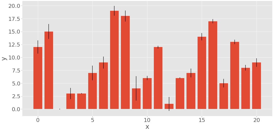
The heights of the red bars correspond to the frequencies y, while the lengths of the black lines show the errors err. If you don’t want to include the errors, then omit the parameter yerr of .bar().
X-Y Plots
The x-y plot or scatter plot represents the pairs of data from two datasets. The horizontal x-axis shows the values from the set x, while the vertical y-axis shows the corresponding values from the set y. You can optionally include the regression line and the correlation coefficient. Let’s generate two datasets and perform linear regression with scipy.stats.linregress():
>>> x = np.arange(21)
>>> y = 5 + 2 * x + 2 * np.random.randn(21)
>>> slope, intercept, r, *__ = scipy.stats.linregress(x, y)
>>> line = f'Regression line: y={intercept:.2f}+{slope:.2f}x, r={r:.2f}'
The dataset x is again the array with the integers from 0 to 20. y is calculated as a linear function of x distorted with some random noise.
linregress returns several values. You’ll need the slope and intercept of the regression line, as well as the correlation coefficient r. Then you can apply .plot() to get the x-y plot:
fig, ax = plt.subplots()
ax.plot(x, y, linewidth=0, marker='s', label='Data points')
ax.plot(x, intercept + slope * x, label=line)
ax.set_xlabel('x')
ax.set_ylabel('y')
ax.legend(facecolor='white')
plt.show()
The result of the code above is this figure:
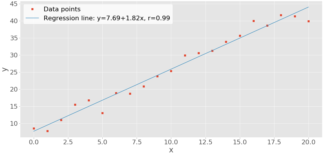
You can see the data points (x-y pairs) as red squares, as well as the blue regression line.
Heatmaps
A heatmap can be used to visually show a matrix. The colors represent the numbers or elements of the matrix. Heatmaps are particularly useful for illustrating the covariance and correlation matrices. You can create the heatmap for a covariance matrix with .imshow():
matrix = np.cov(x, y).round(decimals=2)
fig, ax = plt.subplots()
ax.imshow(matrix)
ax.grid(False)
ax.xaxis.set(ticks=(0, 1), ticklabels=('x', 'y'))
ax.yaxis.set(ticks=(0, 1), ticklabels=('x', 'y'))
ax.set_ylim(1.5, -0.5)
for i in range(2):
    for j in range(2):
        ax.text(j, i, matrix[i, j], ha='center', va='center', color='w')
plt.show()
Here, the heatmap contains the labels 'x' and 'y' as well as the numbers from the covariance matrix. You’ll get a figure like this:
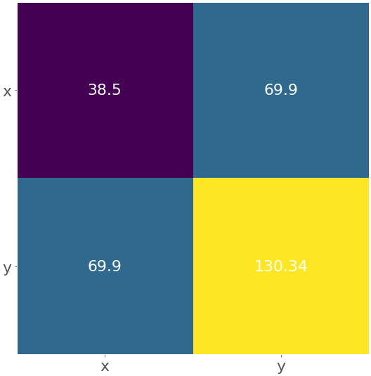
The yellow field represents the largest element from the matrix 130.34, while the purple one corresponds to the smallest element 38.5. The blue squares in between are associated with the value 69.9.
You can obtain the heatmap for the correlation coefficient matrix following the same logic:
matrix = np.corrcoef(x, y).round(decimals=2)
fig, ax = plt.subplots()
ax.imshow(matrix)
ax.grid(False)
ax.xaxis.set(ticks=(0, 1), ticklabels=('x', 'y'))
ax.yaxis.set(ticks=(0, 1), ticklabels=('x', 'y'))
ax.set_ylim(1.5, -0.5)
for i in range(2):
    for j in range(2):
        ax.text(j, i, matrix[i, j], ha='center', va='center', color='w')
plt.show()
The result is the figure below:
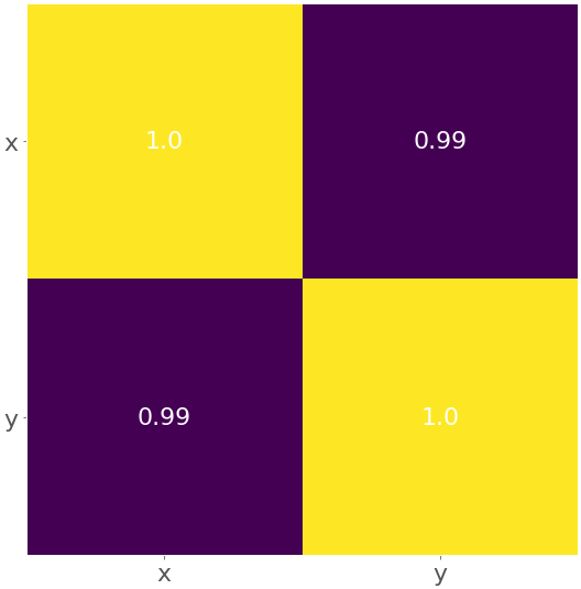
The yellow color represents the value 1.0, and the purple color shows 0.99.
Conclusion
You now know the quantities that describe and summarize datasets and how to calculate them in Python. It’s possible to get descriptive statistics with pure Python code, but that’s rarely necessary. Usually, you’ll use some of the libraries created especially for this purpose:
- Use Python’s
statisticsfor the most important Python statistics functions. - Use NumPy to handle arrays efficiently.
- Use SciPy for additional Python statistics routines for NumPy arrays.
- Use pandas to work with labeled datasets.
- Use Matplotlib to visualize data with plots, charts, and histograms.
In the era of big data and artificial intelligence, you must know how to calculate descriptive statistics measures. Now you’re ready to dive deeper into the world of data science and machine learning! If you have questions or comments, then please put them in the comments section below.