When you’re coding, there’s always a font involved in displaying the text on the screen. Yet, the font that you use is an often-overlooked piece in your programming tool kit. Many operating systems and code editors come with their default monospace fonts that you may end up using.
But there are a bunch of technicalities and features to take into consideration when choosing the best font for your daily programming. That’s why it’s worth investigating the requirements that a programming font should fulfill to make it a perfect match for you.
In this tutorial, you’ll learn:
- How to spot a high-quality coding font
- What characters are important when coding in Python
- Which features of a programming font matter
- Where to download programming fonts
- How to install a font on your operating system
Throughout the tutorial, you’ll consider twenty-seven hand-picked programming fonts that you can use right away. You’ll take a close look at all the fonts and investigate why their particular features are important for you as a programmer. In the end, you’ll be able to decide which coding fonts suit your needs best.
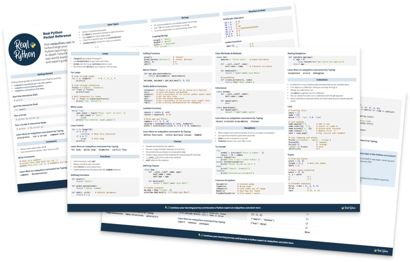
If you want to keep a list of the fonts for future reference, then you can get an overview PDF of all the fonts by clicking the link below:
Free Bonus: Click here to download your comprehensive guide to all the coding fonts in this tutorial.
Take the Quiz: Test your knowledge with our interactive “Choosing the Best Font for Programming” quiz. You’ll receive a score upon completion to help you track your learning progress:
Interactive Quiz
Choosing the Best Font for ProgrammingIn this quiz, you'll test your understanding of how to choose the best font for your daily programming. You'll get questions about the technicalities and features to consider when choosing a programming font and refresh your knowledge about how to spot a high-quality coding font.
🎧 Listen Now: This tutorial has a companion podcast episode created by the Real Python team: Finding the Right Coding Font for Programming in Python. Listen to it together with the written tutorial to deepen your understanding.
Say Hello to Your Next Coding Font
In this tutorial, you’ll take a deep dive and learn about the forms and shapes that make a quality coding font. You’ll encounter significant technical details, handy features, and surprising quirks along the way.
Note: In this tutorial, you’ll focus on the characteristics of fonts that are suitable for Python programming. But the fonts will work similarly in any other programming language.
You’ll notice that all the images in this tutorial have a similar style. The font name is always on the left. On the right, you’ll see a sample string or specific characters worth noting. To kick things off, have a look at the fonts that you’ll examine in this tutorial:
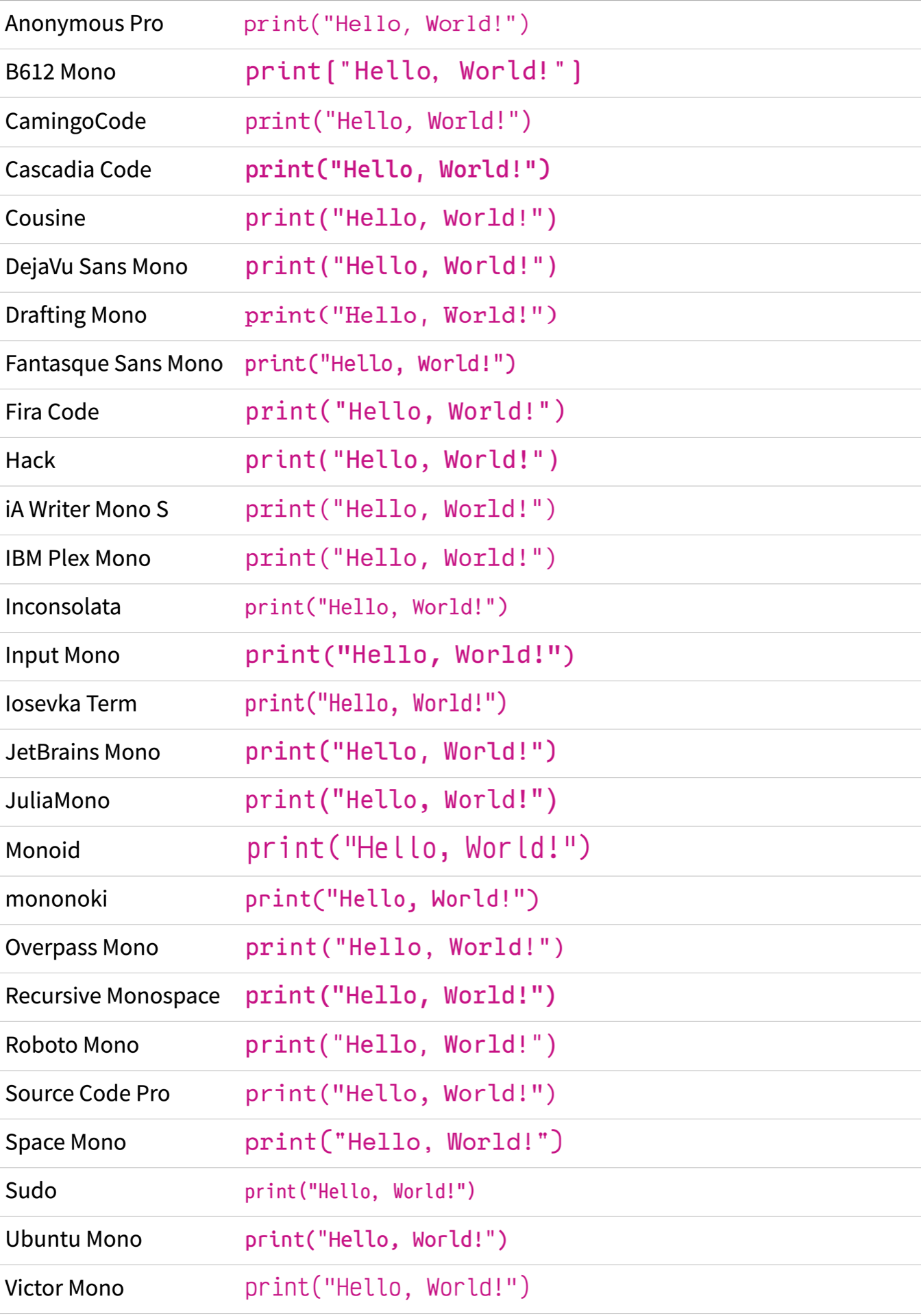
It’s a good idea to open this image in another window and keep it open while you read the tutorial. For example, you can right-click the image above, select Open Image in New Window, and then drag the tab into a new window:
Having the tutorial and the fonts list side by side lets you conveniently compare certain fonts with others. You can even go a step further and print the image to annotate the fonts with your likes and dislikes.
If you’re already excited to try out new fonts in your own coding editor, then you can scroll down to the get your new coding font section. There you can download all the fonts in this tutorial and load them up in your editor. That way, you can get a head start and evaluate any font with your own editor theme, preferred font size, and some familiar code.
Note: Color schemes and font sizes are very personal settings that can easily skew your evaluation of a font. That’s why you won’t see any larger code samples set in any font in this tutorial.
Instead, you’ll see many examples that objectively focus on specific font characteristics, independently of any coding editors.
Once you try out a coding font, you’ll recognize if you like or dislike it. Sometimes it’s just a matter of taste. But sometimes there are reasons why one font might be a better fit for you while another isn’t.
Over the next few sections, you’ll get a tool set so that you can evaluate for yourself what makes a quality programming font.
Consider the Basics
Whether you just wrote your first Hello, World! script or maintain huge codebases, choosing the right programming font will be beneficial for you as a developer.
Before you dig into the characteristics of a font on a character level, there are some broader features to take into consideration. Some of them may filter out a font in your search from the get-go.
For example, a font might not be a good choice if the font doesn’t support your language or if it costs money that you’re not willing to invest. Another criterion could be that the font must be monospace.
In this section, you’ll explore important points of comparison. That way, you’ll know which fonts to include in your circle of coding fonts to consider more closely.
Does the Font File Format Matter?
Fonts come in a bunch of different font file formats. Back in the day, the font format played an important role. Depending on the operating system you were working on, you needed to use a specific font format on the desktop. On the Web, you needed to provide different formats for different web browsers.
Nowadays, the font landscape is less complicated, and you only have three main font formats to consider:
| Format | Main Usage | Extensions |
|---|---|---|
| Compact Font Format (CFF) | Desktop | otf |
| TrueType (TTF) | Desktop | ttf |
| Web Open Font Format (WOFF) | Web | woff, woff2 |
Certain applications and use cases still work better with one format or the other.
On the Web, you’re better off using woff2 web fonts.
For code editors on your desktop, you’re usually fine with either OTF or TTF fonts.
But ultimately, if you have the option, then TrueType fonts are a good choice on any common operating system. The TrueType format offers font developers the functionality of hinting their fonts. Hinting is a fancy term for screen optimization and gives fonts a crisp look on small sizes.
Your operating system may or may not recognize the hinting instructions when it’s rendering a font. But even if your operating system ignores hinting instructions, TTF won’t put you at a disadvantage.
If you’re using a high-resolution display, then screen optimization may be nothing to worry about. Instead, it may be more important that your coding font speaks your language.
Can You Type Your Spoken Language?
A programming font only works for you if you can type any character that you want with it. That’s why you have to consider the character set of a font when choosing a programming font.
A proper character set should contain not only a decent number of characters but also the actual characters that you need in your daily life as a Python programmer.
For example, when you write your code comments in a language other than English, then you may want to pay closer attention to the character set. In such a case, you should look out for the language support list that font distributors provide. On some sites, you can even filter for specific languages that a font must support for you:
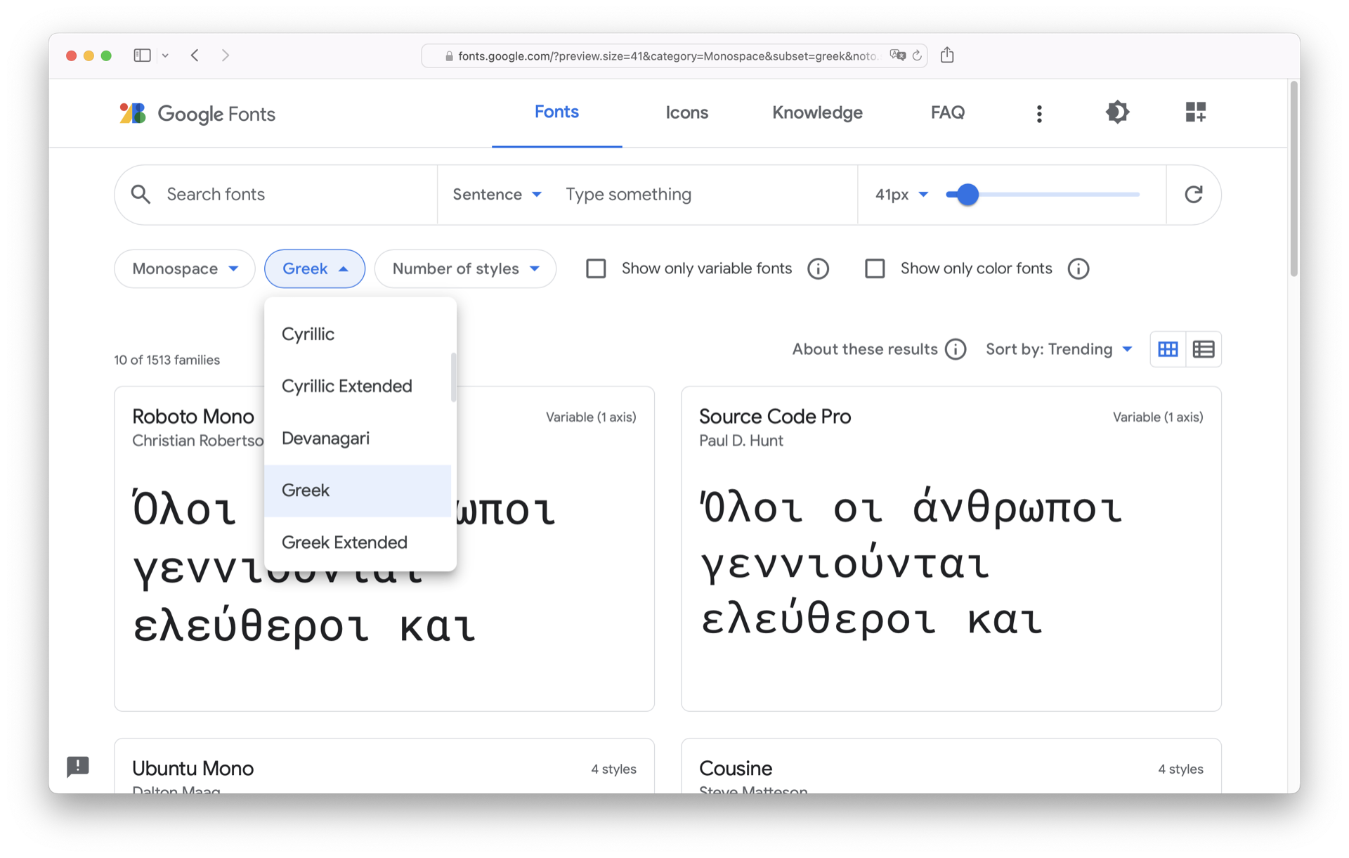
On Google Fonts, for example, you can filter for a variety of languages. That way you can make sure that any font you choose from Google Fonts supports languages that are relevant for your situation.
But worry not! The fonts that you’ll find in this tutorial support a wide range of symbols, scripts, and languages.
How Much Does the Font Cost?
Fonts are software and usually come with a license attached to them. So even when you find a font to download on the Web, you should pay attention to the terms and conditions of the font. Sometimes you need to purchase the font before you’re allowed to use it on your computer.
Note: The pricing for font licenses is usually very reasonable given the amount of work and expertise that it takes to create a high-quality font.
If you want to learn more about the process of creating a font, then check out the article From idea to typeface: How are fonts designed? or How typefaces are designed & fonts are made.
The good news is that over the last few years, many start-ups and software companies have released free versions of fonts to use for programming. This gives you a big pool of high-quality fonts to choose your next favorite programming font from.
If you’re willing to pay money for your font, then there are great options out there, too. For example, you might try Akkurat Mono, Berkeley Mono, Dank Mono, GinTronic, or MonoLisa.
But don’t grab your wallet just yet! For this tutorial, you’ll only see fonts that are free to use.
Is the Font Monospaced or Proportional?
Common text fonts are proportional.
That means that the characters are spaced individually based on the proportions of the character.
For example, the lowercase i will be much more narrow than the uppercase W:

Programming fonts, on the other hand, are traditionally monospaced. Monospace means that every character in a font takes up the same horizontal space:

There’s no strict rule that you must use a monospaced font for programming. But there are good reasons for using monospace fonts in programming, which is why they’re so popular among coders:
-
Alignment and readability: In a monospace font, each character occupies the same width, making it easier to align code elements vertically, which improves readability. This is particularly helpful in languages that use indentation to define code blocks, like Python.
-
Distinct character recognition: Monospace fonts clearly distinguish between similar characters, reducing the potential for confusion between easily misread characters. This is important for avoiding syntax errors and improving code maintenance.
-
Consistency: Monospace fonts enable uniform appearance across different text editors and platforms, ensuring that code looks the same whether you’re viewing it in a local text editor or on a remote server.
-
Cursor navigation: Using a monospace font makes it easier to navigate through the code with the cursor, as each character takes up the same horizontal space. This helps to accurately locate the cursor, especially for tasks such as selecting code or performing find-and-replace operations.
-
Whitespace visibility: Monospace fonts clearly show the amount of whitespace, including spaces and tabs, which is essential for a language that’s sensitive to whitespace usage like Python. This helps developers avoid indentation errors and ensure code is properly formatted.
Especially when you have tabular content, or you want to use the font in the terminal, a monospaced font is the better choice. Otherwise, your well-crafted text-based user interface for your dice-rolling application or your rich Wordle game may break.
Does the Font Have a Family?
Have you ever pushed the B or I button in a text editor to make the font bold or italic? Believe it or not, fonts that support this behavior are actually families of several related fonts.
The same is true in your code editor. Depending on the theme that you’re using, some parts of your code may be rendered bold or italic. If you want a font that supports this behavior, then you must actually use multiple fonts that work together visually. In that case, using fonts from the same font family is a good idea.
A font family shares the same design philosophy and character set. This makes rendering some parts in bold or italics visually cohesive and organized.
Sadly, not every font has a family. For many editor themes, this doesn’t matter because they work with one weight and slope anyway. But if you want to display your code in different styles, then you might only consider fonts that have a family.
Note: The fonts that you’ll find in this tutorial all belong to families. On the screenshots, you’ll usually see the regular cut.
Sometimes the family only consists of four cuts. Besides the normal, regular weight, you often find an italic slope, as well as an additional bold weight with the corresponding bold italic slope:

Other fonts have huge families that not only contain weight and slope cuts but also width variants. This can be a convincing argument for you, as it lets you fine-grain your font choice based on your weight, width, and slope preferences.
To see how many family members each of the fonts in this tutorial has, you can download the programming font comparison by clicking the link below:
Free Bonus: Click here to download your comprehensive guide to all the coding fonts in this tutorial.
In the PDF that you can download above, you’ll also find out if the font has a variable variant. If this is the case, then you only need to work with one variable font file. This font file contains information for you to change the weight, width, slope, values, and sometimes even other font characteristics yourself.
Variable fonts are a game changer for dynamic website layouts. As a web designer, you can show an extended version for headlines and a narrower style for the copy text— by only serving one font file. If you want to learn more about variable fonts, then you can check out Google’s Variable Font Knowledge site.
Does the Font Match Your Personal Taste?
When you want to evaluate a font, then it’s vital to note your immediate reaction to the general feel of a font. Every font has some characteristics that you may love or loathe.
Have a look at this overview of font with the famous quick brown fox pangram. Read every line, and recognize any feelings that you have about the font:
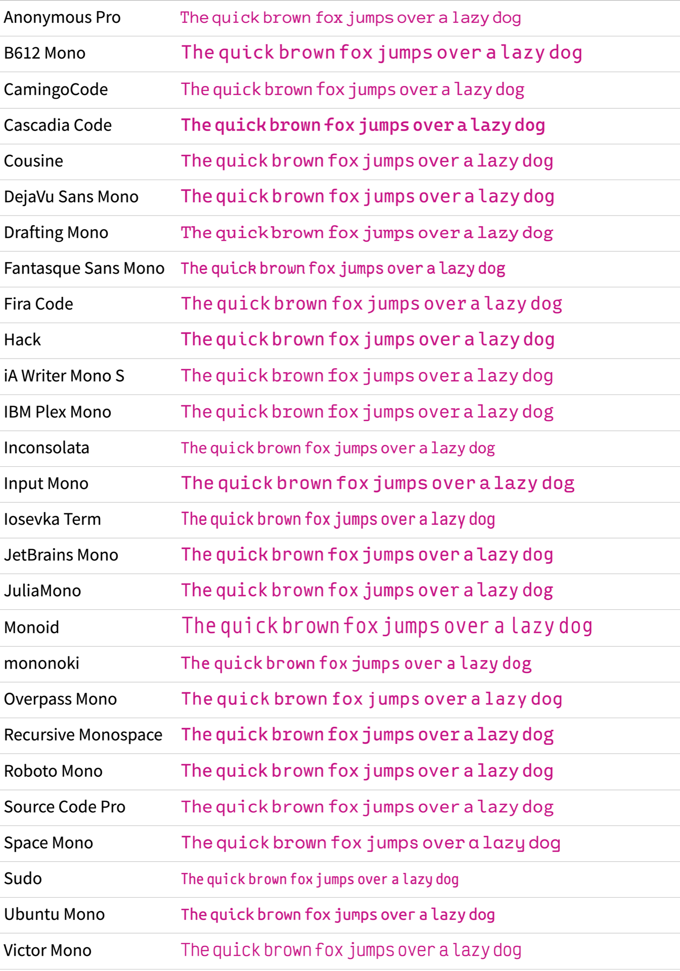
If you liked some fonts in the picture above better than others, then you’re off to a good start. After all, choosing a font is about personal taste. Some fonts may look dated to you, others too progressive. When you’re looking at the length of the lines, some may be too long, while others feel too narrow.
Note: All the fonts in the overview are rendered in the same size. Yet, some fonts seem bigger than others. You’ll explore this phenomenon later in this tutorial when you compare the uppercase and lowercase sizes.
If you look at the overview of fonts and can’t tell which ones you like, then worry not! Over the next few sections, you’ll take a look at specific characteristics so that you know what to look out for when choosing the best programming font for you.
Next, you’ll study the shapes that fonts are made of.
Look at the Shapes
Once a font fulfills your requirements regarding language support, license terms, and monospacing, it’s time to have a closer look at the design of the font.
While some fonts are technical masterpieces, the visual design is what’s most obvious to you as an end user. A good font is only a good font for you when it pleases your eyes and makes your code more readable.
In this section, you’ll zoom in on the shapes of a font’s characters. This way, you’ll get a better understanding of what details to look out for when choosing the best programming font for you.
Character Anatomy
Remember when you were first learning how to write? You probably paid a lot of attention to every single line and dot, as well as how your letters lined up and filled the space on the page. There’s a lot more to a single character than meets the eye:

In the upcoming sections, you’ll run into some typographic terms that may sound strange to you. That’s fine! After all, you’re a programmer and not a designer.
Still, knowing some basic terms will help you undestand some specifics of a font better. Here are some of the most important typographic terms that describe the anatomy of a chracter:
- Bounding box: The rectangular area that encloses a character
- Baseline: The line upon which the characters sit, providing a consistent reference for vertical alignment in typography
- x-height: The height of the lowercase letters in relation to the baseline
- Stroke: The individual lines that form the structure of a character
- Cross stroke: A horizontal or diagonal stroke that intersects the main vertical or diagonal strokes of a character
- Stem: The main vertical or diagonal stroke of a character
- Slope: The angle at which the characters in a font are tilted
- Serif: The small lines that look like arms and feet at the top, bottom, or ends of the main strokes of a character
- Tail: A stroke that extends from the bottom of a letterform
- Terminal: The endpoints or finishing points of strokes in letterforms
- Bowl: The rounded, enclosed part of a character
- Single-Story: A type of lowercase letter that has a single, closed bowl
- Double-Story: A type of lowercase letter that has two distinct parts
- Ascender: The upward-extending part of some lowercase letters, which surpasses the x-height
- Descender: The downward-extending part of some lowercase letters, which goes below the baseline
- White space: The empty or negative space surrounding and within characters
Similar to knowing syntax in a programming language, knowing typographic terms makes talking about a character’s anatomy less ambiguous. So, it’s a good idea to reference the list above every time you don’t understand a term in this tutorial.
Letters
Type designers must give every single character their utmost attention, so they often spend years tweaking these shapes.
In a well-designed font, all letters work together to create a homogeneous look.
Still, the lowercase and uppercase letters from a to z are the most important letters of all, as they’re used the most.
You already had a look at the general feel of the fonts in this tutorial in the previous section.
Now, take a look at some letters in particular, starting with the lowercase letters a, g, j, k, and y.
These five letters can give you a good impression of some design choices that type designers made when designing the font. In Cascadia Code, the lowercase letters contain a similarly shaped descender:

When you look at the descenders of g, j, and y, then you notice the same swung shape that you can find at the top of a and in the arm of k.
This gives the font a tidy and cohesive look.
But even when the letters don’t share similar shapes, you can often tell that they belong together:

In Source Code Pro, the lowercase g clearly follows a different design.
But the same stroke width makes these letters a harmonious team.
If you compare the g of both fonts above, then you’ll notice two typographic variants.
Cascadia Code features a single-story g, while Source Code Pro contains a double-story g.
Note: Some fonts provide the option to switch the design of characters. You’ll explore stylistic options later in the tutorial.
The lowercase a is a letter where you often find typographic variants, too.
In the coding fonts of this tutorial, all the fonts except one have a double-story a by default.
The one font with a single-story a is Space Mono:

Single-story characters have more space for their bowl and tend to look less dense. There’s no advantage of one variant over the other as long as the font is designed with a clear design philosophy in mind.
Take Fantasque Sans Mono for example:

When you look at Fantasque Sans Mono in the font overview, then you may notice that the font gives a cheerful impression.
Zooming in on single letters makes you understand why:
especially k and y look like they’re dressed up for a dance party!
Still, a type design like this works because the designer shaped all the characters less conservatively. Have a look at some uppercase letters:

Modern uppercase letters came from Roman square capitals that were carved in stone. Since it’s way easier to carve straight lines than expressive round forms, most uppercase letters of the Latin alphabet are rather geometric. But as you can see above, type designers still find ways to give uppercase letters their own personality.
A fun uppercase letter to look at is Q.
Although the letter Q might not come up often in your code, you can get a sense of a font’s playfulness by checking how designers shape the tail of Q:

The tail of Draftings Mono’s Q looks like a waterfall coming out of an O.
In Victor Mono, the tail looks like a river floating underneath the letter:

Other fonts like Hack keep it straight:

In all of the screenshots above, you can see the letters inside of boxes that have the same size within each font. That means a type designer must fit any character of a font in a box like this.
For letters like a, g, j, k, and y or A, B, G, R, and Q, the designer usually has just enough space to give them deliberate design.
In the next section, you’ll explore letters where the surrounding space plays a more important role when designing them.
Space Usage
A big contributor to the general feel of a monospace font is how the type designer formed the shapes of characters like i, l, r, f, and t that usually wouldn’t take up much space in proportional fonts.
In a monospace font, every character has the same amount of space. So a narrow character may end up looking lost in its bounding box. To solve this problem, type designers find very interesting solutions to make these characters take up more space:

The r of JetBrains Mono has an extended terminal that almost looks like the shoulder of a lowercase n.
Fira Code takes a different approach by giving the terminal of the r a slab serif shape:

Another interesting design solution is the terminal of Anonymous Pro’s lowercase letter t:

To fill up the space of the bounding box, the t contains a terminal that almost looks like a slide.
Fun!
Monospace fonts often rely on exaggerated cross strokes and serifs for some letters to make use of empty space. Other letters usually need the opposite treatment.
Characters like m, M, w, and W tend to be squeezed into their bounding boxes.
Here, type designers have to find ways to remove parts of a letter without sacrificing readability:

A remarkable characteristic of Ubuntu Mono is the cut middle stem of the lowercase m.
This design decision creates visual space for a letter that often struggles with finding space to put its three legs.
Handling the available space gets even harder when a font is generally narrow. Sudo solves this by bending the diagonal strokes:

In this section, you focused on letters that are commonly problematic to fit into the bounding box. Every monospace font has unique features to solve space constraints. You may favor some shapes over others.
As a programmer, you constantly work with letters. For example, you create strings, write comments, or document your code. Therefore, it makes sense to take a close look at the design of letters when choosing a programming font.
Another integral part of any programming language is numbers. Numbers are also an integral part of any font. Read on to find out what details matter when you evaluate the numbers of a programming font.
Numbers
If you’re currently taking your first steps into data science with NumPy, or you’re representing rational numbers with fractions, then your Python code will contain a bunch of numbers. Even when you just want to check if a string contains a substring, you’ll end up with some integers here and there.
Either way, when a number appears in your code, you don’t want to second-guess which number it is. One important factor for the readability of a number is the white space. That’s the space in the bounding box that’s not occupied by a numbers’ stroke drawing.
Have a look at the numbers zero (0) to nine (9) of B612 Mono:

In most monospace fonts, the numbers are designed in a way so that the inner space is as open as possible. B612 is no exception. However, something interesting is happening with the zero of B612.
Usually, type designers use one of two stylistic variants for their zeros in monospace fonts:
- Slashed zero
- Dotted zero
You’ll explore the reason for these two stylistic variants in the next section when you look at similarly shaped characters.
But the short answer, for now, is that it’s important not to confuse the zero with the uppercase letter O.
For B612, you have to decide if you like the open design of the zero for the cost of differentiating it from the uppercase O or if you’d rather have a clearer distinction in your programming font.
As an example, Inconsolata features a slashed zero that’s easily distinguishable from an uppercase O:

You may have also wondered about the H7C9T string in the screenshots above.
With this string, you can investigate how the height of the numbers corresponds to the height of the uppercase letters.
For a monospace font, you may want the numbers and uppercase letters to be roughly the same height. Otherwise, the combination of both may look a bit bumpy:

In a font like Sudo, the height of the numbers and uppercase letters differs a lot. For this font, you may argue that you accept the bumpiness in order to have characters that are very distinguishable, not only by form but also by height.
Other than that, Sudo features a dotted zero, just like Cousine:

For dotted zeros, you can even find variants where the dot isn’t a circle or square but an oval. For example, check out the Hack font:

Maybe some Python developers are especially fond of this special dot style because the zero looks a bit like the eye of a snake.
Personally, you may find quirky design choices in your coding font charming.
For example, maybe you like an excessive Q tail or a zero without a dot in the middle.
Everything is allowed, as long as you like the design, the font is readable, and you can differentiate the characters that you’re writing.
Differentiation
When you write code, it’s not uncommon for a typo to introduce weird behavior in your code. Sometimes, seemingly minor typos can even cause serious harm:
In 1962, the Mariner-I rocket (meant to explore Venus) veered off track and had to be destroyed. It had a few software bugs, and one main problem was traced to the following Fortran statement:
DO 5 K = 1. 3.The
.should have been a comma. The statement was meant to be a DO loop, as inDO 5 K = 1, 3, but while typing the program, it was mistyped asDO 5 K = 1. 3. (Source)
Hopefully, your bugs have less dramatic effects. Still, it seems like a good reminder to have a closer look at some similar-looking characters in your programming font.
Here’s the list of fonts with similar-looking characters. Squint your eyes while you try to read the samples:
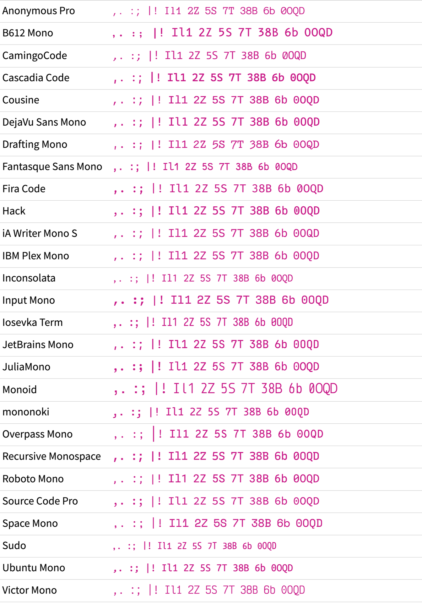
When you squint your eyes, you blur your vision a bit, and some character shapes become less obvious. Chances are that some of the fonts above gave you a harder time deciphering the different characters than other fonts.
Take the dot (.) and comma (,) of Roboto Mono, for example:

When you zoom in, the dot (.) and comma (,) of Roboto Mono are clearly two different characters.
The dot is a soft circle, while the comma has sharp corners.
However, for these shapes, the visual weight is quite similar, so they’re hard to differentiate in small sizes. It’s often a better approach for a type designer to exaggerate the form of the comma instead.
A good example of a font with a more extreme comma shape is mononoki:

Although both characters have soft corners, the long tail of the comma clearly separates it from the dot.
Another character pair to look at is the vertical bar (|) and the exclamation point (!).
In Python, the vertical bar represents the bitwise OR operator.
In other programming languages, you can use the vertical bar as an or Boolean operator. In the terminal, you can use the vertical bar as a pipe operator to chain commands.
When the exclamation point occurs outside of strings, it’s often a negation operator. You commonly use it when you want to compare objects in Python.
Ideally, the vertical bar should be longer, and there should be a comfortable space between the dot and the bar of the exclamation point. Iosevka Term does a good job with both:

In Iosevka Term, the vertical bar touches the bounding box at the top and at the bottom. The bar of the exclamation point is notably smaller and is at a reasonable distance from the dot.
Focusing on vertical characters a bit longer, have a look at the uppercase I, the lowercase l, and the number one.
The characters in this trio are notorious for looking similar. For example, check out Overpass Mono:

Even in this big size, the three characters are hard to distinguish.
The only difference is the upper-right serif on the uppercase I and the angle of the one’s arm.
More often than not, you’ll find at least two very similar shapes when looking at I, l, and 1 side by side.
The Anonymous Pro font is no exception:

The only difference between the uppercase I and the lowercase l is the missing serif on the upper right of the lowercase l.
As if the font wanted to make up for it, you can identify the number one pretty clearly with its arm.
In Drafting Mono, the lowercase l and the one look similar:

Luckily, there are also fonts where all three characters look different. For example, here’s JetBrains Mono:

Instead of having a lower-left serif, JetBrains Mono rocks a dynamic curve.
You can spot the font’s clarity in other potentially similar-looking number and letter combinations like 2Z, 5S, 7T, 38B, 6b, or 0OQD, too:

Fira Code is another good example where the designers put effort into carving out differences in certain shapes:

In the examples of this section, you’ve seen similar-looking characters next to each other.
But keep in mind that those characters may appear alone in your code without the context of potential look-alikes.
You really want to be sure that you don’t mistake an I for an l or a comma for a dot.
By looking closely at some of the critical shapes of a font, you get a good feel for your coding font. Some of the characteristics that you investigated with coding fonts in mind will also be relevant when you look for a font in general.
In the next section, you’ll dive in even deeper to explore the key characteristics of a font for you as a Python programmer.
Study Common Python Syntax Symbols
Once you like the general feel of a font and have investigated critical shapes, it’s important to pay attention to characters that are essential to Python’s syntax.
Symbols that are relevant to the syntax of a programming language appear over and over again in your code. That’s why it’s a good idea to have a closer look at them.
Underscores
If you follow Python’s naming conventions when naming variables or when constructing classes, then the underscore character (_) will appear repeatedly in your Python code.
This makes the underscore arguably one of the single most important characters to focus on when choosing a programming font as a Python programmer.
Before you have a look at the list of coding fonts, here’s what you should consider for your underscore evaluation:
- Vertical position: Is the underscore positioned on the baseline or below?
- Length: Does the underscore have some space to the left and right, or is it drawn over the full length of the bounding box?
- Thickness: How does the thickness look compared to the other characters?
There’s no right or wrong way to design the underscore. So, again, it’s up to your personal taste which design of the underscore you like most when reading over the list of fonts.
Okay, ready? Here’s the list of all the coding fonts displaying def __init__(self, snake_case): as a sample string to explore the underscore design:
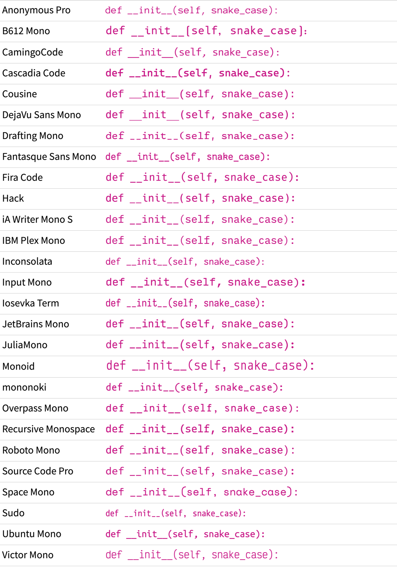
Now that you’ve had a look at all the snake case examples, have a look at some of them more closely, starting with JuliaMono:

The underscore of JuliaMono sits comfortably on the baseline.
This creates a pleasant visual line with the serifs of the lowercase i.
On the other end of the spectrum, you can find B612 Mono:

In the B612 Mono font, the underscore sits significantly below the baseline. Although this doesn’t create a nice connection to adjacent serifs, it can make the underscore stand out more.
You may have also spotted that some fonts display a line when you type a double underscore. CamingoCode is such a font:

The same goes for DejaVu Sans Mono. Here the underscore also takes up the whole box and creates a line when two underscores appear next to each other:

A connected line like this may look nice, but it won’t tell you at a glance whether you have one or two underscores.
In the DejaVu Sans Mono font, you can also see a high contrast between the stroke weight of the font and the thickness of the underscore.
If you feel strongly about the gap between the underscores, then make sure to download the programming font comparison PDF by clicking the link below:
Free Bonus: Click here to download your comprehensive guide to all the coding fonts in this tutorial.
In the comparison PDF, you’ll find a checkbox for each font that tells you if the double underscore creates a line or contains a gap. That way, you can quickly select only those fonts that match your taste.
The underscore is undoubtedly an important character when programming in Python. Evaluating how a font’s underscore is designed is a vital step in finding your perfect programming font. That’s especially important when two underscores are combined into a double underscore.
The double underscore is not the only character combination that appears in your code. Read on to explore other common character combinations next.
Parentheses and Curly Braces
Parentheses (()) will probably appear quite often in your Python code.
They’re essential when working with functions or tuples.
If you don’t want your parentheses to steal the show, then a font like JuliaMono is a good choice:

In JuliaMono, the parentheses almost look like parentheses from proportional fonts. They’re light and don’t take up much space in their box horizontally. Vertically, they’re very long, though.
If you don’t want to miss a parenthesis ever again, then check out mononoki:

In mononoki, the parentheses almost create a full circle when they appear next to each other.
Curly braces ({}) appear here and there in your day-to-day Python code.
You’ll see them when you create dictionaries or sets in Python, or when you work with f-strings.
Especially when you use Jinja templates, it’s a good idea to inspect the design of curly braces since they’ll be everywhere in your templates.
Just like with any other characters, coding fonts feature a wide range of different design approaches for curly braces. Input Mono, for example, contains curly braces with a rather snappy look:

As if the designer wanted to make up for it, he gave the hash mark (#) a more conservative design.
You’ll explore this character and the at sign (@) next.
At Signs and Hash Marks
Another interesting design choice in the mononoki font from the previous section is the design of the at sign (@).
Its bowl is completely filled.
The overall design is rather slim.
However, there are fonts where the @ symbol is even slimmer:

If you’re a fan of Python’s decorators, then the @ sign of the Recursive Mono font might be a bit too narrow for you.
In that case, have a look at Space Mono:

In Space Mono, the @ symbol shows that there’s a clear design idea behind it.
The rectangular shape makes good use of the available space by not wrapping the swirl around the whole lowercase a.
Comments in Python and the shebang start with a hash mark (#).
While the shebang only appears once in a file, comments can be all over the place.
Design-wise, it’s a rather simple character with two vertical lines crossed by two horizontal lines. However, the part of the character where the two vertical lines cross the two horizontal lines can appear dense. That’s why you can find interesting design choices for the hash mark in your coding fonts, too.
In IBM Plex Mono, the designers gave the center more space by omitting the horizontal bars in the middle:

The designer of Drafting Mono solved the space issue in the middle by thinning the bars of the character:

A common design that you can see in hash marks is a slight slant. Instead of using perfectly vertical bars, some designers give the lines an angle.
In Fira Code, the hash mark has decent space in the cross-section and a dynamic look due to the slanted vertical bars:

Just like in IBM Plex Mono and Drafting Mono, the designers of Fira Code moved the upper horizontal bar slightly to the right.
Have a look at Ubuntu Mono to see what happens when the vertical bars are slanted, but the horizontal bars stay in place:

In Ubuntu Mono, the hash mark may look a bit skewed for your taste. Or perhaps this small design detail makes the font even more charming.
Asterisks
In Python, the asterisk (*) can have different jobs. You can use this little star symbol as an operator or a way to unpack lists and dictionaries.
Just like with the characters you investigated before, type designers find ways to add their own style to the asterisk. To begin with, check out a more conventional style of the asterisk character in Source Code Pro:

The asterisk of Source Code Pro has five arms and sits roughly at the x-height of the lowercase characters.
The size of the asterisk symbol above isn’t too big or too small. To see an asterisk that’s on the smaller side, check out Cousine:

In Cousine, the asterisk is much smaller than the lowercase letters of the font.
It’s also positioned way higher—at the ascender height, where the stem of the lowercase k ends.
As a Python developer, you may want a font that features an asterisk that isn’t an afterthought. In that case, iA Writer Mono S might be a good pick:

In this font, the asterisk has almost the same size as the lowercase letters.
With an asterisk of that size, you may spot kwargs and args in Python functions more conveniently.
However, you may find a smaller asterisk, which looks more like a superscript, to be visually more distinct and easier to spot.
In the examples above, the asterisk has five arms. But you don’t need to be content with this number. You can find fonts with even more asterisk arms:

In Victor Mono, the asterisk is similarly big compared to the asterisk in iA Mono Pro. On top of that, the asterisk has six arms, giving the symbol even more visual weight.
If you’re still not satisfied with the number of arms, then check out Space Mono:

In Space Mono, you can enjoy the visual weight of eight arms on the asterisk.
The downside of this high arm count is that you could confuse the asterisk with the bullet point (•) in smaller font sizes.
An honorable mention for the design of the asterisk goes to the Drafting Mono font:

In Drafting Mono, the center of the asterisk isn’t filled. This gives the asterisk a distinctive look that resembles a blossom. Hopefully, the flowerish design doesn’t attract any bugs to your code!
Although it might be a creative excuse, you shouldn’t blame your programming font for mistakes that you introduce into your code. So looking at the important shapes of characters that frequently appear in your Python code is crucial.
If you’re also working with other programming languages, then you may pay closer attention to the important characters in their syntax:
| Language | Characters |
|---|---|
| HTML | < / > |
| JavaScript | {} ; |
| MATLAB | % |
| PHP | $ |
Depending on your field of work, you may think of other characters that are important to you.
You may also wonder about symbols like the plus (+) or the equal sign (=).
While the design of these characters is usually pretty straightforward, it’s worth looking at them from a different angle.
You’ll do this in the next section, where you’ll explore different visual and technical features that programming fonts offer.
Investigate Font Features
In the previous section, you fixed your gaze on the shapes of some characters in a font. In this section, you’ll zoom out a bit and look at the visual style of a font, as well as some technical features that a programming font may contain.
Vertical Alignment
When you studied the underscore (_), you were already looking at the vertical alignment of a character compared to the baseline of a font.
For you as a programmer, it’s also important how characters that often appear together are vertically aligned compared to each other.
Take, for example, this piece of Python code:
>>> counter = 0
>>> counter += 1
In this example, you define a counter and use the += operator to increase the value of counter by one.
The programming font of your choice should ideally position symbols that you use together in a harmonious way. The characters that you should take into consideration are some of the ones you use in augmented assignments or for type hints to annotate return types.
Look at the examples below and take note of how the pairs are vertically aligned.
Ideally, the vertical center of the floating characters isn’t higher or lower than the equal sign (=) or the dash (-):
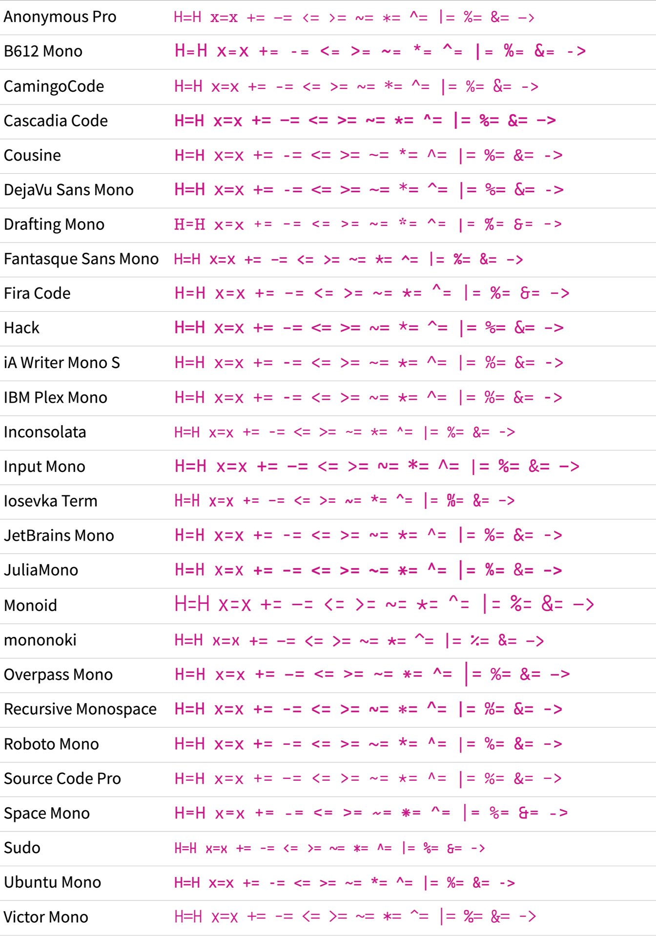
In the example strings above, you can see a bunch of floating characters in combination with the equal sign (=) or the dash (-).
These examples give you a good impression of how the pairs are vertically positioned next to each other.
You can also see the sample strings H=H and x=x in the list above.
When you examine a combination like this, then you can get a feeling of how the uppercase and lowercase sizes play together with operator symbols and expressions.
You may have also noticed that some fonts appear bigger than others in a list like the one above. You’ll explore the reason behind this in the next section.
Uppercase and Lowercase Sizes
One essential characteristic of a font is its size, which can influence how easy it is to read and how it looks on a page. However, you can perceive the size of a font differently depending on its uppercase height and its x-height.
When you set the font size, then the application will set the bounding box to that size. Depending on how the uppercase and lowercase letters are sitting in the bounding box, a font can appear bigger or smaller compared to another font that’s set in the same font size.
To see this effect in practice, have a look at the font list again:

All the fonts are set in the same font size. Yet, some look bigger, and some look smaller.
Take Monoid, for example:

In the Monoid font, the uppercase H almost fills the whole bounding box. The lowercase x also sits quite comfortably in the bounding box.
Unless you write in all caps, the x-height of a font will determine if the font looks larger or smaller. A font with a high x-height will have more space dedicated to lowercase letters, making them appear larger relative to the uppercase letters.
In contrast, a font with a low x-height will have less space devoted to lowercase letters, making them appear smaller relative to the uppercase letters. Sudo is such a candidate:

If you set Sudo in the same font size as Monoid, Sudo will always look smaller. Luckily, in your code editor, you’ll probably choose one font to work with. So if a font appears too small, then you can increase the font size without side effects to other fonts.
But the font size isn’t the main benchmark that makes Sudo seemingly smaller than Monoid. The width of the bounding box is quite narrow compared to other fonts.
The font width is a setting you usually can’t adjust in your code editor. Luckily, there are options you can take into consideration instead.
Font Width and Weight
Remember that all fonts mentioned in this tutorial come in families. Usually, the weight styles of the family are these:
- Regular
- Italic
- Bold
- Bold Italic
In addition to the weight styles, you can sometimes find width styles like narrow or extended in the family. Just like there’s no rule about the size of characters in their bounding box, there’s no rule about the standard width.
Have a look at the width of the phrase Minimal Wisdom set in Cascadia Code first:

Now, compare the width of Cascadia Code with the width of Iosevka Term:

Although both Cascadia Code and Iosevka Term are set in the same font size, Iosevka Term is much narrower.
Note also that both are set in regular style. Yet, Cascadia Code looks much bolder.
If you’re looking for a font where the regular style sits somewhere in the middle, then Input Mono is a good choice:

Depending on the design of a font, the regular size might not fit your personal taste. A font may look too bold for you, so you’re better off choosing a lighter variant. Other times, a thinly designed font may look too fragile on your display.
Often you can find the sweet spot for your perfect programming font by looking at what styles the font family offers and then by playing around with the width and weight variants of a font.
Note: The regular style with a normal width should be your go-to style when choosing your programming font. This is usually the default style that a code editor tries to find when you set the font.
If you choose an overly exotic width and weight combination, then some code editors may not display the font correctly. Similarly fragile are ligature features that some fonts offer. In the next section, you’ll find out why.
Ligatures
Ligatures are a typographic feature that combines two or more characters into a single character. They were originally developed to improve the appearance of handwritten text and are now commonly used in printed text. Ligatures can enhance the readability of a font by reducing the space between characters and improving the flow of the text.
In recent years, more and more programming fonts ship with a ligature feature.
Once you enable ligatures in your code editor, some character combinations will merge into one character. For example, a dash (-) and the greater-than sign (>) will become an arrow.
Fira Code is popular for the design of their ligatures:

By definition, a ligature feature substitutes two characters with one. In consequence, the ligature needs to be exactly double in width. Otherwise, the font wouldn’t appear monospace anymore.
Fonts like Victor Mono celebrate this newly won width for their ligatures by stretching them as far as they can:

Some programmers say that ligatures make their code more harmonic. For others, ligatures in coding fonts can be distracting as they make some expressions hard to read.
As always, taste varies from person to person. That’s why some type designers offer fonts with and without ligatures for you to choose from.
Last but not least, keep in mind that not all coding editors support ligatures. So, when you’re in doubt, it’s better to use a font without ligatures.
Stylistic Options
When you publish a Python package on PyPI, you may get feature requests from your users. As a developer, you then have to decide if the suggestions make sense to you and your vision or if you’d rather reject those ideas.
Type designers deal with a similar situation. For example, some users like their zero dotted, while others like the zero slashed. Luckily, there can be more than one zero in a font. That way, you as a user can choose which version you want to see when coding.
However, utilizing these stylistic options in practice can sometimes be complicated. Depending on the font, you may need to preconfigure your font settings before downloading to ensure that you get the version you want.
Alternatively, some editors allow you to choose stylistic alternates by selecting a stylistic set of a font. That’s similar to the ligature feature that you learned about above. But not all editors support stylistic sets, which may burst your dream of a special zero type.
Considering all the features that a programming font may offer can be confusing. If you’re overwhelmed by the options, then you can use this table to guide you:
| Style or Feature | Standard |
|---|---|
| Weight | Regular |
| Width | Normal |
| Ligatures | No |
| Stylistic Options | None |
If you really feel strongly about certain character features, and the font offers them as a stylistic option, then there’s no harm in trying it out. But keep in mind that when you stick to the standard version of a font first, you’re getting the version that the type designer considered the default.
Either way, it’s a good idea to write some code with the font and get a feel for it. And for this, you need to get the font on your system.
Get Your New Coding Font
There are multiple places to find free programming fonts to download. When you just search for the font name of your choice, then you’ll find a bunch of websites that offer the font. Some of them are trustworthy, others not.
That’s why it’s a good idea to download the fonts directly from the font’s distributor. This will ensure not only that you download the correct fonts but also that you work with the most up-to-date version of the font.
In this section, you’ll find download links to all the fonts that you explored in this tutorial. Once you pick the font of your choice, you’ll also learn how to install the font on your operating system and use it in your code editor.
Downloading Your Coding Font Pick
If a font in this tutorial caught your attention, then you can click its download link in the table below. The link will lead you to the font’s distribution page, where you can download the font to your computer.
And no worries if you can’t pick just one. It’s a great idea to download more than one font and play around with them on your system!
Here are the free fonts that you looked at in this tutorial:
| Name | Download Link |
|---|---|
| Anonymous Pro | Download |
| B612 Mono | Download |
| CamingoCode | Download |
| Cascadia Code | Download |
| Cousine | Download |
| DejaVu Sans Mono | Download |
| Draftings Mono | Download |
| Fantasque Sans Mono | Download |
| Fira Code | Download |
| Hack | Download |
| iA Writer Mono S | Download |
| IBM Plex Mono | Download |
| Inconsolata | Download |
| Input Mono | Download |
| Iosevka Term | Download |
| JetBrains Mono | Download |
| JuliaMono | Download |
| Monoid | Download |
| mononoki | Download |
| Overpass Mono | Download |
| Recursive Mono | Download |
| Roboto Mono | Download |
| Source Code Pro | Download |
| Space Mono | Download |
| Sudo | Download |
| Ubuntu Mono | Download |
| Victor Mono | Download |
Although these fonts are free to download, you may still need a license depending on a particular use case. For example, maybe you plan on using the fonts in a commercial setting.
If you want to get an overview of the fonts with more details, then you can download the bonus PDF by clicking the link below:
Free Bonus: Click here to download your comprehensive guide to all the coding fonts in this tutorial.
Installing a Font for Use
Just like with other software, installing a font is different for each operating system. However, the installation procedures for Windows, Linux, and macOS have three steps in common:
- Locate the downloaded font file.
- Double-click the font file.
- Press the Install Font button.
Once you have the font installed, you can adjust the settings in the code editor of your choice.
With the font available on your operating system, you can go ahead and choose it as your default programming font in your coding editor. Sometimes you need to restart your code editor after you install the font. After that, you can change the font in the code editor’s settings.
In most programming editors, you can change the coding font when you follow the steps below:
- Go to Settings
- Navigate to Editor or Text Editor
- Look for the Font setting
- Select your coding font
In some code editors like Visual Studio Code, you need to add the font family name in front of the font list. You can find the font family name when you open another text application where you have a Fonts list and use the exact name that the font list item shows.
Tip: Sometimes, you can define fallback fonts in your editor’s settings. To make sure that the right font is actually rendered, it’s a good idea to choose a different-looking font as the fallback for your font pick:
With a different-looking font as a fallback to your programming font, you’ll spot right away if your font isn’t loaded correctly. For example, maybe you forgot to install the font, or you made a typo in the font name.
Congratulations, with your selected coding font in your editor, you’ve achieved a big milestone!
Next, you can play around with the font size and different themes. Also, load up some programming projects that you’re currently working on and see how the font gives your code a new face.
Conclusion
When it comes to programming, finding the perfect font can make a big difference in your overall experience of writing code. The font that you choose should be comfortable to read and easy on the eyes, so take your time and enjoy the process of finding your perfect coding font match.
Ideally, you fell in love with one particular coding font in this tutorial that you’re happy to use from now on.
In this tutorial, you’ve learned:
- How to spot a high-quality coding font
- What characters are important when coding in Python
- Which features of a programming font matter
- Where to download programming fonts
- How to install a font on your operating system
Don’t worry if the font that you thought would be your next sweetheart isn’t the right match in practice. Just like with shoes, it doesn’t harm to try on more than one pair. In fact, experimenting with different fonts can help you discover new favorites. Don’t be afraid to test out different styles, sizes, and weights until you find the one that feels just right.
If you found your perfect coding font match or if you use a coding font that isn’t listed in this tutorial, then let the Real Python community know which font it is.
Take the Quiz: Test your knowledge with our interactive “Choosing the Best Font for Programming” quiz. You’ll receive a score upon completion to help you track your learning progress:
Interactive Quiz
Choosing the Best Font for ProgrammingIn this quiz, you'll test your understanding of how to choose the best font for your daily programming. You'll get questions about the technicalities and features to consider when choosing a programming font and refresh your knowledge about how to spot a high-quality coding font.
