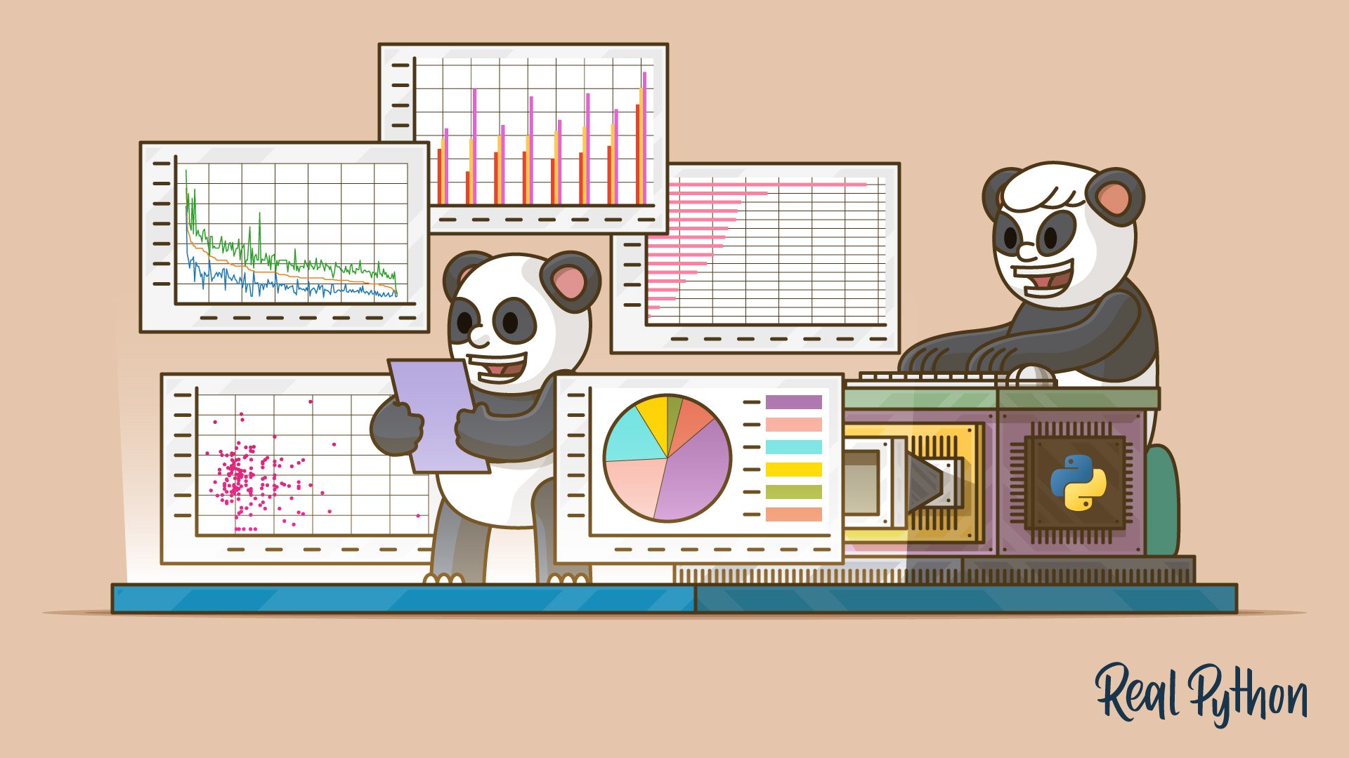
Data Visualization With Python
Learning Path ⋅ Skills: NumPy, Matplotlib, Bokeh, Seaborn, pandas

Clear visualizations turn raw data into stories your audience can act on. This learning path teaches you to build charts, plots, and interactive dashboards with Python.
By completing this path, you’ll be able to:
- Plot data directly from pandas and create histograms
- Build detailed visualizations with Matplotlib and Seaborn
- Create interactive plots with Bokeh and styled charts with ggplot
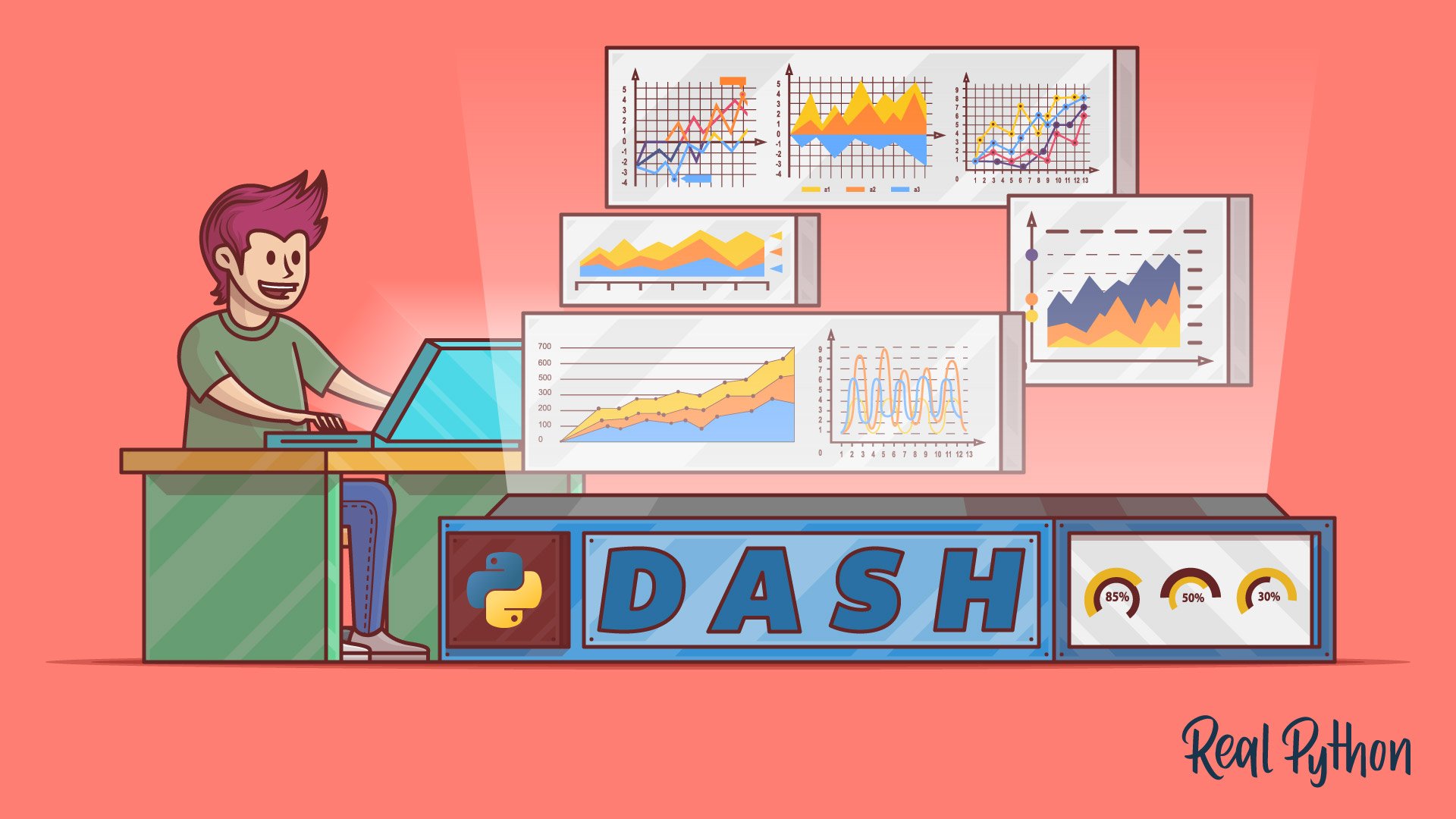
- Build data visualization web apps with Dash
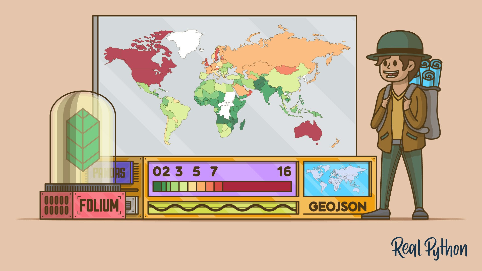
- Generate web maps with Folium
This path is for Python developers who want to present data visually in reports, dashboards, or web applications. Basic Python and some familiarity with data structures will help.
You’ll start with pandas plotting basics, explore dedicated visualization libraries, and finish by building interactive applications.
Data Visualization With Python
Learning Path ⋅ 10 Resources
Introduction to Data Visualization in Python
Kickstart your journey with these foundational courses on data visualization in Python. Learn the basics of creating histograms and plots using libraries like NumPy, Matplotlib, pandas, and Seaborn.
Course
Plot With pandas: Python Data Visualization Basics
Get to know the basic plotting possibilities that Python provides in the popular data analysis library pandas. You'll learn about the different kinds of plots that pandas offers, how to use them for data exploration, and which types of plots are best for certain use cases.

Course
Histogram Plotting in Python: NumPy, Matplotlib, Pandas & Seaborn
Learn how to make production-quality, presentation-ready Python histogram plots with a range of choices and features. It's your one-stop shop for constructing and manipulating histograms with Python's scientific stack.
Data Visualization Libraries in Python
Delve deeper into Python’s data visualization capabilities with these courses. Discover the specifics of plotting with Matplotlib, creating interactive visuals with Bokeh, and utilizing the grammar of graphics via ggplot.

Course
Python Plotting With Matplotlib
Learn about plotting in Python with Matplotlib by looking at the theory and following along with practical examples in this beginner-friendly course.

Course
Using plt.scatter() to Visualize Data in Python
Learn how to create scatter plots in Python, which are a key part of many data visualization applications. You'll get an introduction to plt.scatter(), a versatile function in the Matplotlib module for creating scatter plots.

Tutorial
Visualizing Data in Python With Seaborn
Learn how to use the Python seaborn library to produce statistical data analysis plots to allow you to better visualize your data. You'll learn how to use both its traditional classic interface and more modern objects interface.

Course
Interactive Data Visualization With Bokeh and Python
Get you up and running with Bokeh, using examples and a real-world dataset. You'll learn how to visualize your data, customize and organize your visualizations, and add interactivity.

Course
Graph Your Data With Python and ggplot
Learn how to use ggplot in Python to build data visualizations with plotnine. You'll discover what a grammar of graphics is and how it can help you create plots in a very concise and consistent way.
Applied Data Visualization
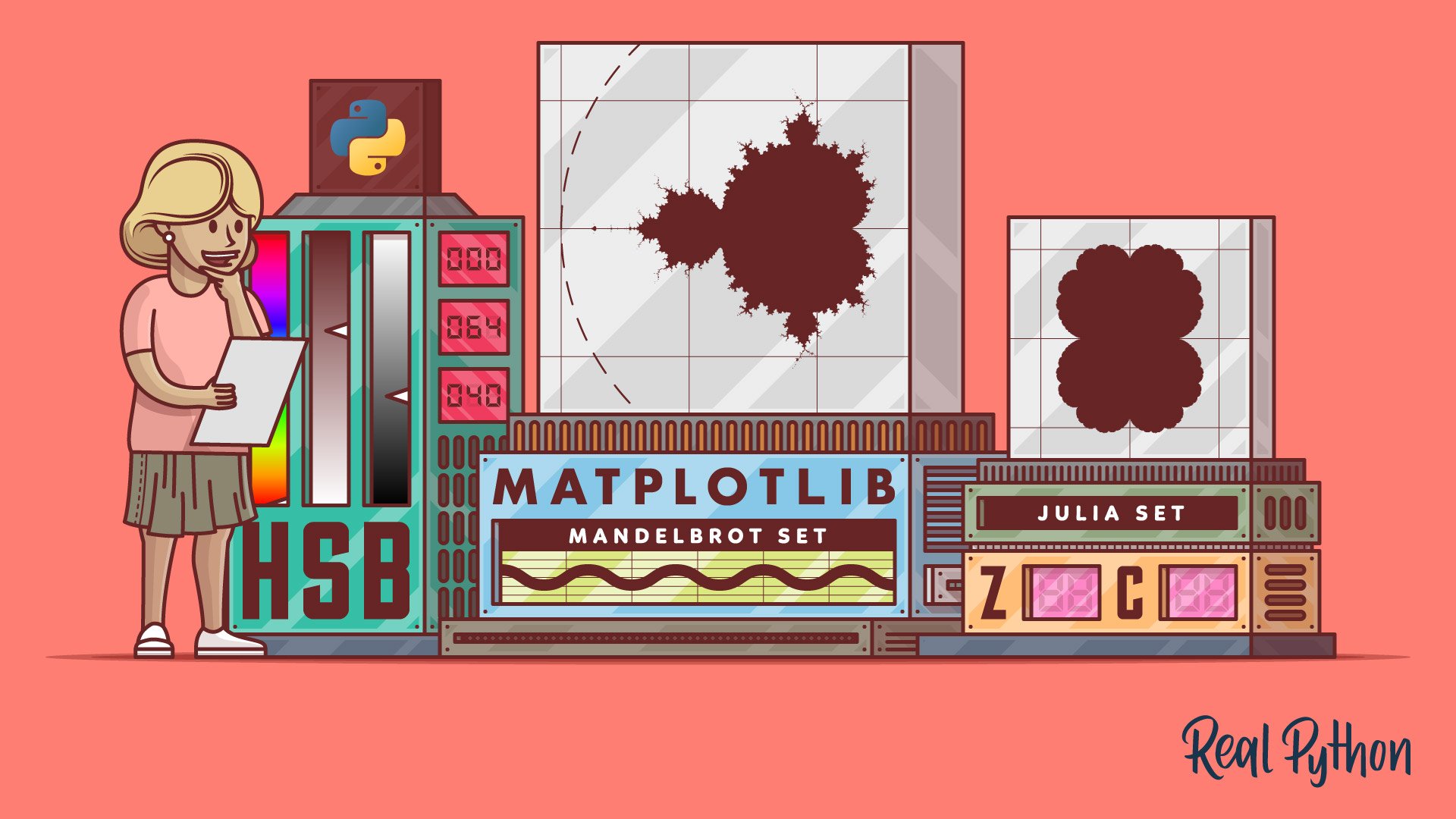
In this final section, apply your data visualization skills in Python on real world tasks. Learn to build interactive web applications with Dash, and interactive web maps using Folium. Then, explore the creative side of data visualization by drawing the Mandelbrot set, a famous fractal, using Matplotlib and Pillow.
Course
Data Visualization Interfaces in Python With Dash
Learn how to build a dashboard using Python and Dash. Dash is a framework for building data visualization interfaces. It helps data scientists build fully interactive web applications quickly.

Course
Creating Web Maps From Your Data With Python Folium
You'll learn how to create web maps from data using Folium. The package combines Python's data-wrangling strengths with the data-visualization power of the JavaScript library Leaflet. In this video course, you'll create and style a choropleth world map showing the ecological footprint per country.
Interactive Quiz
Python Folium: Create Web Maps From Your Data
Tutorial
Draw the Mandelbrot Set in Python
In this tutorial, you'll visualize the famous Mandelbrot set using Python's Matplotlib and Pillow libraries. You'll learn how to draw the fractal in black and white, grayscale, and color.
Congratulations on completing this learning path! If you’d like to continue to develop your skills for visualizing your data with Python, then check out the data visualization topic on Real Python.
Or maybe you’d like to explore different ways to organize and work with a variety of data. In that case, these learning paths have got you covered:
Got feedback on this learning path?
Looking for real-time conversation? Visit the Real Python Community Chat or join the next “Office Hours” Live Q&A Session. Happy Pythoning!
