If you have some experience using Python for data analysis, chances are you’ve produced some data plots to explain your analysis to other people. Most likely you’ll have used a library such as Matplotlib to produce these. If you want to take your statistical visualizations to the next level, you should master the Python seaborn library to produce impressive statistical analysis plots that will display your data.
In this tutorial, you’ll learn how to:
- Make an informed judgment as to whether or not seaborn meets your data visualization needs
- Understand the principles of seaborn’s classic Python functional interface
- Understand the principles of seaborn’s more contemporary Python objects interface
- Create Python plots using seaborn’s functions
- Create Python plots using seaborn’s objects
Before you start, you should familiarize yourself with the Jupyter Notebook data analysis tool available in JupyterLab. Although you can follow along with this seaborn tutorial using your favorite Python environment, Jupyter Notebook is preferred. You might also like to learn how a pandas DataFrame stores its data. Knowing the difference between a pandas DataFrame and Series will also prove useful.
So now it’s time for you to dive right in and learn how to use seaborn to produce your Python plots.
Free Bonus: Click here to download the free code that you can experiment with in Python seaborn.
Take the Quiz: Test your knowledge with our interactive “Visualizing Data in Python With Seaborn” quiz. You’ll receive a score upon completion to help you track your learning progress:

Interactive Quiz
Visualizing Data in Python With SeabornPractice creating statistical plots in Python with seaborn. Compare the classic functional interface with the newer objects interface.
Getting Started With Python seaborn
Before you use seaborn, you must install it. Open a Jupyter Notebook and type !python -m pip install seaborn into a new code cell. When you run the cell, seaborn will install. If you’re working at the command line, use the same command, only without the exclamation point (!). Once seaborn is installed, Matplotlib, pandas, and NumPy will also be available. This is handy because sometimes you need them to enhance your Python seaborn plots.
Before you can create a plot, you do, of course, need data. Later, you’ll create several plots using different publicly available datasets containing real-world data. To begin with, you’ll work with some sample data provided for you by the creators of seaborn. More specifically, you’ll work with their tips dataset. This dataset contains data about each tip that a particular restaurant waiter received over a few months.
Creating a Bar Plot With seaborn
Suppose you wanted to see a bar plot showing the average amount of tips received by the waiter each day. You could write some Python seaborn code to do this:
In [1]: import matplotlib.pyplot as plt
   ...: import seaborn as sns
   ...:
   ...: tips = sns.load_dataset("tips")
   ...:
   ...: (
   ...:     sns.barplot(
   ...:         data=tips, x="day", y="tip",
   ...:         estimator="mean", errorbar=None,
   ...:     )
   ...:     .set(title="Daily Tips ($)")
   ...: )
   ...:
   ...: plt.show()
First, you import seaborn into your Python code. By convention, you import it as sns. Although you can use any alias you like, sns is a nod to the fictional character the library was named after.
To work with data in seaborn, you usually load it into a pandas DataFrame, although other data structures can also be used. The usual way of loading data is to use the pandas read_csv() function to read data from a file on disk. You’ll see how to do this later.
To begin with, because you’re working with one of the seaborn sample datasets, seaborn allows you online access to these using its load_dataset() function. You can see a list of the freely available files on their GitHub repository. To obtain the one you want, all you need to do is pass load_dataset() a string telling it the name of the file containing the dataset you’re interested in, and it’ll be loaded into a pandas DataFrame for you to use.
The actual bar plot is created using seaborn’s barplot() function. You’ll learn more about the different plotting functions later, but for now, you’ve specified data=tips as the DataFrame you wish to use and also told the function to plot the day and tip columns from it. These contain the day the tip was received and the tip amount, respectively.
The important point you should notice here is that the seaborn barplot() function, like all seaborn plotting functions, can understand pandas DataFrames instinctively. To specify a column of data for them to use, you pass its column name as a string. There’s no need to write pandas code to identify each Series to be plotted.
The estimator="mean" parameter tells seaborn to plot the mean y values for each category of x. This means your plot will show the average tip for each day. You can quickly customize this to instead use common statistical functions such as sum, max, min, and median, but estimator="mean" is the default. The plot will also show error bars by default. By setting errorbar=None, you can suppress them.
The barplot() function will produce a plot using the parameters you pass to it, and it’ll label each axis using the column name of the data that you want to see. Once barplot() is finished, it returns a matplotlib Axes object containing the plot. To give the plot a title, you need to call the Axes object’s .set() method and pass it the title you want. Notice that this was all done from within seaborn directly, and not Matplotlib.
Note: You may be wondering why the barplot() function is encapsulated within a pair of parentheses (...). This is a coding style often used in seaborn code because it frequently uses method chaining. These extra brackets allow you to horizontally align method calls, starting each with its dot notation. Alternatively, you could use the backslash (\) for line continuation, although that is discouraged.
If you take another look at the code, the alignment of .set() is only possible because of these extra encasing brackets. You’ll see this coding style used throughout this tutorial, as well as when you read the seaborn documentation.
In some environments like IPython and PyCharm, you may need to use Matplotlib’s show() function to display your plot, meaning you must import Matplotlib into Python as well. If you’re using a Jupyter notebook, then using plt.show() isn’t necessary, but using it removes some unwanted text above your plot. Placing a semicolon (;) at the end of barplot() will also do this for you.
When you run the code, the resulting plot will look like this:
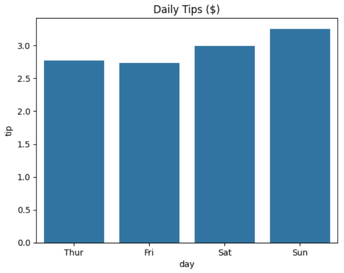
As you can see, the waiter’s daily average tips rise slightly on the weekends. It looks as though people tip more when they’re relaxed.
Note: One thing you should be aware of is that load_dataset(), unlike read_csv(), will automatically convert string columns into the pandas Categorical data type for you. You use this where your data contains a limited, fixed number of possible values. In this case, the day column of data will be treated as a Categorical data type containing the days of the week. You can see this by using tips["day"] to view the column:
In [2]: tips["day"]
Out[2]:
0       Sun
1       Sun
2       Sun
3       Sun
4       Sun
       ...
239     Sat
240     Sat
241     Sat
242     Sat
243    Thur
Name: day, Length: 244, dtype: category
Categories (4, object): ['Thur', 'Fri', 'Sat', 'Sun']
As you can see, your day column has a data type of category. Note, also, that while your original data starts with Sun, the first entry in the category is Thur. In creating the category, the days have been interpreted for you in the correct order. The read_csv() function doesn’t do this.
Next, you’ll create the same plot using Matplotlib code. This will allow you to see the differences in code style between the two libraries.
Creating a Bar Plot With Matplotlib
Now take a look at the Matplotlib code shown below. When you run it, it produces the same output as your seaborn code, but the code is nowhere near as succinct:
In [3]: import matplotlib.pyplot as plt
   ...: import pandas as pd
   ...:
   ...: tips = pd.read_csv("tips.csv")
   ...:
   ...: average_daily_tip = (
   ...:     tips
   ...:     .groupby("day")["tip"]
   ...:     .mean()
   ...: )
   ...:
   ...: days = ["Thur", "Fri", "Sat", "Sun"]
   ...: daily_averages = [
   ...:     average_daily_tip["Thur"],
   ...:     average_daily_tip["Fri"],
   ...:     average_daily_tip["Sat"],
   ...:     average_daily_tip["Sun"],
   ...: ]
   ...:
   ...: fig, ax = plt.subplots()
   ...: plt.bar(x=days, height=daily_averages)
   ...: ax.set_xlabel("day")
   ...: ax.set_ylabel("tip")
   ...: ax.set_title("Daily Tips ($)")
   ...:
   ...: plt.show()
This time, you use a mixture of pandas and Matplotlib, so you must import both.
Note: When you import pandas, you may receive a DeprecationWarning informing you that something called PyArrow will become a required dependency of pandas in the future. PyArrow is the Python implementation of Apache Arrow, which is a set of technologies for faster data processing of large volumes of data.
Feel free to ignore this warning, or you can avoid it by installing PyArrow using !python -m pip install pyarrow. Remember, you don’t need the exclamation point (!) if you’re working at the command line.
To begin with, you read the tips.csv file using the pandas read_csv() function. You then must manually group the data using the DataFrame’s .groupby() method, before calculating each day’s average using .mean().
Next, you manually specify the data that you wish to plot, and the order you wish to plot it in. When read_csv() reads in the data, it doesn’t categorize or apply any ordering to it for you. To compensate, you specify what you want to plot as the days and daily_averages lists.
To produce the plot, you use Matplotlib’s bar() function and specify the two data Series to be plotted. In this case, you pass x=days and height=daily_averages. Finally, you apply the axis labels and plot title to it.
If you run this code, then you’ll see the same plot produced as before.
If you want to save your plots to an external file, perhaps to use them in a presentation or report, then there are several options for you to choose from.
In many environments—for example, PyCharm—when you call plt.show(), the plot will appear in a different window. Often this window contains its own file-saving tools.
If you’re using a Jupyter notebook, then you can right-click on your plot and copy it to your clipboard before pasting it into your report or presentation.
You can also make some adjustments to your code for this to happen automatically:
In [4]: import matplotlib.pyplot as plt
   ...:
   ...: import seaborn as sns
   ...:
   ...: tips = sns.load_dataset("tips")
   ...:
   ...: (
   ...:     sns.barplot(
   ...:         data=tips, x="day", y="tip",
   ...:         estimator="mean", errorbar=None,
   ...:     )
   ...:     .set_title("Daily Tips ($)")
   ...:     .figure.savefig("daily_tips.png")
   ...: )
   ...:
   ...: plt.show()
Here you’ve used the plot’s .figure property, which allows you access to the underlying Matplotlib figure, and then you’ve called its .savefig() method to save it to a png file. The default is png, but .savefig() also allows you to pass in common alternative graphics formats, including "jpeg", "pdf", and "ps".
You may have noticed that the bar plot’s title was set using the .set_title("Daily Tips ($)") method, and not the .set(title="Daily Tips ($)") method that you used previously. Although you can usually use these interchangeably, using .set_title("Daily Tips ($)") is more readable when you want to save a figure using figure.savefig().
The reason for this is that .set_title("Daily Tips ($)") returns a matplotlib.text.Text object, whose underlying associated Figure object can be accessed using the .figure property. This is what you save when you use the .savefig() method.
If you use .set(title="Daily Tips ($)"), this still returns a Text object. However, it is the first element in a list. To access it, you need to use .set(title="Daily Tips ($)")[0].figure.savefig("daily_tips.png"), which isn’t as readable.
Hopefully, this introduction has given you a taste for seaborn. You’ve seen the relative clarity of seaborn’s Python code over that used by Matplotlib. This is possible because much of Matplotlib’s complexity is hidden from you by seaborn. As you saw in the barplot() function, seaborn passes the data in as a pandas DataFrame, and the plotting function understands its structure.
The plotting functions are part of seaborn’s classic functional interface, but they’re only half the story.
A more modern way of using seaborn is to use something called its objects interface. This provides a declarative syntax, meaning you define what you want using various objects and then let seaborn combine them into your plot. This results in a more consistent approach to creating plots, which makes the interface easier to learn. It also hides the underlying Matplotlib functionality even more than the plotting functions.
You’ll now move on and learn how to use each of these interfaces.
Understanding seaborn’s Classic Functional Interface
The seaborn classic functional interface contains a set of plotting functions for creating different plot types. You’ve already seen an example of this when you used the barplot() function earlier. The functional interface classifies its plotting functions into several broad types. The three most common are illustrated in the diagram below:
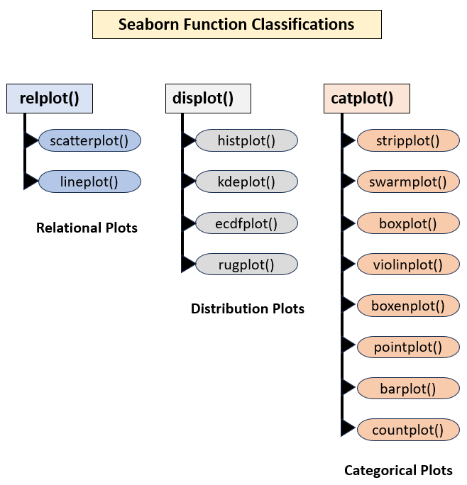
The first column shows seaborn’s relational plots. These help you understand how pairs of variables in a dataset relate to each other. Common examples of these are scatter plots and line plots. For example, you might want to know how profits vary as a product’s price rises. There’s also a regression plots category that adds regression lines, as you’ll see later.
The second column shows seaborn’s distribution plots. These help you understand how variables in a dataset are distributed. Common examples of these include histogram plots and rug plots. For example, you might want to see a count of each grade obtained in a national examination.
The third column shows seaborn’s categorical plots. These also help you understand how pairs of variables in a dataset relate to each other. However, one of the variables usually contains discrete categories. Common examples of these include bar plots and box plots. The waiter’s average tips categorized by day, which you saw earlier, is an example of a categorical plot.
You may also have noticed that there’s a hierarchical structure to the plotting functions. You can also define each classification as either a figure-level or axes-level function. This allows great flexibility.
A figure-level function allows you to draw multiple subplots, with each showing a different category of data. For example, you might want to know how profits vary with the price increases of multiple products but want separate subplots for each product. The parameters you specify in the figure-level function apply to each subplot, which gives them a consistent look and feel. The relplot(), displot(), and catplot() functions are all figure-level.
Note: Seaborn also contains the distplot() function, but this has now been deprecated and replaced by histplot() and displot().
In contrast, an axes-level function allows you to draw a single plot. This time, any parameters you provide to an axes-level function apply only to the single plot produced by that function. Each axes-level plot is represented with an oval on the diagram. The lineplot(), histplot(), and boxplot() functions are all axes-level functions.
Note: The term axes is one that’s confusingly named. You might think it refers collectively to the x-axis and y-axis of a plot. While this is certainly correct in everyday language, in seaborn an axes object is the correct term for a plot. This is where axes-level functions get their name from.
Next, you’ll take a closer look at how to use axes-level functions to produce single plots.
Using Axes-Level Functions
When all you need is a single plot, you’ll most likely use an axes-level function. In this example, you’ll use a file named cycle_crossings_apr_jun.csv. This contains bicycle crossing data for different New York bridges. The original data comes from NYC Open Data, but a copy is available in the downloadable materials.
The first thing you need to do is read the cycle_crossings_apr_jun.csv file into a pandas DataFrame. To do this, you use the read_csv() function:
In [1]: import pandas as pd
   ...:
   ...: crossings = pd.read_csv("cycle_crossings_apr_jun.csv")
The crossings DataFrame now contains the entire content of the file. The data is therefore available for visualization.
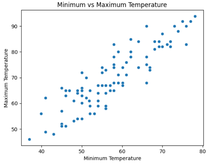
Suppose you wanted to see if there was any relationship between the highest and lowest temperatures for the three months of data contained in the file. One way you could do this would be to use a scatterplot. Seaborn provides a scatterplot() axes-level function for this very purpose:
In [2]: import matplotlib.pyplot as plt
   ...: import seaborn as sns
   ...:
   ...: (
   ...:     sns.scatterplot(
   ...:         data=crossings, x="min_temp", y="max_temp"
   ...:     )
   ...:     .set(
   ...:         title="Minimum vs Maximum Temperature",
   ...:         xlabel="Minimum Temperature",
   ...:         ylabel="Maximum Temperature",
   ...:     )
   ...: )
   ...:
   ...: plt.show()
You use the scatterplot() function here in a way that’s similar to how you used barplot(). Again you supply the DataFrame as its data parameter, then the columns to plot. As an enhancement, you also call Matplotlib’s Axes.set() method to give your plot a title, and use xlabel and ylabel to label each axis. By default, there’s no title, and each axis is labeled according to its data Series. Using Axes.set() allows capitalization.
The resulting plot looks like this:
Although each figure-level function requires its own set of parameters and you should read the seaborn documentation to find out what’s available, there’s one powerful parameter that appears in most functions called hue. This parameter allows you to add different colors to different categories of data on a plot. To use it, you pass in the name of the column that you wish to apply coloring to.
The relational plotting functions also support style and size parameters that allow you to apply different styles and sizes to each point as well. These can further clarify your plot. You decide to update your plot to include them:
In [3]: (
   ...:    sns.scatterplot(
   ...:         data=crossings, x="min_temp", y="max_temp",
   ...:         hue="month", size="month", style="month",
   ...:    )
   ...:     .set(
   ...:         title="Minimum vs Maximum Temperature",
   ...:         xlabel="Minimum Temperature",
   ...:         ylabel="Maximum Temperature",
   ...:     )
   ...: )
   ...:
   ...: plt.legend(title="Month")
   ...: plt.show()
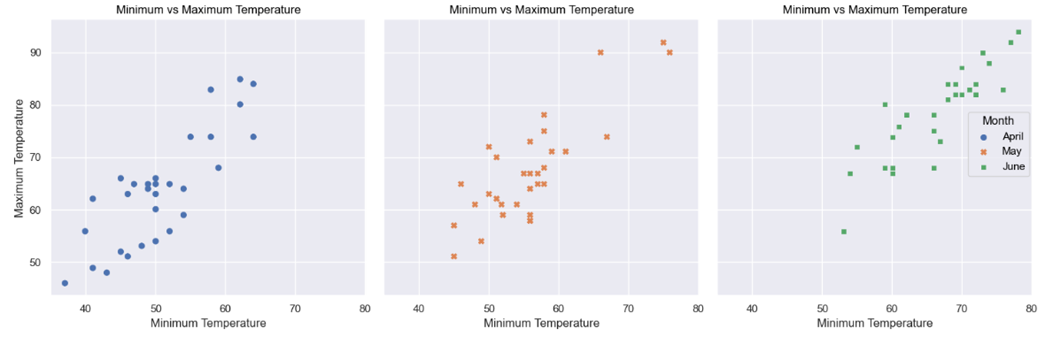
Although it’s perfectly possible to set hue, size, and style to different columns within the DataFrame, by setting them all to "month", you give each month’s data point a different color, size, and symbol, respectively. You can see this on the updated plot below:
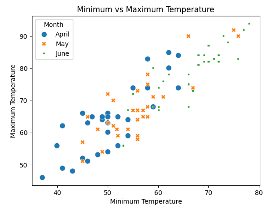
Although applying all three parameters is probably overkill, in this case, you can now see which month each dot belongs to. You did all of this within a single function call as well.
Notice, also, that seaborn has helpfully applied a legend for you. However, the legend’s default title is the same as the data Series passed to "hue". To capitalize it, you used the legend() function.
You’ll see more axes-level plot functions later in this tutorial, but now it’s time for you to see a figure-level function in action.
Using Figure-Level Functions
Sometimes you may want several subplots of your data, each showing the different categories of the data. You could create several plots manually, but a figure-level function will do this automatically for you.
As with axes-level functions, each figure-level function contains some common parameters that you should learn how to use. The row or col parameters allow you to specify the row or column data Series that will be displayed in each subplot. Setting the column parameter will place each of your subplots in their own columns, while setting the row parameter will give you a separate row for each of them.
Suppose, for example, you wanted to see separate scatterplots for each month’s temperatures:
In [1]: import matplotlib.pyplot as plt
   ...: import pandas as pd
   ...: import seaborn as sns
   ...:
   ...: crossings = pd.read_csv("cycle_crossings_apr_jun.csv")
   ...:
   ...: (
   ...:     sns.relplot(
   ...:         data=crossings, x="min_temp", y="max_temp",
   ...:         kind="scatter", hue="month", col="month",
   ...:     )
   ...:     .set(
   ...:         title="Minimum vs Maximum Temperature",
   ...:         xlabel="Minimum Temperature",
   ...:         ylabel="Maximum Temperature",
   ...:     )
   ...:     .legend.set_title("Month")
   ...: )
   ...:
   ...: plt.show()
As with axes-level functions, when using figure-level plot functions, you pass in the DataFrame and highlight the Series within it that you’re interested in seeing. In this example, you used relplot(), and by setting kind="scatter", you tell the function to create multiple scatterplot subplots.
The hue parameter still exists and still allows you to apply different colors to your subplots. Indeed, you’re advised to always use it with figure-level plotting functions to force seaborn to create a legend for you. This clarifies each subplot. However, the default legend title will be "month" in lowercase.
By setting col="month", each subplot will be in its own column, with each column representing a separate month. This means you’ll see a row of them.
Figure-level plot functions, such as relplot(), create a FacetGrid object upon which each of their subplots is placed. To capitalize legends created by figure-level plots, you use the FacetGrid's .legend accessor to access .set_title(). You may then add the legend title for the underlying FacetGrid object.
Your plot now looks like this:
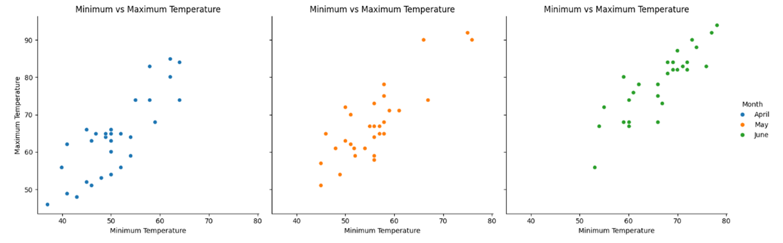
You’ve created three separate scatterplots, one for each month’s data. Each plot has been given a separate color, and a handy legend has been prepared to allow you to better identify what each plot is showing you.
You’ll see more examples of the functions interface later, but for now, it’s time to meet the relatively new kid on the block: seaborn’s objects interface.
Introducing seaborn’s Contemporary Objects Interface
In this section, you’ll learn about the core components of seaborn’s objects interface. This uses a more declarative syntax, meaning you build up your plot in layers by creating and adding the individual objects needed to create it. Previously, the functions did this for you.
When you build a plot using seaborn objects, the first object that you use is Plot. This object references the DataFrame whose data you’re plotting, as well as the specific columns within it whose data you’re interested in seeing.
Suppose you wanted to build up the previous temperatures scatterplot example using the objects interface. A Plot object would be your starting point:
In [1]: import pandas as pd
   ...: import seaborn.objects as so
   ...:
   ...: crossings = pd.read_csv("cycle_crossings_apr_jun.csv")
   ...:
   ...: (
   ...:     so.Plot(
   ...:         data=crossings, x="min_temp", y="max_temp"
   ...:     )
   ...:     .show()
   ...: )
When you use the seaborn objects interface, it’s the convention to import it into Python with an alias of so. The above code reuses the crossings DataFrame that you created earlier.
To create your Plot object, you call its constructor and pass in the DataFrame containing your data and the names of the columns containing the data Series that you wish to plot. Here these are min_temp for x, and max_temp for y. The Plot object now has data to work with.
The Plot object contains its own .show() method to display it. As with plt.show() discussed earlier, you don’t need this in a Jupyter notebook.
When you run the code, the output may not exactly excite you:
As you can see, the data plot is nowhere to be seen. This is because a Plot object is only a background for your plot. To see some content, you need to build it up by adding one or more Mark objects to your Plot object. The Mark object is the base class of a whole range of subclasses, with each representing a different part of your data visualization.
Note: One point to note is that a Plot object could be reused for a range of different plots. For example, if you assign your Plot object to a variable such as temperatures = so.Plot(data=crossings ...), you can later reuse the same object and create different plot types by adding different content onto it. Remember, the Plot object only contains data for visualizing.
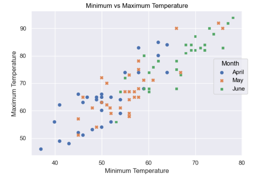
Next, you add some content to your Plot object to make it more meaningful:
In [2]: (
   ...:     so.Plot(
   ...:         data=crossings, x="min_temp", y="max_temp"
   ...:      )
   ...:     .add(so.Dot())
   ...:     .label(
   ...:            title="Minimum vs Maximum Temperature",
   ...:            x="Minimum Temperature",
   ...:            y="Maximum Temperature",
   ...:     )
   ...:     .show()
   ...: )
To display your Plot object’s data as a scatterplot, you need to add several Dot objects to it. The Dot class is a subclass of Mark that displays each x and y pair as a dot. To add the Dot objects, you call the Plot object’s .add() method, and pass in the objects that you want to add. Each time you call .add(), you’re adding in a new layer of detail onto your Plot.
As a final touch, you label the plot and each of its axes. To do this, you call the .label() method of Plot. The title parameter gives the plot a title, while the x and y parameters label the associated axes respectively.
When you run the code, it looks the same as your first scatterplot, even down to the title and axis labels:

Next, you can improve your plot by separating each day into a separate color and symbol:
In [3]: (
   ...:     so.Plot(
   ...:         data=crossings, x="min_temp",
   ...:         y="max_temp", color="month",
   ...:     )
   ...:     .add(so.Dot(), marker="month")
   ...:     .label(
   ...:         title="Minimum vs Maximum Temperature",
   ...:         x="Minimum Temperature",
   ...:         y="Maximum Temperature",
   ...:         color=str.capitalize,
   ...:     )
   ...:     .show()
   ...: )
To separate each month’s data into markers with separate colors, you pass the column whose data you wish to separate into the Plot object as its color parameter. In this case, color="month" will assign different colors to each different month. This provides similar functionality to the hue parameter used by the functions interface that you saw earlier.
To apply different marker styles to the dot representing each month, you need to pass the marker variable to the same layer that the Dot object is defined on. In this case, you set marker="month" to define the Series whose marker style you wish to differentiate.
You label the title and axes in the same way as you did your earlier plots. To label the legend, you also use the Plot object’s .label() method. By passing it color=str.capitalize, you’ll apply the string’s .capitalize() method to the default label of month, causing it to display as Month. The x and y parameters could’ve been set in the same way, but the underscores would’ve remained. You could also have set color="Month" for the same result.
Your plot now looks like this:
The next stage is to separate each month’s data into individual plots:
In [4]: (
   ...:     so.Plot(
   ...:         data=crossings, x="min_temp",
   ...:         y="max_temp", color="month",
   ...:     )
   ...:     .add(so.Dot(), marker="month")
   ...:     .facet(col="month")
   ...:     .layout(size=(15, 5))
   ...:     .label(
   ...:         title="Minimum vs Maximum Temperature",
   ...:         x="Minimum Temperature",
   ...:         y="Maximum Temperature",
   ...:         color=str.capitalize,
   ...:     )
   ...:     .show()
   ...: )
To create a set of subplots, one for each month, you use the Plot object’s .facet() method. By passing in a string containing a reference to the data that you wish to split—in this case, col="month"—you separate each month into its own column. You’ve also used the Plot.layout() method to resize the output to a width of 15 inches by 5 inches. This makes the plot readable.
The final version of your object-oriented version of the plot now looks like this:
As you can see, each subplot still retains its own color and marker style. The objects interface allows you to create multiple subplots by making a minor adjustment to your existing code, but without making it more complicated. With objects, there’s no need to start from the beginning with a completely different function.
Deciding Which Interface to Use
The seaborn objects interface is designed to provide you with a more intuitive and extensible way of visualizing your data. It achieves this through modularity. Regardless of what you want to visualize, all plots start with the same Plot object before being customized with additional Mark objects, such as Dots. Using objects also gives your plotting code a more uniform look.
The objects interface also allows you to create more complex plots without needing to use more complicated code to do so. The ability to add objects whenever you please means you can build up some very impressive plots incrementally.
This interface is inspired by the Grammar of Graphics. You’ll therefore see that it resembles plotting libraries like Vega-Altair, plotnine, and R’s ggplot2 that all share the same inspiration.
The objects API is also still being developed. The developers make no secret of this. Although the seaborn developers intend for the objects API to be its future, it’s still worthwhile to keep an eye on the what’s new in each version pages of the documentation to see how both interfaces are being improved. Still, understanding the objects API now will serve you well in the future.
This means that you shouldn’t abandon the seaborn plotting functions entirely. They’re still very popular and in widespread use. If you’re happy with what they produce for you, then there’s no overwhelming reason to change. In addition, the seaborn developers do still maintain them and improve them as they see fit. They’re by no means obsolete.
Also remember that while you may personally favor one interface over the other, you may need to use each for different plots to meet your requirements.
In the remainder of this tutorial, you’ll create a range of different plots using both functions and objects. Once again, this won’t be exhaustive coverage of everything that you can do with seaborn, but it’ll show you more useful techniques that will help you. Once again, do keep an eye on the documentation for more details of what can be done with the library.
Creating Different seaborn Plots Using Functions
In this section, you’ll learn how to draw a range of common plot types using seaborn’s functions. As you work through the examples, keep in mind that they’re designed to illustrate the principles of working with seaborn. These are the real learning points that you should grasp to allow you to expand your knowledge in the future.
To begin with, you’ll take a look at some examples of categorical plots.
Creating Categorical Plots Using Functions
Seaborn’s categorical plots are a family of plots that show the relationship between a collection of numerical values and one or more different categories. This allows you to see how the value varies across the different categories.
Suppose you wanted to investigate the daily crossings of all four bridges detailed in cycle_crossings_apr_jun.csv. Although all the data you need to do this is present, it’s not quite in the correct format for analyzing by bridge:
In [1]: import pandas as pd
   ...:
   ...: crossings = pd.read_csv("cycle_crossings_apr_jun.csv")
   ...: crossings.head()
Out[1]:
         date        day  month  max_temp  min_temp  precipitation  \
0  01/04/2017   Saturday  April      46.0      37.0           0.00
1  02/04/2017     Sunday  April      62.1      41.0           0.00
2  03/04/2017     Monday  April      63.0      50.0           0.03
3  04/04/2017    Tuesday  April      51.1      46.0           1.18
4  05/04/2017  Wednesday  April      63.0      46.0           0.00

   Brooklyn  Manhattan  Williamsburg  Queensboro
0   606       1446          1915        1430
1  2021       3943          4207        2862
2  2470       4988          5178        3689
3   723       1913          2279        1666
4  2807       5276          5711        4197
The problem is that to categorize the data by bridge type, you need each bridge’s daily data in a single column. Currently, there’s a separate column for each bridge. To sort this, you need to use the DataFrame.melt() method. This will change the data from its current wide format to the required long format. You can do this using the following code:
In [2]: bridge_crossings = crossings.melt(
   ...:     id_vars=["day", "date"],
   ...:     value_vars=[
   ...:         "Brooklyn", "Manhattan",
   ...:         "Williamsburg", "Queensboro"
   ...:     ],
   ...:     var_name="Bridge",
   ...:     value_name="Crossings",
   ...: ).rename(columns={"day": "Day", "date": "Date"})
   ...:
   ...: bridge_crossings.head()
Out[2]:
         Day        Date    Bridge  Crossings
0   Saturday  01/04/2017  Brooklyn        606
1     Sunday  02/04/2017  Brooklyn       2021
2     Monday  03/04/2017  Brooklyn       2470
3    Tuesday  04/04/2017  Brooklyn        723
4  Wednesday  05/04/2017  Brooklyn       2807
To reorganize the DataFrame so that each bridge’s data will appear in the same column, you first of all pass id_vars=["day", "date"] to .melt(). These are identifier variables and are used to identify the data being reformatted. In this case, each Day and Date value will be used to identify the data for each bridge in this and future plots.
You also pass in a list of the values whose Day and Date data you wish to appear in one column. In this case, you set value_vars to a list of bridges since you want to list each of the bridge crossing values with their day and date.
To make your plot labels more meaningful and capitalized for neatness, you pass in the var_name and val_name parameters with the values Bridge and Crossings, respectively. This will create two new columns. The Bridge column will contain all of the bridge names, while the Crossings column will contain the crossings of each for each day and date.
Finally, you use the DataFrame.rename() method to update the day and date column names to Day and Date respectively. This will save you from having to change the various plot labels the way you did before.
As you can see from the output, the new bridge_crossings DataFrame has the data in a format that you can more easily work with. Note that although only some Brooklyn Bridge data is shown, the other bridges are listed below it in the full DataFrame.
You can use your data to produce a bar plot showing the total daily crossings of all four bridges for each day of the week:
In [3]: import matplotlib.pyplot as plt
   ...: import seaborn as sns
   ...:
   ...: sns.barplot(
   ...:     data=bridge_crossings,
   ...:     x="Day", y="Crossings",
   ...:     hue="Bridge", errorbar=None,
   ...:     estimator="sum",
   ...: )
   ...: plt.show()
This code is similar to the earlier example of a bar plot where you analyzed the tips data. This time, you use the hue parameter to color each bridge’s data differently and also plot the total number of crossings by day by setting estimator="sum". This is the name of the function that you wish to use to calculate the total crossings.
The resulting plot is illustrated below:
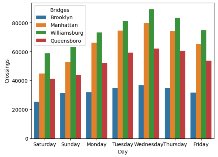
As you can see, the bar plot contains seven groups of four bars, one for each bridge for each day of the week.
From the plot, you see that the Williamsburg Bridge appears to be the busiest overall, with Wednesday being the busiest day. You decide to investigate this further. You decide to produce a boxplot of the Wednesday figures for Williamsburg for each of the three months of data. This will provide you with some statistical analysis of the data:
In [4]: wednesday_crossings = crossings.loc[
   ...:     crossings.day.isin(["Wednesday"])
   ...: ].rename(columns={"month": "Month"})
   ...:
   ...: (
   ...:     sns.boxplot(
   ...:         data=wednesday_crossings, x="day",
   ...:         y="Williamsburg", hue="Month",
   ...:     )
   ...:     .set(xlabel=None)
   ...: )
   ...:
   ...: plt.show()
This time, you use the axes-level boxplot() function to produce the plot. As you can see, its parameters are similar to those you’ve already seen. The x and y parameters tell the function what data to use, while setting hue="month" provides separate boxplots for each month. You also set xlabel=None on the plot. This removes the default day label, but leaves Wednesday.
Your plot looks like this:
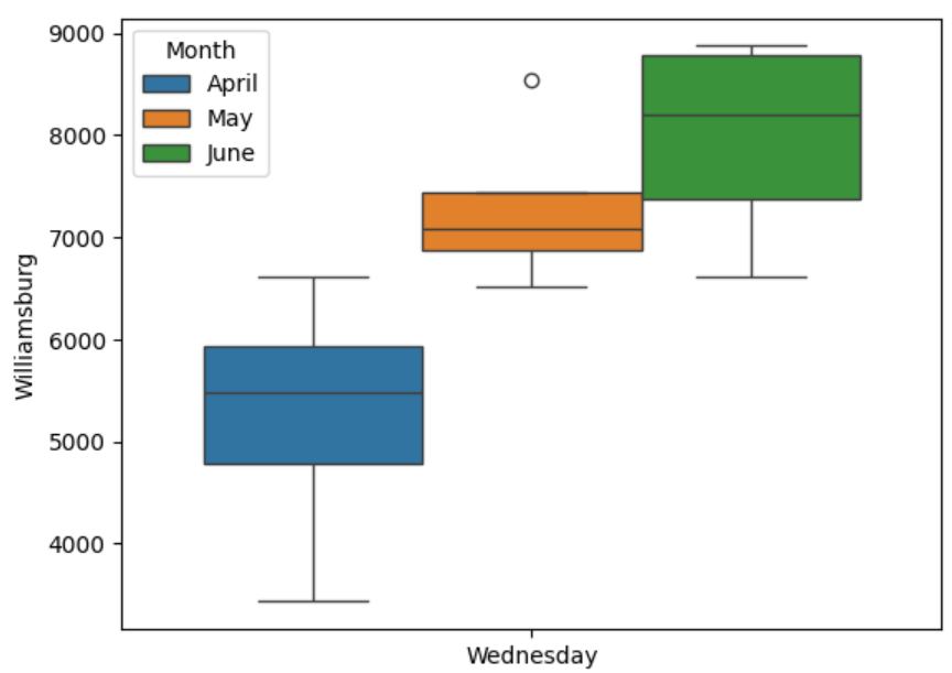
For each of the three months, the height of each box shows the interquartile range, while the central line through each box shows the median values. The horizontal whisker lines outside each box show the upper and lower quartiles, while the circles show outliers.
Using the principles that you’ve learned so far, and the seaborn documentation, you might like to try the following exercises:
Task 1: See if you can create multiple barplots for the weekend data only, with each day on a separate plot but in the same row. Each subplot should show the highest number of crossings for each bridge.
Task 2: See if you can draw three boxplots in a row containing separate monthly crossings for the Brooklyn Bridge for Wednesdays only.
Task 1 Solution Here’s one way that you could plot the maximum crossings for Saturday and Sunday separately for each bridge using barplots:
In [1]: import matplotlib.pyplot as plt
   ...: import pandas as pd
   ...: import seaborn as sns
   ...:
   ...: crossings = pd.read_csv("cycle_crossings_apr_jun.csv")
   ...:
   ...: bridge_crossings = crossings.melt(
   ...:     id_vars=["day", "date"],
   ...:     value_vars=[
   ...:         "Brooklyn", "Manhattan",
   ...:         "Williamsburg", "Queensboro",
   ...:     ],
   ...:     var_name="Bridge",
   ...:     value_name="Crossings",
   ...: ).rename(columns={"day": "Day", "date": "Date"})
   ...:
   ...: weekend = bridge_crossings.loc[
   ...:     bridge_crossings.Day.isin(["Saturday", "Sunday"])
   ...: ]
   ...:
   ...: (
   ...:     sns.catplot(
   ...:         data=weekend, x="Day", y="Crossings",
   ...:         hue="Bridge", col="Day", errorbar=None,
   ...:         estimator="max", kind="bar",
   ...:     ).set(xlabel=None)
   ...: )
   ...:
   ...: plt.show()
As before, you read the raw data with read_csv() and then use .melt() to pivot the data so that each bridge’s crossings appear in one column.
Then you use .isin() to extract only the weekend data. Once you have this, you use the catplot() function to create the plot. By passing in col="Day", each day’s data is separated into a different subplot. With estimator="max", you ensure you’re only plotting the highest daily crossings. The kind="bar" parameter produces the desired plot type for you.
Task 2 Solution One way that you could create boxplots for the Wednesday crossings of the Brooklyn Bridge for each month is shown below:
In [2]: import matplotlib.pyplot as plt
   ...: import pandas as pd
   ...: import seaborn as sns
   ...:
   ...: crossings = pd.read_csv("cycle_crossings_apr_jun.csv")
   ...:
   ...: wednesday = (
   ...:     crossings
   ...:     .loc[crossings.day.isin(values=["Wednesday"])]
   ...:     .rename(columns={"month": "Month"})
   ...: )
   ...:
   ...: (
   ...:     sns.catplot(
   ...:         data=wednesday, x="day", y="Brooklyn",
   ...:         col="Month", kind="box",
   ...:     )
   ...:     .set(xlabel=None)
   ...: )
   ...:
   ...: plt.show()
This time, after reading in the data, you use .isin() to extract only the Wednesday data. Once you have this, you then use catplot() to produce the plot. By passing in x="day" you ensure that you’re placing each day’s data onto a different subplot, while by setting y="Brooklyn", you ensure only the data for the Brooklyn Bridge is plotted. To separate the months, you set col="Month", while setting kind="box" produces a boxplot.
Next, you’ll take a look at some examples of distribution plots.
Creating Distribution Plots Using Functions
Seaborn’s distribution plots are a family of plots that allow you to view the distribution of data across a range of samples. This can reveal trends in the data or other insights, such as allowing you to see whether or not your data conforms to a common statistical distribution.
One of the most common distribution plot types is the histplot(). This allows you to create histograms, which are useful for visualizing the distribution of data by grouping it into different ranges or bins.
In this section, you’ll use the cereals.csv file. This file contains data about various popular breakfast cereals from a range of manufacturers. The original data comes from Kaggle and is freely available under the Creative Commons License.
The first thing that you’ll need to do is read the cereals data into a DataFrame:
In [1]: import pandas as pd
   ...:
   ...: cereals_data = (
   ...:     pd.read_csv("cereals_data.csv")
   ...:     .rename(columns={"rating": "Rating"})
   ...: )
   ...:
   ...: cereals_data.head()
Out[1]:
                      name   manufacturer  calories  protein  fat  ...  \
0  Apple Cinnamon Cheerios  General Mills       110        2    2  ...
1                  Basic 4  General Mills       130        3    2  ...
2                 Cheerios  General Mills       110        6    2  ...
3    Cinnamon Toast Crunch  General Mills       120        1    3  ...
4                 Clusters  General Mills       110        3    2  ...

     vitamins  shelf  weight  cups     Rating
0          25      1    1.00  0.75  29.509541
1          25      3    1.33  0.75  37.038562
2          25      1    1.00  1.25  50.764999
3          25      2    1.00  0.75  19.823573
4          25      3    1.00  0.50  40.400208
As a starting point, suppose you want to find out more about how the cereal ratings vary between different cereals. One way of doing this is to create a histogram showing the distribution of the rating count for each cereal. The data contains a Rating column with this information. You can create the plot using the histplot() function:
In [2]: import matplotlib.pyplot as plt
   ...: import seaborn as sns
   ...:
   ...: (
   ...:     sns.histplot(data=cereals_data, x="Rating", bins=10)
   ...:     .set(title="Cereal Ratings Distribution")
   ...: )
   ...:
   ...: plt.show()
As with all of the axes-level functions that you’ve used, you assign to the data parameter of histplot() the DataFrame that you want to use. The x parameter contains the values that you want to count. In this example, you decide to group the data into ten equal-sized bins. This will produce ten columns in your plot:
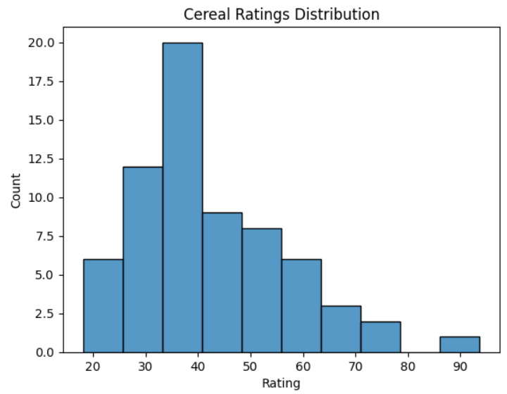
As you can see, the distribution of cereal ratings is skewed toward the lower end. The most popular rating of these cereals is in the high thirties.
Another common distribution plot type is the kernel density estimation, or KDE, plot. This allows you to analyze continuous data and estimate the probability that any value will occur within it. To create the KDE curve for your breakfast cereal analysis, you could use the following code:
In [3]: (
   ...:     sns.kdeplot(data=cereals_data, x="Rating")
   ...:     .set(title="Cereal Ratings KDE Curve")
   ...: )
   ...:
   ...: plt.show()
This will analyze each Rating value in the cereals_data data Series and draw a KDE curve based on its probability of appearing. The various parameters passed to the kdeplot() function have the same meaning as those in histplot() that you used earlier. The resulting KDE curve looks like this:
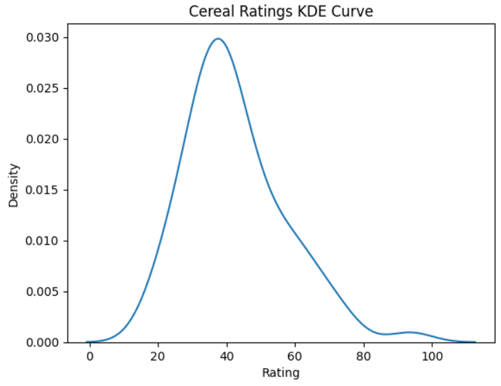
This curve provides further evidence that the distribution of cereal ratings is skewed toward the lower end. If you pick any breakfast cereal serving in the dataset at random, it’ll most likely contain a rating of around forty.
A rug plot is another type of plot used to visualize data distribution density. It contains a set of vertical lines, like the twists in a twist pile rug, but whose spacing varies with the distribution density of the data they represent. More common data is represented by more closely packed lines, while less common data is represented by wider-spaced lines.
A rug plot is a stand-alone plot in its own right, but it’s normally added to another, more explicit plot. You can do this by making sure both of your functions reference the same underlying Matplotlib figure. You do this by making sure code such as plt.figure(), which creates a separate underlying Matplotlib figure object, doesn’t appear between each pair of functions.
Suppose you wanted to visualize the crossings data by creating a rug plot on top of a KDE plot:
In [4]: sns.kdeplot(data=cereals_data, x="Rating")
   ...:
   ...: (
   ...:     sns.rugplot(
   ...:         data=cereals_data, x="Rating",
   ...:         height=0.2, color="black",
   ...:     )
   ...:     .set(title="Cereal Rating Distribution")
   ...: )
   ...:
   ...: plt.show()
The kdeplot() function is the same as the one that you used earlier. In addition, you’ve added a new rug plot using the rugplot() function. The data and x parameters are the same for both to ensure that they both match. By setting height=0.2, the rug plot will occupy twenty percent of the plot height, while by setting color="black", it’ll stand out more prominently.
The final version of your plot looks like this:
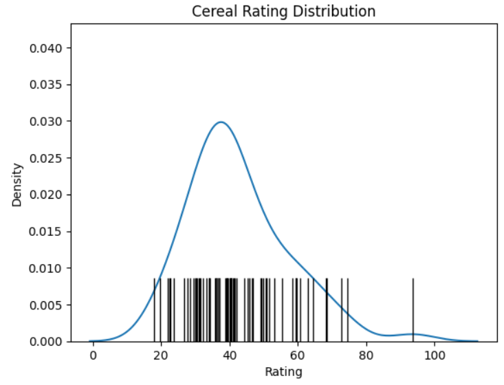
As you can see, as the KDE curve increases in value, the fibers of the rug plot become more bundled together. Conversely, the lower the KDE values, the more sparse the rug plot’s fibers become.
Using the principles that you’ve learned so far, and the seaborn documentation, you might like to try the following exercises:
Task 1: Produce a single histogram showing cereal ratings distribution such that there’s a separate bar for each manufacturer. Keep to the same ten bins.
Task 2: See if you can superimpose a KDE plot onto your original ratings histogram using only one function.
Task 3: Update your answer to Task 1 such that each manufacturer’s calorie data appears on a separate plot along with its own KDE curve.
Task 1 Solution Here’s one way that you could plot the cereal ratings distributions for each manufacturer:
In [1]: import matplotlib.pyplot as plt
   ...: import pandas as pd
   ...: import seaborn as sns
   ...:
   ...: cereals_data = (
   ...:     pd.read_csv("cereals_data.csv")
   ...:     .rename(columns={"rating": "Rating"})
   ...: )
   ...:
   ...: sns.histplot(
   ...:     data=cereals_data, x="Rating",
   ...:     bins=10, hue="manufacturer",
   ...:     multiple="dodge",
   ...: )
   ...:
   ...: plt.show()
After reading in the data, you can pretty much tweak the code that you used earlier when you plotted the distribution for all manufacturers. By setting the histplot() function’s hue and multiple parameters to "manufacturer" and "dodge" respectively, you separate the data with a separate bar for each manufacturer and make sure they don’t overlap.
Task 2 Solution One way you could superimpose the KDE plot is shown below:
In [2]: import matplotlib.pyplot as plt
   ...: import pandas as pd
   ...: import seaborn as sns
   ...:
   ...: cereals_data = (
   ...:     pd.read_csv("cereals_data.csv")
   ...:     .rename(columns={"rating": "Rating"})
   ...: )
   ...:
   ...: sns.histplot(
   ...:    data=cereals_data,
   ...:    x="Rating", kde=True, bins=10,
   ...: )
   ...: plt.show()
You can solve this problem also by making a small update to your original ratings histogram. All you need to do is set its kde parameter to True. This will add the KDE plot.
Task 3 Solution Here’s one way that you could plot each manufacturer’s rating distributions plus their KDE curves separately:
In [3]: import matplotlib.pyplot as plt
   ...: import pandas as pd
   ...: import seaborn as sns
   ...:
   ...: cereals_data = (
   ...:     pd.read_csv("cereals_data.csv")
   ...:     .rename(columns={
   ...:         "rating": "Rating",
   ...:         "manufacturer": "Manufacturer",
   ...:     })
   ...: )
   ...:
   ...: sns.displot(
   ...:     data=cereals_data, x="Rating",
   ...:     bins=10, hue="Manufacturer",
   ...:     kde=True, col="Manufacturer",
   ...: )
   ...:
   ...: plt.show()
This solution is similar to task two, except you use the figure-level displot() function and not the axes-level histplot() function. The parameters are similar, except you set both the hue and column parameters to manufacturer. These will separate each manufacturer’s data into a separate color and plot, respectively. Histograms are created by default, but you can also specify kind="hist" to be explicit.
Next, you’ll take a look at some examples of Relational plots.
Creating Relational Plots Using Functions
Seaborn’s relational plots are a family of plots that allow you to investigate the relationship between two sets of data. You saw an example of one of these earlier when you created a scatterplot.
The other common relational plot is the line plot. Line plots display information as a set of data marker points joined with straight line segments. They’re commonly used to visualize time series. To create one in seaborn, you use the lineplot() function.
In this section, you’ll reuse the crossings and bridge_crossings DataFrames that you used earlier as a basis for your relational plots.
Suppose you wanted to see the trend in daily bridge crossings across the Brooklyn Bridge for the three months of April to June. A line plot is one way of showing you this:
In [1]: import matplotlib.pyplot as plt
   ...: import pandas as pd
   ...: import seaborn as sns
   ...:
   ...: crossings = pd.read_csv("cycle_crossings_apr_jun.csv")
   ...:
   ...: sns.set_theme(style="darkgrid")
   ...:
   ...: (
   ...:     sns.lineplot(data=crossings, x="date", y="Brooklyn")
   ...:     .set(
   ...:         title="Brooklyn Bridge Daily Crossings",
   ...:         xlabel=None,
   ...:     )
   ...: )
   ...:
   ...: plt.xticks(
   ...:     ticks=[
   ...:         "01/04/2017", "01/05/2017", "01/06/2017", "30/06/2017"
   ...:     ],
   ...:     rotation=45,
   ...: )
   ...:
   ...: plt.show()
To enhance the appearance of the plot, you call seaborn’s set_theme() function and set a background theme of darkgrid. This gives the plot a shaded background plus a white grid for ease of reading. Note that this setting will apply to all subsequent plots unless you reset it back to its default white value.
As with all seaborn functions, you first pass lineplot() in a DataFrame. The line plot will show a time series, so the x values are assigned the date Series, while the y values are assigned the Brooklyn Series. These parameters are sufficient to draw the visualization.
The x Series contains over ninety values, meaning they’ll be crushed together and unreadable when the plot is drawn. To clarify this, you decide to use the Matplotlib xticks() function to rotate and display only the starting date of each of the three months, plus the last day in June. Your reader can infer the rest of the dates using this information, along with the background grid. You also give the plot a title and remove its xlabel.
The plot that you’ve created looks like this:
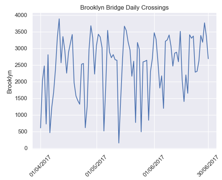
As you can see, the line plot plots each daily crossing value and joins these values together with straight-line segments. You may be surprised to see the variation in the levels of crossings of the bridge. On some days, there are fewer than 500 crossings, while on other days there are nearer 4,000.
Using the principles that you’ve learned so far, and the seaborn documentation, you might like to try the following exercises:
Task 1: Using an appropriate dataset, produce a single line plot showing the crossings for all bridges from April to June.
Task 2: Clarify your solution to Task 1 by creating a separate subplot for each bridge.
Task 1 Solution Here’s one way you could plot bridge crossings on a single line plot:
In [1]: import matplotlib.pyplot as plt
   ...: import pandas as pd
   ...: import seaborn as sns
   ...:
   ...: crossings = pd.read_csv("cycle_crossings_apr_jun.csv")
   ...:
   ...: bridge_crossings = crossings.melt(
   ...:     id_vars=["day", "date"],
   ...:     value_vars=[
   ...:         "Brooklyn", "Manhattan",
   ...:         "Williamsburg", "Queensboro",
   ...:     ],
   ...:     var_name="Bridge",
   ...:     value_name="Crossings",
   ...: ).rename(columns={"day": "Day", "date": "Date"})
   ...:
   ...: (
   ...:     sns.lineplot(
   ...:         data=bridge_crossings, x="Date", y="Crossings",
   ...:         hue="Bridge", style="Bridge",
   ...:     )
   ...:     .set_title("Daily Bridge Crossings")
   ...: )
   ...:
   ...: plt.xticks(
   ...:     ticks=[
   ...:         "01/04/2017", "01/05/2017", "01/06/2017", "30/06/2017"
   ...:     ],
   ...:     rotation=45,
   ...: )
   ...:
   ...: plt.show()
You once more read in the data and pivot it using the DataFrame’s .melt() method to put each bridge’s data in the same column. Then you use the lineplot() function to draw the plot. By setting both hue and style to "Bridge", you make sure the data for each bridge appears as a separate line with a different color and appearance. To make the x-axis less crowded, you set its ticks to the four date positions shown and rotate them by 45 degrees.
Task 2 Solution One way you could separate your previous line plot is shown below:
In [2]: import matplotlib.pyplot as plt
   ...: import pandas as pd
   ...: import seaborn as sns
   ...:
   ...: crossings = pd.read_csv("cycle_crossings_apr_jun.csv")
   ...:
   ...: bridge_crossings = crossings.melt(
   ...:     id_vars=["day", "date"],
   ...:     value_vars=[
   ...:         "Brooklyn", "Manhattan",
   ...:         "Williamsburg", "Queensboro",
   ...:     ],
   ...:     var_name="Bridge",
   ...:     value_name="Crossings",
   ...: ).rename(columns={"day": "Day", "date": "Date"})
   ...:
   ...: sns.relplot(
   ...:     data=bridge_crossings, kind="line",
   ...:     x="Date", y="Crossings",
   ...:     hue="Bridge", col="Bridge",
   ...: )
   ...:
   ...: plt.xticks(
   ...:     ticks=[
   ...:         "01/04/2017", "01/05/2017", "01/06/2017", "30/06/2017"
   ...:     ],
   ...:     rotation=45,
   ...: )
   ...:
   ...: plt.show()
This code is similar to your solution to Task 1, only this time you use the relplot() function. By setting col="Bridge", you separate the data of each bridge into its own plot.
Next, you’ll take a look at some examples of regression plots.
Creating Regression Plots Using Functions
Seaborn’s regression plots are a family of plots that allow you to investigate the relationship between two sets of data. They produce a regression analysis between the datasets that helps you visualize their relationship.
The two axes-level regression plot functions are the regplot() and residplot() functions. These produce a regression analysis and the residuals of a regression analysis, respectively.
In this section, you’ll continue with the crossings DataFrame that you used earlier.
Earlier you used the scatterplot() function to create a scatterplot comparing the minimum and maximum temperatures. Had you used regplot() instead, you would’ve produced the same result, only with a linear regression line superimposed on it:
In [1]: import matplotlib.pyplot as plt
   ...: import pandas as pd
   ...: import seaborn as sns
   ...:
   ...: crossings = pd.read_csv("cycle_crossings_apr_jun.csv")
   ...:
   ...: (
   ...:     sns.regplot(
   ...:         data=crossings, x="min_temp",
   ...:         y="max_temp", ci=95,
   ...:     )
   ...:     .set(
   ...:         title="Regression Analysis of Temperatures",
   ...:         xlabel="Minimum Temperature",
   ...:         ylabel="Maximum Temperature",
   ...:     )
   ...: )
   ...:
   ...: plt.show()
As before, the regplot() function requires a DataFrame, as well as the x and y Series to be plotted. This is sufficient to draw the scatterplot, along with a linear regression line. The resulting regression plot looks like this:
The shading around the line is the confidence interval. By default, this is set to 95 percent but can be adjusted by setting the ci parameter accordingly. You can delete the confidence interval by setting ci=None.
One of the most frustrating aspects of using regplot() is that it doesn’t allow you to insert the regression equation or R-squared value onto the plot. Although regplot() knows about these internally, it doesn’t reveal them to you. If you want to see the equation, then you must calculate and display it separately.
To do this, you use the LinearRegression class from the scikit-learn library. Objects of this class allow you to work out an ordinary least squares linear regression between two variables.
To use it, you must first install scikit-learn using !python -m pip install scikit-learn. As before, you don’t need the exclamation point (!) if you’re working at the command line. Once the scikit-learn library is installed, you can perform the regression:
In [2]: from sklearn.linear_model import LinearRegression
   ...:
   ...: x = crossings.loc[:, ["min_temp"]]
   ...: y = crossings.loc[:, "max_temp"]
   ...:
   ...: model = LinearRegression()
   ...: model.fit(x, y)
   ...:
   ...: r_squared = f"R-Squared: {model.score(x, y):.2f}"
   ...: best_fit = (
   ...:     f"y = {model.coef_[0]:.4f}x"
   ...:     f"{model.intercept_:+.4f}"
   ...: )
   ...:
   ...: ax = sns.regplot(
   ...:     data=crossings, x="min_temp", y="max_temp",
   ...:     line_kws={"label": f"{best_fit}\n{r_squared}"},
   ...: )
   ...:
   ...: ax.set_xlabel("Minimum Temperature")
   ...: ax.set_title("Regression Analysis of Temperatures")
   ...: ax.set_ylabel("Maximum Temperature")
   ...: ax.legend()
   ...:
   ...: plt.show()
First, you import LinearRegression from sklearn.linear_model. As you’ll see shortly, you’ll need this to perform the linear regression calculation. You then create a pandas DataFrame and a pandas Series. Your x is a DataFrame that contains the min_temp column’s data, while y is a Series that contains the max_temp column’s data. You could potentially regress on several features, which is why x is defined as a DataFrame with a list of columns.
Next, you create a LinearRegression instance and pass in both data sets to it using .fit(). This will perform the actual regression calculations for you. By default, it uses ordinary least squares (OLS) to do so.
Once you’ve created and populated the LinearRegression instance, its .score() method calculates the R-squared, or coefficient of determination, value. This measures how close the best-fit line is to the actual values. In your analysis, the R-squared value of 0.78 indicates a 78 percent accuracy between the best-fit line and the actual values. You store it in a string named r_squared for plotting later. You round the value for neatness.
The LinearRegression instance also calculates the slope of the linear regression line and its y-intercept. These are stored in the .coef_[0] and .intercept_ properties, respectively.
To draw the plot, you use the regplot() function as before, but you use its line_kws parameter to define the label property of the regression line. This is passed in as a Python dictionary whose key is the parameter you wish to set, and whose value is the value of that parameter. In this case, it’s a string containing both the best_fit equation and the r_squared value that you calculated earlier.
You assign the regplot(), which is a Matplotlib Axes object, to a variable named ax to allow you to give the plot and its axes titles. Finally, you use the .legend() method to display the contents of its label—in other words, the linear regression equation and R-squared value.
Note: You may be wondering why both the model.coef_ and model.intercept_ variables have underscore suffixes. This is a scikit-learn convention to indicate variables that contain estimated values.
Your updated plot now looks like this:
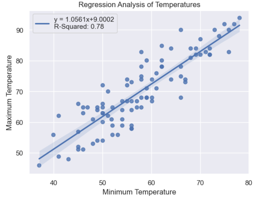
As you can see, the equation of the best-fitting straight line of the data points has been added to your plot.
Using the principles that you’ve learned so far, and the seaborn documentation, you might like to try the following exercises:
Task 1: Redo the previous regression plot, but this time create a single plot showing a separate regression line, with the equation, for each of the three months.
Task 2: Use an appropriate figure-level function to create a separate regression plot for each month.
Task 3: See if you can add the correct equation onto each of the three plots that you created in Task 2. Hint: Research the FacetGrid.map_dataframe() method.
Task 1 Solution One way you could plot each regression on the same plot for each month is:
In [1]: import matplotlib.pyplot as plt
   ...: import pandas as pd
   ...: import seaborn as sns
   ...: from sklearn.linear_model import LinearRegression
   ...:
   ...: def calculate_regression(month, data):
   ...:     x = data.loc[:, ["min_temp"]]
   ...:     y = data.loc[:, "max_temp"]
   ...:     model = LinearRegression()
   ...:     model.fit(x, y)
   ...:     r_squared = (
   ...:         f"R-Squared: {model.score(x, y):.2f}"
   ...:     )
   ...:     best_fit = (
   ...:         f"{month}\ny = {model.coef_[0]:.4f}x"
   ...:         f"{model.intercept_:+.4f}"
   ...:     )
   ...:     return r_squared, best_fit
   ...:
   ...: def drawplot(month, crossings):
   ...:     monthly_crossings = crossings[
   ...:         crossings.month == month
   ...:     ]
   ...:     r_squared, best_fit = calculate_regression(
   ...:         month, monthly_crossings
   ...:     )
   ...:
   ...:     ax = sns.regplot(
   ...:         data=monthly_crossings, x="min_temp",
   ...:         y="max_temp", ci=None,
   ...:         line_kws={"label": f"{best_fit}\n{r_squared}"},
   ...:     )
   ...:     ax.set_title(
   ...:         "Regression Analysis of Temperatures"
   ...:     )
   ...:     ax.legend()
   ...:
   ...: crossings = pd.read_csv("cycle_crossings_apr_jun.csv")
   ...:
   ...: months = ["April", "May", "June"]
   ...: for month in months:
   ...:     drawplot(month, crossings)
   ...:
   ...: plt.show()
As with your earlier example, you need to manually calculate the regression equation for each line. To do this, you create a calculate_regression() function that takes a string representing the month whose line is to be determined, as well as a DataFrame containing the data. The main body of this function uses similar code as your earlier example to calculate the linear regression equation.
The regression plot is again produced using seaborn’s regplot() function. You’ve also placed the code into a drawplot() function so that you can call it several times, once for each month that you’re plotting. This too works similarly to the example that you saw earlier.
The main code reads the source data and then calls drawplot() within a for loop for each of the three months required. It passes in a string to identify the month as well as the DataFrame containing the data.
Task 2 Solution One way you could plot each regression on the same plot for each month is:
In [2]: import matplotlib.pyplot as plt
   ...: import pandas as pd
   ...: import seaborn as sns
   ...:
   ...: crossings = pd.read_csv("cycle_crossings_apr_jun.csv")
   ...:
   ...: sns.lmplot(
   ...:     data=crossings, x="min_temp",
   ...:     y="max_temp", col="month",
   ...: )
   ...:
   ...: plt.show()
This time, you use seaborn’s lmplot() function to do the plotting for you. To separate each subplot by month, you set col="month".
Task 3 Solution One way you could plot each regression on the same plot for each month is:
In [3]: import matplotlib.pyplot as plt
   ...: import pandas as pd
   ...: import seaborn as sns
   ...: from sklearn.linear_model import LinearRegression
   ...:
   ...: crossings = pd.read_csv("cycle_crossings_apr_jun.csv")
   ...:
   ...: def regression_equation(data, **kws):
   ...:     x = data.loc[:, ["min_temp"]]
   ...:     y = data.loc[:, "max_temp"]
   ...:     model = LinearRegression()
   ...:     model.fit(x, y)
   ...:     r_squared = (
   ...:         f"R-Squared: {model.score(x, y):.2f}"
   ...:     )
   ...:     best_fit = (
   ...:         f"y = {model.coef_[0]:.4f}x"
   ...:         f"{model.intercept_:+.4f}"
   ...:     )
   ...:     ax = plt.gca()  # Get current Axes.
   ...:     ax.text(
   ...:         0.1, 0.6,
   ...;         f"{best_fit}\n{r_squared}",
   ...:         transform=ax.transAxes,
   ...:     )
   ...:
   ...: crossings = pd.read_csv("cycle_crossings_apr_jun.csv")
   ...:
   ...: sns.lmplot(
   ...:     data=crossings, x="min_temp",
   ...:     y="max_temp", col="month",
   ...: ).map_dataframe(regression_equation)
   ...:
   ...: plt.show()
As before, you use the lmplot() function to create your plot. You set col="month" to ensure separate plots are produced for each month. Next, you must manually calculate the regression equations for each month’s data. You do the calculation within the regression_equation() function. The header of this function shows that it takes a DataFrame as its data parameter plus a range of other parameters passed by keyword.
Here you need to call regression_equation() once for each month of data whose equation you want. To do this, you use seaborn’s FacetGrid.map_dataframe() method. Remember, the FacetGrid is the object upon which each subplot will be placed, and it’s created by lmplot().
By calling .map_dataframe() and passing regression_equation in as its argument, the regression_equation() function will be called for each month. It’s passed data originally passed to lmplot() but filtered on col="month". It then uses these to work out the regression equations for each separate month’s data.
Next, you’ll turn your attention to working with seaborn’s objects interface.
Creating seaborn Data Plots Using Objects
Earlier you saw how seaborn’s Plot object is used as a background for your plot, while you must use one or more Mark objects to give it content. In this section, you’ll learn the principles of how to use more of these, as well as how to use some other common seaborn objects. As with the section on using functions, remember to concentrate on understanding the principles. The details are in the documentation.
Using the Main Data Visualization Objects
The seaborn object interface includes several Mark objects, including Line, Bar, and Area, as well as the Dot that you’ve already seen. Although each of these can produce plots individually, you can also combine them to produce more complicated visualizations.
As an example, suppose you wanted to prepare a plot to allow you to visualize the minimum temperatures for the first week of your crossings data:
In [1]: import pandas as pd
   ...: import seaborn.objects as so
   ...:
   ...: crossings = pd.read_csv(
   ...:     "cycle_crossings_apr_jun.csv",
   ...:     parse_dates=["date"],
   ...:     dayfirst=True,
   ...: )
   ...:
   ...: first_week = (
   ...:     crossings
   ...:     .loc[crossings.month == "April"]
   ...:     .sort_values(by="date")
   ...:     .head(7)
   ...: )
   ...:
   ...: (
   ...:     so.Plot(data=first_week, x="day", y="min_temp")
   ...:     .add(so.Line(color="black", linewidth=3, marker="o"))
   ...:     .add(so.Bar(color="green", fill=False, edgewidth=3))
   ...:     .add(so.Area(color="yellow"))
   ...:     .label(
   ...:         x="Day", y="Temperature",
   ...:         title="Minimum Temperature",
   ...:     )
   ...:     .show()
   ...: )
You make sure that the date column is interpreted as dates, so that you can calculate the first seven days of April. You create first_week by filtering crossings to obtain the April data, sorting on date and using .head(7) to obtain only the first seven rows, containing the first week’s worth of data.
As with all seaborn plots created using objects, you must first create a Plot object that contains references to the data that you need. In this case, you must supply the first_week DataFrame as well as the day and min_temp Series within it for data, x, and y, respectively. These values will be available to any objects that you later add to your plot.
To add content to the plot, you use the Plot.add() method and pass in the object or objects that you wish to add. Each time you call Plot.add(), you add its parameters to a separate layer of your Plot object. In this case, you’ve called .add() three times, so three separate layers will be added.
The first layer contains a Line object, which you use to draw lines on the plot and create a line plot. By passing in color, linewidth, and marker parameters, you define how you want your Line object to look. A set of lines joining adjacent data points will appear on your plot.
The second layer contains a Bar object. These are used in bar plots. Again you specify some parameters to define how the bars will look. These are then applied to each bar on your plot.
The final layer adds an Area object. This provides shading below data. In this case, it’ll be yellow since you’ve specified this as its color property.
To finish off, you call the .label() method of Plot, to provide your plot with a title and capitalized label axes.
Your plot looks like this:
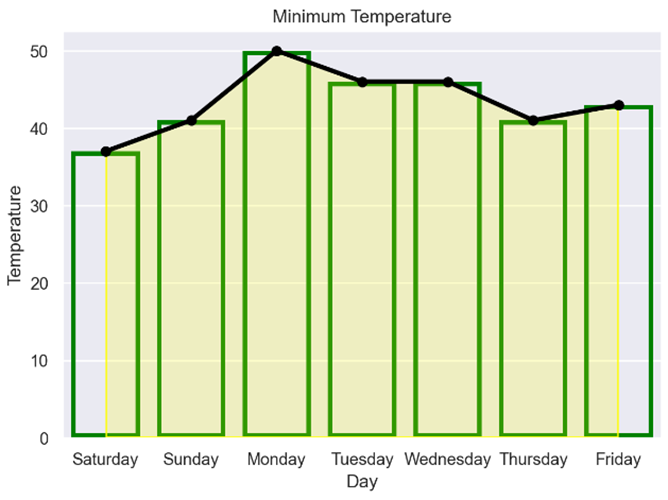
As you can see, all three objects have been placed on the plot. Allowing you to add separate objects to the Plot object gives you great flexibility in how your final visualization will look. You’re no longer restricted by how a function decides how your plot will look. However, as you’ve seen here, you can overdo it without realizing it.
Enhancing Your Plots With Move and Stat Objects
Next, suppose you wanted to analyze the median maximum temperatures for each day in each of the three months. To do this you need to make use of seaborn’s Stat and Move object types:
In [2]: import pandas as pd
   ...: import seaborn.objects as so
   ...:
   ...: crossings = pd.read_csv("cycle_crossings_apr_jun.csv")
   ...:
   ...: (
   ...:     so.Plot(
   ...:         data=crossings, x="month",
   ...:         y="max_temp", color="day",
   ...:     )
   ...:     .add(
   ...:         so.Bar(),
   ...:         so.Agg(func="median"),
   ...:         so.Dodge(gap=0.1),
   ...:     )
   ...:     .label(
   ...:         x=None, y="Temperature",
   ...:         title="Median Temperature", color="Day",
   ...:     )
   ...:     .show()
   ...: )
As usual, you start by defining your Plot object. This time you add in a color parameter. However, instead of assigning an actual color, you define the day data Series. This will mean that all layers added will separate the plot into separate days, with each day having a different color. This is similar in concept to the hue parameter you saw earlier, however, hue does not exist in a Plot.
You decide to use Bar objects to represent your data, but those are not quite sufficient by themselves in this case.
To display the median values on each temperature bar plotted, you need to add an Agg object into the same layer as the Bar. This is an example of a Stat type and allows you to specify how the data will be transformed or calculated before it’s plotted. In this example, you pass in "median" as its func parameter which tells it to use median values for each Bar object. The default is "mean".
By default, each of the bars will appear on top of each other. To separate them, you need to add a Dodge object into the layer as well. This is an example of a Move object type and allows you to adjust the placement of the different bars. In this case, you set each bar to have a gap between them by passing gap=0.1.
Finally, you use the .label() method to specify the plot’s labels. By setting color="Day", you give the legend title a capitalized string.
Your resulting plot looks like this:
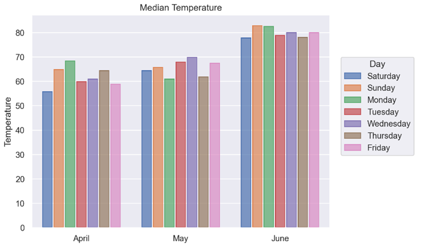
As you can see, each month’s data is represented by a separate cluster of bars, with each bar within each cluster representing a different day. If you look carefully, you’ll see each bar is also slightly separated from the others.
Separating a Plot Into Subplots
Now suppose you wanted each of the monthly plots to appear on a separate subplot. To do this you use the Plot object’s .facet() method to decide how you want to separate the data:
In [3]: import pandas as pd
   ...: import seaborn.objects as so
   ...:
   ...: crossings = pd.read_csv("cycle_crossings_apr_jun.csv")
   ...:
   ...: (
   ...:     so.Plot(
   ...:         data=crossings, x="month",
   ...:         y="max_temp", color="day",
   ...:     )
   ...:     .facet(col="month")
   ...:     .add(
   ...:         so.Bar(),
   ...:         so.Agg(func="median"),
   ...:         so.Dodge(gap=0.1)),
   ...:     .label(
   ...:         x=None, y="Temperature",
   ...:         title="Median Temperature", color="Day",
   ...:     )
   ...:     .show()
   ...: )
This time when you call .facet(col="month") on your Plot object, each of the monthly figures is separated out:
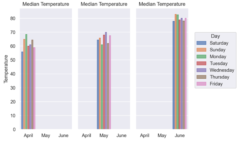
As you can see, the updated plot now shows three subplots, each with a different month’s worth of data. Once again, making a minor tweak in your code allows you to produce significantly different output.
Using the principles you’ve learned so far, and the seaborn documentation, you might like to try the following exercises:
Task 1: Redraw the min_temperature vs max_temperature scatterplot that you created at the start of the article using objects. Also, make sure each marker has a different color depending on the days that it represents. Finally, use a star to represent each marker.
Task 2: Create a bar plot using objects showing the maximum and minimum bridge crossings for each of the four bridges.
Task 3: Create a bar plot using objects analyzing the counts of breakfast cereal calories. The calories should be placed into ten equal-sized bins.
Task 1 Solution One way you could redraw your initial scatterplot using objects could be:
In [1]: import pandas as pd
   ...: import seaborn.objects as so
   ...:
   ...: crossings = pd.read_csv("cycle_crossings_apr_jun.csv")
   ...:
   ...: (
   ...:     so.Plot(
   ...:         data=crossings, x="min_temp",
   ...:         y="max_temp", color="day",
   ...:     )
   ...:     .add(so.Dot(marker="*"))
   ...:     .label(
   ...:         x="Minimum Temperature",
   ...:         y="Maximum Temperature",
   ...:         title="Scatterplot of Temperatures",
   ...:     )
   ...:     .show()
   ...: )
To begin with, you read the data into a DataFrame and then pass it to the Plot object’s constructor, along with the columns whose data you’re interested in. In this case, you assign "min_temp" and "max_temp" to the x and y parameters, respectively.
You create the content of a scatterplot by adding in a Dot object for each x and y value pair. To make each point appear as a star, you pass in marker="*". Finally, you use .label() to provide a title for your plot as well as a label for each axis.
Task 2 Solution One way you could create a bar plot showing the maximum and minimum bridge crossings for each bridge could be:
In [2]: import pandas as pd
   ...: import seaborn.objects as so
   ...:
   ...: crossings = pd.read_csv("cycle_crossings_apr_jun.csv")
   ...:
   ...: bridge_crossings = crossings.melt(
   ...:     id_vars=["day", "date"],
   ...:     value_vars=[
   ...:         "Brooklyn", "Manhattan",
   ...:         "Williamsburg", "Queensboro",
   ...:     ],
   ...:     var_name="Bridge",
   ...:     value_name="Crossings",
   ...: )
   ...:
   ...: (
   ...:     so.Plot(
   ...:         data=bridge_crossings, x="Bridge",
   ...:         y="Crossings", color="Bridge",
   ...:     )
   ...:     .add(so.Bar(), so.Agg("max"))
   ...:     .add(so.Bar(), so.Agg("min"))
   ...:     .label(
   ...:         x="Bridge", y="Crossings",
   ...:         title="Bridge Crossings",
   ...:     )
   ...:     .show()
   ...: )
Once again, you use .melt() to restructure the bridge data before passing it into the Plot object’s constructor, along with the "Bridge" and "Crossings" data that you’re interested in. To build up the plot’s content, you add two pairs of Bar and Agg objects, one to produce the bars of maximum values and the other to produce the bars of minimum values. Finally, you add in some titles using .label().
Task 3 Solution One way you could create a bar plot analyzing the counts of breakfast cereal calories could be:
In [3]: import pandas as pd
   ...: import seaborn.objects as so
   ...:
   ...: cereals_data = pd.read_csv("cereals_data.csv")
   ...:
   ...: (
   ...:     so.Plot(data=cereals_data, x="calories")
   ...:     .add(so.Bar(), so.Hist(bins=10))
   ...:     .label(
   ...:         x="Calories", y="Count",
   ...:         title="Calorie Counts",
   ...:     )
   ...:     .show()
   ...: )
To begin with, you read the data into a DataFrame and then pass it into the Plot object’s constructor along with the column whose data you’re interested in. In this case, you set x="calories". The content of your bar plot is created using Bar objects, but you must also supply a Hist object to specify the number of bins you want. As before, you add some titles and label each axis.
Although you may think otherwise, you’ve not actually reached the end of your seaborn journey, but rather only the end of its beginning. Remember, seaborn is still growing, so there’s always more for you to learn. Your main focus in this tutorial has been to gain awareness of the key principles of seaborn. You must understand these because you can later apply them in a wide range of ways to produce very sophisticated plots.
Why not take another look over the various tasks that you accomplished during this tutorial, and use the documentation to see if you can enhance them? In addition, don’t forget that the writers of seaborn make lots of sample datasets freely available to you to allow you to practice, practice practice!
Conclusion
You’ve now gained a grounding in the basics of seaborn. Seaborn is a library that allows you to create statistical analysis visualizations of data. With its twin APIs and its foundation in Matplotlib, it allows you to produce a wide variety of different plots to meet your needs.
In this tutorial, you’ve learned:
- How to identify situations where you could consider using seaborn with Python
- How seaborn’s functional interface can be used to visualize data with Python
- How seaborn’s objects interface can be used to visualize data with Python
- How to create several common plot types using both interfaces
- How to to keep your skills up to date by reading the documentation
With this knowledge, you’re now ready to start creating fancy seaborn data visualizations in your Python code to show off to others your analyzed data.
Free Bonus: Click here to download the free code that you can experiment with in Python seaborn.
Take the Quiz: Test your knowledge with our interactive “Visualizing Data in Python With Seaborn” quiz. You’ll receive a score upon completion to help you track your learning progress:
Interactive Quiz
Visualizing Data in Python With SeabornPractice creating statistical plots in Python with seaborn. Compare the classic functional interface with the newer objects interface.