In this tutorial, you’ll learn how to use ggplot in Python to create data visualizations using a grammar of graphics. A grammar of graphics is a high-level tool that allows you to create data plots in an efficient and consistent way. It abstracts most low-level details, letting you focus on creating meaningful and beautiful visualizations for your data.
There are several Python packages that provide a grammar of graphics. This tutorial focuses on plotnine since it’s one of the most mature ones. plotnine is based on ggplot2 from the R programming language, so if you have a background in R, then you can consider plotnine as the equivalent of ggplot2 in Python.
In this tutorial, you’ll learn how to:
- Install plotnine and Jupyter Notebook
- Combine the different elements of the grammar of graphics
- Use plotnine to create visualizations in an efficient and consistent way
- Export your data visualizations to files
This tutorial assumes that you already have some experience in Python and at least some knowledge of Jupyter Notebook and pandas. To get up to speed on these topics, check out Jupyter Notebook: An Introduction and Using Pandas and Python to Explore Your Dataset.
Free Download: Get a sample chapter from Python Tricks: The Book that shows you Python’s best practices with simple examples you can apply instantly to write more beautiful + Pythonic code.
Setting Up Your Environment
In this section, you’ll learn how to set up your environment. You’ll cover the following topics:
- Creating a virtual environment
- Installing plotnine
- Installing Juptyer Notebook
Virtual environments enable you to install packages in isolated environments. They’re very useful when you want to try some packages or projects without messing with your system-wide installation. You can learn more about them in Python Virtual Environments: A Primer.
Run the following commands to create a directory named data-visualization and a virtual environment inside it:
$ mkdir data-visualization
$ cd data-visualization
$ python3 -m venv venv
After running the above commands, you’ll find your virtual environment inside the data-visualization directory. Run the following command to activate the virtual environment and start using it:
$ source ./venv/bin/activate
When you activate a virtual environment, any package that you install will be installed inside the environment without affecting your system-wide installation.
Next, you’ll install plotnine inside the virtual environment using the pip package installer.
Install plotnine by running this command:
$ python -m pip install plotnine
Executing the above command makes the plotnine package available in your virtual environment.
Finally, you’ll install Jupyter Notebook. While this isn’t strictly necessary for using plotnine, you’ll find Jupyter Notebook really useful when working with data and building visualizations. If you’ve never used the program before, then you can learn more about it in Jupyter Notebook: An Introduction.
To install Jupyter Notebook, use the following command:
$ python -m pip install jupyter
Congratulations, you now have a virtual environment with plotnine and Jupyter Notebook installed! With this setup, you’ll be able to run all the code samples presented through this tutorial.
Building Your First Plot With ggplot and Python
In this section, you’ll learn how to build your first data visualization using ggplot in Python. You’ll also learn how to inspect and use the example datasets included with plotnine.
The example datasets are really convenient when you’re getting familiar with plotnine’s features. Each dataset is provided as a pandas DataFrame, a two-dimensional tabular data structure designed to hold data.
You’ll work with the following datasets in this tutorial:
economics: A time series of US economic datampg: Fuel economy data for a range of vehicleshuron: The level of Lake Huron between the years 1875 and 1972
You can find the full list of example datasets in the plotnine reference.
You can use Jupyter Notebook to inspect any dataset. Launch Jupyter Notebook with the following commands:
$ source ./venv/bin/activate
$ jupyter-notebook
Then, once inside Jupyter Notebook, run the following code to see the raw data in the economics dataset:
from plotnine.data import economics

economics
The code imports the economics dataset from plotnine.data and shows it in a table:
      date      pce      pop   psavert uempmed  unemploy
0   1967-07-01  507.4   198712  12.5    4.5     2944
1   1967-08-01  510.5   198911  12.5    4.7     2945
... ...         ...     ...     ...     ...     ...
572 2015-03-01  12161.5 320707  5.2     12.2    8575
573 2015-04-01  12158.9 320887  5.6     11.7    8549
As you can see, the dataset includes economics information for each month between the years 1967 and 2015. Each row has the following fields:
date: The month when the data was collectedpce: Personal consumption expenditures (in billions of dollars)pop: The total population (in thousands)psavert: The personal savings rateuempmed: The median duration of unemployment (in weeks)unemploy: The number of unemployed (in thousands)
Now, using plotnine, you can create a plot to show the evolution of the population through the years:
 1from plotnine.data import economics
 2from plotnine import ggplot, aes, geom_line
 3
 4(
 5    ggplot(economics)  # What data to use
 6    + aes(x="date", y="pop")  # What variable to use
 7    + geom_line()  # Geometric object to use for drawing
 8)
This short code example creates a plot from the economics dataset. Here’s a quick breakdown:
-
Line 1: You import the
economicsdataset. -
Line 2: You import the
ggplot()class as well as some useful functions fromplotnine,aes()andgeom_line(). -
Line 5: You create a plot object using
ggplot(), passing theeconomicsDataFrame to the constructor. -
Line 6: You add
aes()to set the variable to use for each axis, in this casedateandpop. -
Line 7: You add
geom_line()to specify that the chart should be drawn as a line graph.
Running the above code yields the following output:
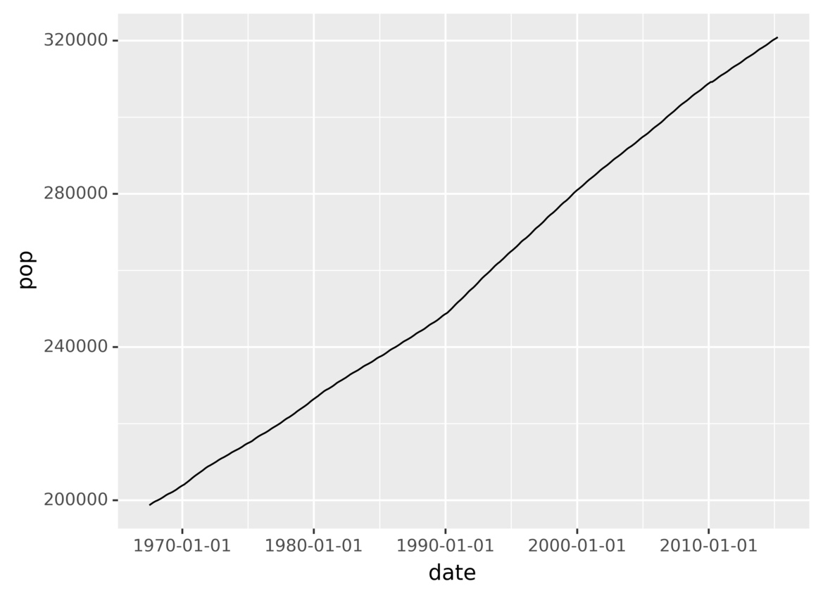
You’ve just created a plot showing the evolution of the population over time!
In this section, you saw the three required components that you need to specify when using the grammar of graphics:
- The data that you want to plot
- The variables to use on each axis
- The geometric object to use for drawing
You also saw that different components are combined using the + operator.
In the following sections, you’ll take a more in-depth look at grammars of graphics and how to create data visualizations using plotnine.
Understanding Grammars of Graphics
A grammar of graphics is a high-level tool that allows you to describe the components of a graphic, abstracting you from the low-level details of actually painting pixels in a canvas.
It’s called a grammar because it defines a set of components and the rules for combining them to create graphics, much like a language grammar defines how you can combine words and punctuation to form sentences. You can learn more about the foundations of grammars of graphics in Leland Wilkinson’s book The Grammar of Graphics.
There are many different grammars of graphics, and they differ in the components and rules that they use. The grammar of graphics implemented by plotnine is based on ggplot2 from the R programming language. This specific grammar was presented in Hadley Wickham’s paper “A Layered Grammar of Graphics.”
Below, you’ll learn about the main components and rules of plotnine’s grammar of graphics and how to use them to create data visualizations. First you’ll recap the three required components for creating a plot:
-
Data is the information to use when creating the plot.
-
Aesthetics (
aes) provides a mapping between data variables and aesthetic, or graphical, variables used by the underlying drawing system. In the previous section, you mapped thedateandpopdata variables to the x- and y-axis aesthetic variables. -
Geometric objects (
geoms) defines the type of geometric object to use in the drawing. You can use points, lines, bars, and many others.
Without any of these three components, plotnine wouldn’t know how to draw the graphic.
You’ll also learn about the optional components that you can use:
-
Statistical transformations specify computations and aggregations to be applied to the data before plotting it.
-
Scales apply some transformation during the mapping from data to aesthetics. For example, sometimes you can use a logarithmic scale to better reflect some aspects of your data.
-
Facets allow you to divide data into groups based on some attributes and then plot each group into a separate panel in the same graphic.
-
Coordinates systems map the position of objects to a 2D graphical location in the plot. For example, you can choose to flip the vertical and horizontal axes if that makes more sense in the visualization you’re building.
-
Themes allows you to control visual properties like colors, fonts, and shapes.
Don’t worry if you don’t fully understand what each component is right now. You’ll learn more about them throughout this tutorial.
Plotting Data Using Python and ggplot
In this section, you’ll learn more about the three required components for creating a data visualization using plotnine:
- Data
- Aesthetics
- Geometric objects
You’ll also see how they’re combined to create a plot from a dataset.
Data: The Source of Information
Your first step when you’re creating a data visualization is specifying which data to plot. In plotnine, you do this by creating a ggplot object and passing the dataset that you want to use to the constructor.
The following code creates a ggplot object using plotnine’s fuel economy example dataset, mpg:
from plotnine.data import mpg
from plotnine import ggplot

ggplot(mpg)
This code creates an object belonging to the class ggplot using the mpg dataset. Note that since you haven’t specified the aesthetics or geometric object yet, the above code will generate a blank plot. Next, you’ll build the plot piece by piece.
As you’ve seen before, you can inspect the dataset from Jupyter Notebook with the following code:
from plotnine.data import mpg

mpg
These two lines of code import and show the dataset, displaying the following output:
  manufacturer  model  displ  year  cyl  trans      drv  cty  hwy  fl  class
0 audi          a4      1.8   1999  4    auto(l5)   f    18   29   p  compact
1 audi          a4      1.8   1999  4    manual(m5) f    21   29   p  compact
2 audi          a4      2.0   2008  4    manual(m6) f    20   31   p  compact
...
The output is a table containing fuel consumption data for 234 cars from 1999 to 2008. The displacement (displ) field is the size of the engine in liters. cty and hwy are the fuel economy in miles per gallon for city and highway driving.
In the following sections, you’ll learn the steps to turn this raw data into graphics using plotnine.
Aesthetics: Define Variables for Each Axis
After specifying the data that you want to visualize, the next step is to define the variable that you want to use for each axis in your plot. Each row in a DataFrame can contain many fields, so you have to tell plotnine which variables you want to use in the graphic.
Aesthetics maps data variables to graphical attributes, like 2D position and color. For example, the following code creates a graphic that shows vehicle classes on the x-axis and highway fuel consumption on the y-axis:
from plotnine.data import mpg
from plotnine import ggplot, aes

ggplot(mpg) + aes(x="class", y="hwy")
Using the ggplot object from the previous section as the base for the visualization, the code maps the vehicle class attribute to the horizontal graphical axis and the hwy fuel economy to the vertical axis.
But the generated plot is still blank because it’s missing the geometric object for representing each data element.
Geometric Objects: Choose Different Plot Types
After defining your data and the attributes that you want to use in the graphic, you need to specify a geometric object to tell plotnine how data points should be drawn.
plotnine provides a lot of geometric objects that you can use out of the box, like lines, points, bars, polygons, and a lot more. A list of all available geometric objects is available in plotnine’s geoms API Reference.
The following code illustrates how to use the point geometric object to plot data:
from plotnine.data import mpg
from plotnine import ggplot, aes, geom_point

ggplot(mpg) + aes(x="class", y="hwy") + geom_point()
In the code above, geom_point() selects the point geometric object. Running the code produces the following output:
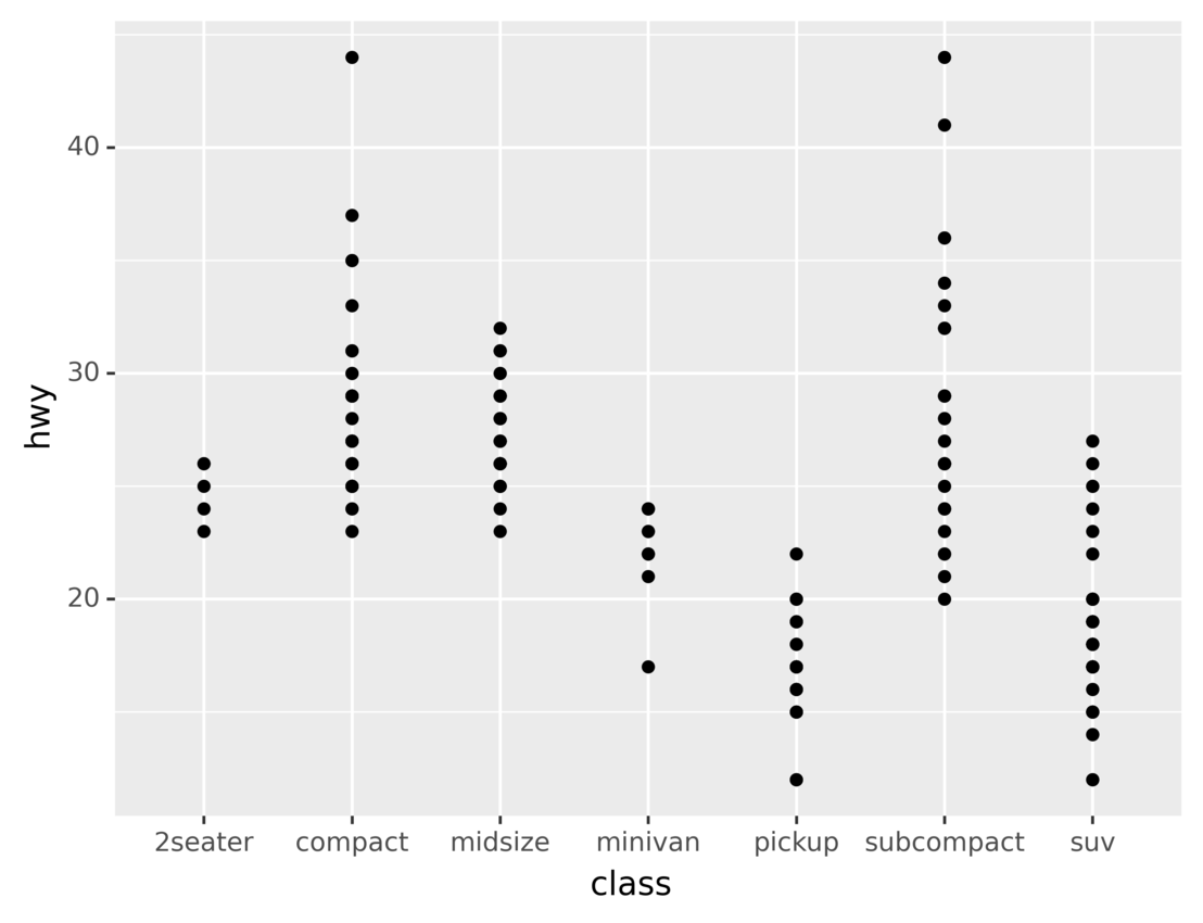
As you can see, the generated data visualization has a point for each vehicle in the dataset. The axes show the vehicle class and the highway fuel economy.
There are many other geometric objects that you can use to visualize the same dataset. For example, the following code uses the bar geometric object to show the count of vehicles for each class:
from plotnine.data import mpg
from plotnine import ggplot, aes, geom_bar

ggplot(mpg) + aes(x="class") + geom_bar()
Here, geom_bar() sets the geometric object to bar. Since the code doesn’t specify any attribute for the y-axis, geom_bar() implicitly groups data points by the attribute used for the x-axis and then uses the count of points in each group for the y-axis.
Running the code, you’ll see the following output:
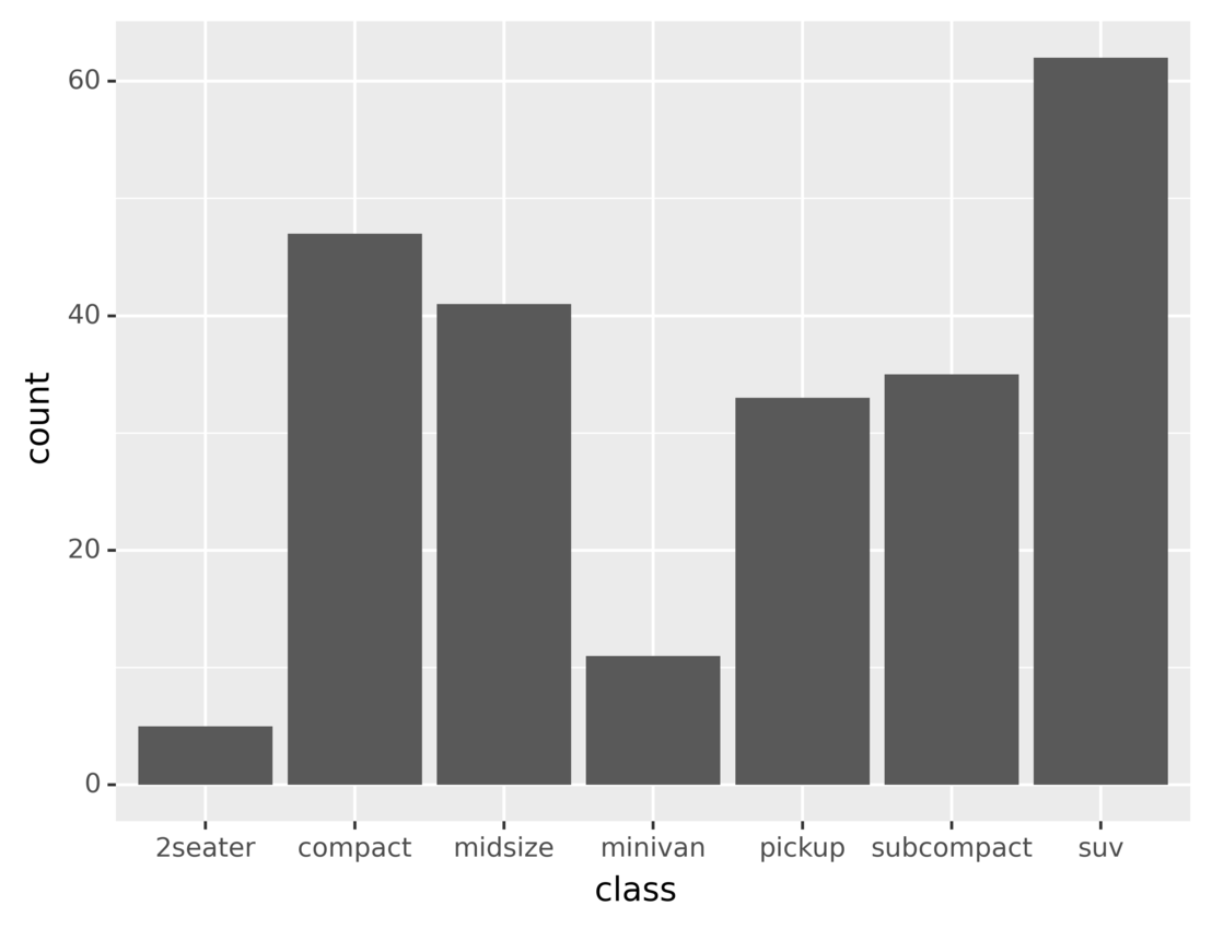
The height of each bar in the plot represents the number of vehicles belonging to the corresponding vehicle class. You’ll learn more about data aggregation and grouping the latter sections.
In this section, you learned about the three compulsory components that must be specified when creating data visualizations:
- Data
- Aesthetics
- Geometric objects
You also learned how to combine them using the + operator.
In the following sections, you’ll learn about some optional components that you can use to create more complex and beautiful graphics.
Using Additional Python and ggplot Features to Enhance Data Visualizations
In this section, you’re going to learn about the optional components that you can use when building data visualizations with plotnine. These components can be grouped into five categories:
- Statistical transformations
- Scales
- Coordinates systems
- Facets
- Themes
You can use them to create richer and more beautiful plots.
Statistical Transformations: Aggregate and Transform Your Data
Statistical transformations apply some computation to the data before plotting it, for example to display some statistical indicator instead of the raw data. plotnine includes several statistical transformations that you can use.
Let’s say that you want to create a histogram to display the distributions of the levels of Lake Huron from 1875 to 1975. This dataset is included with plotnine. You can use the following code to inspect the dataset from Jupyter Notebook and learn about its format:
# Import our example dataset with the levels of Lake Huron 1875–1975
from plotnine.data import huron

huron
The code imports and shows the dataset, producing the following output:
    year  level   decade
0   1875  580.38  1870
1   1876  581.86  1870
...
96  1971  579.89  1970
97  1972  579.96  1970
As you can see, the dataset contains three columns:
yearleveldecade
Now you can build the histogram in two steps:
- Group the level measurements into bins.
- Display the number of measurements in each bin using a bar plot.
The following code shows how these steps can be done in plotnine:
from plotnine.data import huron
from plotnine import ggplot, aes, stat_bin, geom_bar

ggplot(huron) + aes(x="level") + stat_bin(bins=10) + geom_bar()
In the above code, stat_bin() divides the level range into ten equally sized bins. Then the number of measurements that falls into each bin is drawn using a bar plot.
Running the code produces the following graphic:
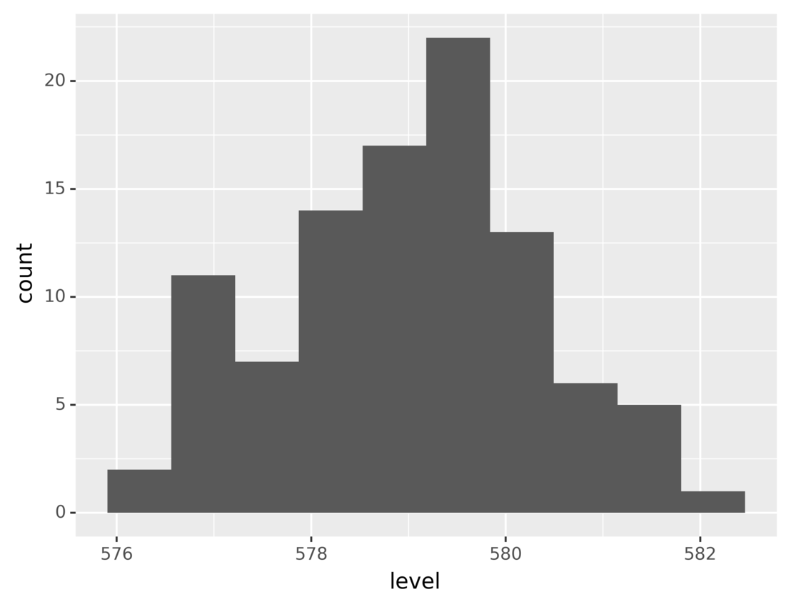
This plot shows the number of measurements for each range of lake levels. As you can see, most of the time the level was between 578 and 580.
For most common tasks, like building histograms, plotnine includes very convenient functions that make the code more concise. For example, with geom_histogram(), you can build the above histogram like this:
from plotnine.data import huron
from plotnine import ggplot, aes, geom_histogram

ggplot(huron) + aes(x="level") + geom_histogram(bins=10)
Using geom_histogram() is the same as using stats_bin() and then geom_bar(). Running this code generates the same graphic you saw above.
Now let’s look at another example of a statistical transformation. A box plot is a very popular statistical tool used to show the minimum, maximum, sample median, first and third quartiles, and outliers from a dataset.
Suppose you want to build a visualization based on the same dataset to show a box plot for each decade’s level measurements. You can build this plot in two steps:
- Group the measurements by decade.
- Create a box plot for each group.
You can do the first step using factor() in the aesthetics specification. factor() groups together all data points that share the same value for the specified attribute.
Then, once you’ve grouped the data by decade, you can draw a box plot for each group using geom_boxplot().
The following code creates a plot using the steps described above:
from plotnine.data import huron
from plotnine import ggplot, aes, geom_boxplot

(
  ggplot(huron)
  + aes(x="factor(decade)", y="level")
  + geom_boxplot()
)
The code groups the data rows by decade using factor() and then uses geom_boxplot() to create the box plots.
As you saw in the previous example, some geometrical objects have implicit statistical transformations. This is really convenient as it makes your code more concise. Using geom_boxplot() implies stat_boxplot(), which takes care of calculating the quartiles and outliers.
Running the above code, you’ll obtain the following graphic:
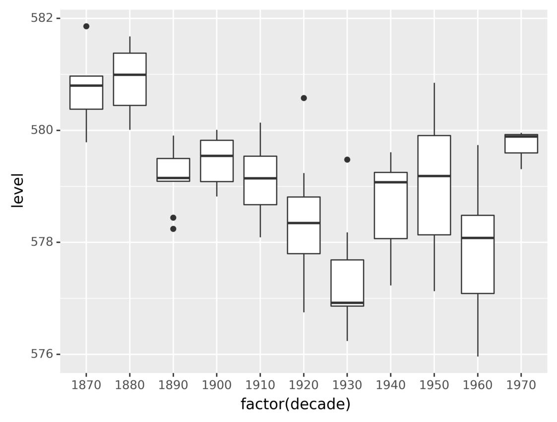
The graphic shows the distributions of the water levels using a box plot for each decade.
There are other statistical transformations that you can use to build data visualizations using ggplot in Python. You can learn about them in plotnine’s stats API documentation.
Scales: Change Data Scale According to Its Meaning
Scales are another kind of transformation that you can apply during the mapping from data to aesthetics. They can help make your visualizations easier to understand.
At the beginning of this tutorial, you saw a plot that showed the population for each year since 1970. The following code shows how you can use scales to show the elapsed years since 1970 instead of raw dates:
from plotnine.data import economics
from plotnine import ggplot, aes, scale_x_timedelta, labs, geom_line

(
    ggplot(economics)
    + aes(x="date", y="pop")
    + scale_x_timedelta(name="Years since 1970")
    + labs(title="Population Evolution", y="Population")
    + geom_line()
)
Using scale_x_timedelta() transforms each point’s x-value by computing its difference from the oldest date in the dataset. Note that the code also uses labs() to set a more descriptive label to the y-axis and the title.
Running the code shows this plot:
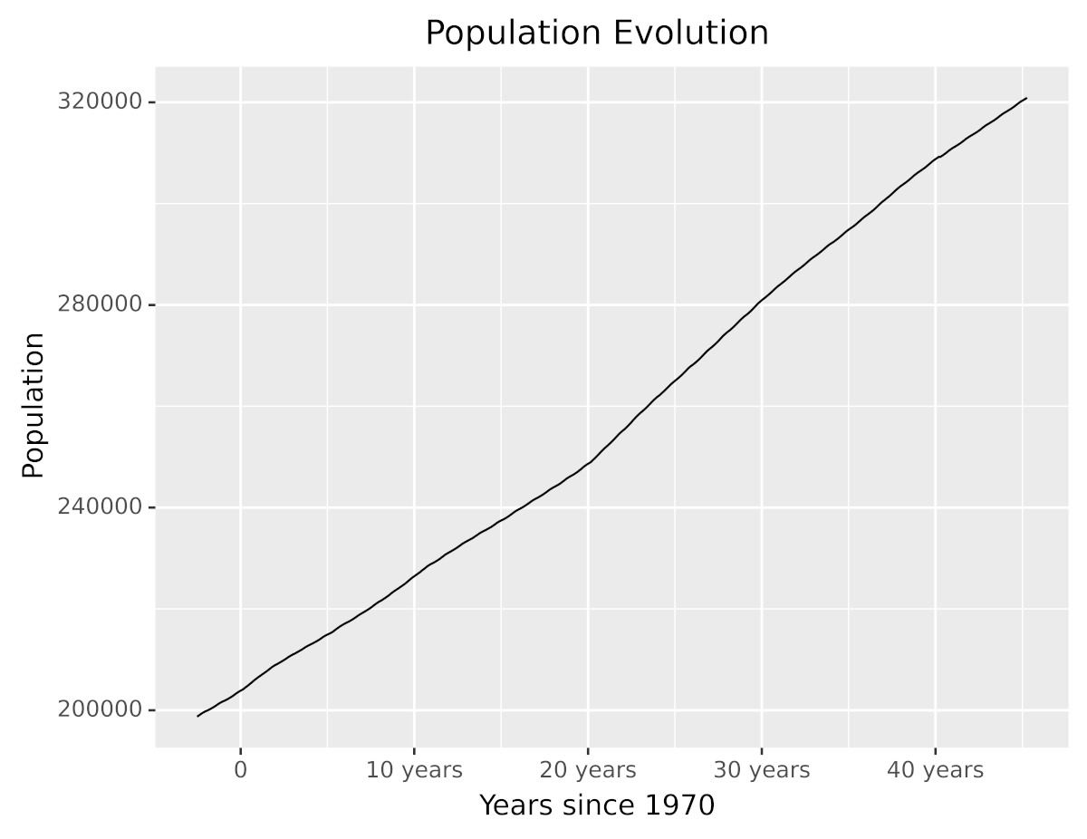
Without changing the data, you’ve made the visualization easier to understand and friendlier to the reader. As you can see, the plot now has better descriptions, and the x-axis shows the elapsed years since 1970 instead of dates.
plotnine provides a large number of scale transformations for you to choose from, including logarithmic and other non-linear scales. You can learn about them in plotnine’s scales API reference.
Coordinates Systems: Map Data Values to 2D Space
A coordinates system defines how data points are mapped to 2D graphical locations in the plot. You can think of it as a map from mathematical variables to graphical positions. Choosing the right coordinates system can improve the readability of your data visualizations.
Let’s revisit the previous example of the bar plot to count vehicles belonging to different classes. You created the plot using the following code:
from plotnine.data import mpg
from plotnine import ggplot, aes, geom_bar

ggplot(mpg) + aes(x="class") + geom_bar()
The code uses geom_bar() to draw a bar for each vehicle class. Since no particular coordinates system is set, the default one is used.
Running the code generates the following plot:
The height of each bar in the plot represents the number of vehicles in a class.
While there’s nothing wrong with the above graphic, the same information could be better visualized by flipping the axes to display horizontal bars instead of vertical ones.
plotnine provides several functions that allow you to modify the coordinates system. You can flip the axes using coord_flip():
from plotnine.data import mpg
from plotnine import ggplot, aes, geom_bar, coord_flip

ggplot(mpg) + aes(x="class") + geom_bar() + coord_flip()
The code flips the x- and y-axes using coord_flip(). Running the code, you’ll see the following graphic:
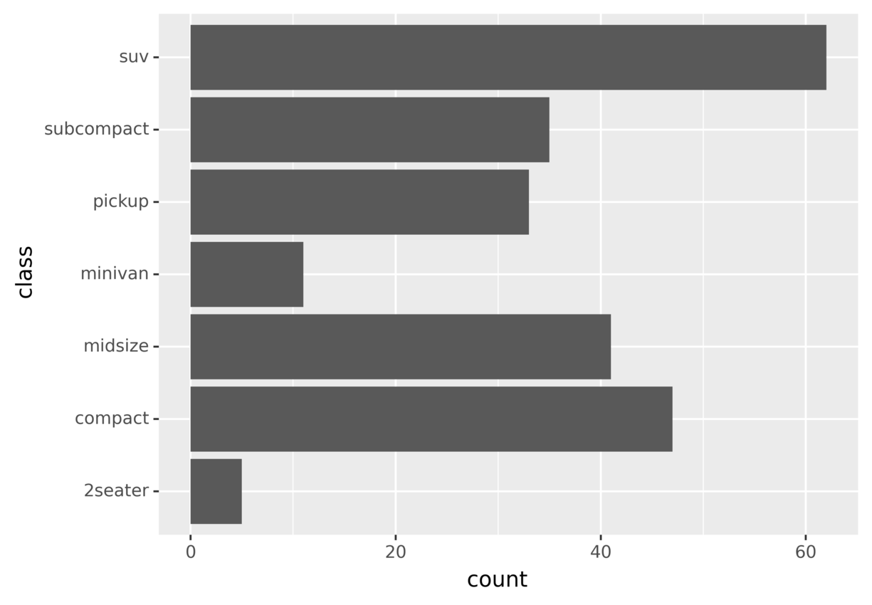
This graphic shows the same information you saw in the previous plot, but by flipping the axes you may find it easier to understand and compare different bars.
There’s no hard rule about which coordinate system is better. You should pick the one that best suits your problem and data. Give them a try and do some experiments to learn what works for each case. You can find more information about other coordinates systems in plotnine’s coordinates API reference.
Facets: Plot Subsets of Data Into Panels in the Same Plot
In this section, you’re going to learn about facets, one of the coolest features of plotnine. Facets allow you to group data by some attributes and then plot each group individually, but in the same image. This is particularly useful when you want to show more than two variables in the same graphic.
For example, let’s say you want to take the fuel economy dataset (mpg) and build a plot showing the miles per gallon for each engine size (displacement) for each vehicle class for each year. In this case your plot needs to display information from four variables:
hwy: Miles per gallondispl: Engine sizeclass: Vehicle classyear: Model year
This presents a challenge, because you have more variables than graphical dimensions. You could use a 3D perspective if you had to display three variables, but a four-dimensional graphic is hard to even imagine.
There’s a two-step trick that you can use when faced with this problem:
-
Start by partitioning the data into groups where all data points in a group share the same values for some attributes.
-
Plot each group individually, showing only the attributes not used in the grouping.
Going back to the example, you can group vehicles by class and year and then plot each group to show displacement and miles per gallon. The following visualization was generated using this technique:
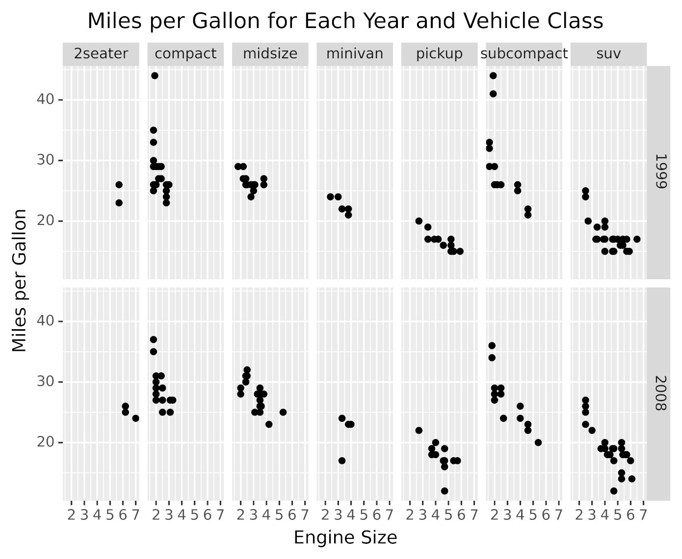
As you can see in the above graphic, there’s a panel for each group. Each panel shows the miles per gallon for different engine displacements belonging to that vehicle class and year.
This data visualization was generated with the following code:
from plotnine.data import mpg
from plotnine import ggplot, aes, facet_grid, labs, geom_point

(
    ggplot(mpg)
    + facet_grid(facets="year~class")
    + aes(x="displ", y="hwy")
    + labs(
        x="Engine Size",
        y="Miles per Gallon",
        title="Miles per Gallon for Each Year and Vehicle Class",
    )
    + geom_point()
)
The code partitions data by year and vehicle class using facet_grid(), passing it the attributes to use for the partitioning with facets="year~class". For each data partition, the plot is built using the components that you saw in previous sections, like aesthetics, geometric objects, and labs().
facet_grid() displays the partitions in a grid, using one attribute for rows and the other for columns. plotnine provides other faceting methods that you can use to partition your data using more than two attributes. You can learn more about them in plotnine’s facets API Reference.
Themes: Improve the Look of Your Visualization
Another great way to improve the presentation of your data visualizations is to choose a non-default theme to make your plots stand out, making them more beautiful and vibrant.
plotnine includes several themes that you can pick from. The following code generates the same graphic that you saw in the previous section, but using the dark theme:
from plotnine.data import mpg
from plotnine import ggplot, aes, facet_grid, labs, geom_point, theme_dark

(
    ggplot(mpg)
    + facet_grid(facets="year~class")
    + aes(x="displ", y="hwy")
    + labs(
        x="Engine Size",
        y="Miles per Gallon",
        title="Miles per Gallon for Each Year and Vehicle Class",
    )
    + geom_point()
    + theme_dark()
)
In the code above, specifying theme_dark() tells plotnine to draw the plot using a dark theme. Here’s the graphic generated by this code:
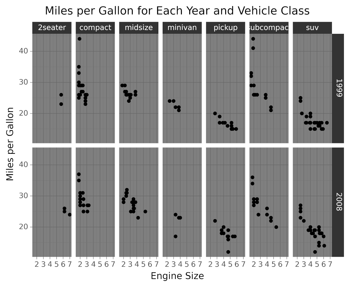
As you can see in the image, setting the theme affects the colors, fonts, and shapes styles.
theme_xkcd() is another theme that’s worth mentioning because it gives you a really cool comic-like look. It makes your data visualizations look like xkcd comics:
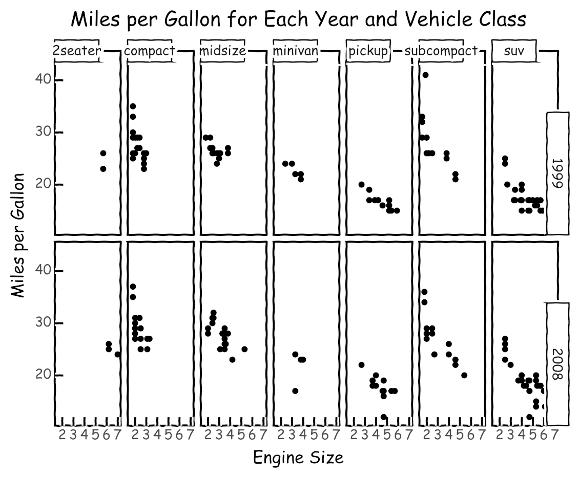
Choosing the right theme can help you attract and retain the attention of your audience. You can see a list of available themes in plotnine’s themes API reference.
In the preceding sections, you’ve learned about the most important aspects of grammars of graphics and how to use plotnine to build data visualizations. Using ggplot in Python allows you to build visualizations incrementally, first focusing on your data and then adding and tuning components to improve its graphical representation.
In the next section, you’ll learn how to use colors and how to export your visualizations.
Visualizing Multidimensional Data
As you saw in the section about facets, displaying data with more than two variables presents some challenges. In this section, you’ll learn how to display three variables at the same time, using colors to represent values.
For example, going back to the fuel economy dataset (mpg), suppose you want to visualize the relationship between the engine cylinder count and the fuel efficiency, but you also want to include the information about vehicle classes in the same plot.
As an alternative to faceting, you can use colors to represent the value of the third variable. To achieve this, you have to map the engine cylinder count to the x-axis and miles per gallon to the y-axis, then use different colors to represent the vehicle classes.
The following code creates the described data visualization:
from plotnine.data import mpg
from plotnine import ggplot, aes, labs, geom_point

(
    ggplot(mpg)
    + aes(x="cyl", y="hwy", color="class")
    + labs(
        x="Engine Cylinders",
        y="Miles per Gallon",
        color="Vehicle Class",
        title="Miles per Gallon for Engine Cylinders and Vehicle Classes",
    )
    + geom_point()
)
The vehicle class is mapped to the graphic color by passing color="class" in the aesthetic definition.
Running the code displays this graphic:
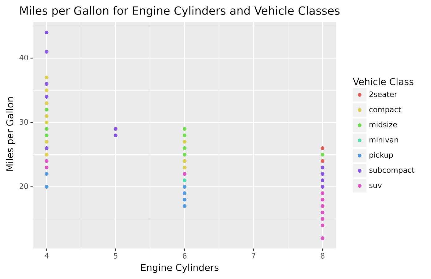
As you can see, the points have different colors depending on the class to which the vehicle belongs.
In this section, you learned another way to display more than two variables in a graphic using ggplot in Python. When you have three variables, you should choose between using facets and colors depending on which approach makes the data visualization easier to understand.
Exporting Plots to Files
In some situations, you’ll need to save the generated plots to image files programmatically instead of showing them inside Jupyter Notebook.
plotnine provides a very convenient save() method that you can use to export a plot as an image and save it to a file. For example, the next piece of code shows how you can save the graphic seen at the beginning of the tutorial to a file named myplot.png:
from plotnine.data import economics
from plotnine import ggplot, aes, geom_line

myPlot = ggplot(economics) + aes(x="date", y="pop") + geom_line()
myPlot.save("myplot.png", dpi=600)
In this code, you store the data visualization object in myPlot and then invoke save() to export the graphic as an image and store it as myplot.png.
You can tweak some image settings when using save(), such as the image dots per inch (dpi). This is really useful when you need high-quality images to include in presentations or articles.
plotnine also includes a method to save various plots in a single PDF file. You can learn about it and see some cool examples in plotnine’s save_as_pdf_pages documentation.
Being able to export your data visualizations opens up a lot of possibilities. You’re not constrained to only viewing your data in interactive Jupyter Notebook—you can also generate graphics and export them for later analysis or processing.
Conclusion
Using ggplot in Python allows you to build data visualizations in a very concise and consistent way. As you’ve seen, even complex and beautiful plots can be made with a few lines of code using plotnine.
In this tutorial, you’ve learned how to:
- Install plotnine and Jupyter Notebook
- Combine the different elements of the grammar of graphics
- Use plotnine to create visualizations in an efficient and consistent way
- Export your data visualizations to files
This tutorial uses the example datasets included in plotnine, but you can use everything you learned to create visualizations from any other data. To learn how to load your data into pandas DataFrames, the data structure used by plotnine, check out Using Pandas and Python to Explore Your Dataset.
Finally, take a look at plotnine’s documentation to continue your journey through ggplot in Python, and also visit plotnine’s gallery for more ideas and inspiration.
There are other Python data visualization packages that are worth mentioning, like Altair and HoloViews. Take a look at them before choosing a tool for your next project. Then use everything you’ve learned to build some amazing data visualizations that help you and others better understand data!