

Now that you’ve seen how to build a histogram in Python from the ground up, let’s see how other Python packages can do the job for you. Matplotlib provides the functionality to visualize Python histograms out of the box with a versatile wrapper around NumPy’s histogram():
import matplotlib.pyplot as plt

# An "interface" to matplotlib.axes.Axes.hist() method
n, bins, patches = plt.hist(x=d, bins='auto', color='#0504aa',
                            alpha=0.7, rwidth=0.85)
plt.grid(axis='y', alpha=0.75)
plt.xlabel('Value')
plt.ylabel('Frequency')
plt.title('My Very Own Histogram')
plt.text(23, 45, r'$\mu=15, b=3$')
maxfreq = n.max()
# Set a clean upper y-axis limit.
plt.ylim(ymax=np.ceil(maxfreq / 10) * 10 if maxfreq % 10 else maxfreq + 10)
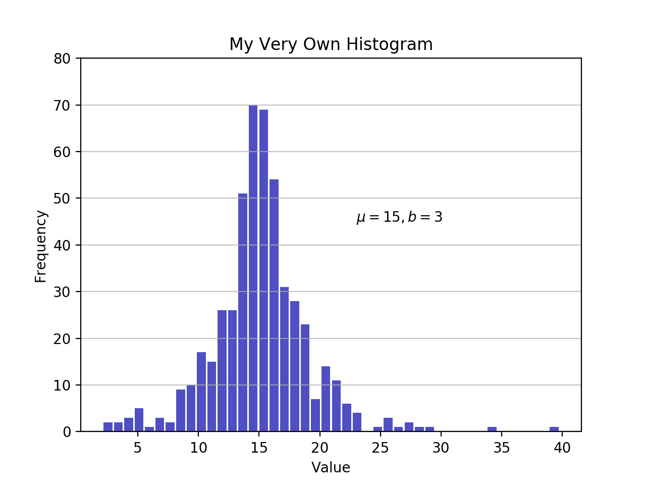
As defined earlier, a plot of a histogram uses its bin edges on the x-axis and the corresponding frequencies on the y-axis. In the chart above, passing bins='auto' chooses between two algorithms to estimate the ideal number of bins. At a high level, the goal of the algorithm is to choose a bin width that generates the most faithful representation of the data. For more on this subject, which can get pretty technical, check out Choosing Histogram Bins from the Astropy docs.
Staying in Python’s scientific stack, Pandas’ Series.histogram() uses matplotlib.pyplot.hist() to draw a Matplotlib histogram of the input Series:

williamjarrold on April 24, 2020
Hi,
The first script did not work the first time because it does not define the variable d. One simply needs to add…
np.random.seed(444) np.set_printoptions(precision=3)
d = np.random.laplace(loc=15, scale=3, size=500)
…to the top to make it work (it’s from the prior section of the course)
Also, after I made the addition and ran it from Terminal on my Mac, it did not display. Thanks to stackoverflow.com/questions/2512225/matplotlib-plots-not-showing-up-in-mac-osx I fixed this problem by adding....
plt.show()
… to the last line of the script. If there are better / alternative ways of getting the display to work, I’m interested. (-: