Flask by Example
Learning Path ⋅ Skills: Web Development, Flask Framework, Jinja, REST APIs, Deployment
Flask gives you a lightweight starting point for Python web development and lets you add exactly the pieces you need. This learning path guides you through building complete Flask applications step by step.
By completing this path, you’ll be able to:
- Build scalable Flask web applications with databases
- Create REST APIs using Flask, Connexion, and SQLAlchemy
- Add logging and notification messages to your projects
- Connect a JavaScript front end to a Flask API
- Deploy your Flask applications to the web
This path is for Python developers who want to build web applications with a framework that stays out of your way. You should be comfortable with Python basics.
You’ll start with HTML, CSS, and Jinja templating, then build progressively larger Flask projects before tackling REST APIs, front-end integration, and deployment.
Flask by Example
Learning Path ⋅ 12 Resources
Laying the Foundation for Web Development
Before you jump into web development with Flask, it’s important to brush up on some foundational skills, like understanding HTML, CSS and Jinja templating.
Course
HTML and CSS Foundations for Python Developers
There's no way around HTML and CSS when you want to build web apps. Even if you're not aiming to become a web developer, knowing the basics of HTML and CSS will help you understand the Web better. In this video course, you'll get an introduction to HTML and CSS for Python programmers.
Course
Jinja Templating
With Jinja, you can build rich templates that power the front end of your web applications. But you can also use Jinja without a web framework running in the background. Whenever you need to generate text files with dynamic content, Jinja provides a flexible and powerful solution.
Interactive Quiz
Primer on Jinja Templating
Getting Started With Flask
Now that you’ve learned some foundational skills, you’re ready to start creating your first Flask project!

Course
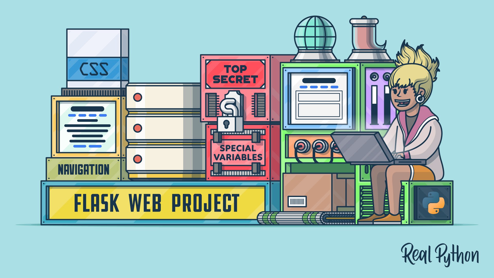
Creating a Scalable Flask Web Application From Scratch
In this video course, you'll explore the process of creating a boilerplate for a Flask web project. It's a great starting point for any scalable Flask web app that you wish to develop in the future, from basic web pages to complex web applications.
Interactive Quiz
Build a Scalable Flask Web Project From Scratch
Tutorial
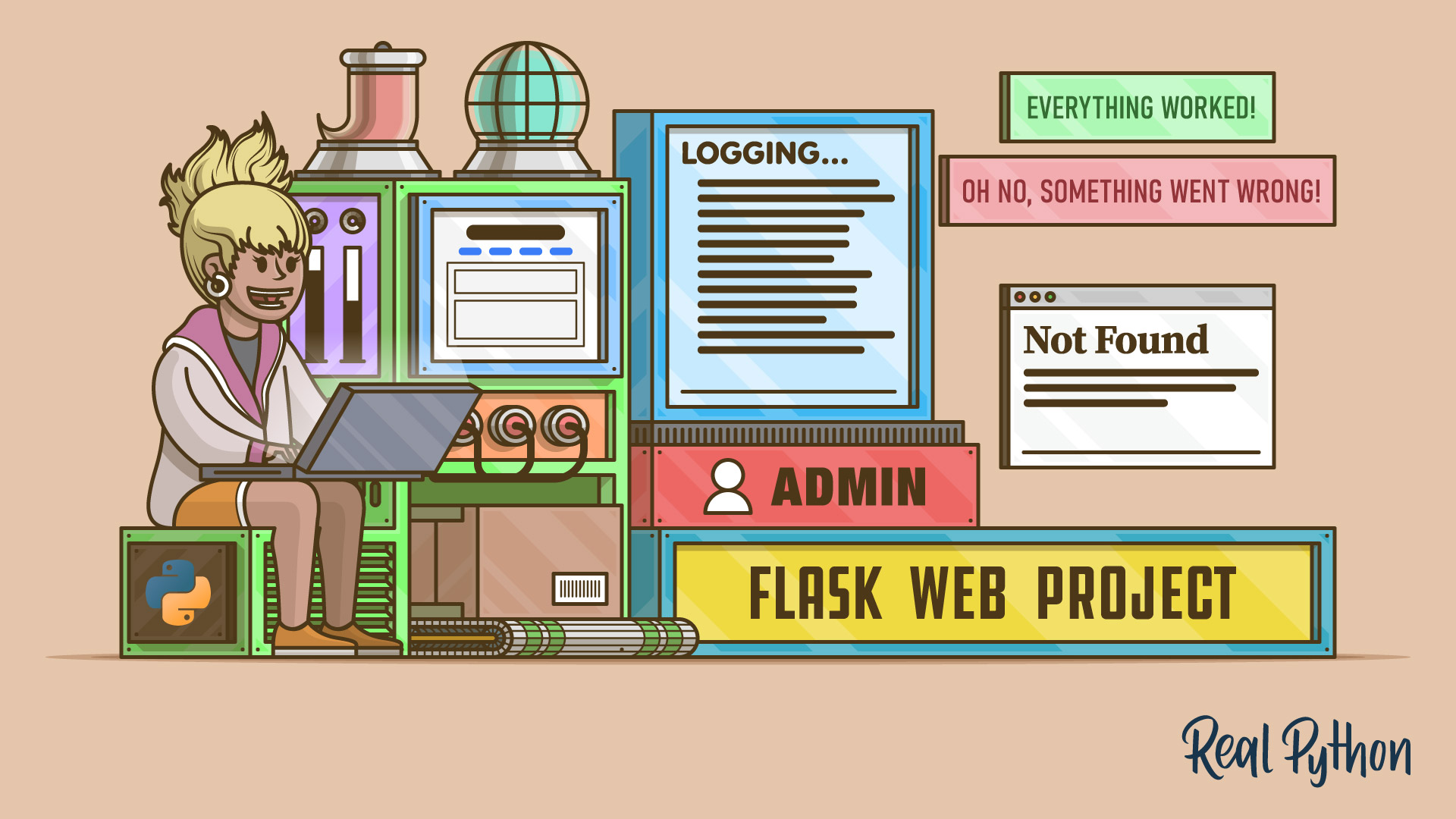
Add Logging and Notification Messages to Flask Web Projects
After you implement the main functionality of a web project, it's good to understand how your users interact with your app and where they may run into errors. In this tutorial, you'll enhance your Flask project by creating error pages and logging messages.
Tutorial
Enhance Your Flask Web Project With a Database
Adding a database to your Flask project elevates your web app to the next level. In this tutorial, you'll learn how to connect your Flask app to a database and how to receive and store posts from users.
Building a REST API
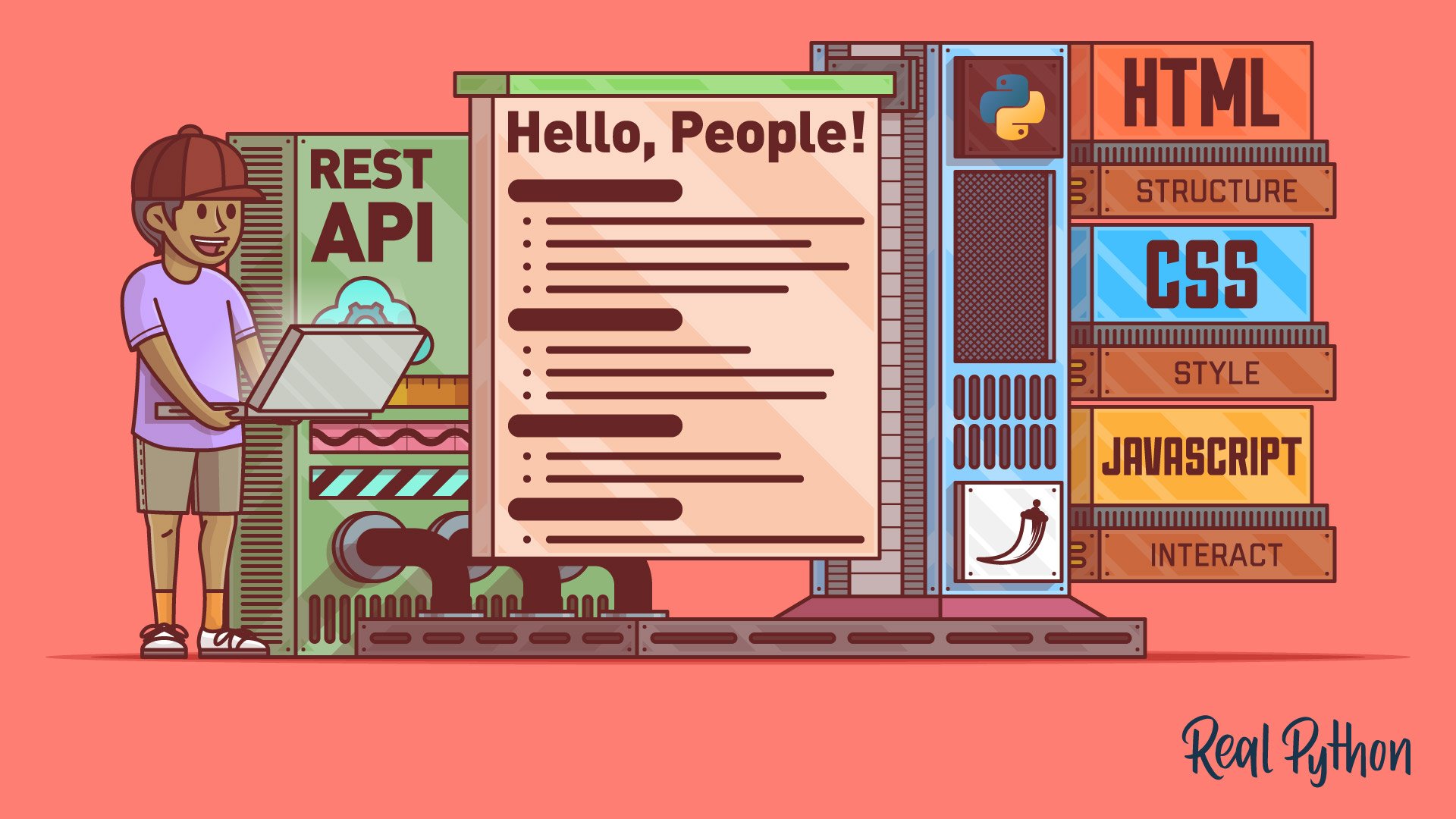
The lightweight nature of Flask makes the framework a valid option for building a RESTful API. While working through a multi-part project, you’ll explore HTTP requests and databases.
Tutorial
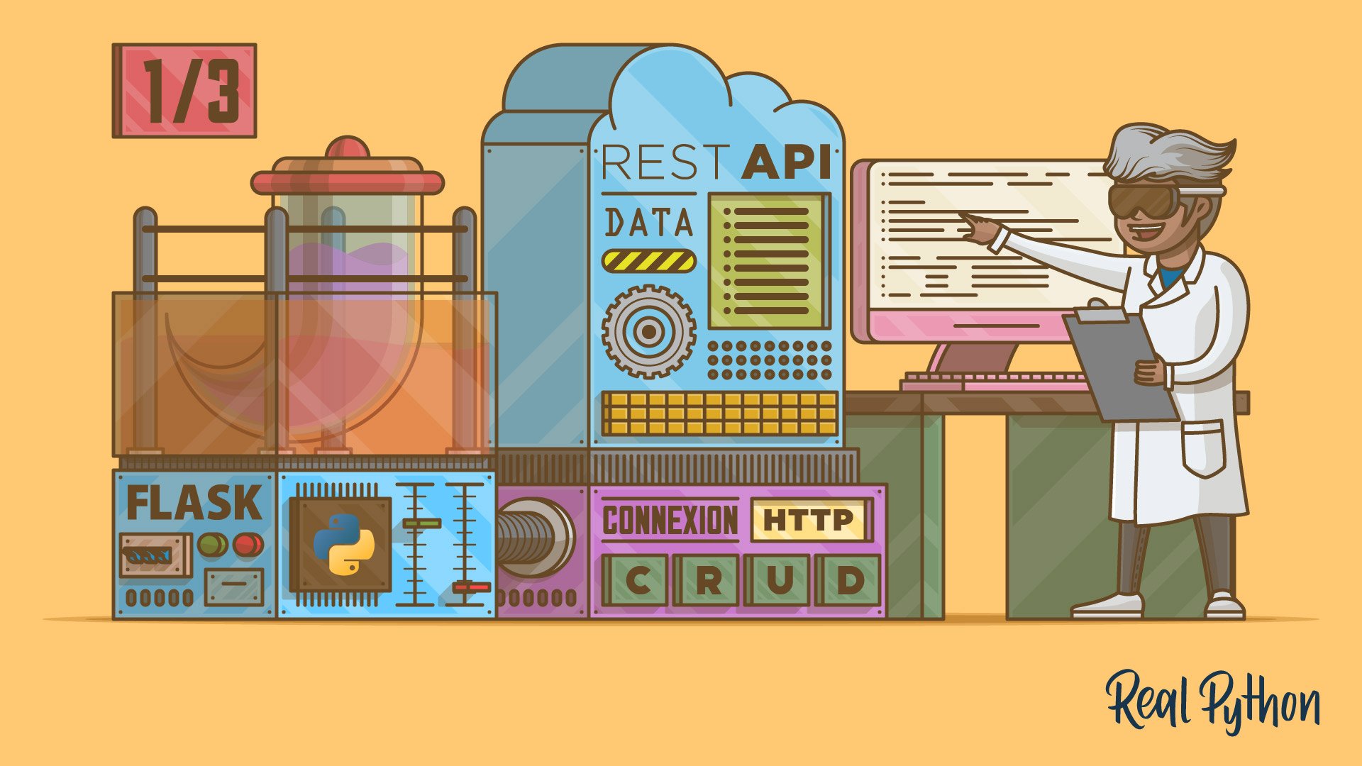
Python REST APIs With Flask, Connexion, and SQLAlchemy – Part 1
In this three-part tutorial series, you'll create a RESTful API from scratch to keep track of people and notes using the Flask web framework. You'll also test your API with Swagger UI API documentation. In part one, you'll build the foundation of your note-keeping app.
Tutorial
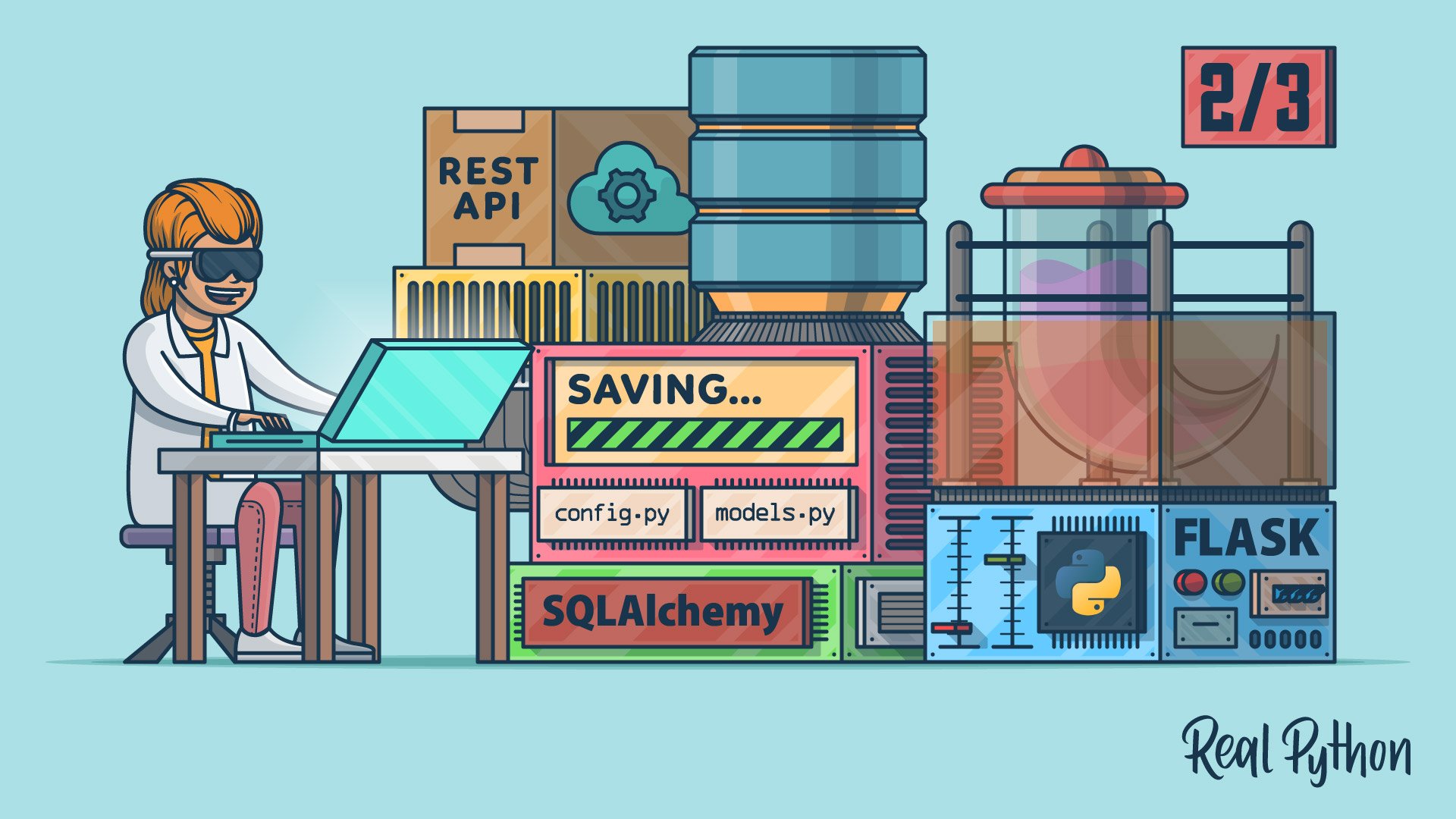
Python REST APIs With Flask, Connexion, and SQLAlchemy – Part 2
In this three-part tutorial series, you'll create a RESTful API from scratch to keep track of people and notes using the Flask web framework. You'll also test your API with Swagger UI API documentation. In part two, you'll implement a SQLite database to store your data permanently.
Tutorial
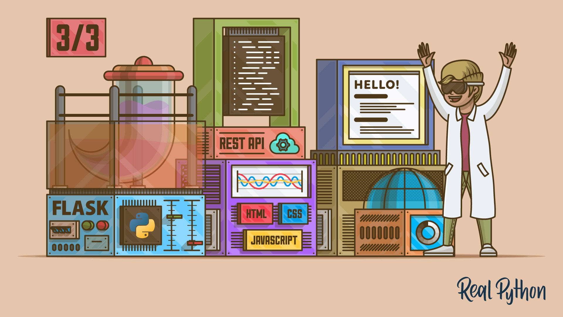
Python REST APIs With Flask, Connexion, and SQLAlchemy – Part 3
In this three-part tutorial series, you'll create a RESTful API from scratch to keep track of people and notes using the Flask web framework. You'll also test your API with Swagger UI API documentation. In part three, you'll use SQLAlchemy to provide the functionality to add notes to a person.
Working on the Frontend
The frontend of your web application is the part that your users interact with. You already learned about HTML and CSS. Now it’s time to put JavaScript into the mix.
Course
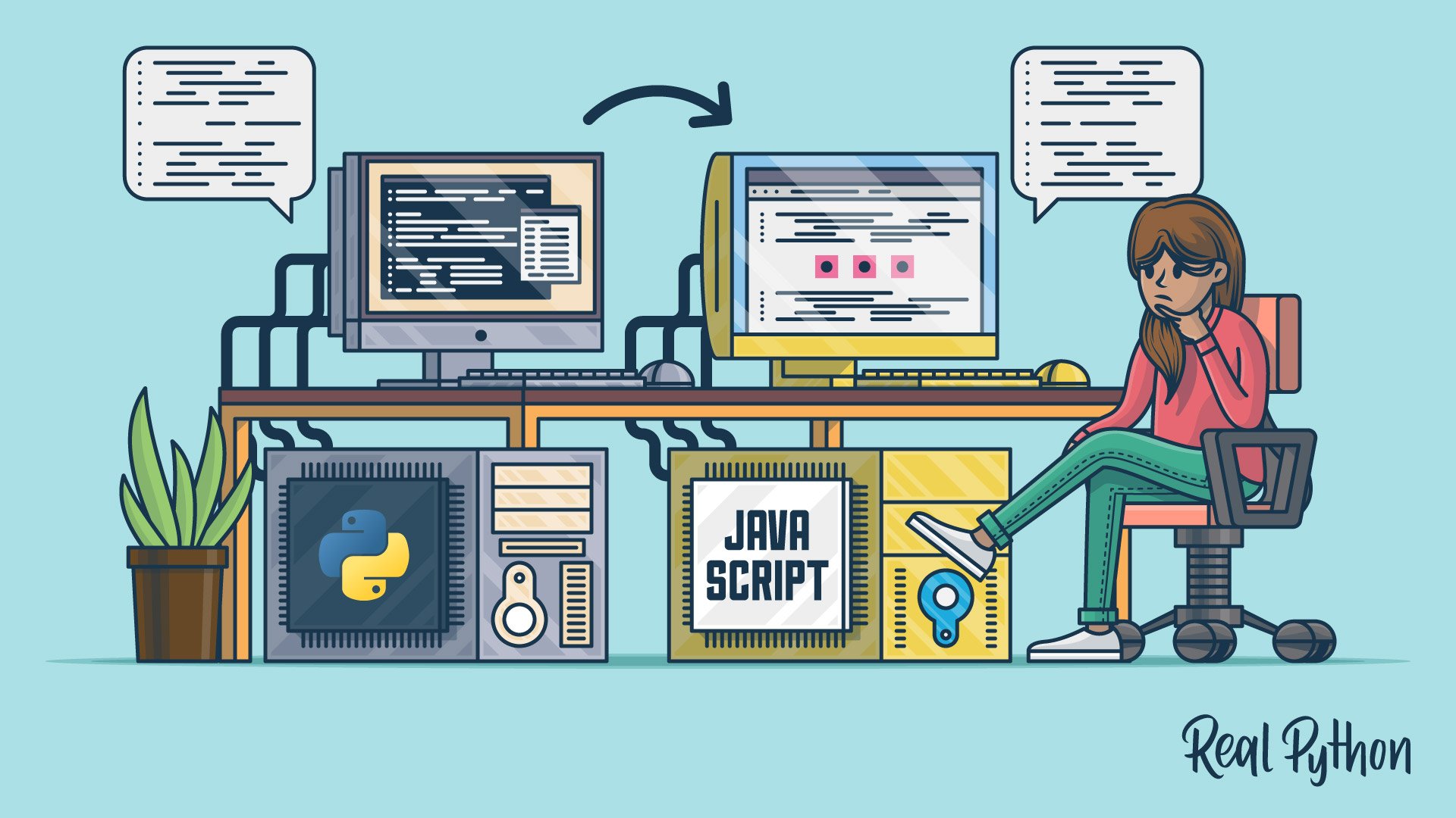
Python vs JavaScript for Python Developers
Python and JavaScript are two of the most popular programming languages in the world. In this course, you'll take a deep dive into the JavaScript ecosystem by comparing Python vs JavaScript. You'll learn the jargon, language history, and best practices from a Pythonista's perspective.
Tutorial
Build a JavaScript Front End for a Flask API
Most modern websites are powered by a REST API. That way, you can separate the front-end code from the back-end logic, and users can interact with the interface dynamically. In this step-by-step tutorial, you'll learn how to build a single-page Flask web application with HTML, CSS, and JavaScript.
Deploying Your Projects
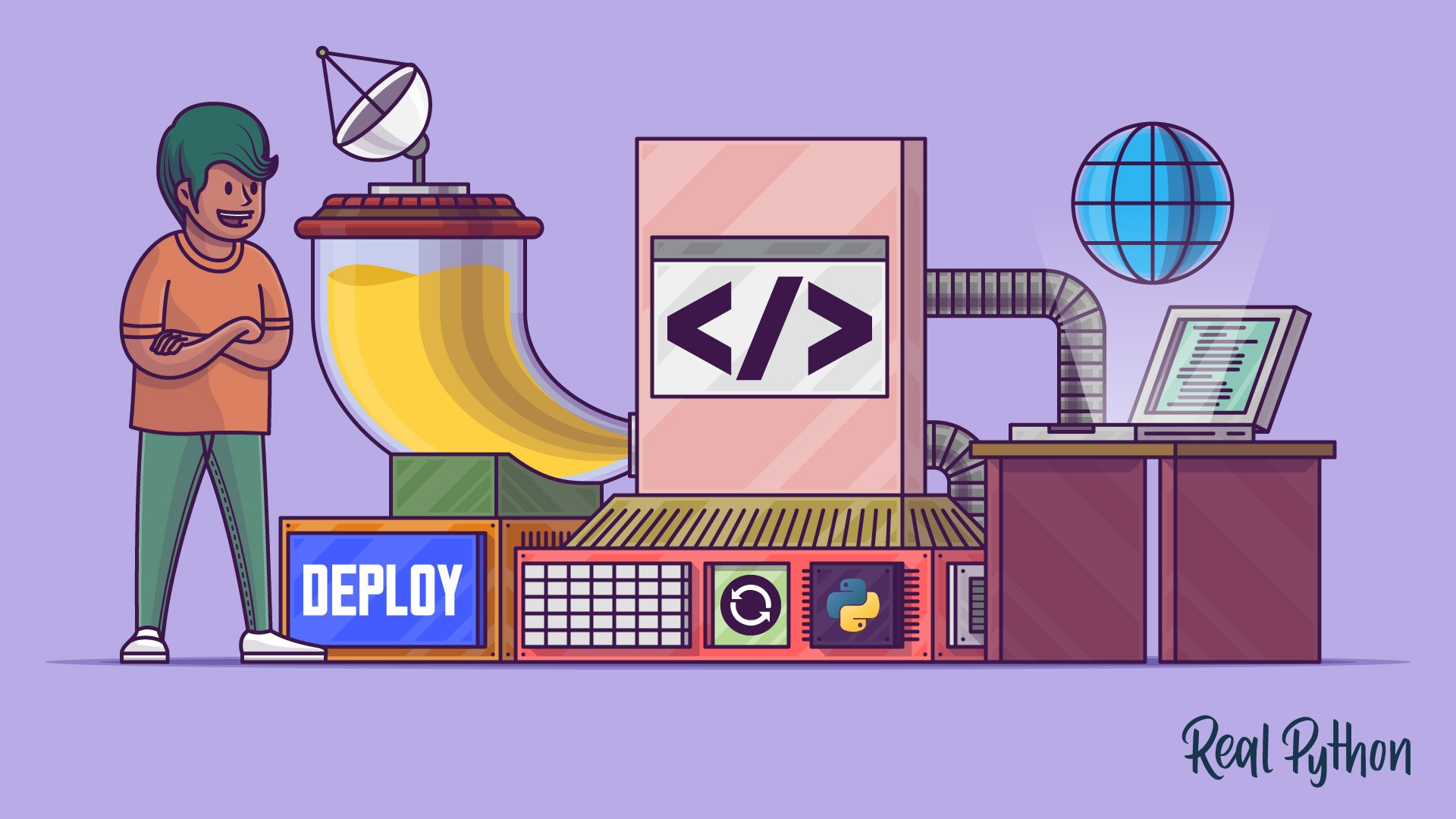
You must put your Flask projects online to make them available to everyone. This process is called deployment, and it’s the cherry on top of working with Flask.
Course
Deploy Your Python Script on the Web With Flask
In this course, you’ll learn how to go from a local Python script to a fully deployed Flask web application that you can share with the world.
Course
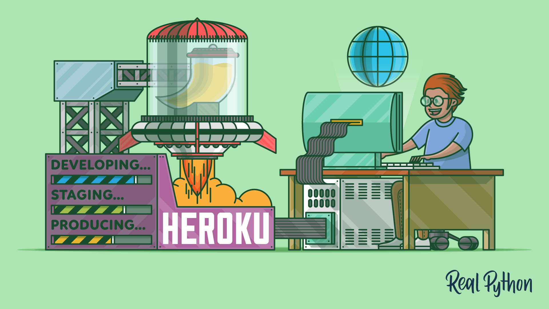
Deploying a Flask Application Using Heroku
Learn how to create a Python Flask example web application and deploy it using Heroku. You’ll also use Git to track changes to the code, and you’ll configure a deployment workflow with different environments for staging and production.
Congratulations on completing this learning path! You’ve learned how to build, extend, and deploy web applications with Flask.
If you’d like to continue developing your web skills, check out these related learning paths:
Got feedback on this learning path?
Looking for real-time conversation? Visit the Real Python Community Chat or join the next “Office Hours” Live Q&A Session. Happy Pythoning!
