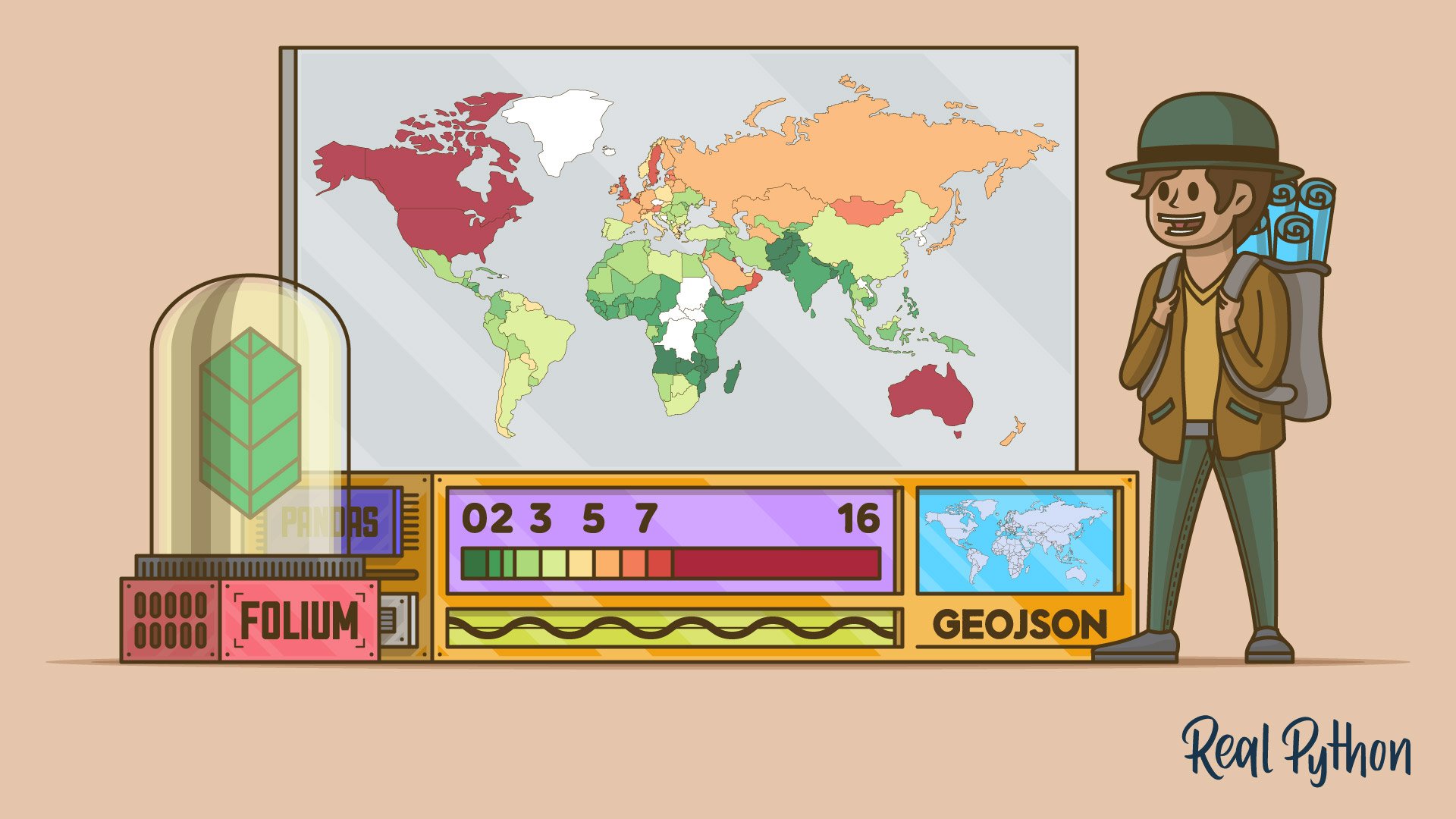
If you’re working with geospatial data in Python, then you might want to quickly visualize that data on a map. Python’s Folium library gives you access to the mapping strengths of the Leaflet JavaScript library through a Python API. It allows you to create interactive geographic visualizations that you can share as a website.
You’ll build a web map that displays the ecological footprint per capita of many countries and is based on a similar map on Wikipedia. Along the way, you’ll learn the basics of using Folium for data visualization.
In this video course, you’ll:
- Create an interactive map using Folium and save it as an HTML file
- Choose from different web map tiles
- Anchor your map to a specific geolocation
- Bind data to a GeoJSON layer to create a choropleth map
- Style the choropleth map
You’ll use Folium inside of a Jupyter notebook, so the Folium library will render your maps directly in the Jupyter notebook. This gives you a good opportunity to visually explore a geographical dataset or include a map in your data science report.
What’s Included:
- 10 Lessons
- Video Subtitles and Full Transcripts
- 2 Downloadable Resources
- Accompanying Text-Based Tutorial
- Interactive Quiz to Check Your Progress
- Q&A With Python Experts: Ask a Question
- Certificate of Completion
Downloadable Resources:
Related Learning Paths:


