In this course, you’ll be equipped to make production-quality, presentation-ready Python histogram plots with a range of choices and features.
If you have introductory to intermediate knowledge in Python and statistics, then you can use this article as a one-stop shop for building and plotting histograms in Python using libraries from its scientific stack, including NumPy, Matplotlib, Pandas, and Seaborn.
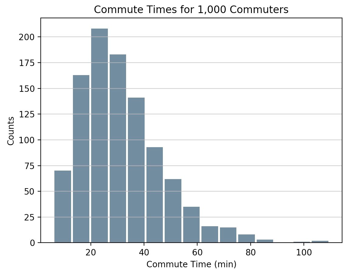
A histogram is a great tool for quickly assessing a probability distribution that is intuitively understood by almost any audience. Python offers a handful of different options for building and plotting histograms. Most people know a histogram by its graphical representation, which is similar to a bar graph:

This course will guide you through creating plots like the one above as well as more complex ones. Here’s what you’ll cover:
- Building histograms in pure Python, without use of third party libraries
- Constructing histograms with NumPy to summarize the underlying data
- Plotting the resulting histogram with Matplotlib, Pandas, and Seaborn
Free Bonus: Short on time? Click here to get access to a free two-page Python histograms cheat sheet that summarizes the techniques explained in this tutorial.
What’s Included:
- 8 Lessons
- Video Subtitles and Full Transcripts
- Accompanying Text-Based Tutorial
- Q&A With Python Experts: Ask a Question
- Certificate of Completion
Related Learning Paths:


