The YData Profiling package generates an exploratory data analysis (EDA) report with a few lines of code. The report provides dataset and column-level analysis, including plots and summary statistics to help you quickly understand your dataset. These reports can be exported to HTML or JSON so you can share them with other stakeholders.
By the end of this tutorial, you’ll understand that:
- YData Profiling generates interactive reports containing EDA results, including summary statistics, visualizations, correlation matrices, and data quality warnings from DataFrames.
ProfileReportcreates a profile you can save with.to_file()for HTML or JSON export, or display inline with.to_notebook_iframe().- Setting
tsmode=Trueand specifying a date column withsortbyenables time series analysis, including stationarity tests and seasonality detection. - The
.compare()method generates side-by-side reports highlighting distribution shifts and statistical differences between datasets.
To get the most out of this tutorial, you’ll benefit from having knowledge of pandas.
Note: The examples in this tutorial were tested using Python 3.13. Additionally, you may need to install setuptools<81 for backward compatibility.
You can install this package using pip:
$ python -m pip install ydata-profiling
Once installed, you’re ready to transform any pandas DataFrame into an interactive report. To follow along, download the example dataset you’ll work with by clicking the link below:
Get Your Code: Click here to download the free sample code and start automating Python data analysis with YData Profiling.
The following example generates a profiling report from the 2024 flight delay dataset and saves it to disk:
flight_report.py
import pandas as pd
from ydata_profiling import ProfileReport

df = pd.read_csv("flight_data_2024_sample.csv")

profile = ProfileReport(df)
profile.to_file("flight_report.html")
This code generates an HTML file containing interactive visualizations, statistical summaries, and data quality warnings:
You can open the file in any browser to explore your data’s characteristics without writing additional analysis code.
There are a number of tools available for high-level dataset exploration, but not all are built for the same purpose. The following table highlights a few common options and when each one is a good fit:
| Use case | Pick | Best for |
|---|---|---|
| You want to quickly generate an exploratory report | ydata-profiling |
Generating exploratory data analysis reports with visualizations |
| You want an overview of a large dataset | skimpy or df.describe() |
Providing fast, lightweight summaries in the console |
| You want to enforce data quality | pandera |
Validating schemas and catching errors in data pipelines |
Overall, YData Profiling is best used as an exploratory report creation tool. If you’re looking to generate an overview for a large dataset, using SkimPy or a built-in DataFrame library method may be more efficient. Other tools, like Pandera, are more appropriate for data validation.
If YData Profiling looks like the right choice for your use case, then keep reading to learn about its most important features.
Take the Quiz: Test your knowledge with our interactive “Automate Python Data Analysis With YData Profiling” quiz. You’ll receive a score upon completion to help you track your learning progress:

Interactive Quiz
Automate Python Data Analysis With YData ProfilingTest your knowledge of YData Profiling, including report creation, customization, performance optimization, time series analysis, and comparisons.
Building a Report With YData Profiling
A YData Profiling report is composed of several sections that summarize different aspects of your dataset. Before customizing a report, it helps to understand the main components it includes and what each one is designed to show.
A typical report contains the following elements:
- A dataset overview that summarizes the number of variables and observations, size in memory, and missing or duplicate values
- Summary statistics for each column that describe distributions, count distinct and missing values, and display relevant plots based on column type
- Correlation analyses that highlight relationships between variables
- Data quality warnings that flag potential issues like missing values, high cardinality, or constant columns
Together, these sections provide a structured view of your data, helping you quickly assess its shape, quality, and potential problem areas.
To start building a report, create a new Python script. You’ll typically generate the report and then save it as an HTML file:
flight_report.py
import pandas as pd
from ydata_profiling import ProfileReport

df = pd.read_csv("flight_data_2024_sample.csv")

profile = ProfileReport(df)
profile.to_file("flight_report.html")
You can also save the report as JSON rather than HTML by changing the filename to "flight_report.json".
Note: When you’re working in a Jupyter notebook, you can display the report inline without saving to a file:
report_notebook.ipynb
# ...

profile = ProfileReport(df)
profile.to_notebook_iframe()
This will render the report inside your notebook without exporting it to a file.
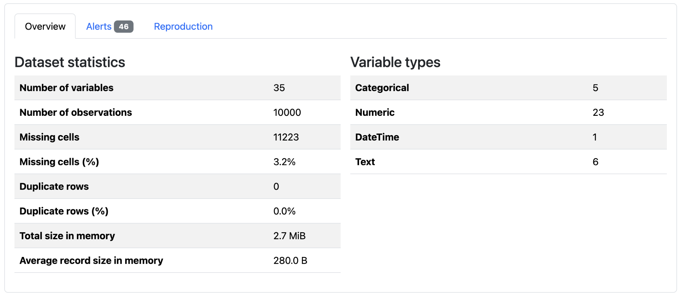
When you first open the report, you’ll see an overview of dataset-level information:
There are summary statistics, data quality alerts, and report generation metadata. You can see that there are 10,000 rows for this DataFrame, and that 3.2% of the data is missing. Below these tabs, the dataset columns are analyzed. The exact information depends on the type of data:
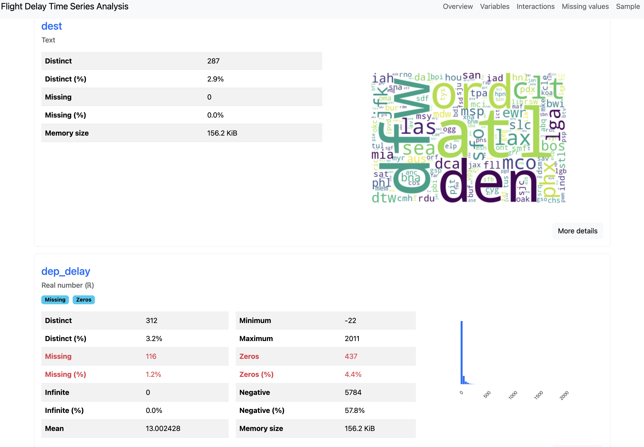
You can see above that the overview for the text column "dest" is visualized as a word cloud, whereas the numeric column "dep_delay" displays a minimum value, a maximum value, and a zeros value. After the column-level analysis, there are plots for column interactions, correlations, and missing values.
The report’s metadata can be updated to include additional information about your data. This metadata is where you can add extra context like copyright holder, copyright year, or a relevant URL for the project. You can also add column descriptions that explain what each field represents:
flight_report.py
# ...
profile = ProfileReport(
df,
variables={
"descriptions": {
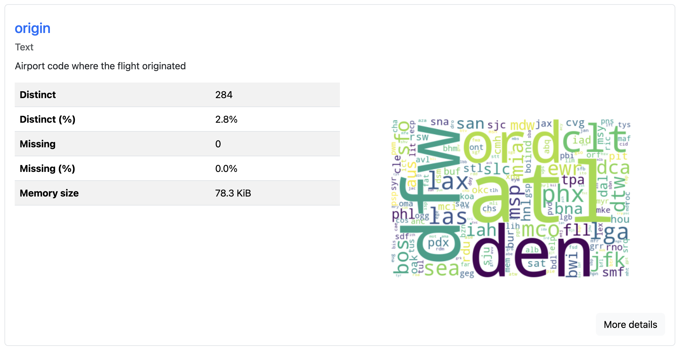
"origin": "Airport code where the flight originated",
"dest": "Airport code of flight destination",
"crs_dep_time": "Scheduled departure time at origin (hhmm)"
}
}
)
profile.to_file("documented_report.html")
You can use the variables argument to add metadata like "descriptions" for each column. These descriptions appear in the report alongside the statistical analysis, making it easier for others to understand your dataset’s context. This feature proves especially useful when sharing reports with team members who aren’t familiar with the data’s origin or meaning:
Because the report generation includes expensive computations for a thorough analysis, it’s slow for large datasets. To speed up report generation, you have a couple of options:
flight_report.py
# ...

# Option 1: Generate a minimal report
profile = ProfileReport(df, minimal=True)
profile.to_file("minimal_report.html")

# Option 2: Sample your data before profiling
df_sample = df.sample(n=10000, random_state=42)
profile = ProfileReport(df_sample)
profile.to_file("sampled_report.html")
The minimal=True argument creates a shorter report that does not include column interaction plots, correlation plots, and missing data plots. Alternatively, you can sample your DataFrame before creating the profile. This reduces the amount of data being analyzed while still generating a complete report with all visualizations.
The generated report is a convenient input for AI-powered analysis. Since it consolidates your dataset’s statistics into a single self-contained file, you can feed the report into tools like Claude or GitHub Copilot. That way, you can ask the tool natural-language questions about your data rather than exploring the report manually. This can be especially useful when working with large datasets.
Profiling Time Series Data
You can specify time-dependent columns to generate additional time series analysis in reports. The general flow of creating the report is identical to non-time series data. To signal that the data is time-dependent, you need to specify which column is temporal.
You can use the flight dataset to see this type of profiling:
flight_time_series.py
import pandas as pd
from ydata_profiling import ProfileReport

df = pd.read_csv("flight_data_2024_sample.csv")
df["fl_date"] = pd.to_datetime(df["fl_date"])

profile = ProfileReport(
    df,
    title="Flight Delay Report",
    tsmode=True,
    sortby="fl_date"
)
profile.to_file("flight_timeseries_report.html")
If you encounter warnings about correlation calculations failing due to duplicate labels, you can disable the problematic correlation type:
flight_time_series.py
# ...

profile = ProfileReport(
    df,
    correlations={"auto": {"calculate": False}}
)
profile.to_file("flight_timeseries_report.html")
This disables the auto-correlation calculation, which can fail on datasets with duplicate index labels. The report will still include other analyses that are successful with your data:
The tsmode=True parameter enables time series analysis features, and the sortby="fl_date" ensures the data is ordered chronologically. For time series analysis to work correctly, your data should be sorted by the time column, either by your own analysis or the sortby argument. If your date column isn’t already a datetime type, then you should convert it first:
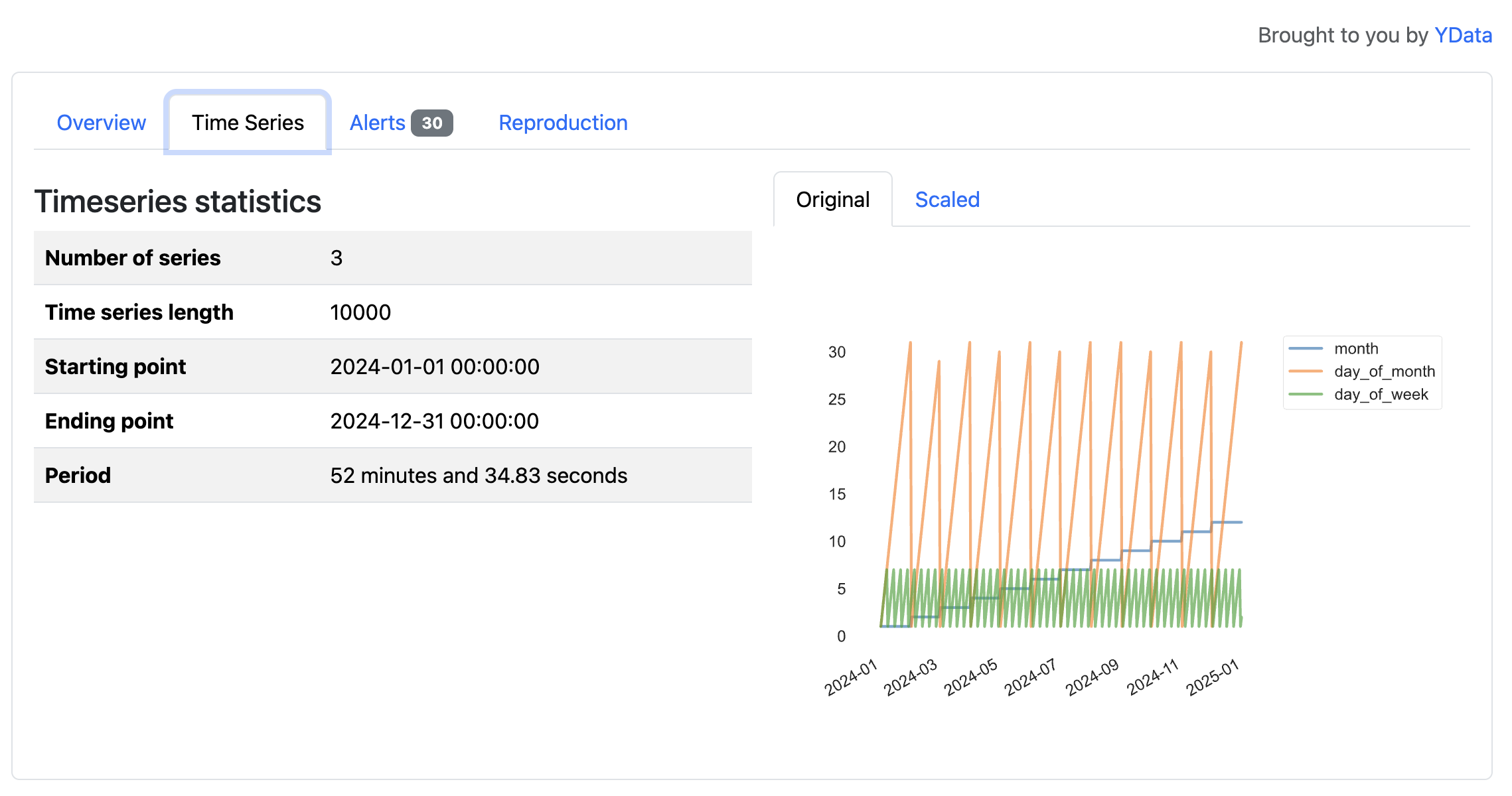
In this flight dataset, the time series features reveal patterns tied to the calendar, such as cycles across months, days of the month, and days of the week in 2024. These variables primarily reflect how a calendar year progresses, but the visualizations illustrate how YData Profiling surfaces temporal structure in time series data.
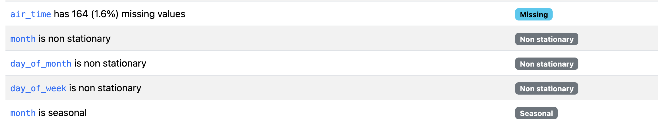
The resulting report includes sections for stationarity tests, seasonality analysis, and time plots. Two types of alerts, non-stationary and seasonal, are generated for time series data.
Generating Comparison Reports
When you’re working with multiple versions of a dataset, you can generate a comparison report that highlights differences between multiple comparable datasets. This feature helps you detect data drift, identify preprocessing errors, or verify that train-test splits have similar distributions.
You create comparison reports by generating profiles for each dataset and then comparing them. For example, you can split the data by origin to compare flights from LAX (Los Angeles, CA, USA) and ATL (Atlanta, GA, USA):
airport_comparison.py
import pandas as pd
from ydata_profiling import ProfileReport

df = pd.read_csv("flight_data_2024_sample.csv")

# Split into flights originating from LAX and ATL
df_lax = df[df["origin"] == "LAX"]
df_atl = df[df["origin"] == "ATL"]

lax_profile = ProfileReport(df_lax, title="LAX Flights")
atl_profile = ProfileReport(df_atl, title="ATL Flights")
After separating airports, you’ll generate a report for each of the new DataFrames. Then, you can compare the lax_profile to the atl_profile using the .compare() method:
airport_comparison.py
# ...

comparison = lax_profile.compare(atl_profile)
comparison.to_file("airport_comparison.html")
This will take the columns in the LAX profile that match columns in the ATL report and create comparisons for each shared column:
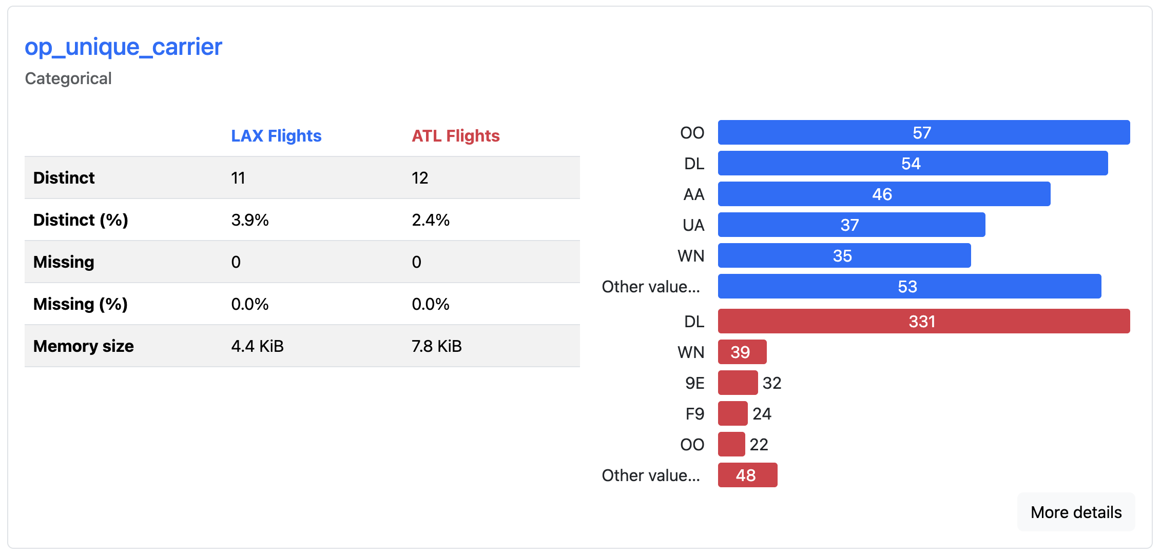
The comparison report displays side-by-side statistics, highlighting where distributions have shifted, means have changed, or new patterns have emerged. Color-coded differences draw attention to changes between the datasets, allowing you to spot when data characteristics have evolved over time. Here, you can quickly see which airlines fly most frequently out of each airport. DL is most common from ATL, whereas OO is the most common from LAX.
This comparison functionality is particularly valuable in machine learning systems where you need to determine if incoming data matches the distribution of your training data.
Avoiding Limitations
While many common scenarios are supported, it’s important to understand this tool’s constraints before relying on it for your exploratory analysis.
The library supports many data types, but it works exclusively with pandas and Spark DataFrames. If you’re using other data structures like Dask DataFrames or Polars DataFrames, you’ll need to convert them to pandas first.
Performance can also be an issue with large datasets. Reports may take several minutes to generate when profiling millions of rows or hundreds of columns. You can speed up report generation by sampling your data or excluding irrelevant columns, but YData Profiling isn’t optimized for big data workloads.
Note: YData Profiling used to be known as Pandas Profiling. The package was renamed in February 2023 to reflect support for more than just pandas DataFrames. All functionality was retained, and YData Profiling is a drop-in replacement for Pandas Profiling. You may still encounter the older name in articles, documentation, examples, or source code.
Some advanced features require a paid subscription, including outlier analysis, relational database profiling directly from SQL connections, and certain advanced data quality checks. All examples and features used in this tutorial are available in the open-source version of YData Profiling.
Conclusion
YData Profiling generates comprehensive reports with a few lines of code, allowing you to spend less time writing initial exploratory analysis code and more time interpreting results. Now you understand how to leverage this package to automate exploratory data analysis.
In this tutorial, you’ve learned how to:
- Generate exploratory reports from pandas DataFrames using
ProfileReport - Configure reports for time series data to surface temporal patterns
- Compare multiple datasets side by side to detect changes in data
- Add metadata and descriptions to make reports easier to interpret and share
For complete configuration options and advanced features, visit the official documentation. It covers detailed examples for specific use cases, tips for performance tuning, and guides on customizing report appearance and content.
If you’re interested in going deeper into your data, you may want to learn more about using pandas to explore datasets. To better understand the information generated in reports, you can follow up with statistics in Python.
Get Your Code: Click here to download the free sample code and start automating Python data analysis with YData Profiling.
Frequently Asked Questions
Now that you have some experience with YData Profiling in Python, you can use the questions and answers below to check your understanding and recap what you’ve learned. These FAQs address the most important concepts you’ve covered in this tutorial. Click the Show/Hide toggle beside each question to reveal the answer.
YData Profiling generates comprehensive exploratory data analysis reports from pandas or Spark DataFrames with a single function call. The reports include summary statistics, visualizations, correlation matrices, and data quality warnings that help you quickly understand your dataset.
While .describe() provides basic summary statistics in the console, YData Profiling creates interactive HTML or JSON reports with visualizations, missing value analysis, correlation plots, and data quality alerts. This makes it better suited for sharing insights with stakeholders or exploring unfamiliar datasets.
Yes, YData Profiling supports time series analysis when you set tsmode=True and specify a date column with the sortby parameter. The resulting report includes stationarity tests, seasonality analysis, and time-specific alerts.
Report generation involves expensive computations like correlation matrices and interaction plots across all columns. For large datasets, you can use minimal=True to skip these heavy analyses, sample your data before profiling, or exclude irrelevant columns.
Pandas Profiling was renamed YData Profiling in February 2023 to reflect that the library now supports more than just pandas DataFrames. The current package is a drop-in replacement with all functionality retained.
Take the Quiz: Test your knowledge with our interactive “Automate Python Data Analysis With YData Profiling” quiz. You’ll receive a score upon completion to help you track your learning progress:
Interactive Quiz
Automate Python Data Analysis With YData ProfilingTest your knowledge of YData Profiling, including report creation, customization, performance optimization, time series analysis, and comparisons.