There’s a moment many data analysts know well: you have a new dataset and a clear question, and you open a notebook only to find yourself writing boilerplate axis and figure setup before you’ve even looked at the data. Matplotlib gives you fine-grained control, but that control comes with a cost. Altair takes a completely different approach to data visualization in Python.
Instead of scripting every visual detail, you describe what your data means. This includes specifying which column goes on which axis, what should be colored, and what should be interactive. Altair then generates the visualization.
If you’re wondering whether it’s worth adding another visualization library to your toolkit, here’s how Altair and Matplotlib compare:
| Use Case | Pick Altair | Pick Matplotlib |
|---|---|---|
| Interactive exploratory charts in notebooks | ✅ | — |
| Pixel-precise publication figures or 3D plots | — | ✅ |
Altair generates web-native charts. The output is HTML and JavaScript, which means charts render right in your notebook and can be saved as standalone HTML files or embedded in web pages. It’s not a replacement for Matplotlib, and it doesn’t try to be. Think of them as tools you reach for in different situations.
Get Your Code: Click here to download the free sample code you’ll use to build interactive Python charts the declarative way with Altair.
Take the Quiz: Test your knowledge with our interactive “Altair: Declarative Charts With Python” quiz. You’ll receive a score upon completion to help you track your learning progress:

Interactive Quiz
Altair: Declarative Charts With PythonTest your knowledge of Altair, the declarative data visualization library for Python that turns DataFrames into interactive charts.
Start Using Altair in Python
It’s a good idea to install Altair in a dedicated virtual environment. It pulls in several dependencies like pandas and the Vega-Lite renderer, and a virtual environment keeps them from interfering with your other projects. Create one and install Altair with pip:
$ python -m venv altair-venv
$ source altair-venv/bin/activate
(altair-venv) $ python -m pip install altair
This tutorial uses Python 3.14 and Altair 6.0. All the code runs inside a Jupyter notebook, which is the most common environment for interactive data exploration with Altair. If you prefer a different JavaScript-capable environment like VS Code, Google Colab, or JupyterLab, feel free to use that instead. To launch a Jupyter notebook, run the following:
(altair-venv) $ python -m pip install notebook
(altair-venv) $ jupyter notebook
The second command launches the Jupyter Notebook server in your browser. Create a new notebook and enter the following code, which builds a bar chart from a small DataFrame containing daily step counts for one week:
import altair as alt
import pandas as pd

steps = pd.DataFrame({
    "Day": ["1-Mon", "2-Tue", "3-Wed", "4-Thu", "5-Fri", "6-Sat", "7-Sun"],
    "Steps": [6200, 8400, 7100, 9800, 5500, 9870, 3769],
})

weekly_steps = alt.Chart(steps).mark_bar().encode(
    x="Day",
    y="Steps",
)
weekly_steps
You should see a bar chart displaying daily step counts:
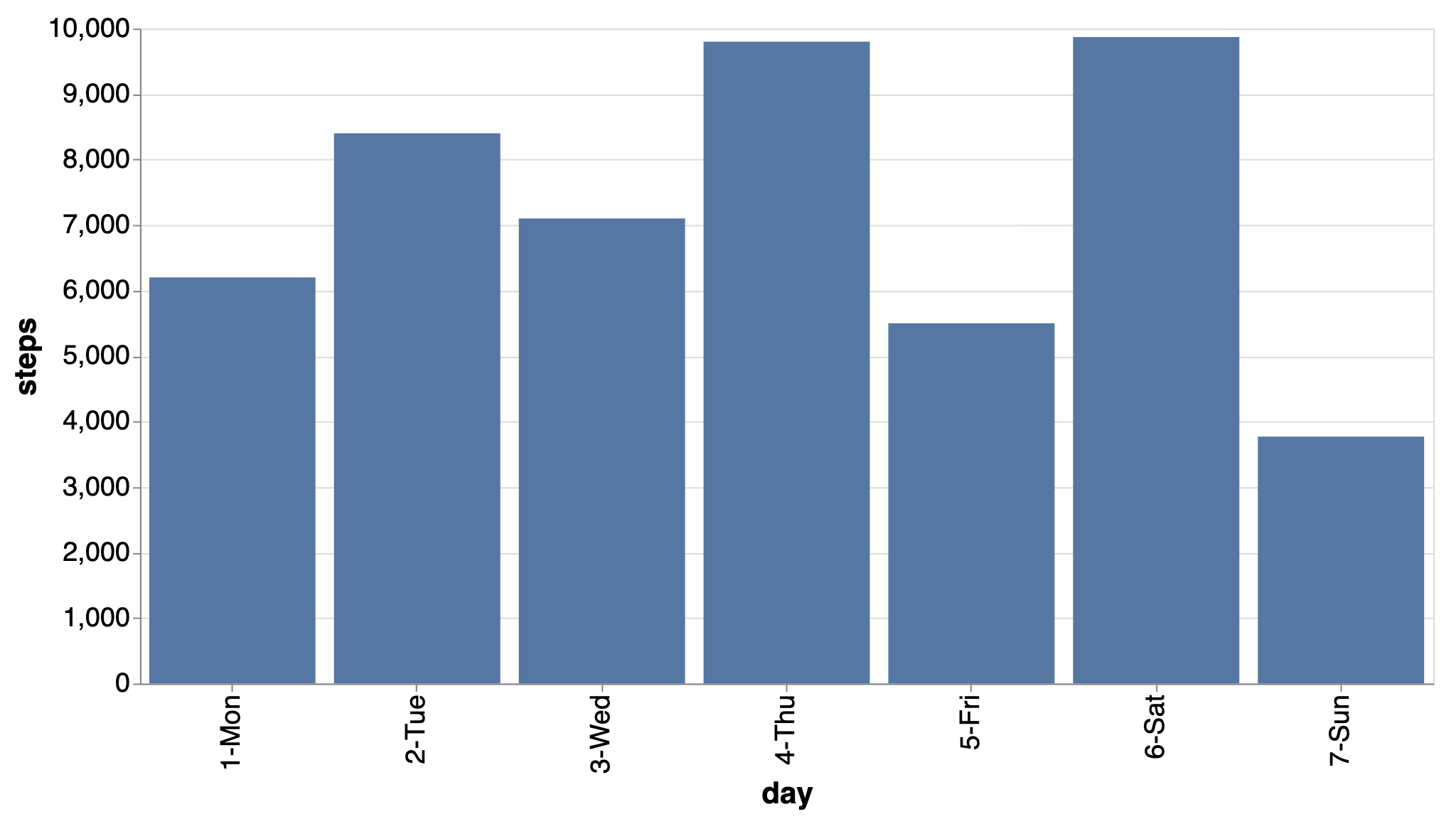
The dataset is intentionally minimal because data isn’t the main focus: it has seven rows for seven days, and two columns for the day name and step count. Notice how the weekly_steps chart is constructed. Every Altair chart follows this same pattern. It’s built from these three building blocks:
- Data: A pandas DataFrame handed to
alt.Chart(). - Mark: The visual shape you want, chosen via
.mark_*(). Here,.mark_bar()draws bars. Other options include.mark_point(),.mark_line(), and.mark_arc(). - Encode: The mapping from data columns to visual properties, declared inside
.encode(). Here,Daygoes to the x-axis andStepsto the y-axis.
This is Altair’s core grammar in action: Data → Mark → Encode. You’ll use it every time.
The key difference between Matplotlib and Altair lies in your approach to creating charts. Matplotlib is imperative, meaning you provide explicit instructions to create a figure, add an axes object, set labels, and adjust ticks. It’s a sequence of drawing commands.
Conversely, Altair is declarative. You describe the data and desired appearance, and Altair handles the rest. The end results are similar, but the underlying mental models are fundamentally different.
Explore Multiple Dimensions With Encoding Channels
Now that you’re familiar with Altair’s pattern for creating charts, it’s time to apply it to a dataset with more to explore. Altair provides a collection of example datasets through the altair.datasets module. Some are bundled with the package, while Altair fetches others, like movies, from the network on demand. You’ll use this dataset throughout the rest of this tutorial.
This dataset is a good playground, with a mix of quantitative columns like Production Budget, Worldwide Gross, and IMDB Rating (Internet Movie Database), alongside categorical ones like Major Genre and MPAA Rating. It also contains several columns with missing values, like a true real-world dataset.
You can load the movies dataset and drop rows with missing values in the columns you’ll use in the examples ahead:
from altair.datasets import data

movies = data.movies()
movies = movies.dropna(subset=[
    "Production Budget", "Worldwide Gross",
    "IMDB Rating", "Major Genre", "MPAA Rating",
])
With the cleaned dataset ready, you can start exploring it visually.
The next idea to explore is encoding channels. In Altair, an encoding channel is a mapping between a column in your data and a visual property of the chart, such as position, color, or size. You already used two encoding channels in weekly_steps without naming them explicitly: x and y. Start there and build a basic scatter plot with the movies data:
scatter = alt.Chart(movies).mark_point().encode(
    x="Production Budget:Q",
    y="Worldwide Gross:Q",
)
scatter
This creates a basic scatter plot of worldwide earnings against production budgets. The :Q suffix is a type shorthand that tells Altair how to interpret the column’s values. The following table shows the four available type shorthands:
| Shorthand | Type | Example |
|---|---|---|
:Q |
Quantitative (numeric) | Production Budget:Q |
:N |
Nominal (unordered categories) | Major Genre:N |
:O |
Ordinal (ordered categories) | MPAA Rating:O |
:T |
Temporal (dates and times) | Release Date:T |
Altair can often infer the type directly from the DataFrame, but being explicit avoids surprises. You’ll see this shorthand everywhere in Altair documentation and examples online.
Now start adding channels. Altair supports many more, including color, size, tooltip, opacity, shape, and column. Each new channel is just another argument to .encode():
scatter = alt.Chart(movies).mark_point().encode(
    x="Production Budget:Q",
    y="Worldwide Gross:Q",
    color="Major Genre:N",
    size="IMDB Rating:Q",
    tooltip=["Title:N", "IMDB Rating:Q"],
)
scatter
With three additional lines, the chart now visually represents genre with color and IMDb rating with point size:
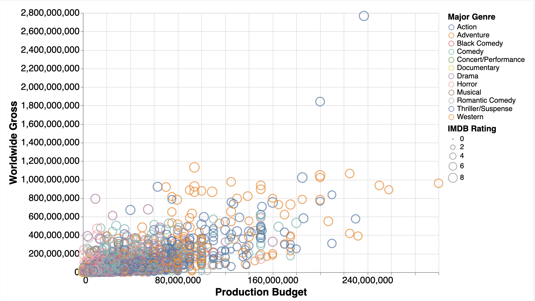
Hovering over any point reveals the film’s title and rating. The legend and size scale appear automatically based on the column types that Altair infers.
Now see what happens when you add one more channel to control the chart’s layout:
scatter = alt.Chart(movies).mark_point().encode(
    x="Production Budget:Q",
    y="Worldwide Gross:Q",
    color="Major Genre:N",
    size="IMDB Rating:Q",
    tooltip=["Title:N", "IMDB Rating:Q"],
    column="MPAA Rating:O",
)
scatter
That single extra column parameter splits the entire chart into side-by-side sub-charts, one for each MPAA rating:

These sub-charts feature synchronized axes and a shared legend.
This is a form of faceting, which means splitting a single visualization into multiple sub-charts based on the distinct values of a categorical variable. In Altair, faceting is another encoding channel. In Matplotlib, you’d need plt.subplots(), manual scale sharing, and separate legend handling.
If you want to build your Matplotlib skills alongside Altair, Real Python’s Python Plotting With Matplotlib video course walks you through subplots, customization, and the object-oriented API that gives you that fine-grained control.
Add Interactivity With Selections
If the encoding channels section showed Altair’s expressiveness, this one shows its most delightful trick: interactivity that requires no JavaScript, no callbacks, and no widget framework.
Altair treats user interactions as integral to the visualization grammar. A selection is a parameter that captures user input, such as a click or a drag, and makes it available to the rest of the chart. You declare what a selection is, reference it in your encodings, and Altair handles all the wiring.
The two most common selection types are selection_interval() and selection_point(). The first creates a rectangular brush that selects all points within a dragged region. The second selects individual data points on click. Both follow the same pattern: create, attach, and reference.
Begin with a base scatter plot and add a brush:
brush = alt.selection_interval()

scatter = alt.Chart(movies).mark_point().encode(
    x="Production Budget:Q",
    y="Worldwide Gross:Q",
    color=(
        alt.when(brush)
        .then("Major Genre:N")
        .otherwise(alt.value("lightgray"))
    ),
).add_params(brush)

scatter
Click and drag on the chart to draw a selection rectangle. Points inside the rectangle stay colored by genre, while everything outside turns gray.
Here’s what each piece does:
alt.when(brush)tests whether a point falls inside the current selection..then("Major Genre:N")applies the genre color if it does..otherwise(alt.value("lightgray"))applies a flat gray if it doesn’t..add_params(brush)attaches the selection behavior to the chart so it can respond to mouse events.
Now connect that same brush to a second chart:
bars = alt.Chart(movies).mark_bar().encode(
    x="mean(IMDB Rating):Q",
    y="Major Genre:N",
).transform_filter(brush)

scatter & bars
The & operator vertically stacks the two charts, and .transform_filter(brush) instructs the bar chart to display only the currently selected data from the scatter plot:
Drag the selection rectangle across different regions of the scatter plot, and the bar chart instantly recalculates the average IMDb rating per genre for the selected movies.
Notice the use of mean(IMDB Rating):Q in the bar chart’s x-axis encoding. That’s an example of inline aggregation, a feature that lets you write an aggregate function directly inside an encoding string. Here, Altair calculates the mean rating per genre on the fly, eliminating the need for a separate .groupby() call or an intermediate DataFrame. The whole linked example is about fifteen lines of code.
Understand Altair’s Limitations and Gotchas
Altair is genuinely enjoyable to use, but a few rough edges are worth knowing about before you encounter them in a real project:
-
Dataset size: Because Altair embeds data directly as JSON inside the chart specification, large DataFrames can produce enormous outputs. Datasets over five thousand rows trigger a
MaxRowsErrorby default. This is a deliberate guardrail, not a bug. The recommended fix is VegaFusion, which handles aggregations server-side, or passing data via URL instead of embedding it. See the Altair docs on large datasets for the details. -
Rendering environment: Altair charts are HTML and JavaScript under the hood, so they need a JS-capable environment to display. That works in Jupyter, JupyterLab, VS Code, and Colab. If you’re running a plain script from the terminal, call
your_chart.save("chart.html")to write the chart to an HTML file that you can then open in any browser. For exporting images as PNG or SVG, you’ll also need to install thevl-convert-pythonpackage. -
Customization ceiling: Altair’s expressiveness is limited by Vega-Lite’s capabilities. This is usually sufficient for exploratory analysis, but if you require detailed annotations, custom layouts, or precise typography, Matplotlib remains the more flexible choice.
-
No 3D plots and no native pie charts: Altair is strictly 2D. For three-dimensional visualization, use Matplotlib’s
mpl_toolkits.mplot3dor Plotly. Altair doesn’t have a dedicatedpiemark, butmark_arc()can create a donut-style chart that serves the same purpose. -
Tidy, column-driven data: Altair expects a tidy pandas DataFrame with one row per observation and one column per variable. Multidimensional NumPy arrays or nested dictionaries must be flattened first.
-
Data-driven properties: Altair assumes every visual property maps from a DataFrame column, including size, color, and labels. You can override this with constants and inline transforms, but doing so is more verbose and loses the declarative feel.
-
Version-sensitive APIs: Some Altair APIs change between major releases. In particular, the
altair.datasetsmodule used in this tutorial to load sample data was introduced in Altair 6.0. If you’re running an older version, you’ll need to load datasets differently. Check the Altair changelog when something doesn’t work as expected, as the fix is often a version update rather than a code change.
None of these are dealbreakers for most exploratory workflows, and the Altair community is actively working on several of them. Knowing these boundaries upfront helps you pick the right tool for the job.
Conclusion
Altair’s core concept is elegant: instead of scripting a chart, you describe it. You specify your data columns, the visual property each column controls, and whether you want user interaction. Altair then takes care of rendering, scales, legends, and JavaScript.
If you’re coming from Matplotlib, you’ll need a slight mental shift. Think in terms of data columns and visual channels rather than axes and drawing commands. However, once this clicks, adding a new dimension to a chart is usually just another line in .encode(), and interactivity stops feeling like a separate problem.
To keep exploring, try swapping the movies dataset for one of your own DataFrames and following the same steps. The Altair Example Gallery is an excellent place to browse what’s possible, and the official documentation covers everything from custom themes to geographic maps.
Real Python’s Data Visualization With Python learning path organizes tutorials and video courses on Matplotlib, Seaborn, Bokeh, and other libraries into a structured curriculum you can follow at your own pace. For more on the individual tools used in this tutorial, check out these resources:
- Python Plotting With Matplotlib (Guide)
- Visualizing Data in Python With Seaborn
- Jupyter Notebook: An Introduction
- The pandas DataFrame: Make Working With Data Delightful
Get Your Code: Click here to download the free sample code you’ll use to build interactive Python charts the declarative way with Altair.
Frequently Asked Questions
Now that you have some experience with Altair in Python, you can use the questions and answers below to check your understanding and recap what you’ve learned.
These FAQs are related to the most important concepts you’ve covered in this tutorial. Click the Show/Hide toggle beside each question to reveal the answer.
Neither is universally superior. Altair excels at fast, interactive exploratory visualization in notebooks, while Matplotlib offers greater control for publication-quality static figures. They’re complementary tools, and many data scientists use both.
Altair is a declarative statistical visualization library built on Vega-Lite. It lets you define what to visualize by mapping data columns to visual properties, and then generates an interactive chart that renders natively in Jupyter, VS Code, and any JavaScript-capable environment.
Altair embeds data as JSON in the chart specification, so datasets over five thousand rows trigger a MaxRowsError by default. The recommended solution is to use VegaFusion, which moves aggregations server-side, or to pass data by URL rather than embedding it directly.
Encoding channels are mappings between columns in a dataset and visual properties of a chart, such as position, color, size, and shape. Each channel is declared as an argument to .encode(), and Altair automatically generates the matching scales, axes, and legends based on the column types.
Take the Quiz: Test your knowledge with our interactive “Altair: Declarative Charts With Python” quiz. You’ll receive a score upon completion to help you track your learning progress:
Interactive Quiz
Altair: Declarative Charts With PythonTest your knowledge of Altair, the declarative data visualization library for Python that turns DataFrames into interactive charts.